

Lillhans
Lillhans
About
- Username
- Lillhans
- Joined
- Visits
- 2,008
- Last Active
- Roles
- Member
- Points
- 2,066
- Location
- Sweden
- Rank
- Surveyor
- Badges
- 13
Latest Images

Reactions
-
A Teleport Hub
Cool stuff!
One way is adding more sheets for additional, superimposed, tiers of cave wall - say two or three - where you gradually alter the shading properties for each so as to create a sense of depth.
Granted, it's more of a paper theatre approach - but who doesn't love paper theatre?


-
Current Affairs Encounter Map
Apologies: this one's rather heavy on the Tell part, but there's pictures also. So, yay!
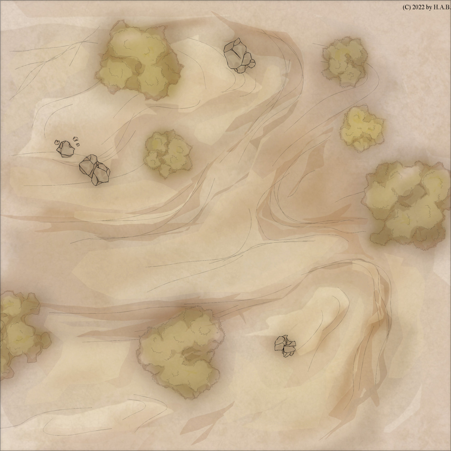
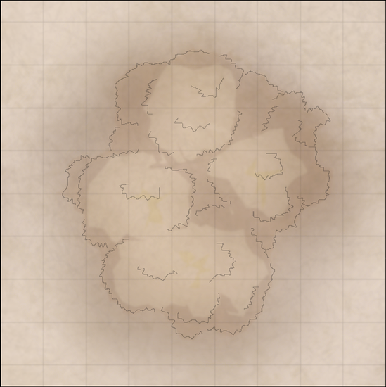
A friend needed wilderness encounter maps (roughly 30 x 30 5 ft. squares).
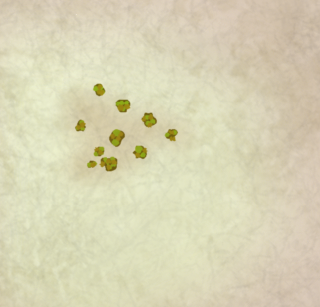
Prior, I had been gravitating towards creating multisheet symbols and this was an opportunity to try the symbols I had made: some rocks and trees.
Each symbol utilizes the "standard" sheets of the style (Sepia Wash; a Palette Plotter variant) meaning I get the same sheet effects as if I were to design each thing directly on the map. This is also the purpose for the (sacrilegious) introduction of symbols itself: topographic features is something I will always have to design from scratch in each map - but does that have to be the case with other features?
I am still a bit ambivalent towards using templates, but let's review what goes into each tree:
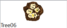
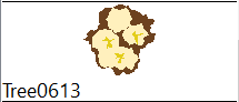
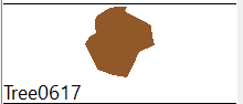
This is the 06 model and it looks like the usual polygon blob. You will notice that the green of the canopy is missing: these symbols were first intended for use in a sepia-only environment. Specifically, my Sepia Wash style palette of:

....with the same colours for the spongy, heavy-on-EFI sheets.
What has happend in the final product is that I have simply slapped on a single, transparent, green polygon on top - transparency allowing for the underlying sepia range of colours to inform the value of the green across the design.
So, with minimum efforts the symbols work in a more colourful environment, too.
Anyway! (colours in parantheses)
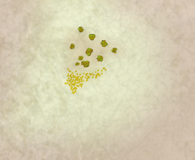
Each canopy starts with a body (36), some volume (29) and a splash of whatever (134) in the Brush Over sheet.
Next, in the underlying Brush Under sheet, I introduce some accents to the edge of the canopy (38) as well as some accents (36) to contrast the brighter parts on the previous sheet.
The spongy bits provide both gradient (thanks to Blur and EFI) but also - because of the transparency throughout; tone. In the medium range, I put a generous contour (36):

...and to encourage a richer browntone, in the weak/fainter range, there's a cover-all piece (38):
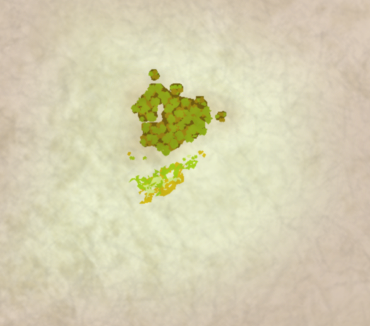
Next, it's line works!
I zig-zag (very delicately!) along the contour of the body:
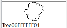
And finally, I put zig-zags to work alongside the tone shifts of the canopy:
The lines get a Straight-To-Smooth treatment and, in tandem, this is what it looks like with sheet effects turned on:
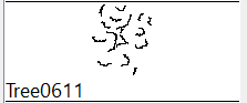
1 tree. 51 individual entities in their right sheet in one click.
We can compare this to the topographic features in the map above - which measures 120 entities.
Pound for pound, at this level of attention to detail, I'd seem to be on my way to the third tree in the time it'd take me to chisel out the entire background/landscape. Unlike the lanscape, however, I want the trees to be more distinct - which translates to pause and decisions in a way that simply wouldn't make the flow of landscape sketching...well, as fluid, I guess. Two very different processes.
Of the 16 tree models I designed, there are some which will always be easy to identify as templates- even if each symbol is set up to randomly rotate and flip over/mirror. But, I can always add more to enhance the illusion of unique designs in each map.
In my opinion, creating a set of symbols kind of sucks. It's nothing like landscaping; it's deliberate, repetitive and horrible. As a more neutral observation, it's not an incentive for development: if I'm happy - why explore? Sure, there is the process of discovery while designing - but once Saved as Catalogue...I can't help but feel that curiosity died at least a little: Gods forbid that I develop in other areas - rendering my catalogue obsolete and in dire need of an overhaul...
As for the result, however, I wanted consistency in variation - and I got it: the software will nudge each set of entities enough to make it a unique experience in a single click - especially with additional colouring on top. And it's all in keeping with the rest of the visuals.
While it's true that I can only deviate so much from the concept before I'd have to redesign trees of this kind there is no denying that - in the above example map - crafting each tree and stone formation from scratch would have increased the required time to completition by a factor of four.
![[Deleted User]](https://secure.gravatar.com/avatar/c75d9a245b74d9c59be0999ea81ca541/?default=https%3A%2F%2Fvanillicon.com%2F92add7f8c954488718110edc4896ad39_200.png&rating=g&size=200)


-
Looking for a style to match Paizo
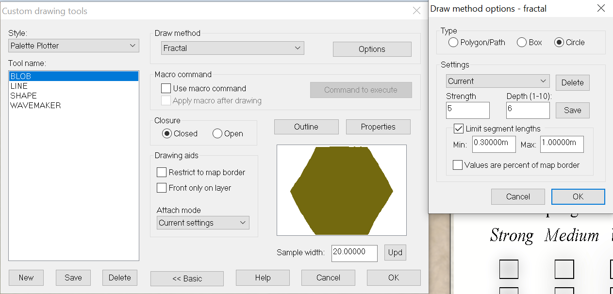
I'd start off with Fractal Circles of a darker tone. Once you have cranked up the fractal count you can stamp random iterations real quick, Ctrl+Scrolling for size adjustments as you go:
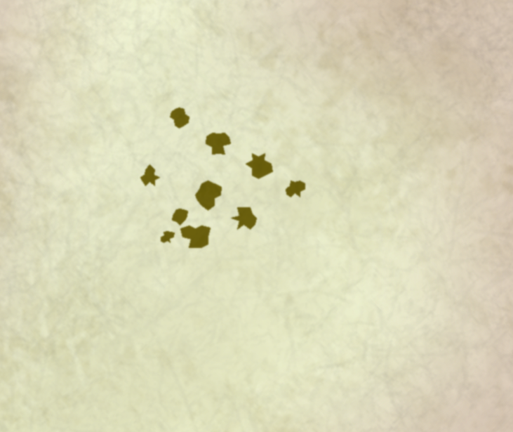
I'd then dot them, similarly, with a brighter green:
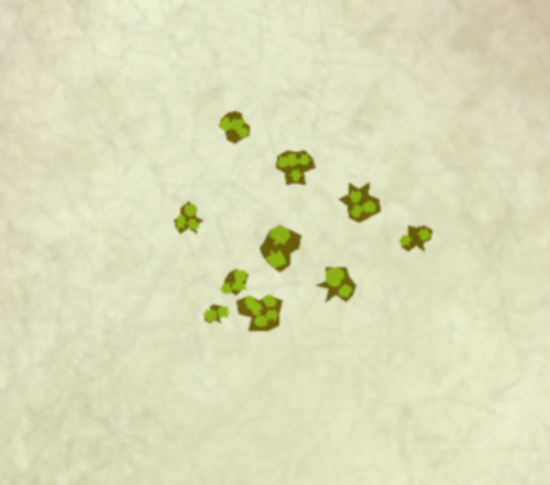
...and perhaps run Straight-To-Smooth and throw in a third colour for the foliage, also adding a brown patch on the ground, just because:
The undergrowth admittedly makes for a bit of an effort, if done similarly, but there you may opt to simply have individual dots towards the edge of the patch - as opposed to make the entire patch out of individual dots, like the below example.
Patches of trees could, of course, be done that way too: one polygon for the bulk of the body and then individuals for the edge/canopies.
-
Looking for a style to match Paizo
Walls I would probably do myself using circle and box tools.

So the bright gray here is the circle and box, respectively, which I gave a polygon contor and a splash of darker gray for variations. Easy enough to multiply strips of the same width for the wall and then the same with towers.
-
Canvas map development
Oil on canvas! Fantastic, obviously :)
"The map is not the territory" kind of has stuck with me and I tend to read a whole lot of terrain into the general area of where there is a mountain symbol - similar to how the ocean just doesn't go straight to plains (even if that's what maps tend to show us). And then, there's of course places like that location in New Zealand where they shot Edoras for The Two Towers - where the mountains go from 0 to 100 in no distance at all.
Ecotones are forever a menace :)
With foothills I see lower and perhaps slightly flatter than the usual suspects mountain proper symbols. The scope/scale of map in which foothills would be the "biggest" geological feature sort of barrs proper mountain symbols (as shown in the above example) from play simply on account of their peaky qualities.
Or not: as @jslayton points out, it isn't set in stone (puns!) and whether it's mountains or hills or foothills kind of depends on what you put next to it.
With regards to my first remark, distinguishing between mountains proper and the intermediary foothills in the same map, to me, suggests a level of landscape detail which closes in on the diorama/map as illustration of actual terrain.
