Palette Plotter (a Doodles & Drawings adventure) - video and end-product journal
 Lillhans
🖼️ 7 images Surveyor
I did a video, which ends in a bit of a cliff-hanger - to be resolved below.
The Water
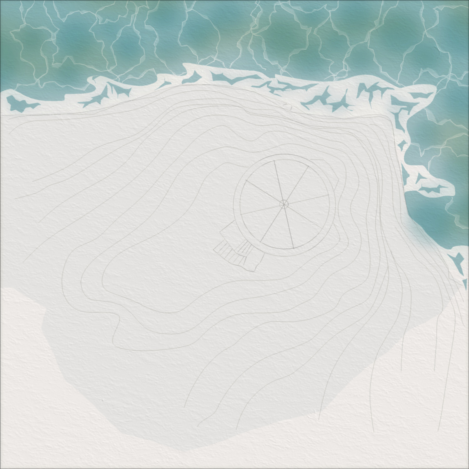
Well, what didn't change after the video? I decided to simply redo the entire thing.
Twice. First I picked up that the Blob was probably subconciously made for being a wave/lightning-maker: a hollow fill style and all I had to do was stamp away. I also decided to go with full canvas coverage there.
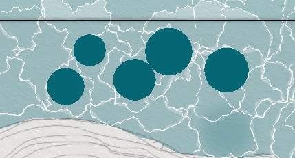
For the in-between darker shades a solid fill circle prove quickest. I make sure to combine them into one big happy polygon using Multipoly: this way, I can grab them all in one go for colour edit (if desired).
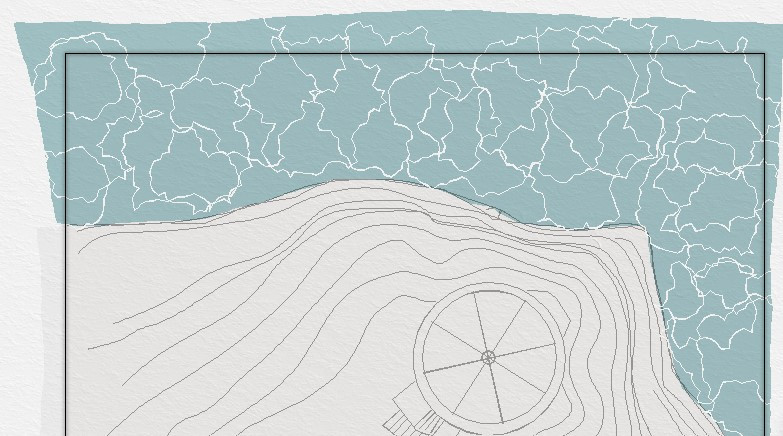
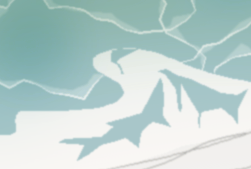
Second time around, I left a gap between the water and edge of the cliffs. I wanted to add some nice foam patterns, and it turned out to be easier to work out the...uhm..negative negative spaces with the same colour and sheet as the rest of the water.
I am probably looking at treating myself to some "how to paint water" videos for the holidays or just the way water tends to behave. By and large I think I'm ready to move on to sort-of-dry-land.





Comments
Many thanks for the video and the addendum here. Great to you see and hear your process unfold!
Glad to be of service! The festive card community challenge is a break both in style and motif of course. But I'd like to think it will allow for me to pick up a thing or two that can be used in the Rock 'n Tower. If nothing else it's a palate cleanser. THE PUNS NEVER END!
The Rock
I make a slight adjustment of the water's edge and move on to the rock.
The heightlines are great for tracing, I find, and I begin attempts to hide them in plain sight with a "brush". This of course gives me the option to drop them entirely;
For now, I am rather happy to have them around: rendering, they will be pushed way back anyway.
I can now move on to sponging bits for gradients - introducing very suble brown here and there: I want to reserce the more distinct gray for the tower itself, and also avoid ending up with a bit of a blu-tack environment alltogether.
A render later and it's becoing apparent that I will have to find a better solution for the water's edge. Rock is coming off with a nice glossy quality to it, suggesting I might want to find a simliar solution for the water landscape.
Tower and Beyond
I move on to the tower and start working out how I want my clay tiles done.
Polygons-as-contours works well to get the outlines of the tiles: it's a bit overkill with regards to the level of detail, but I also think it's important to establish what to make of the orange/brown stuff.
I can then move on to trees and shrubbery - ending up using three colours in total. It's quick enough with the blob tool, though.
I'm happily surprised with how nice they look even without well-defined contours, but seeing as the tower gets a proper ink contour treatment (depending on it, more like...) the vegetation will - ultimately - also need it. Because the sketch and ink lines came first, right? RIIGHT!
More sponge to get gradients and realising the rock, too, probably needs some accentuated bits. I don't think these will be the final lines for the rock, but I'm getting a good idea of just how much (or little, rather) is going to be required.
There's no escaping the cursed water's edge now, it would seem.
And it's a wrap.
Initial ripples pattern certainly isn't on point here. But as far as winging it goes I would be happy to roll for initiative here.
Well, on those cliffs you could end up doing other kinds of rolls too.....
The area beneath the stairs is especially well suited for setting up shop and cook some Smoked Bacon Bomb rolls for sure.