


Wyvern
Wyvern
About
- Username
- Wyvern
- Joined
- Visits
- 3,267
- Last Active
- Roles
- Member
- Points
- 5,585
- Rank
- Cartographer
- Badges
- 24
Latest Images


-
From Quillan to Montsegur
Alternatively, you could try making the higher hills somewhat larger in size, perhaps, or possibly use some smaller mountains to represent them instead.
As Sue said though, the map looks splendid anyway!

-
Medieval / Fantasy Docks and Ships
There are a few options for docks in a couple of different styles from the Annuals, though ships and boats in the same package and style are in shorter supply in general. Fantasy Towns from 2021 has all, albeit the ships and boats are restricted to just one of each (two, if you count the varicolor option as well). Symbol Set 5: Cities of Schley has a broader range of options, and there are some simpler design options in the vector style Serpentine City from 2020. I've likely forgotten others though, and hopefully someone else can jump in with other ideas! Of these, Cities of Schley probably offers the larger set of possibilities, though that may depend on what you're looking for, and what sort of styles appeal most to you. Good luck!

-
Dialogue Concerning two river systems
Yes, the images seem to be fine now, but they definitely weren't yesterday! Even clicking on the image symbol brought up error messages, after several reloads of the topic, so I've no idea what was happening!
Rivers are, as has been pointed out by others here already, always a tricky subject, and it does come down to what you want from them, and how much work you're willing to put in to each map.
For instance, you can always add hand-drawn polygons along the lines to vary the width more, or help disguise features such as multiple river confluences, or where there's too great a difference in appearance between two stretches of river otherwise.
River mouths at the coast are often difficult as well, which can be overcome sometimes by moving the end of the line so it blends better with the effects along the coast (where that's an option, naturally; best to zoom-in very closely), or again add a polygon of appropriate size and colour to hide the river line end.

-
Community Atlas: Dendorlig Hall - A Sort-Of D23 Dungeon for Nibirum
Well, my original intention was to provide a progress update here during January. And then before the end of January. And here we are in February, so you can see how well that went...
However, progress HAS been made despite that, even if a lot of it's less easy to show here as yet. That's mainly because I've been preparing handwritten notes on the various itemised areas within this dungeon, which in turn has led to a few alterations in the look of the map. As I've reached area 100 of the 360 this way, things in that respect aren't going too badly. Typing-up my handwritten scrawlings is not moving at the same speed though, and that's still a LONG way behind.
As I mentioned briefly before, from the initial map, it was clear that the parts nearest the entrance cave (areas 1-49) formed a separate region within the overall dungeon, as all being linked to one another, with just a single access-route to the remainder. Looking at the Atlas notes regarding Malajuri, in conjunction with the relatively small sizes of the rooms, led me to the idea that this had originally been a Gnome subterranean complex. For obscure/now long-forgotten reasons, the Gnomes had had to leave it for long enough that its whereabouts had been lost, until the Gnomes under King Dendorlig XXX had managed to find it again, and start to reoccupy, renovate and explore it in more recent years.
As also noted, the description of what's where within the complex has been drawing heavily on the random details generated by the Wizardawn system, albeit amended or adapted in places, particularly in this first Gnome-reoccupied zone, where random monsters are not going to be lurking! Instead, things like that have been reimagined as alternative features, such as wall-paintings or sculptures, and rather more has been added to have the whole make sense, since there's now a village (in cavern 22) and a military compound covering access to the rest of the dungeon (where dangers DO still lurk), around and off the muster courtyard 39. Along the way, a powerful maybe-deity nature spirit of the mountain has been inserted, Dendorla, at the great Water Temple (17), since water is a) naturally vital for living things, and b) the Gnomes long had elements such as piped water supplies and flushing toilets. I've mentioned before how making sense of random descriptions and area layouts helps me better visualise what may have been happening/is still occurring in such places. There's even a serious danger I may yet have to devise a small area map for the Gnome and Halfling farmlands in the hidden Dendorlig Vale area just beyond the underground complex here (food, after all!). Yes, Halflings too, taking on-board the Tolkienian idea of Halflings being natural farmers and gardeners. Plus as there are almost no Halflings in the area of Alarius I've been mapping, I thought this would give a chance to explore something a little different this way.
Since other parts of the map are still subject to change, I've not tried to present the whole again currently, so this is a view of just the reoccupied "Village" area and a small part of the adjacent areas, from the top right corner of the original map:
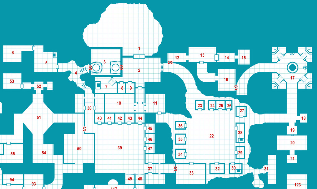
As is rather obvious, the top edge of the map has grown, to better illustrate the full extent of cavern 1 (and yes, the number for that needs moving on this shot still!), and there have been other changes too. The "red-S" doors are no longer secret doors, but sliding ones, operated by magical card-keys only, to better restrict access to various places, such as the Royal Apartments (12-16), the Keep (3), and the route to the remainder of Dendorlig Hall (between 39 and 50).
While not illustrated again here, as I'm still compiling notes and map amendments for the latter stages, I've set areas 50-66, 93-110 and 143-146 on the original plan as those areas the reoccupying Gnomes have currently explored, at least cursorily. The other areas - so most of the map - have yet to be looked over by them, and this is where things can get especially interesting. Even if that "cursorily" proviso means even the explored regions might not be quite so "safe" as expected. That stout, well-secured, red-S door between areas 50 and 39 isn't merely for show!
All being well, further updates to follow (not saying they'll be any more frequent/regular though...).


![[Deleted User]](https://secure.gravatar.com/avatar/c75d9a245b74d9c59be0999ea81ca541/?default=https%3A%2F%2Fvanillicon.com%2F92add7f8c954488718110edc4896ad39_200.png&rating=g&size=200)


-
Winter Trail Project
The lower cliff edges could perhaps do with something to help them "sit down" in the terrain better; they have rather too crisp an edge currently, whereas in reality, there'd be some snow drifted or fallen around the base to make the edge a bit more irregular.

