


Wyvern
Wyvern
About
- Username
- Wyvern
- Joined
- Visits
- 3,303
- Last Active
- Roles
- Member
- Points
- 5,647
- Rank
- Cartographer
- Badges
- 24
Latest Images
-
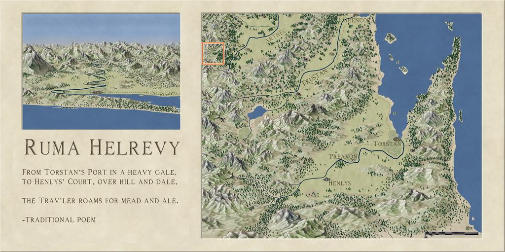
Community Atlas: Oracle Mountains Area, Ruma Helrevy, Peredur
They're mostly the varicolor rock symbols, with a colour chosen to more or less match the ordinary hill symbols, though I did rescale some of the normal hills in places as well. The rock symbols have little dots with some, which helps make the terrain look a little vegetated as well, which with the bushes, fills things out really well for just a few clicks here and there (because the symbols cycle through the options randomly if you don't expand all the catalogues).

-
Community Atlas: Oracle Mountains Area, Ruma Helrevy, Peredur
The last part of the area mapping involved adding a lot more fine detail, to make it look more like a living landscape:
Further small adjustments have been made along the way. A couple of marker-stones have been added by that central-right red roadway, because it is actually a way-marked route, and the marker-areas have especial significance (the Atlas notes will have more details). I've also changed-up one symbol in the lower-centre of the map, to what now looks like (indeed is!) an inverted obelisk hovering above a crater in the ground. Originally, the hovering stone (it actually looks like a huge stone shard hovering over a crater) was drawn with a couple of rescaled, one inverted and mirrored, varicolor mountain symbols. However, reducing their sizes so dramatically meant their lines lost too much definition, making it hard to see where the marker was on the map, especially after adding more little stones, bushes and extra trees nearby. I hadn't been happy with it earlier, so the change here was one of the first things done. The crater's not altogether ideal, a vertically squashed version (different X and Y scaling) of the varicolor dormant volcano symbol, but it doesn't look too bad with extra dressing over and nearby.
The final stage was to add the labels, always something of a challenge. I'd hoped to make more use of the idea from the Peredur notes, that names from the region should have a vaguely Cornish form. However, when I looked-up a couple of online Cornish-English dictionaries and translation options (yes, I know; albeit, perhaps luckily, Google Translate doesn't consider Cornish a language, apparently), a lot of the key words - such as "oracle", "relic", "griffon" - remain the same as in English, and the whole started to feel more effort than it was worth. This was especially so, as my opening thought had been to have a toggle to swap the Cornish and English name-labels in the final Atlas FCW file. Sadly then, just the vague "Mummerset" of the dungeon location's "Quezzal Tower" name makes a token not-really Cornish element here. Even that came merely from a slurred "Quetzal" in the random-word lists extracted from the Knave RPG!
Thus the completed map:
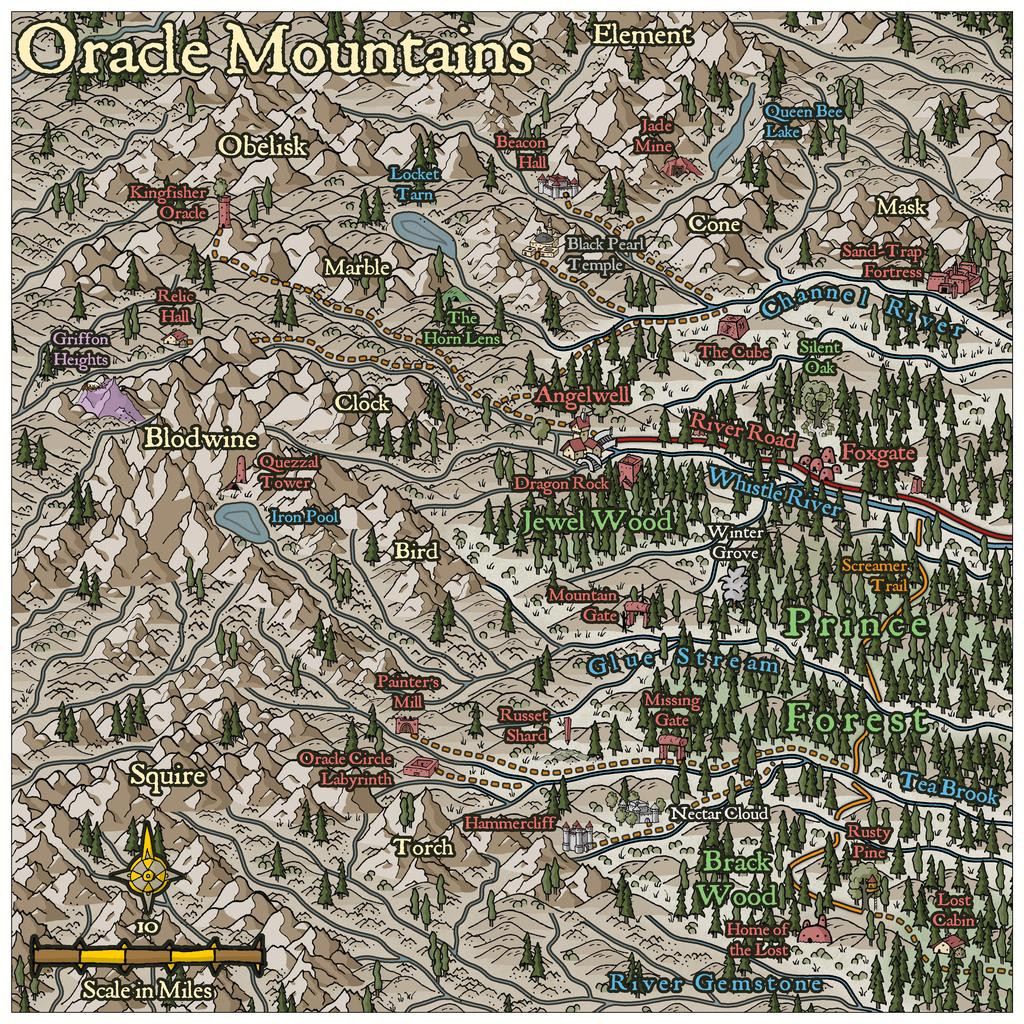
As to how the map's name came about, that's largely because several of the Inkwell card random option notes came up as magical vision-gates and oracular settings. The PDF notes will have more.
Next time, the start of a closer visit to Quezzal Tower...


-
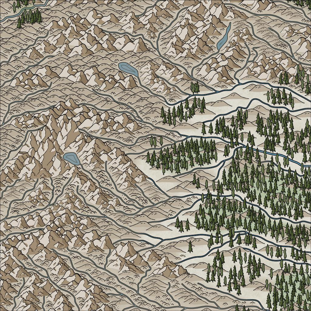
Community Atlas: Oracle Mountains Area, Ruma Helrevy, Peredur
Time next to start adding some vegetation, initially just based on the extant Ruma Helrevy base map, and again with added background polygons for the denser woodlands (although the hill and mountain symbols often hide parts of these):
Next, the randomly-located places were dropped-in (albeit a few had been swapped around to make better sense):
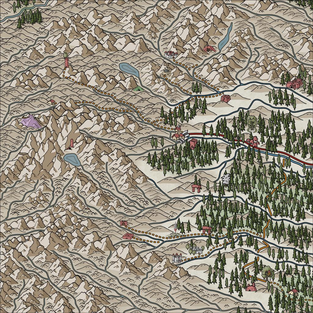
And yes, the Inkwell cards actually do include unusual roads and trackways, shown here by the solid red and orange lines. The dashed lines are my own trackway additions, linking to the somewhat more populated outlying sites.
Aside from the ever-popular 'fiddling about to get the dashed lines to look right' activity (a mixture of over-long dashes in parts needing nodes shifting or removing to look better, and adjusting the variables on how the selected style of dashed lines are drawn, so as to actually look dashed), there was here too the endless fun of trying to get them to lie above and below some of the terrain and other symbol features! Much of the latter was accomplished by using different sheets for different symbol types, although one trail line ended up being cut in the right spots (in the mid-left part of the map), where it was meant to pass behind a mountain peak.
Still in need of some tweaking in parts, of course, and the sharp-eyed may notice I've slipped-in a couple of the newest free "Alien" symbols, not in fact because there are aliens lurking in them thar woods, but because I needed a couple of more rustic location symbol options, and these fitted the bill quite nicely - as well as one for the ruined tower by the mountain tarn where the dungeon map will go eventually, as there aren't any suitable ruin symbols in the style (as yet - is that too subtle a hint?!).
Although there's not much to show today, it actually took three more sessions to reach this point, so the final tweaking, additional dressing and labelling must wait till the next update now!
-
Looking for Symbols
You could try drawing simple shapes (lines, circles, triangles, say) with the Solid White bitmap fills, and experiment with blur and/or edge fade effects on them, rather than looking/hoping for actual symbols. Or just use solid white/grey polygon shapes, with transparency, blur or edge fade effects on those instead - or indeed a mix of all. You may need a few extra sheets, but you could get a more unique look that way.
-
Community Atlas: Oracle Mountains Area, Ruma Helrevy, Peredur
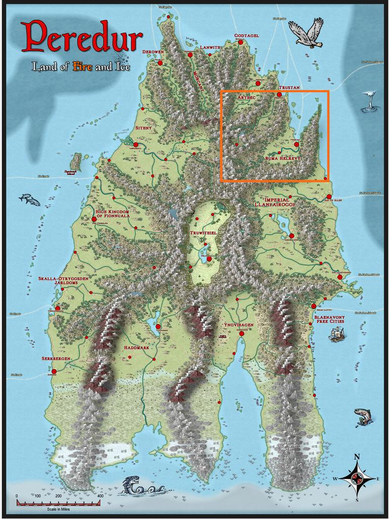
Having concluded my recent diversion to The Dying Earth of Jack Vance, it's now time to resume mapping for the Community Atlas. The next maps were intended for somewhere in the substantial Ruma Helrevy region of Peredur, as noted previously in the final post here:
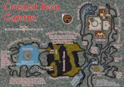
This also brought a switch to a new Inkwell Ideas Dungeonmorph Dice set, as the next four dungeony maps were to be from designs in the Lairs pack. These are quite a contrast to the recent Trailblazer set's layouts, because most of the Lairs ones are caverns, or otherwise irregular spaces. As luck had it though, one of the dice designs randomly selected here was something transitional, with a square entrance room leading into a large series of caves. These dice also have an accompanying Inkwell Ideas book of suggestions for every design, "Dungeonmorph: Delves and Descriptions - Crypts, Lairs & Sewers Edition".
As usual, I checked through the book notes, with random rolls, to spark off some initial concepts, in conjunction with examining the existing Atlas maps for the region, and any notes with those, to find a suitable spot to locate this map. Almost nothing has been mapped in the Ruma Helrevy area, except the main settlement of Torstan, and most of the map's notes revolved around that more southerly broad valley as well. Meanwhile, what I'd determined/adapted from the Inkwell book were some Ogre-sized Badgerfolk who'd broken into the cellar (the square entrance room), which was a former summoning chamber in the base of a ruined wizard's tower. This led, by a now shattered secret door, to the cavern complex. In the caves were a Naga in a pool cavern, a whole group of Spidermages, one of whom was a strange, oracular creature, all of which mages had originally inhabited a far deeper world, led to by a great chasm, come nearer the surface to collect ambient magic in their special web-nets, and a second entrance, via a narrow, open-sky cleft, where a group of Wyverns (yay! 😁) were nesting.
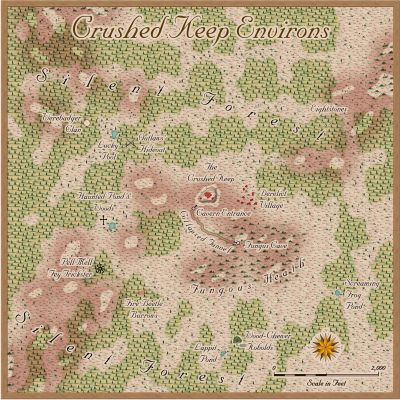
The whole magic-from-the-air concept led me to think of a stone windmill-like wizard's tower, with four fixed, stone-framed sails, now partly ruined, designed to draw magic from the sky in a remote mountain valley (because of the Wyvern-cleft). And suddenly one map became three, because aside from the dungeon one, this needed an area map, and some sort of design for the surface tower too.
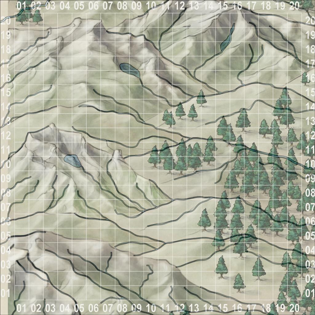
There are plenty of mountains in Ruma Helrevy, and I quickly narrowed the options down to a zone in that map's northwest, away from the more civilised parts. Ordinarily, I'd have gone with a 20-mile square area for this, which has become fairly, if not exclusively, typical during this project. That looked ridiculously tiny here though, so I doubled-up, and went with a 40-mile square instead, right on the extant map's northwestern edge:
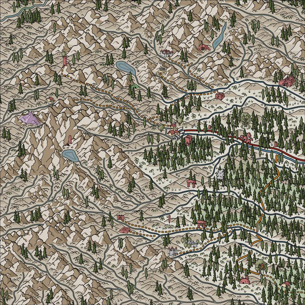
Following what's become my normal practice, I set-up a, here, 2-mile square grid across that area, and randomly-rolled for locations of interest among those. I also randomly rolled up some name-options for the leading creatures from Mythmere Games' "Nomicon", and a whole series of mostly single-word idea-prompts for more names from the random tables in the "Knave: Second Edition" RPG rules (Jacob Hurst & Swordfish Islands LLC). However, for the location details, I decided to try out another, much newer, Inkwell Ideas product, the "Hexploration Kit". This comes with a large group of pre-drawn, coaster-sized, hexagonal terrain maps printed on card, and five separate card decks with an evocative illustration on one side (by The Forge Studios), and random tables of text ideas on the reverse. Several cards per deck have ideas and random tables on both sides, to further expand the options. I used cards here from three of these decks, "Stranger Places", "Into the Wilderness" and "Settled Lands", with suitable random rolls and further adaptations.
With all this decided, finally, I could start mapping! I opted to stay with Ralf's Hand-Drawn Fantasy style again for the area map (and the dungeon one too), and set-to.
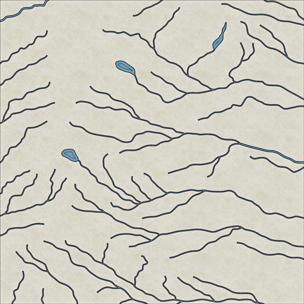
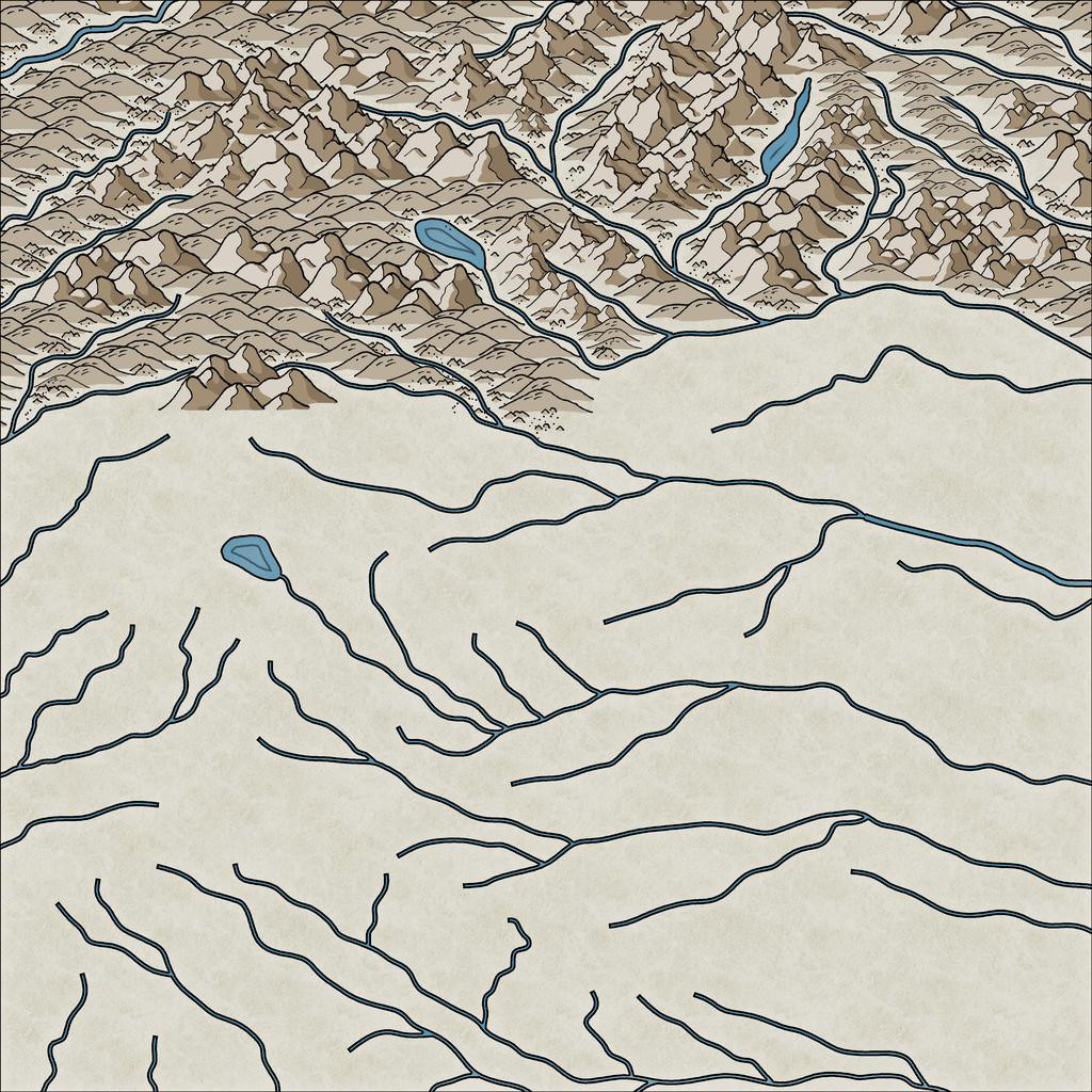
While using the gridded map to place locations, I'd been struck by the flowing lines of the Jon Roberts' style mountains, and thought those lines could be readily adapted to show rivers. This first image illustrates how I drew those, still with the imported, semi-transparent, gridded base bitmap showing:
I also added a few small lakes, partly because I'd developed a mental image of how I wanted the ruined tower to look (aimed for the lake-head around square 0411, facing southeast down the valley), and it seemed likely such glaciated mountains (this is around 53°S latitude) would have small lakes of this kind. As you can see too, I've not simply gone with the valleys from the Jon Roberts symbols, but have used some of the crest lines too, essentially because that looked more interesting!
This shot gives a better idea of the final riverine layout:
With that completed, I started sketching-in the physical terrain:
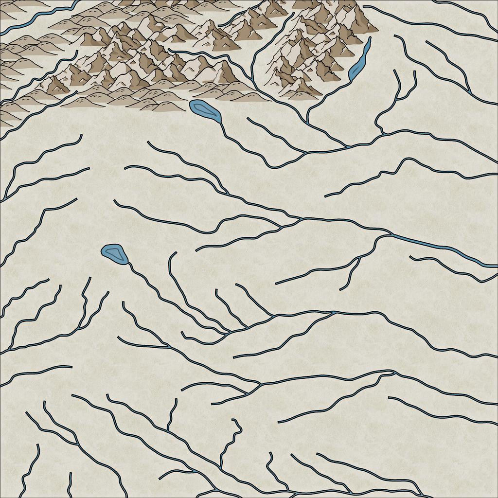
This still needs a lot of tweaking - hiding the ends of the river lines, filling-in the blank valley bottoms, and so forth. Here's a shot partway through that "cleaning-up" process, and a bit further along more generally:
I tend to do this in segments of the map, to try to avoid too many problems with the ordering of which symbol overlies which ("Sort Symbols in Map" can create as many problems as it solves with styles of this sort that involve fade-out lower symbol edges, unfortunately). Thus all this took a couple of mapping sessions, and another couple more to complete the whole terrain layout:
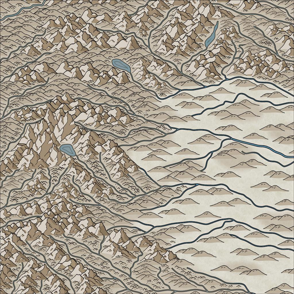
By this point, I've also added the background mountain-shading polygons as well. The absence of smaller terrain features in the lower-lying areas is because there are going to be woodlands here, which would make many such smaller symbols redundant, as largely hidden away.
Still quite a lot more to do, but that's definitely long enough for today's round-up, I think!


