


Wyvern
Wyvern
About
- Username
- Wyvern
- Joined
- Visits
- 3,266
- Last Active
- Roles
- Member
- Points
- 5,585
- Rank
- Cartographer
- Badges
- 24
Latest Images


-
Mr Tumnus’ cave
And congratulations too on having your "Horse & His Boy" map selected by Ralf as one of February's Maps of the Month on the ProFantasy blog!


-
What B&W Styles are Suitable for Large Maps?
You might want to redownload SS1 if you don't have the Fantasy or Handdrawn symbol folders available, as there are definitely four folders showing in my SS1 symbol sets - these two, plus "Peter" and "Sean". Unless the contents have been changed since I obtained mine (they are all dated 2016 in my installation, certainly, so that was a while back!).
I wouldn't rely on the program to automatically change symbols sizes to always look right. I often find these need tweaking, sometimes quite substantially (and not always by the same amount for all symbols in a style).
Really just have to pick or adjust things to suit per map. Once you've done it a few times, it becomes pretty automatic.

-
What B&W Styles are Suitable for Large Maps?
Don't forget there's also the standard CC3+ B&W overland style, CC3 Vector BW, and if you have SS1, there's the Fantasy - Monochrome and Handrawn - Hollow (varicolor, so choose a suitable black for the lines) options. It's easy to forget these amongst all the many Annual options, I know!
Some of the varicolor sets can also be changed to actual, or more-or-less, B&W too, with a bit of experimentation.
Plus, depending on what sort of area you're intending, it may be possible to enlarge the symbols to keep them clear enough when resized (although this can lead to pixellation).
Depending on what style you're using, you may also be able to add a Whole Drawing Greyscale effect using the RGB Matrix to shift everything to look black-and-white.

-
Playing Card County Maps
To answer some of the questions here, yes these were genuinely used as playing cards back in the day, but they also had an educational aspect, described sometimes as a sort-of early pocket atlas. The full sets included the usual 52 cards, an explanatory extra card, and a title card with a map of England and Wales divided into counties. The cards were among the first maps to show roads. As the sample here shows, they also gave the county dimensions, latitude (they predate the adoption of the Greenwich meridian for longitude in the mid-19th century in Britain) and selected towns' distances from London. It's thought only one complete set of these cards still survives, although there are a few incomplete ones, and more surviving individual cards.
-
Playing Card County Maps
By chance, I came upon an item in the press this week about a playing-card map of the county of Northumberland in England from about 1676, by Robert Morden (well-known British mapmaker of the period), which had been sold at auction. This is an image of the card's face:
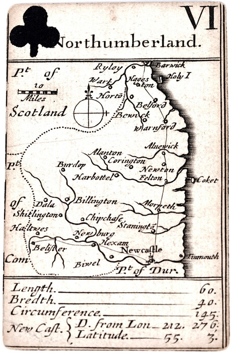
This kind of black-and-white period style is one already readily available in CC3+. However, the concept of playing-card county maps like this (apparently, the complete deck included all the counties of England and Wales, and was updated several times over the following century) was new to me, and something that seemed an interesting concept to introduce to fantasy RPG mapping, perhaps.
A suitable template could be created quite easily in CC3+ for a full card deck, and a background fill texture applied before adding the maps and details. The nature of the maps means they wouldn't all need to fit together ultimately, although it would be practical to devise a large, full-country map first, and then cut it into segments to fit to the cards.
The auctioneers' webpage where I found the original image is here, as it also shows the card's plain(-ish!) back. The local press for Northeast England has further details, as the information on this webpage is pretty sparse. I'm never sure if those outside the UK will be able to access the press sites though, so haven't given any links here.


