


Wyvern
Wyvern
About
- Username
- Wyvern
- Joined
- Visits
- 3,266
- Last Active
- Roles
- Member
- Points
- 5,584
- Rank
- Cartographer
- Badges
- 24
Latest Images


-
Postcard Maps
In my accidental "voyage of discovery" of non-standard maps this year, following my learning of the playing card maps highlighted here earlier, recently I came across some old UK annotated postcard maps, not least one that the H P Lovecraft Historical Society reprinted as a physical prop with one of their series of 1920s-30s-style audio programmes, "The Iron Maiden", published early last year. Mostly, these "Dark Adventure Radio Theatre" shows are based on the works of H P Lovecraft and similar horror writers of that period and before. The prop in question was this map of the Isle of Wight off the south coast of England, from the 1920s:
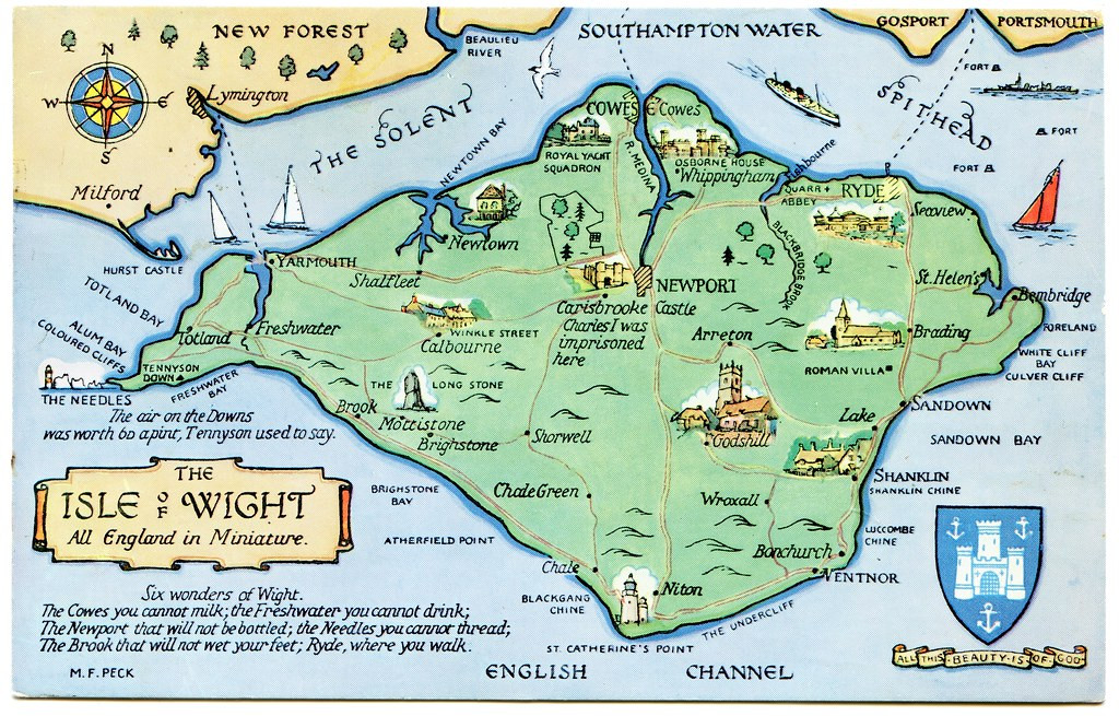
This style of map could be quite easily drawn using CC3+, and I particularly liked the annotations, as elements it would be easy to add to such a small-area map to inspire adventures in a fantasy setting, notably that short list, the "Six wonders of Wight".
Again, like the county playing card maps, this could be something readily adapted for RPG mapping use, I think, to give a fresh twist on how they appear. Of course, a dedicated style, with suitable feature symbol illustrations for CC3+, wouldn't go amiss either!


-
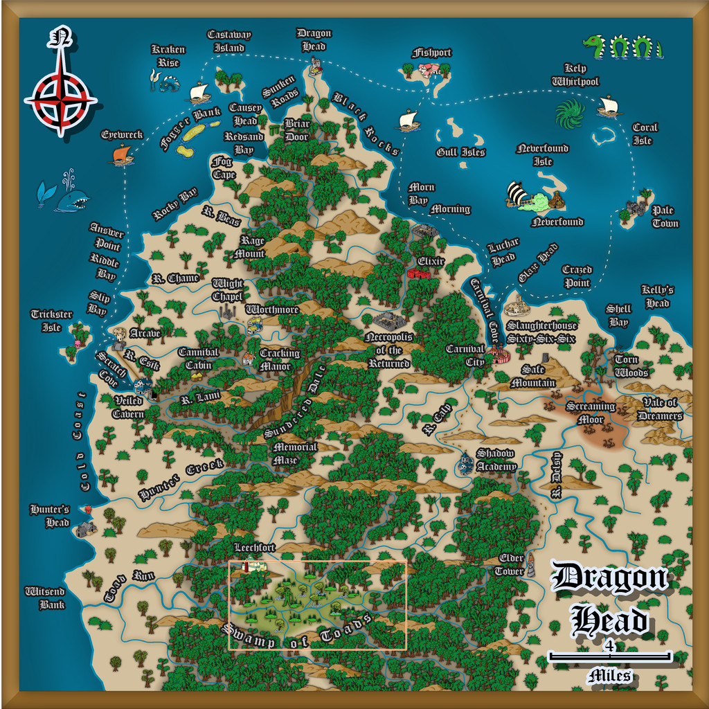
Community Atlas: Dragon Head, Lanka, Kumarikandam
Having succumbed to expanding this map-group to three, I set-to randomly allocating some extra places to the Swamp of Toads, beyond what was there already, though not too many, as the area involved is just six miles by three. I toyed with the notion of changing the mapping style for it as well, but the symbol options were just so much greater using the CA140 and SS1 styles than others I'd thought to try, that I chose to stick with them:
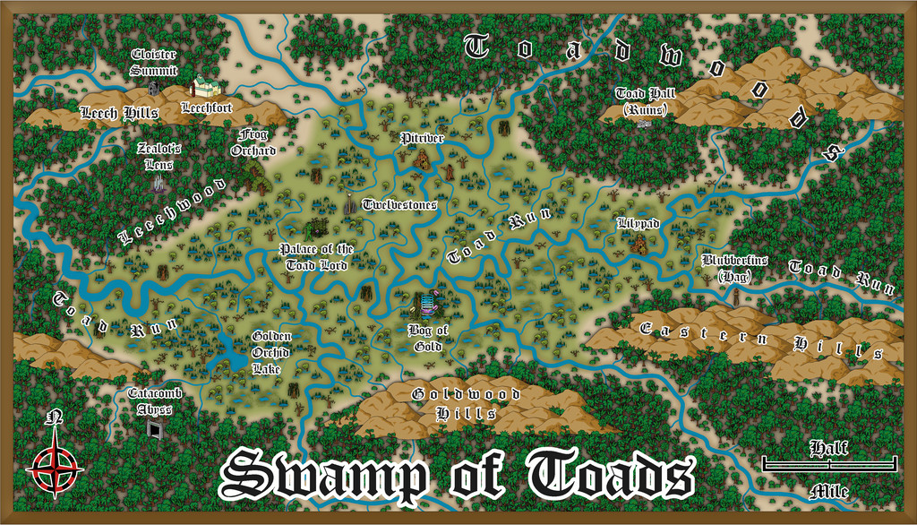
Drawing the twisting river lines was rather fun. Indeed, I had to calm down some of them with redrawing, as while accurate to such things in reality (take a look at some of the historical maps showing how the lower Mississippi has appeared and changed over the years!), it made this map look too messy and hard to read. I also dropped the idea of drawing oxbow lakes alongside the channels for the same reason, plus some of the swamp symbols come with little pools anyway, which worked just as well to hint at such elements, while not looking too cluttered. I did have to add one larger lake from the random design process, though that was big enough not to be a problem.
Many of the features came from a variety of the Story Engine decks again, including the three main ones, "The Story Engine", "Deck of Worlds" and "Loremaster's Deck", and several of the fantasy and horror supplementary decks, but this time added to from tables in the main Shadowdark RPG rules, and the free PDF adventure pack "Shadowdome Thunderdark", both available from The Arcane Library.
Within the Swamp is much monstrous flora, both in size and nature, and the place has been generally little-visited by outsiders for centuries, other than a few folk from the Leechfort martial arts school on the Leech Hills (yep, there are giant leeches here as well as toads!). Most of the intelligent creatures here are humanoid Toadfolk, many of whom live in separate homesteads or small communities scattered over the Swamp and nearby jungles. Then there's a gigantic, deity-like Swamp Elemental, commonly known as the Toad Lord, who lives near the heart of the Swamp. And that Palace was what the dice-design dungeon map was soon to become! (Next time!)


-
WIP - Wayward Village and Inn
Hey, as someone who used to DM with bits of cut-up graph paper, and with friends who DM'd using hand-drawn lines on clear-plastic-covered hex paper, this looks amazing! Mind you, that was close-to 50 years ago, so we had some excuse (that and there wasn't any other option back then!).
-
Community Atlas: Dragon Head, Lanka, Kumarikandam
A good deal later than I'd hoped, delayed thanks to various events outside my control, the next batch of maps for my sort-of Dungeon24-25-2... project are finally completed, covering aspects of a small peninsula on the northern shores of the easternmost Peninsula of Lanka, Kumarikandam:
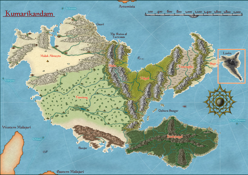
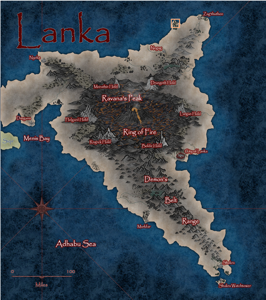
Lanka's pre-existing Atlas notes described it as an ashy, blackened, barren, volcanic wasteland, home to demons, dragons, dwarfs and assorted other (probably inimical) humanoids. However, peering closely at the Atlas map for the peninsula, there are a few spots with trees, shrubs and other hints of vegetation, some of which have settlements marked nearby, so it's not entirely desolate. And it was one of those vegetated headlands that I finally settled on mapping, from this extant base (extracted from the map above):
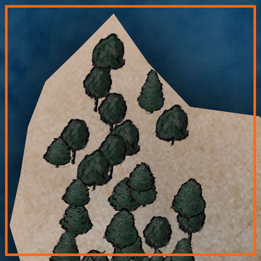
That orange-outlined area is some 20 miles square (30 km or so), to give an idea of scale.
A group of locations where sites of interest could be placed, were randomly assigned, much as usual, and then ideas for what they might be were drawn from, or inspired by, prompts from The Story Engine's "Deck of Worlds" and its expansion card sets, with some from the main "Story Engine" deck and its expansions too, including "Worlds of Blight & Shadow", "Written in Ash & Bone", "Worlds of Myth & Magic", "Worlds of Tide & Tidings", "Heroes' Quests & Fools' Errands", and the "Story & Worlds Bridge Expansion". From which you can tell I was leaning heavily into the "doom and disaster" concepts from the previous map's notes...
With that completed, the map was starting to come alive more, which, thinking about its geographic location - right on the equator - helped firm-up further. I was tempted to run lines of low hills into the gaps in the pre-mapped wooded areas, on northeast-southwest lines, only to decide against that (although hints of that still survive in the final map) as some of the ideas that had begun to coalesce favoured more west-east lines instead, partly based on what and where the random features were placed. These also gave rise to a number of offshore items, many of which were turned into islands too small to be shown on the original (honest!).
Thinking of what mapping styles might work best for this generally "threatening" area brought me eventually to the Dark Fantasy Maps style (CA140), to which were added items from the SS1 Fantasy Color style too, as suggested by the CA140 PDF Mapping Guide. After which, mapping commenced:

To keep things nicely confusing, "Dragon Head" is the name of this whole peninsula area, a coastal village settlement on the peninsula's northern tip, and the name of that headland where the village is sited! More hints of oddness feature in other map names, which the PDF map notes in the Atlas expand upon, as usual. There are definitely Dwarves, Demons, (Demi-?)Gods, Cannibals and Undead in places though, not all necessarily in what might be considered typical forms, along with still weirder things...
Speaking of which, the jungles have been kept deliberately off the hills for a couple of reasons. One is to further enhance the slightly uncomfortable feel of the whole area - rainforest jungle, but maybe the rain here isn't so healthy as it might be (the locals say it's often so heavy, it strips anything less tenacious than grass from the uplands). Plus the land has been tainted by events elsewhere across Lanka that laid waste to so much of it. The other main reason though was because when designing this map, I was also reading a couple of books on the Guadalcanal campaigns of 1942-43 in the Solomon Islands. Those islands are covered in tropical rainforest jungles, yet on Guadalcanal, as period photos clearly show, the hills are bare of anything much larger than scrubby bushes and grass, including from before any fighting began there. That contrast was just so unnervingly striking, it seemed very apt to reuse it here.
The dungeon map was originally going to be located on the western flanks of the narrow, crevasse-like canyon of Sundered Dale, near this map's centre. However, I found I was struggling to find reasons to so-locate it, and exactly how it was going to work there, because part of the design from the Inkwell Ideas Dungeonmorph Dice showed a large clump of trees in an open air circle, in the centre of a large, partly-roofed, temple-like chamber.
Inspiration for where else it might be placed, and just what it might be, came unexpectedly during a YouTube livestream on Free RPG Day 2025 by The Story Engine, creating settings with various guests using their card decks and expansions. One feature option that wasn't immediately spotted by the streamers was "Fence of Toads", and as so often in the live chat, we went off on our own little tangent about that... Then the stream's organiser, creator of The Story Engine decks, Peter Chiykowski, spotted our tangential chat about the point where I'd mentioned I'd then very recently been designing a "Swamp of Toads" (for this Dragon Head map). He said he'd love to see that, half-jokingly, and so was born the decision to expand the Swamp of Toads into a complete, separate Atlas map!
In case you can't spot the Swamp immediately on the map above, it's here, and we'll find out more about it next time:

-
Printing maps from PDF?
So far as I understand it, if you have an MS Office 365 sub, Publisher will cease working in October this year (I think - can't actually recall the exact date now). If you have Publisher on a computer that isn't connected to the Internet (so it was purchased years ago, probably on a disk of some kind - 3.5" floppy or CD-ROM), you should be fine.
I checked around earlier this year when this was first announced, and it seems that the free Libre Office suite (essentially the free equivalent to MS Office) will still open MS Publisher files. I haven't had time to install and check this as yet, but I know the earlier version of their MS Word-equivalent worked fine, and would open MS Word documents, although MS Word (of course...) won't open their files.
I like Publisher because it's so easy to resize the physical page size to fit whatever you're creating exactly - so it's really easy to create and save images, including images drawn in Publisher, to a very precise size. I know you can do this in other programs as well, but I've been using Publisher for decades, so it's much easier that way. I used to create all my maps and diagrams using it 20+ years ago, including for print publications!

