


Wyvern
Wyvern
About
- Username
- Wyvern
- Joined
- Visits
- 3,266
- Last Active
- Roles
- Member
- Points
- 5,584
- Rank
- Cartographer
- Badges
- 24
Latest Images


-
Dungeon Level Symbols - Celtic Revival Room by Room
Naturally 😁🐲!
Things that immediately occur in this regard include having symbols prepared as Sue did in Marine Dungeons 2 as Colour 6 shapes for use as cut-outs, showing her metallic textures beneath as inlaid floors - which would of course allow any other underlying inlay texture to be used as well - such as different coloured stone or wood.
Also, having the symbols available as outlines using the Solid 10 bitmap fill, so they can be used immediately to produce low-relief indented or inscribed designs, as Remy showed back in 2020 in this blog post, but without needing to explode the symbols first.


-
New Encounter sites along the Shattered Road
I like the snakeskin-look road especially!🐍

-
New PF Blog Post, "10 Quick CC3+ tips", by Remy Monsen
Just posted on the PF Blog yesterday, this is a new, slightly eclectic, list of useful options when mapping with CC3+, by our own resident expert Remy Monsen. While the Blog posts are always worth seeing, this is one that's worth printing a PDF version of for future use, I think.
Some of the ten tips will likely be familiar, others things you know about but can never remember the times they're needed (like how to reset the "exporting in fewer passes" thing, item three on this list, and which I always end up scrabbling around trying to recall where I put the note as to what command has to be used to reset this, after a rare glitch that's reset it to the smaller amount!). And others may be new to you - OK, me, then 😁 (looking at you, Quick Move)!


-
Community Atlas: Dragon Head, Lanka, Kumarikandam
While the map layout from the Inkwell dice designs was pretty straightforward, I'd already amended it in a few places before embarking on the CC3+ drawing, because rather than being subterranean, this was going to be a surface feature Palace building, albeit one composed of living vegetation, to fit with its key inhabitant, the Swamp Elemental known as Ssathrokkwa, the Toad Lord. The Palace is thus an extension of himself, in a somewhat loose sense. From a distance, and even quite close-up, it simply looks like one of the denser patches of swamp-jungle vegetation scattered across the whole Swamp area, while inside, being composed of living shrubs, trees and other plants, with marshy floors that sometimes include pools and water channels that pass beneath the walls, the structure isn't as solid as it may appear, albeit with thorns, cuttingly-sharp leaf edges, and dense internal branches that act as deterrents to anyone trying to force a way through walls or ceilings.
Ahead of the mapping, aspects of the Palace and specific items within it were randomly chosen, with adaptations, from a variety of tables in the main Shadowdark RPG rulebook, the free PDF adventure pack "Shadowdome Thunderdark" again, both by The Arcane Library, and the "Curiosities" tables in the "Unnatural Selection" supplement for Shadowdark published by Dungeon Damsel.
For the mapping style, this became quite an unusual mixture. One of the possibilities I'd considered for the Swamp of Toads map was the Darklands City style, and although that wasn't used there, I did like the connecting-symbol hedgerows in it, and thought they might be interesting to use here instead. The tree symbols and water options from that were also deciding factors. However, this is a dungeon-sized map, not a city-sized one, so others of Sue's dungeon-scale styles were pressed into service as well, ultimately including those for Marine Dungeon, Creepy Crypts, and Forest Trail, aside from a few more from DD3.
And so to the map:
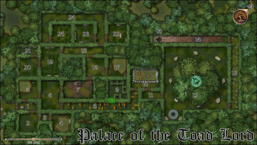
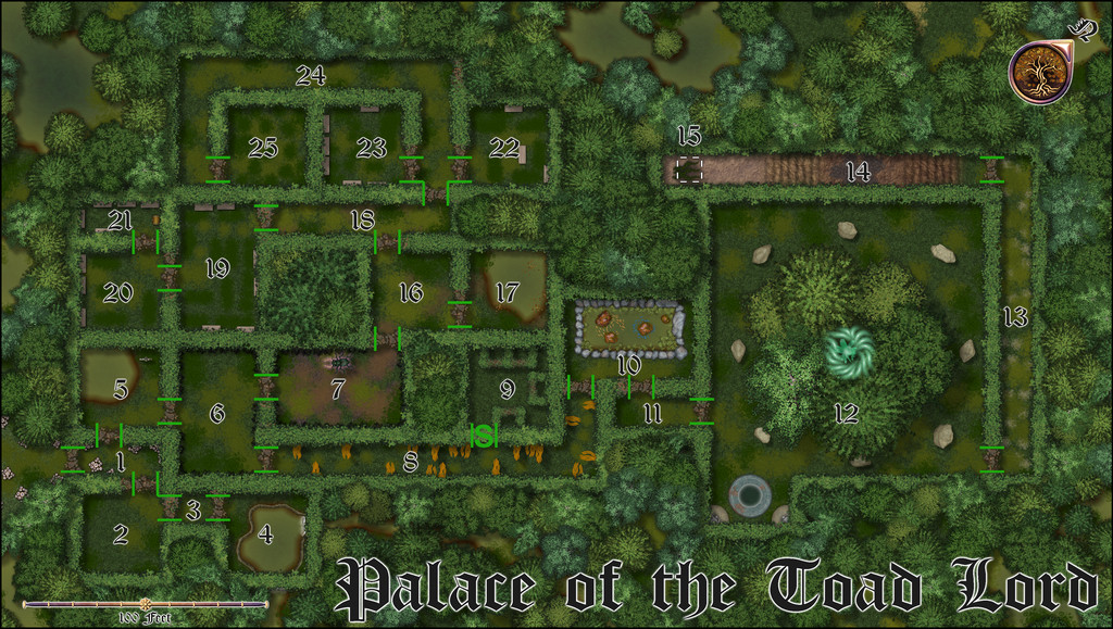
Part of the reason I wanted to use the Darklands City hedges was because they come with thinner, brown-leafed segments, which seemed an ideal way to indicate the doors to this complex. That's because they don't appear obvious to non-residents, and open like a camera iris, the branches and foliage pulling back to form a rounded opening at the touch of a living hand or tongue (the latter is the usual method for the Toadfolk, naturally). The solitary Secret door is shown on the map above ordinarily, which decided me to also provide an option to show similar marker-lines for the ordinary doorways as well, for clarity:
That should have a toggle in the final Atlas FCW version.
Similarly, there should also be a toggle for the map grid:
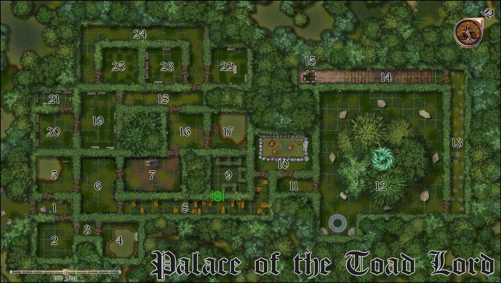
That's been kept deliberately very subtle, and sometimes well-hidden (especially by that grove of trees in the Throne Room, area 12 - the floor space continues beneath their canopy, although much more heavily vegetated than in other open areas). GMs needing a more obvious grid can of course adjust it as necessary. There's also a cluster of magic crystals in the centre of the grove, for those wondering what might be happening there - there are more notes in the PDF file for the Atlas, including Shadowdark game stats for the new and variant creatures involved.
It's amazing what can be repurposed as something else at times. That long, rising passageway with two sets of mud-and-branch steps in (14), for instance. The "steps" are reused rectangles of the Fields bitmap fills from Darklands City, the mud in between the Earth texture fills from there, and the darker area (actually an ooze pit trap) beneath the "14" label, the dungeon dirt patches from Creepy Crypts. At the southern end of that passage, that dashed-white-line square is set over some strands of Kelp from Marine Dungeon, standing-in for swamp-jungle liana vines! And that square hatch and vines lead up to the Watch Tower, available on yet another FCW toggle for the final Atlas version, thus:

Of course, that Tower's of living vegetation too, so the floor is composed of interlocking branches, and the walls of canopy foliage, through which the watchers can climb to keep watch. There's a gentle, milky haze overlay across the lower parts of the map to indicate this is the highest part of the complex as well, and if required, there's an extra area of grid that can be shown for the Tower as well:
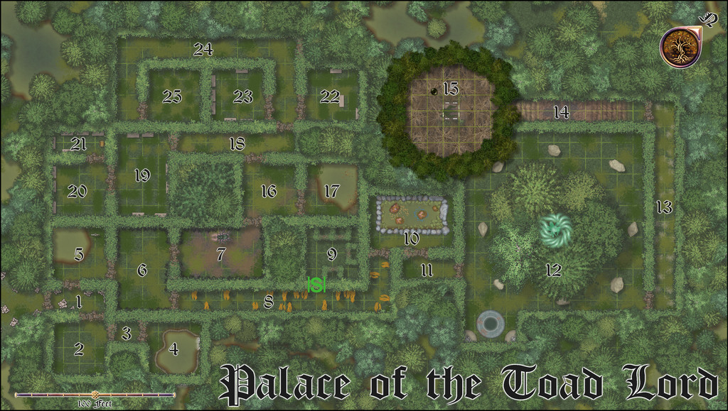
The lower grid doesn't need to be shown at the same time, as they're on separate Sheets, although both are here.
This was a lot of fun to draw, especially with the water pools here and there. Indeed, I got a bit carried away with adding water channels and pools outside the complex initially, as they just looked so interesting, and had to scale those back ultimately in places!
With this complete, the next map's scheduled for somewhere in the vast expanse of NW Doriant...


-
Ricko's Questions
Sorry to be late replying. The simple answer is "no", because the render export will always use the larger value for the larger map edge in a rectangular JPG export, and hold the other to the correct proportion accordingly.
This may mean having to switch the orientation before printing, depending on exactly how the image is to be printed, but when creating just the image file, that's irrelevant.
I always put the same value in both, because it save me worrying about which edge might be marginally longer in some almost square maps, or (and this is more likely!) me entering the wrong value for the obviously longer side because I forgot which box was which in the export pane!

