


Wyvern
Wyvern
About
- Username
- Wyvern
- Joined
- Visits
- 3,266
- Last Active
- Roles
- Member
- Points
- 5,584
- Rank
- Cartographer
- Badges
- 24
Latest Images


-
Community Atlas competition entry: The Summer Palace of the Winter Queen
Thanks Quenten! I started trying to analyse what the influences had been on this set, and while some were obvious enough, the more I thought it over, the more came to mind, mostly from folklore, mythology and fantasy fiction (which latter tends to rely heavily on both the former, of course). Plus as I said back when I started mapping "my" bit of Alarius a couple of years back, I've been working on parts of what was to go into that for decades, and the same is true here too, as essentially another part of the same thing.
Meanwhile, back to Palace 8, which is finally completed. This is it:
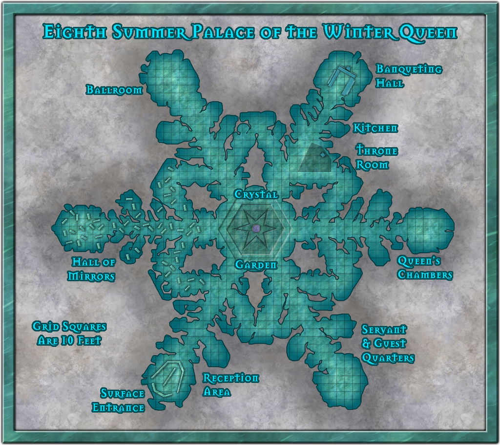
There have been a number of additions and amendments, mostly of a cosmetic nature, beyond the anticipated scattering of symbols and other internal additions, and the labelling, of course. The most substantial change was probably to reduce the overall size of the map somewhat, as the whole felt a little unbalanced at the top and base of the drawing once everything had been added. That was a bit fiddly, because there are always quite a number of entities to amend on the Map Border and Screen Sheets, as well as things like the Background Sheet, whose rectangle was also then too large.
I then had to change the fill for the frame. For all it might be thought a little incongruous as not having a very icy/snowy look, I rather liked the default wood-block pattern on the earlier version, and it looked a serious contender to remain, right up until the point where I adjusted the size of said frame. At which point, the lower border (only) suddenly had a dark horizontal line running right through it, because of the way the fill fits itself into drawings at the scale it had. And that quickly became A Distraction, so sadly it had to go.
The new fill for the frame is Water Green from this CA54 style, scaled-up to prevent it tiling, and holding up remarkably well in doing so, I thought. I was really just experimenting with it, but as soon as it dropped in with the light Bevel Effect, I knew it had to be The One!


-
WIP: Hiero's Journey
It's maybe a little surprising nobody's done an RPG supplement on this setting; pretty well everything else seems to have been done, after all!
The rivers don't look too bad to me (remembering too I'm looking at the very sketchy, small, line illustrations in the actual novels as a nonexistent comparison with your work of art here!). You could maybe add a relatively bright Outer Glow Effect to make them stand out a little more, but that will affect the points they meet the seas too, if they're the usual lines on top of the land and sea Sheets in the Sheets stack. You could make the river lines brighter instead, and perhaps add a green Outer Glow to the lines, different to the colour of the land surface, again to help them "shine" a little more.
-
Grimdark Fantasy (renamed "Darklands") - development thread
@Loopysue - The compass indicators seem too perfect currently. The human skull should maybe have at least some damaged, worn or missing teeth, and likely be a bit more battered overall - Grimdark, not Clean & Neat, after all! Similarly the other skull (dragon?) could be a bit more battered as well, perhaps.
If the FaceBook group wants something a bit "nastier", you might go for an entire impaled skeleton (or being mischievous, you might imagine it to be some of the more vocal respondents there ?), or possibly a severed head hanging from a gibbet, as that seems both grimmer and darker in general...
![[Deleted User]](https://secure.gravatar.com/avatar/c75d9a245b74d9c59be0999ea81ca541/?default=https%3A%2F%2Fvanillicon.com%2F92add7f8c954488718110edc4896ad39_200.png&rating=g&size=200)
-
Community Atlas competition entry: The Summer Palace of the Winter Queen
Thanks Jim! Nice to know you found it interesting. I was getting a bit worried at its length, especially once I'd added all the images! And I still have two more Palace maps to finish after number eight...
-
WIP: Hiero's Journey
Well this is a blast from the past! My copy's a 1976 vintage UK paperback edition, though I'd read it the previous year when a guy at my wargames and D&D group loaned me his copy. Hence I went out and bought my own later! I think the first US edition was earlier though (Wikipedia gives 1973).
It looks as if you've used the map from the later 1983 second volume, "The Unforsaken Hiero" though, as that has a bit more information than the Hiero's Journey one (Otwah League is Otwah Estates in Journey too, for instance - though the Journey Glossary calls it the Otwah League instead - and there's only one Blue Desert marked, not the two you have, as shown in Unforsaken). D'alwah was also only an area by the coast in Journey, but in Unforsaken, it's both a settlement "Capitol of D'alwah", and an area. Kalina seems to be marked as just another area by the coast in both books, and both also have another near-coastal area above = northeast of D'alwah, Chespek. The ocean offshore might be labelled as Lantik Sea (weirdly, both maps show it as Lantik Ocean, but both Glossaries call it Lantik Sea!) too.
Great to know you're going to be off adventuring here soon. I know Journey was one of the favourite books for discussion repeatedly with some members of my college D&D Soc back in the early '80s, and I still have a great fondness for it, though it's many years since I last read either volume.
