KertDawg
KertDawg
About
- Username
- KertDawg
- Joined
- Visits
- 4,759
- Last Active
- Roles
- Member, Administrator, ProFantasy
- Points
- 379
- Birthday
- February 16, 1978
- Location
- NC, USA
- Website
- https://playbyweb.com
- Real Name
- Kertis Henderson
- Rank
- Surveyor
- Badges
- 6
Latest Images
Reactions
-
Post-processing Map to Age It
I've been working on this off and on for a few days. I appreciate all the help and input.
I experimented with matrices, and I think a scaled unity matrix (contrast) and adding brightness is exactly what I needed.
The multiply blend mode gives the texture underneath. This is a success.
Now to actually finish the text. That's another story...
Thanks again.


-
Post-processing Map to Age It
I mean something like a contrast and brightness adjustment effect. I need to look at the list when I get back into CC.
Again, this is doable in the GIMP, I know. I simply love the idea of moving a symbol, then saving as jpg and I'm done. CC3 is so easy, and that makes me want to do all this in one UI if it's possible.
-
Post-processing Map to Age It
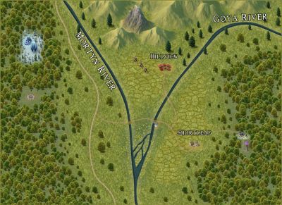
OK, done. Here's a screenshot.
It looks similar, but a little darker. I'm going back and forth between thinking that lighter text glow is better, and then thinking that the darker glow looks more "realistic." I then tried disabling the RGB Matrix, and this makes it look even darker but with more contrast.
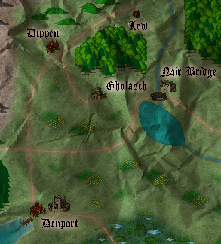
I actually like this! Do you know of a way to decrease contrast so that it looks a little faded and not just sepia?
Thanks for the ideas! I appreciate the help.

-
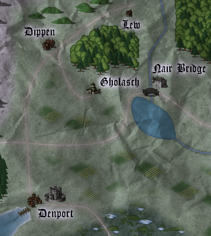
Post-processing Map to Age It
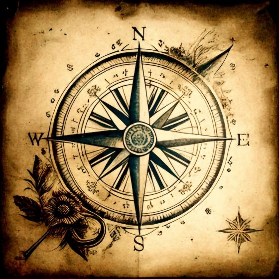
Here's what I started with:
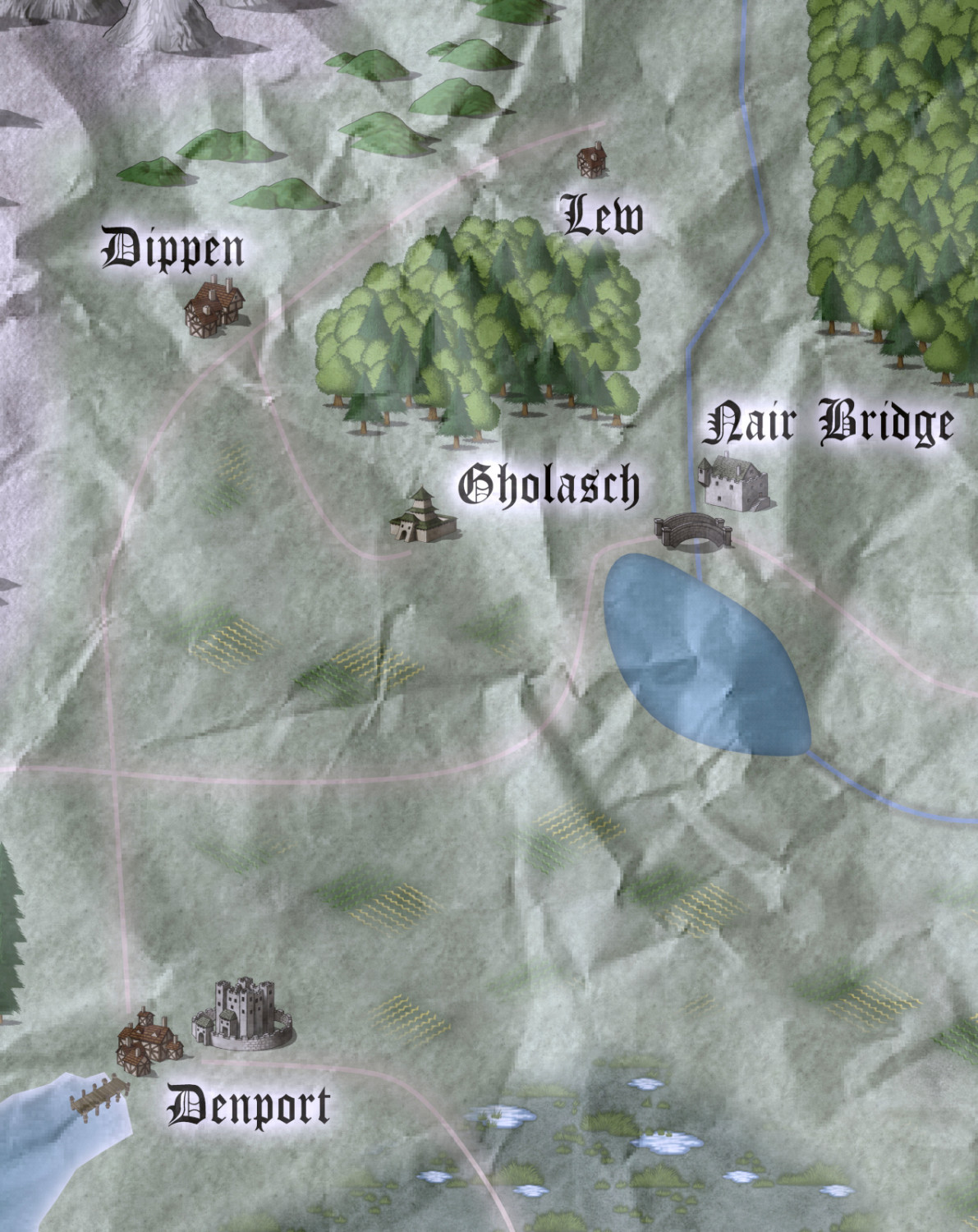
The following output is completely from CC3. I cropped it to just the section that I needed, then I added a crumpled paper on a new sheet, added transparency, and then did a custom RGB matrix for the entire thing. It's not 100% sepia, but more like halfway. I saved the matrix so I won't have to remember anything. It fits my needs right now.
Thanks all for the ideas and support!