Lillhans
Lillhans
About
- Username
- Lillhans
- Joined
- Visits
- 2,008
- Last Active
- Roles
- Member
- Points
- 2,066
- Location
- Sweden
- Rank
- Surveyor
- Badges
- 13
Latest Images

Reactions
-
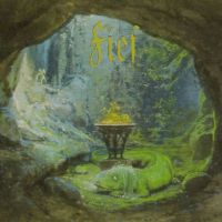
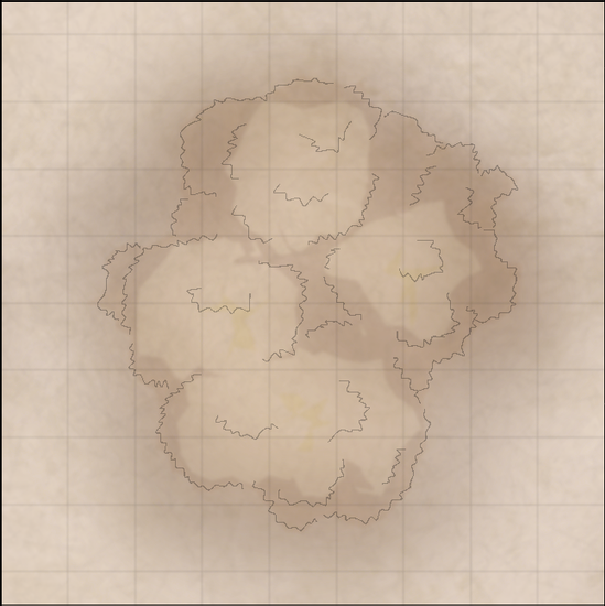
Fuchswald Memorial
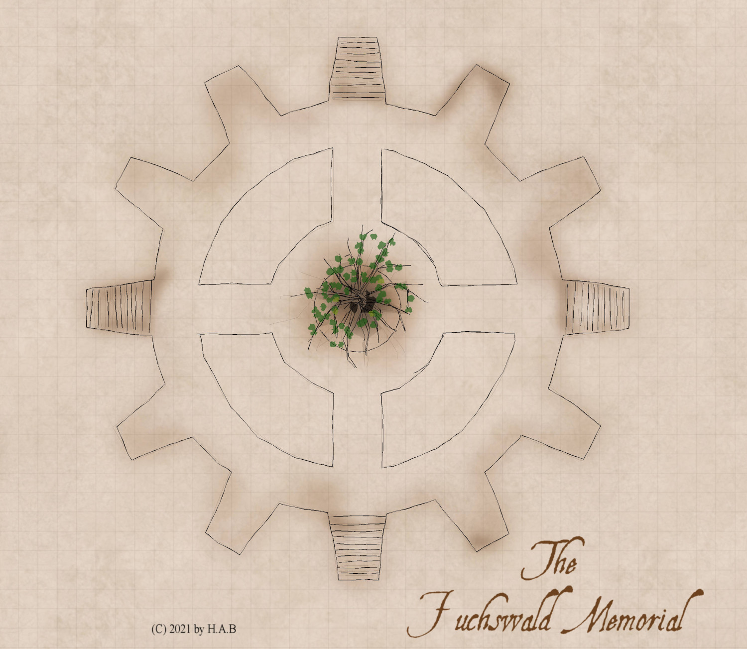
Bauhaus logo "relief" in the ground in Harper Street Gardens. Scenery from the founding of Fuchswald Schlucht is carved along its stone walls.
A single tree stands at the centre of the cogwheel; the only plant in the park which still adheres to the seasons.


![[Deleted User]](https://secure.gravatar.com/avatar/c75d9a245b74d9c59be0999ea81ca541/?default=https%3A%2F%2Fvanillicon.com%2F92add7f8c954488718110edc4896ad39_200.png&rating=g&size=200)


 and 1 other.
 -
October challenge: City Street submission WIP
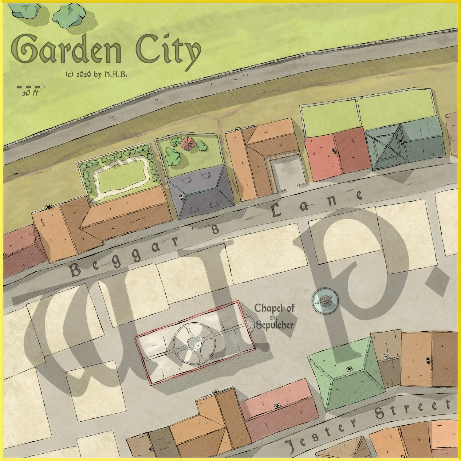
It's coming together nicely, I think. Two more gardens and some rooftops and then it's a wrap. An excellent moment to procrastinate.


-
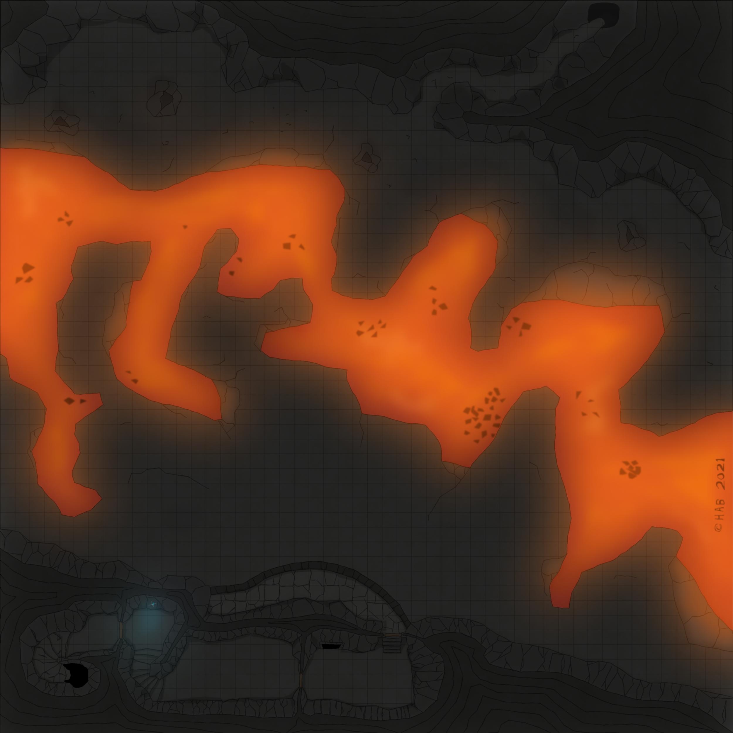
[WIP] Community Atlas Competition entry: Thing beneath the Iron Mounds
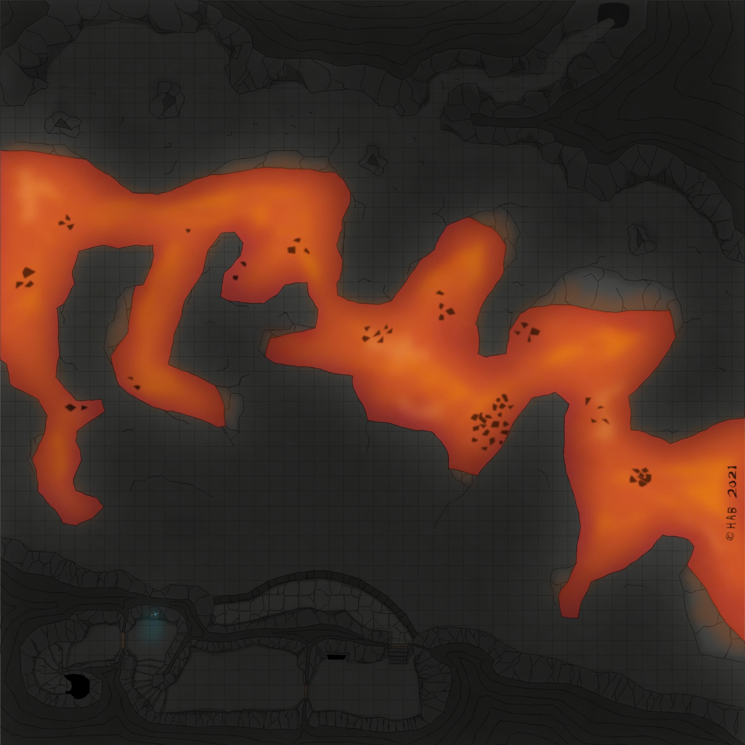
The battlement needs to have the colour choices sorted out and its stairs added...at some point.
I seem to recall a Leonard Cohen line about killing the flame but I think it might be a bit too dark at the present time. But that could just be my fantastic laptop and eyesight playing tricks. Overall though, I think this is probably the right move for introducing shadow play on otherwise very flat-looking cave walls, which aren't supposed to be served by the light from the lava below.
It's not that I don't like the preivious look of things, but it's just that going back to it now seem a bit impossible - so that means it must have been an improvement, right? :D
That would be "not working with shadows" to "cover everything in shadow" over a few days off. It's adding some time to the process but also gaining something in the totals: it feels like it's no longer about *figuring out* how to uncover the good stuff, but rather a matter of making it so.
Anyway.
For the curious, the below is what Colour Key, Blur (with a generous border) and Transparency turn into the above.
The Transparency regulates the Leondard Cohen of the screen (black square polylgon)
The Colour Key (mixed fruit yoghurt colour bit) cuts out the parts that should be default bright.
And Blur, finally, extends the cut-out by toning down the edges of the black polygon - which is treated as now including also where the Colour Key area ends. The latter allows, of course, for adding more dots of "luminated" areas as seen where the fluorescent gem is doing its thing. Somewhere, there is probably a Lighting Effect I should be using instead...
Super printer-friendly map!
Also; I am not saying I will necessarily be doing it, but here is what things look like if one keeps multiple Colour Key below Transparency in the sheet effect stack. This means the colour of the Colour Key will seep through to some extent. Keeping mutliple Colour Key Effects one can then have a colour specifically suited to the light source's colour. Obviously, needs more discipline in regards to how far the glow should reach: seen here is "light" in places which - again - probably should not be as illuminated.
Options, options, options.


-
Panzer sample thread
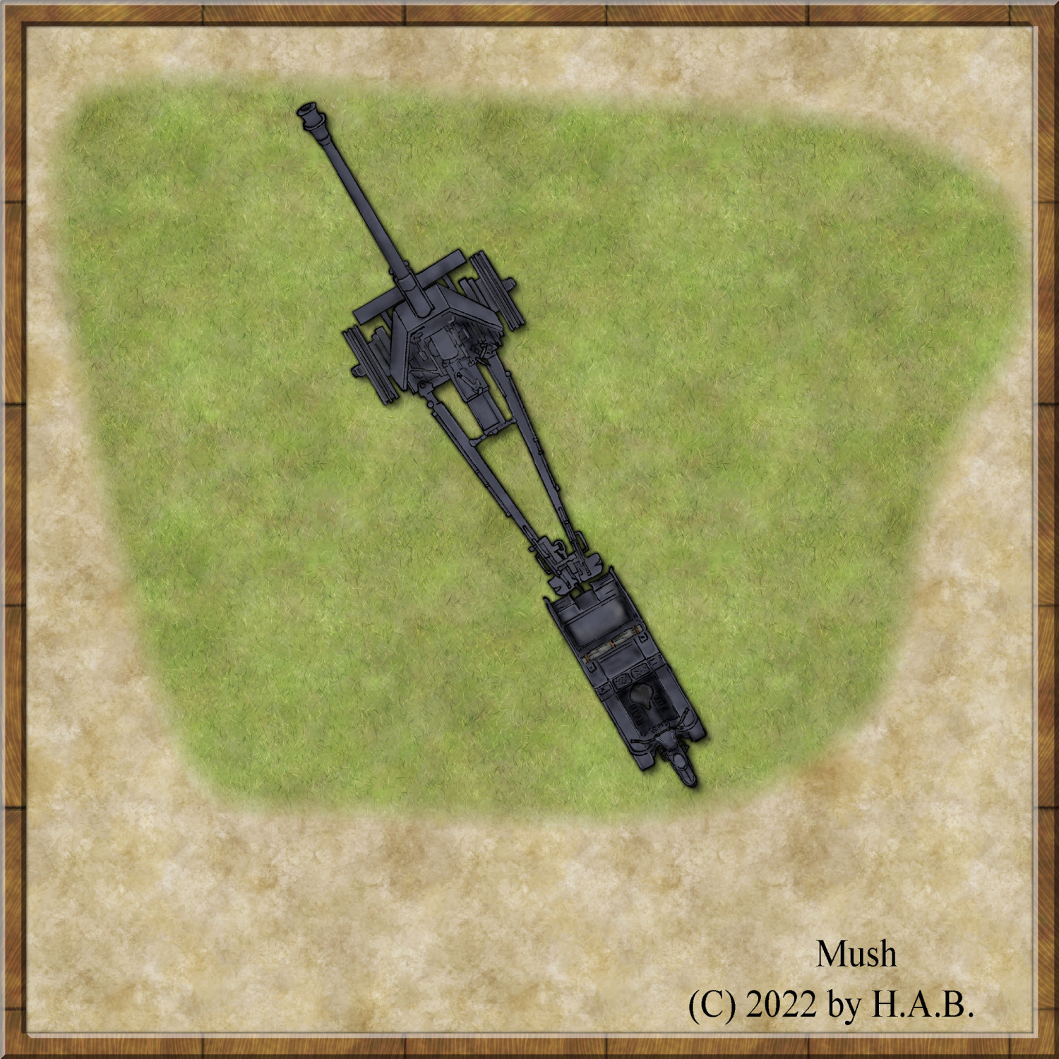
I'll see myself out...
Have a nice weekend!


-
Small encounter map: Smuggler's Landing
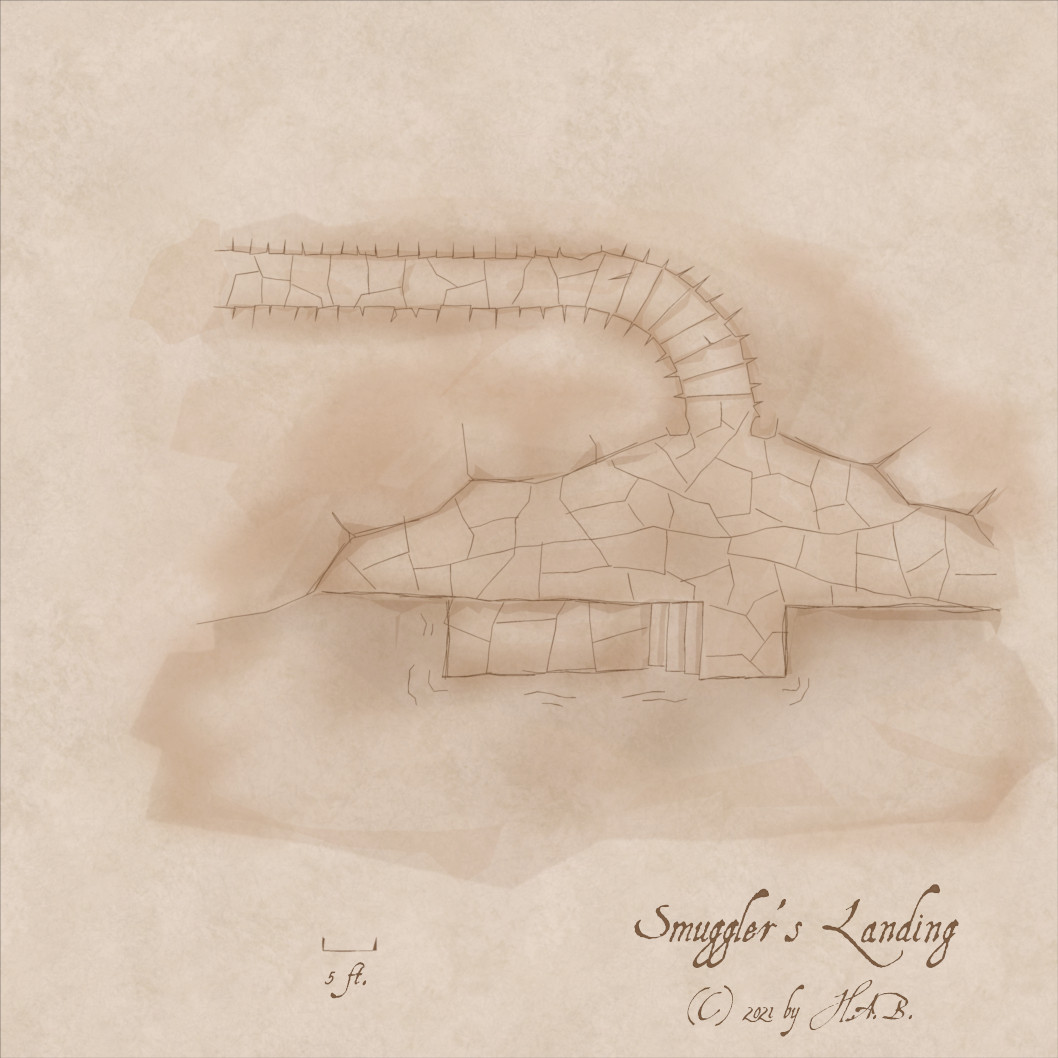
A primary colour sheet...

...in front of some highlight/smudgy bits.
-
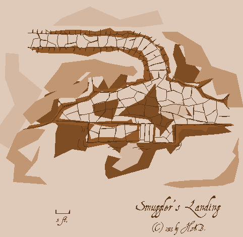
Smudge Topography Shenanigans (of Doom)

Because I think that it 100% probably will help me out with that other project.

-
Skyline Shenanigans
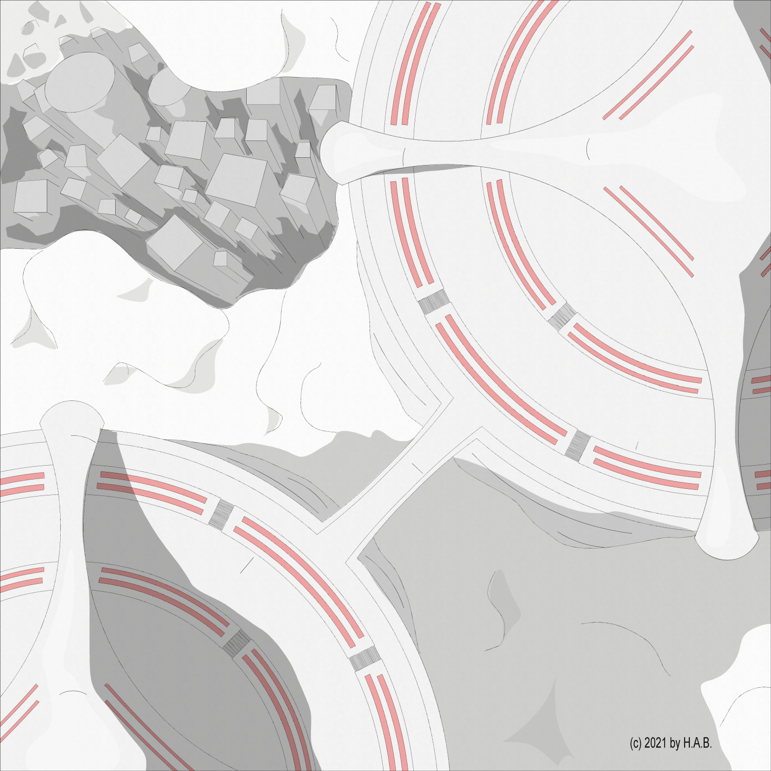
Well. In my defence, I have never drawn megacities before :D
Could do with some stricter colouring, as well as additional embellishments. But, altogether, quite satisfied.


-
Castellfollit de la Roca - remixed
The gauntlet was dropped in the Facebook group to do something about the town of Castellfollit de la Roca.

-
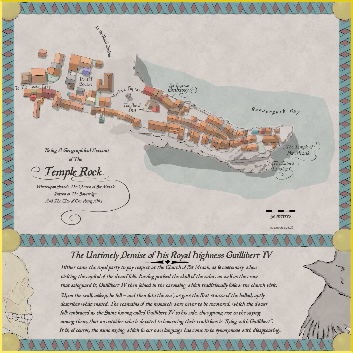
Happy Spooktober
The absolute logistical paradise that was my neighbourhood in the 1870's


 and 2 others.
 -
Current Affairs Encounter Map
Apologies: this one's rather heavy on the Tell part, but there's pictures also. So, yay!
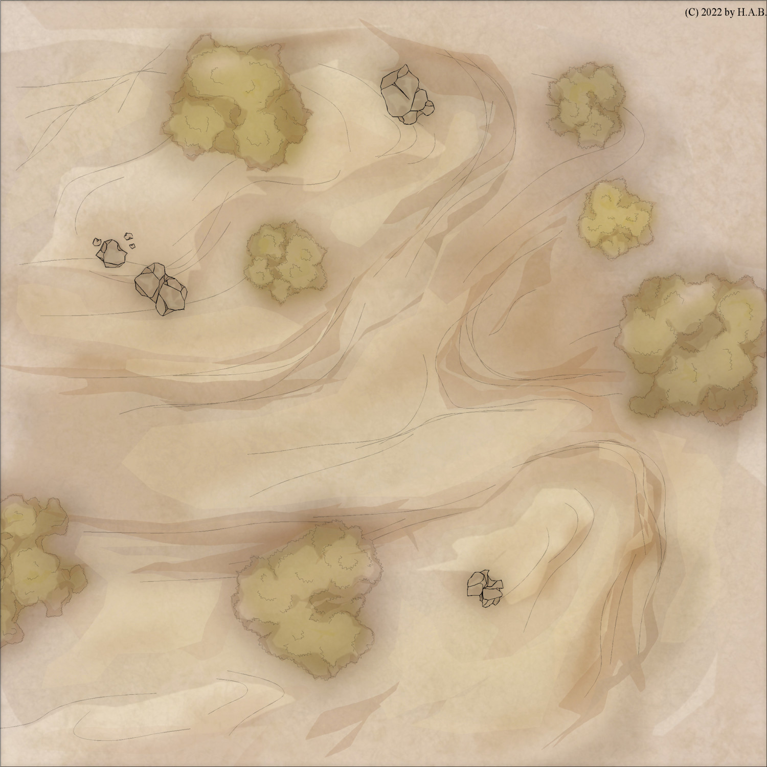
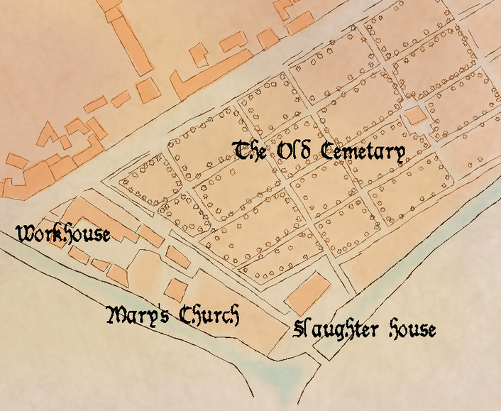
A friend needed wilderness encounter maps (roughly 30 x 30 5 ft. squares).
Prior, I had been gravitating towards creating multisheet symbols and this was an opportunity to try the symbols I had made: some rocks and trees.
Each symbol utilizes the "standard" sheets of the style (Sepia Wash; a Palette Plotter variant) meaning I get the same sheet effects as if I were to design each thing directly on the map. This is also the purpose for the (sacrilegious) introduction of symbols itself: topographic features is something I will always have to design from scratch in each map - but does that have to be the case with other features?
I am still a bit ambivalent towards using templates, but let's review what goes into each tree:
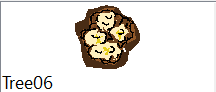
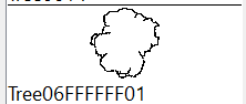
This is the 06 model and it looks like the usual polygon blob. You will notice that the green of the canopy is missing: these symbols were first intended for use in a sepia-only environment. Specifically, my Sepia Wash style palette of:

....with the same colours for the spongy, heavy-on-EFI sheets.
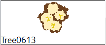
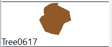
What has happend in the final product is that I have simply slapped on a single, transparent, green polygon on top - transparency allowing for the underlying sepia range of colours to inform the value of the green across the design.
So, with minimum efforts the symbols work in a more colourful environment, too.
Anyway! (colours in parantheses)
Each canopy starts with a body (36), some volume (29) and a splash of whatever (134) in the Brush Over sheet.
Next, in the underlying Brush Under sheet, I introduce some accents to the edge of the canopy (38) as well as some accents (36) to contrast the brighter parts on the previous sheet.
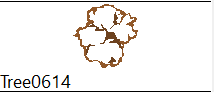
The spongy bits provide both gradient (thanks to Blur and EFI) but also - because of the transparency throughout; tone. In the medium range, I put a generous contour (36):

...and to encourage a richer browntone, in the weak/fainter range, there's a cover-all piece (38):
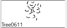
Next, it's line works!
I zig-zag (very delicately!) along the contour of the body:
And finally, I put zig-zags to work alongside the tone shifts of the canopy:
The lines get a Straight-To-Smooth treatment and, in tandem, this is what it looks like with sheet effects turned on:
1 tree. 51 individual entities in their right sheet in one click.
We can compare this to the topographic features in the map above - which measures 120 entities.
Pound for pound, at this level of attention to detail, I'd seem to be on my way to the third tree in the time it'd take me to chisel out the entire background/landscape. Unlike the lanscape, however, I want the trees to be more distinct - which translates to pause and decisions in a way that simply wouldn't make the flow of landscape sketching...well, as fluid, I guess. Two very different processes.
Of the 16 tree models I designed, there are some which will always be easy to identify as templates- even if each symbol is set up to randomly rotate and flip over/mirror. But, I can always add more to enhance the illusion of unique designs in each map.
In my opinion, creating a set of symbols kind of sucks. It's nothing like landscaping; it's deliberate, repetitive and horrible. As a more neutral observation, it's not an incentive for development: if I'm happy - why explore? Sure, there is the process of discovery while designing - but once Saved as Catalogue...I can't help but feel that curiosity died at least a little: Gods forbid that I develop in other areas - rendering my catalogue obsolete and in dire need of an overhaul...
As for the result, however, I wanted consistency in variation - and I got it: the software will nudge each set of entities enough to make it a unique experience in a single click - especially with additional colouring on top. And it's all in keeping with the rest of the visuals.
While it's true that I can only deviate so much from the concept before I'd have to redesign trees of this kind there is no denying that - in the above example map - crafting each tree and stone formation from scratch would have increased the required time to completition by a factor of four.