
Shessar
Shessar
About
- Username
- Shessar
- Joined
- Visits
- 304
- Last Active
- Roles
- Member
- Points
- 1,225
- Rank
- Mapmaker
- Badges
- 13
Latest Images
Reactions
-
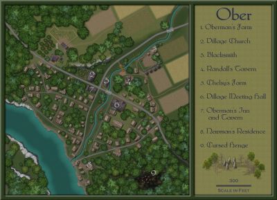
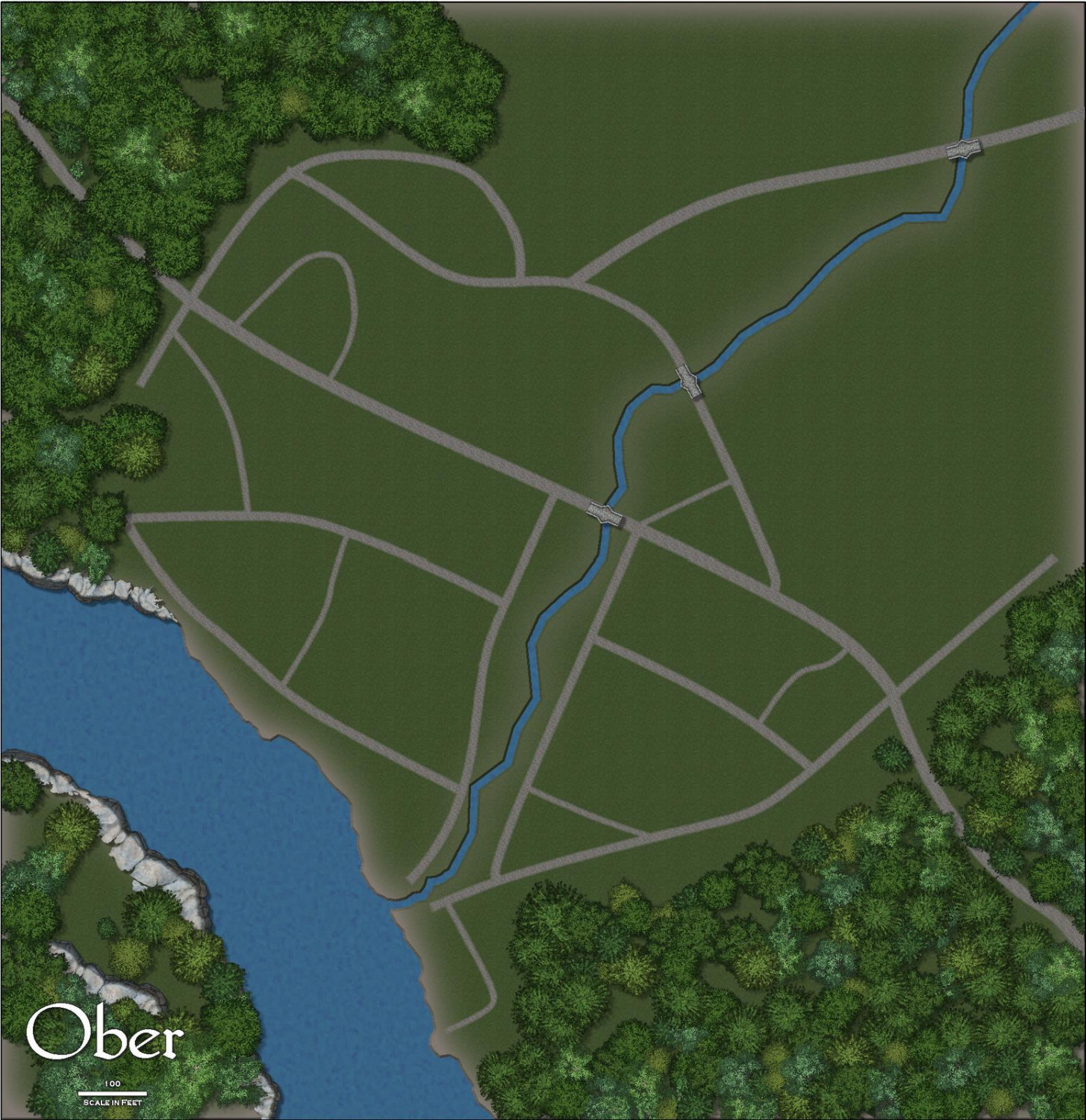
1000th Map Competition: Ober, Southern Scar
Just starting the layout of the terrain and village. A lot to do yet and everything is subject to change as I go. This is the first time I'm working with this annual, so I'll have to experiment and locate things from other symbol sets that I might need.


-
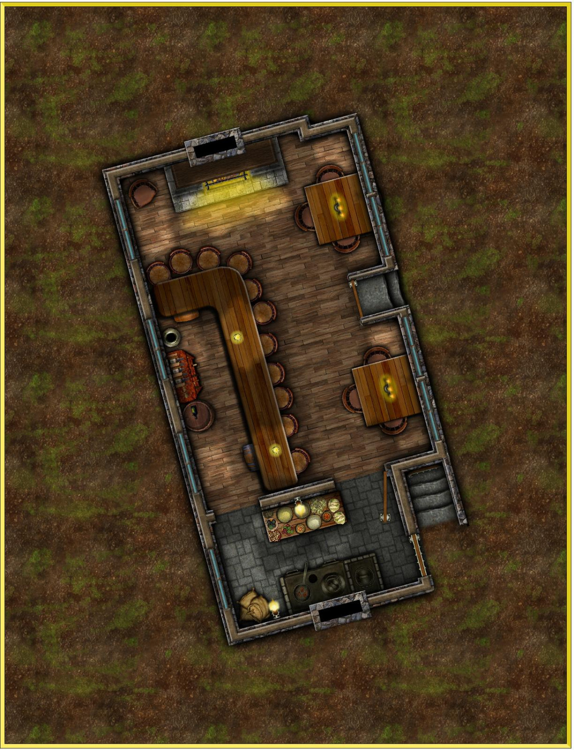
[WIP] August Competition - Pappy's Pub
I'm feeling pretty happy with how the main floor is going so far. I've decided to add a basement to it. Still have to think about the exterior.
@DaltonSpence Working on it. 😉


-
Cyberpunk: Proof of Concept
My group still actively play Shadowrun 2E (with our own homebrewd an modernized rules for deckers). You have define the mapping needs perfectly. Some of the modern symbols are usable as well as some things from the CSUAC. What it all lacks is the grunge of the streets and sleek corporate opulance as you've described it.

-
Festive Winter Card Challenge - Ended - Please vote for your favorite
A well deserved win on this Sue! Your entry was beautiful!
And a great job by everyone who entered!! I loved seeing everyone's clever ideas. 😍
These simple challenges are great. When there is nothing grand at stake, it is mapping/creating for the sheer joy of it.

-
Why should I buy CC3+?
Because with CC3 and its add-ons you can map worlds, cities, dungeons, house interiors, space ships, solar systems, sci-fi bases, isometric interiors, isometric exteriors, paper dioramas, character portraits, plus just about anything you can think of (I just created a baby shower invitation using CC3) and with all of these you can choose from many different art styles.
Show me another bit of mapping software that can compare to this and I'll buy it to try it out. I've tried a number of them for the sake of supporting small gaming/mapping businesses. CC3 is the only one that I actually use. It's not just mapping software, it is CAD software. It is complex but powerful.
CC3 is well supported. ProFantasy is a great company with wonderful people running it and awesome users supporting all aspects of the software.
I could probably think of many more reasons you should choose CC3, but I'll end with "Great software, great company, great people". What else could you want?

-
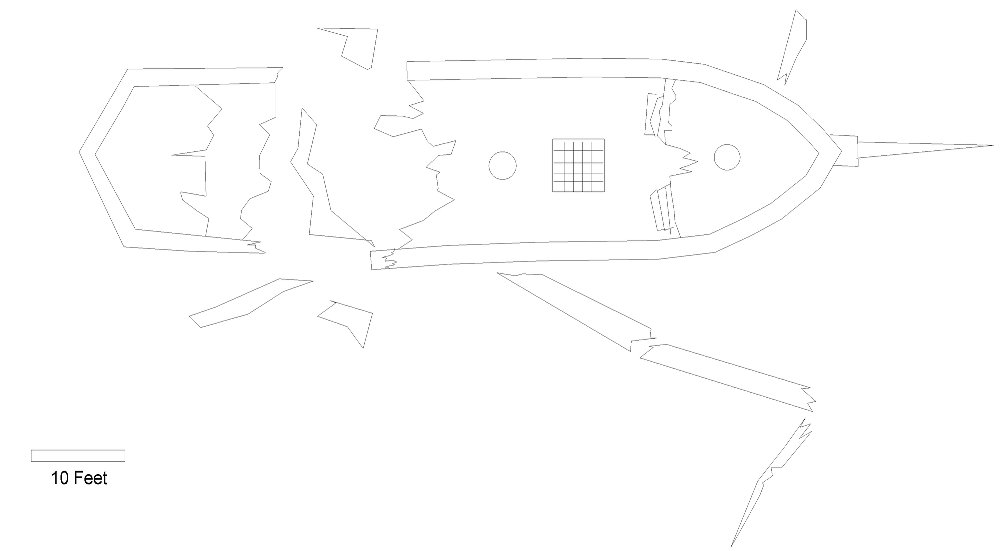
[WIP] May Symbol Challenge - Shipwreck and Debris
Thanks Sue. :D
Here's just a quick concept sketch of what I would like to do.
![[Deleted User]](https://secure.gravatar.com/avatar/c75d9a245b74d9c59be0999ea81ca541/?default=https%3A%2F%2Fvanillicon.com%2F92add7f8c954488718110edc4896ad39_200.png&rating=g&size=200)

-
Turn off shading?
The global sun was the answer. I increased the azimuth quite a bit and added transparency to the sheet. I will have to play with the settings a bit more but you've got me going down the right path Remy. The change in azimuth does affect the houses somewhat but is is a worthwhile compromise I think.
WeathermanSweden, it wasn't the shadows that were my problem but the actual shading of the symbols themselves. Thanks for the input though!


-
Where can I find palm trees and beach items?
The Dundjinni Archives have some in the Vegetation> Trees folder. (Sorry I never formally installed it so don't know what button/menu it would be under.)

-
Greyhawk - CC2 to CC3+ Conversion
There is a CC2 Greyhawk map in the ProFantasy Library that I've always loved. I haven't had much time lately to create my own maps, so I thought it would be fun to convert the old map to the new CC3+ Mike Schley style. I still have tweaking to do on it, but thought I'd share now to get input and recommendations. The png below is pretty pixelated, but I've attached the .fcw. Comments welcome.
-
Looking for Symbols
If you have the Dundjinni Archives there are a few in C:\ProgramData\Profantasy\CC3Plus\Symbols\Dundjinni Archives\BL12_Dressing\Flags
Also a couple from my personal collection. None are varicolor unfortunately.