


Royal Scribe
Royal Scribe
About
- Username
- Royal Scribe
- Joined
- Visits
- 9,725
- Last Active
- Roles
- Member
- Points
- 3,384
- Birthday
- February 5, 1968
- Location
- San Francisco, California
- Website
- https://legacy.drivethrurpg.com/browse/pub/31814/Royal-Scribe-Imaginarium
- Real Name
- Kevin
- Rank
- Mapmaker
- Badges
- 16
Latest Images
Reactions
-
[WIP] Viking Adventures
I was looking for a peaceful, zen mapping project and was inspired by the expansion of Viking symbols released today. It also gave me an excuse to using some of the glacier and icy Overland symbols that I've never used.
I didn't want to lift from Norse mythology and decided to go with Icelandic names, which I stole freely from lists on Wikipedia.
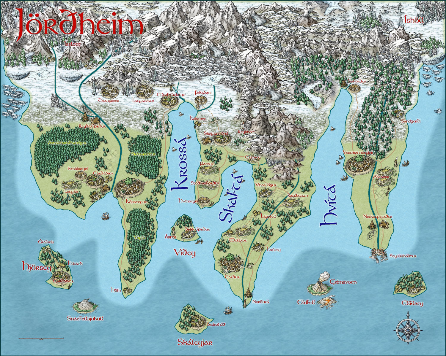
I will also post this in my galleries if anyone wants to zoom in closer.


-
Annual style for a Wild West city map
Hi @pabadger, and welcome!
There are some really great overland styles that work well for a western theme.
CA123 Wild West from Annual 11 (2017) is a particular appropriate one. CA128 Parchment Maps from the same annual could also be good. (And CA132A Sue's Parchments could always provide a different background if you want.)
CA58 Treasure Maps from Annual 5 (2011) might work for you, depending on scale.
CA115 Woodcut Maps from Annual 10 (2016) is one to consider.
Those are the ones that I think most directly relate, but many other overland styles also have great desert and Great Plains symbols and fills that can work. I really like the arid/desert assets in CA163 Spectrum Overland (Volume 8, 2020).


-
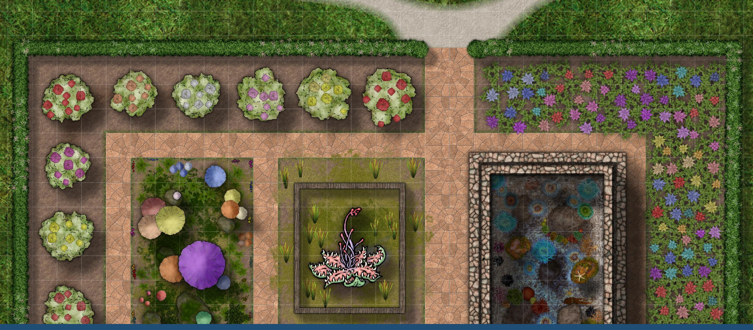
[WIP] Greco-Roman Inspired Temple
Not really sure why the botanical garden didn't post properly. Trying again.


-
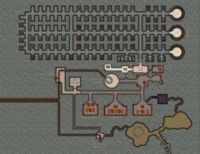
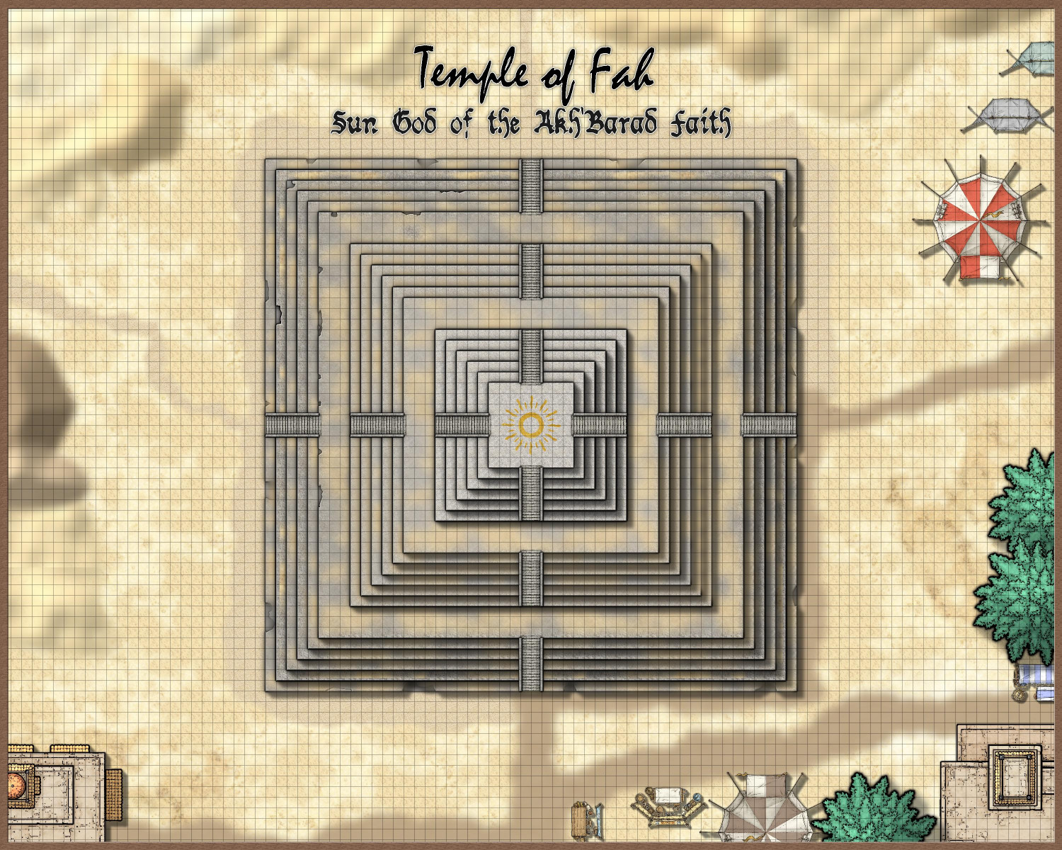
[WIP] Temple of Fah (May Annual: Stairs and Steps)
Okay, I made some screen captures and JPG saves to illustrate the process.
The first thing to know is that there are 18 levels to the temple, with a wider landing (15 feet instead of 5) on the 6th and 12th levels. And the second thing to know is that every level actually has three sheets:
(1) the main sheet for the level, with the stone fill;
(2) a sheet below it of a different color, because the beveling effect on the main sheet can cause weird pockmarks if it gets confused with the colors below the sheet with the beveling effect; and
(3) a sheet above the main one for the level for the sandy debris.
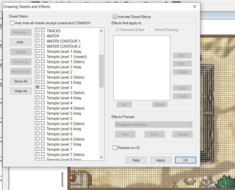
I called the sheet below the main one for each level of the temple "Inlay," because at one point I thought I might have brass or gold inlays on each level, but I ended up only doing that at the top.
Here's what Level 6 looks like with all three of its sheets on but all of the other sheets hidden (except for the 5th level as well as the stairs, just to provide perspective):
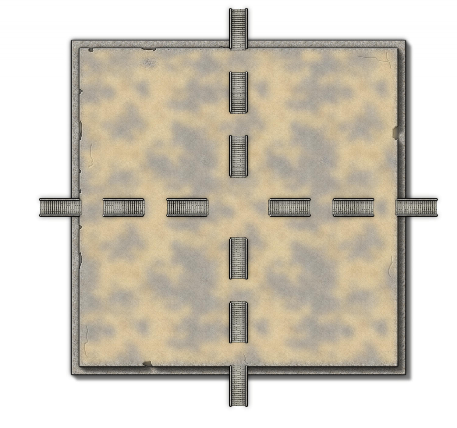
You can see erosion around the sides as well as some cracks (like from the stairs on the south side, as well as a little above the western stairs).
On the "inlay" level below, I put a polygon of solid color. I made it brown, because if it was the same gray as the stonework above, the beveling on the sheet above it would get confused and create weird pockmarks. But I also added a gray inside GLOW effect so that it look gray when it showed through the erosion:

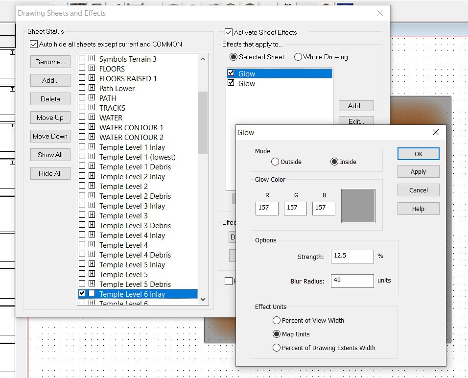
Okay, here's how I did the erosion. First, I added the COLOR KEY sheet effect to that sheet, using the default magenta #6. (Also, it's important to put that sheet effect first on the list, before the Glows and Bevel and Wall Shadow).
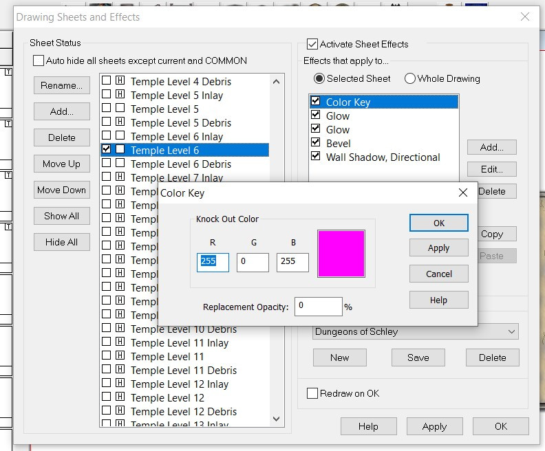
This effect tells CC3+ that when it sees anything of that magenta color on that sheet, cut through whatever's on that sheet and instead show the sheet below it (in this case, the brown-with-gray-glow on the Temple Level 6 Inlay sheet).
I then used the fractal polygon tool to create small bits with that same magenta color, as well as the fractal line drawing tool to create the cracks. Here it is with the sheet effects turned off so you can see the magenta color, along with a zoomed-in version to see it a little better:
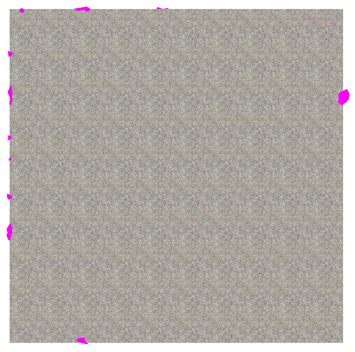
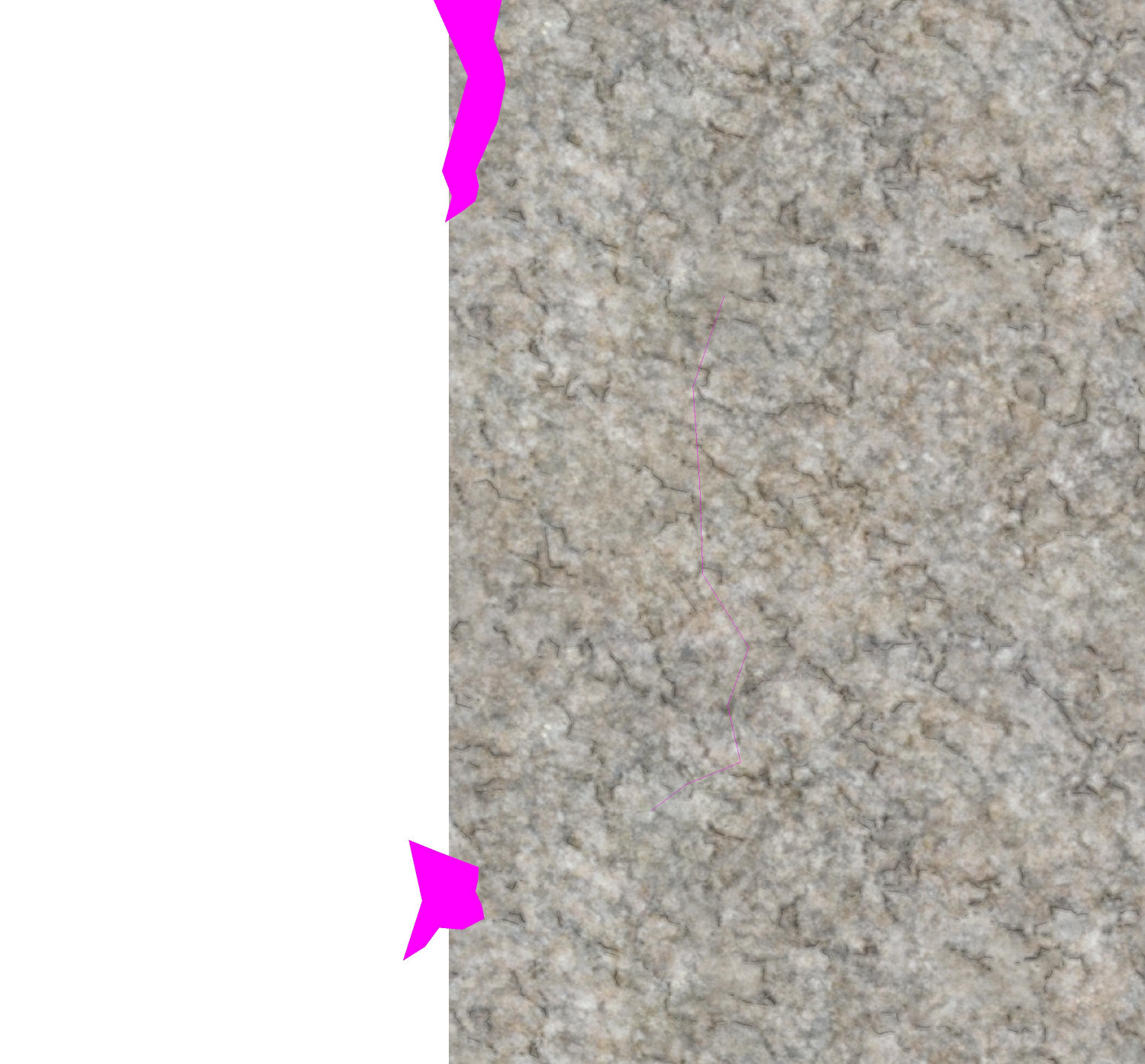
(There's a fractal crack in the stone above the fractal blobs. You can barely see it but it works when the sheet effects are turned on.)
When the sheet effects are turned on, anything on that sheet that's covered by by the magenta polygon will be cut away, showing instead whatever is on the sheet behind the stone. It doesn't matter if the color key cutout extends onto the white part, because there's nothing to cut away there and the sheet below would have been shown anyway.
Here's what the whole thing looks like with sheet effects turned off.
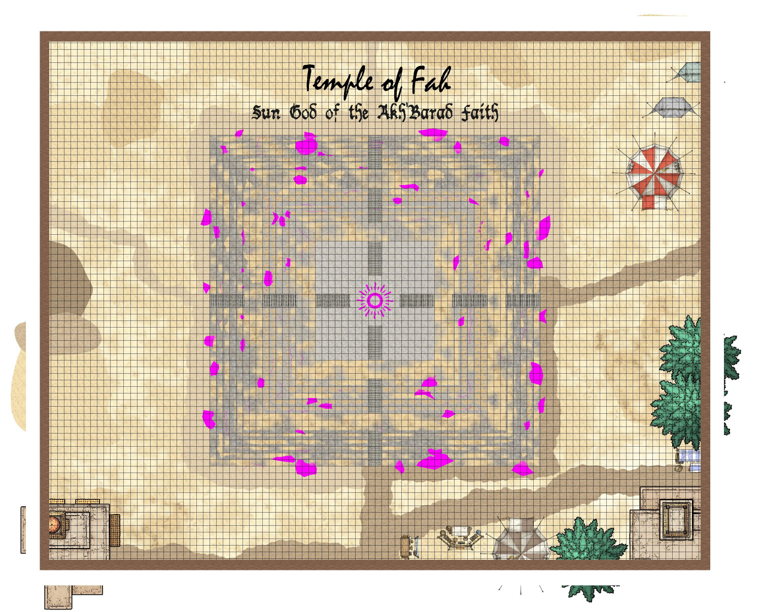
Crazy how powerful CC3+ is to be able render all of those effects to turn this mess into an identifiable ziggurat.
If anyone is interested, here is the FCW file. (It's slow loading when the sheet effects are turned on because of all of the nodes added by the fractal bits.)


-
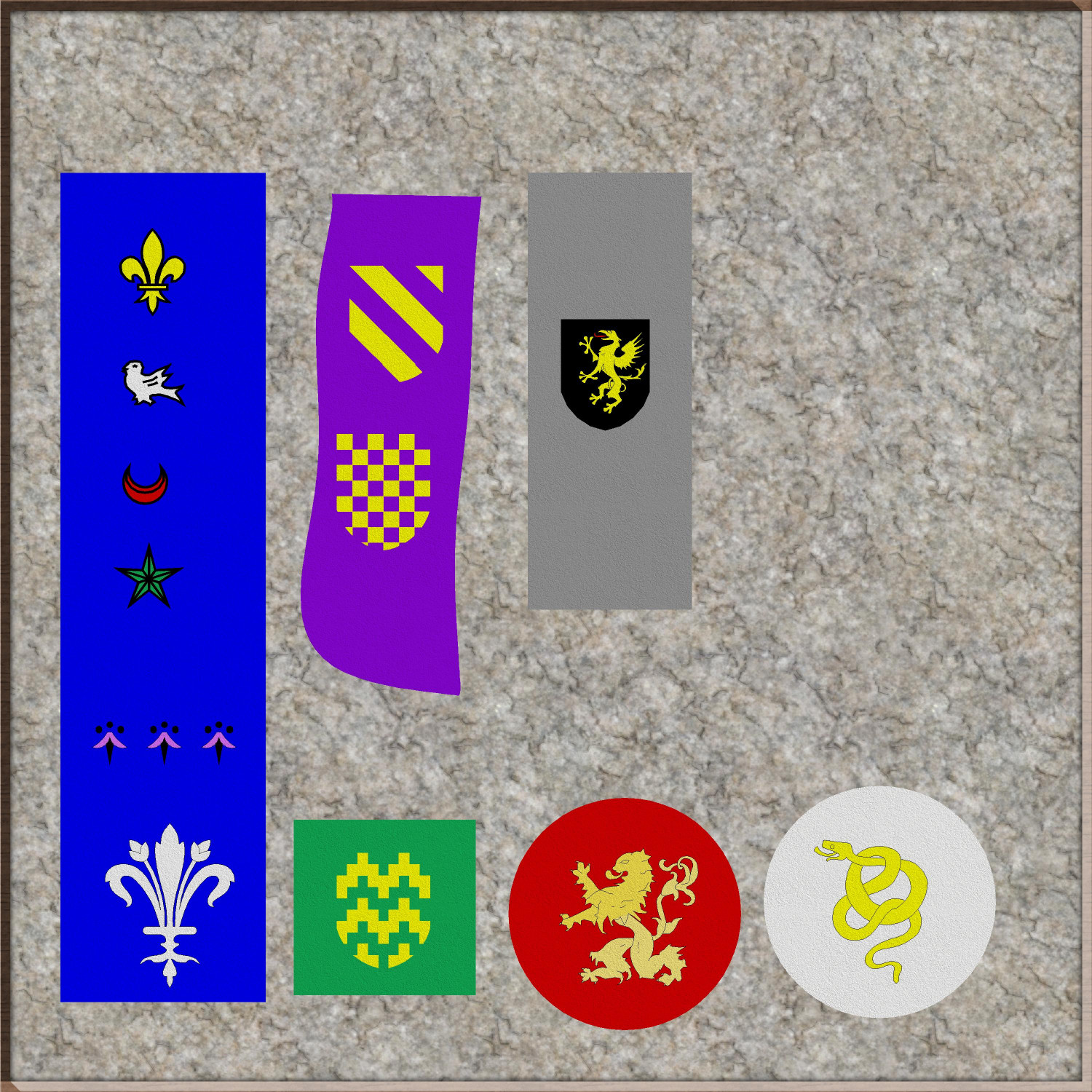
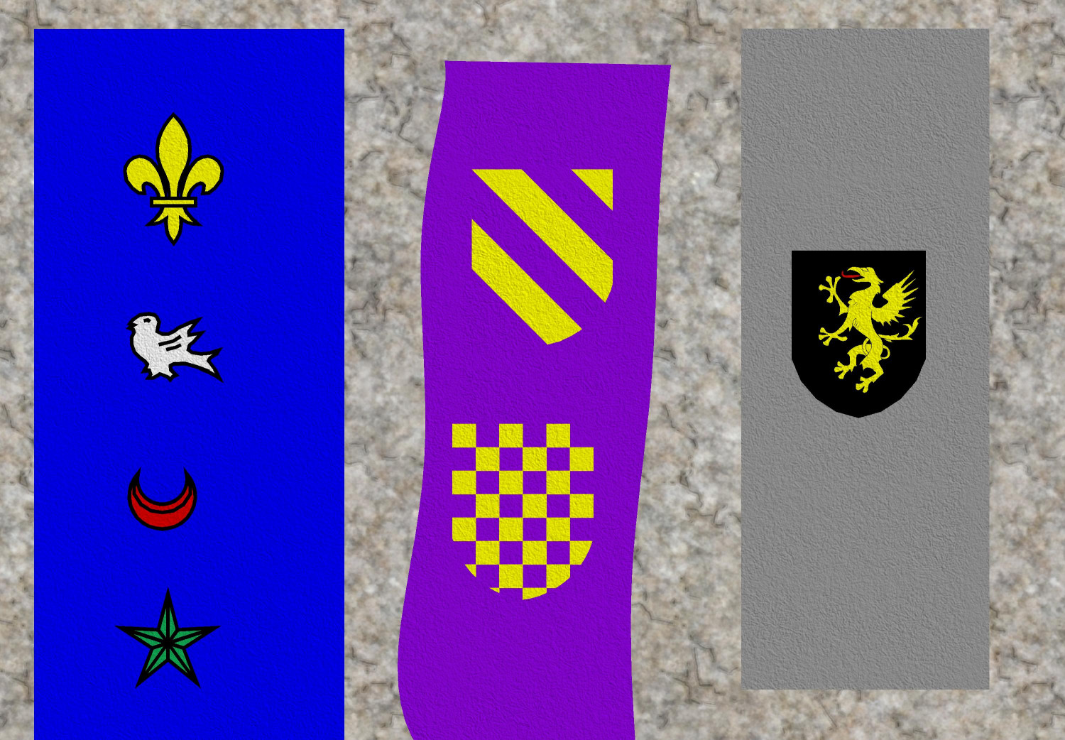
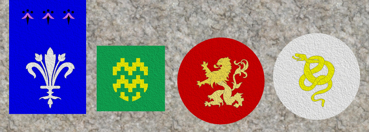
EUREKA MOMENT: CA15 Heraldic Symbols as CA180 Marine Dungeons 2 Brass Inlays
Another revelation that will be obvious to more experienced cartographers here: the TEXTURIZE effect!
I have been wanting to use heraldic symbols stitched onto fabric to make carpets, table runners, banners...and I kept looking in vain for fabric fills. The Modern set includes different colors of carpeting, but it was a little too photorealistic to work with things like Dungeons of Schley.
Through trial and lots of error, I stumbled across the Texture effect and was able to apply it to both a color polygon and the heraldic symbol on top of it to create the effect of fabric with the symbol stitched on. I experimented with a lot of textures, but the one that seemed most "fabric-like" to me was the DD3 Hay_Dry fill. (If anyone knows of a fill that looks more like linen or other woven fabric, please let me know. Maybe there's a good one in an Annual that I have not yet purchased.) And of course, different fills can create the effect of looking like your sigil was painted on wood, or the cobblestone floor (though with more trial and error, I learned that some fills don't really translate well when used with the Texturize effect).
Anyway, here are some heraldic banners or carpets or table runners or whatever:

-
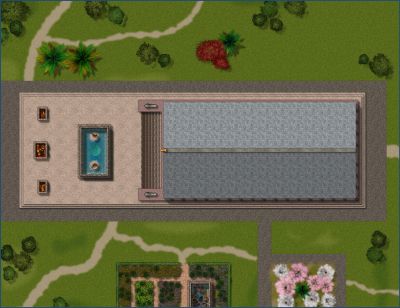
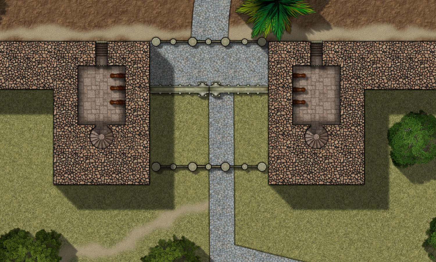
[WIP] Villa Citri (Roman-style villa)
I am diving into the interiors now, starting with the first floor (or ground floor).
At this level, the perimeter wall is mostly solid stonework. The defensive passageway with arrow slits will be one story higher. But the gatehouses do have chambers on this level with mechanisms for raising the two portcullises (I was tempted to write portculli) and open the iron gate. Internal spiral staircases allow guards to reach a chamber with access the parapet over the gate, where they can address visitors when the gates are closed.
Mostly I've been working so far on the first floor of the balneae, the bathhouse. This is what it looks like covered:
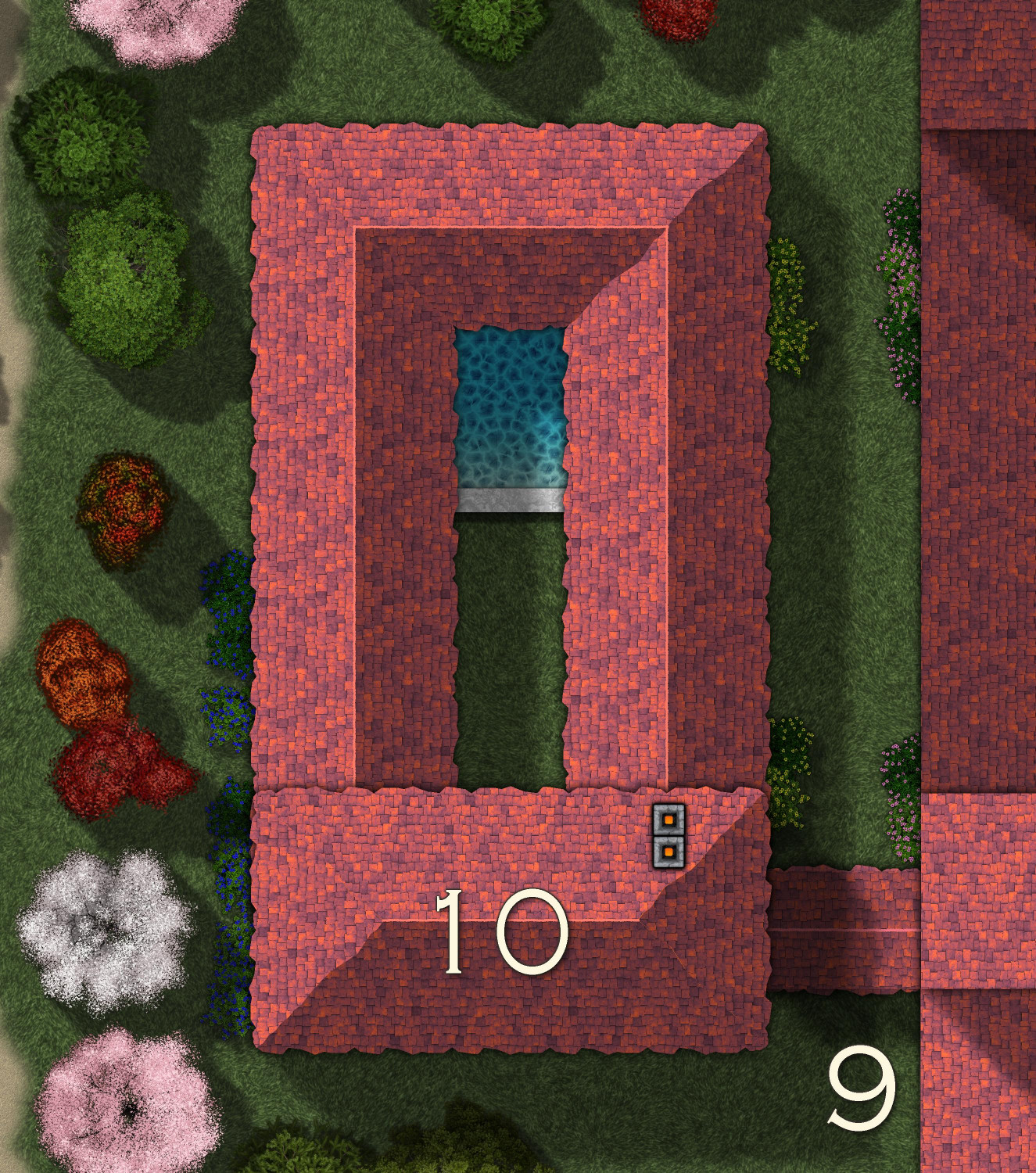
And here's the (not yet labeled) interior of the first floor:
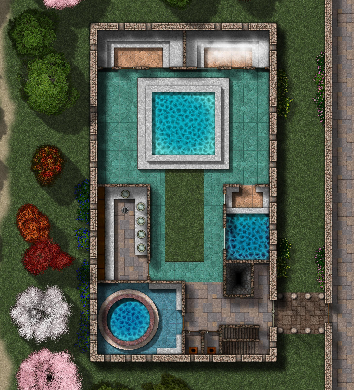
The balneae, or bathhouse, is connected to the main villa by a colonnade, an unwalled covered walkway lined with pillars.
As you enter, there are stairs going up and down to your left, and the chimney for the hypocaust in the basement on your right. Then you see two lavatories, and then the frigidarium, the very cold pool. Next to the frigidarium is the apodyterium, the changing room where bathers could clean up before entering the communal pools. Across the courtyard is the caldarium, the hot room, where both the water and the tile floor are heated by the hypocaust furnaces in the basement. The main pool in the center, partially open to the sky, is the tepidarium, the warm room, where water is heated to a comfortable temperature but not as hot as a bath like the caldarium. On the northern wall are two saunas, the laconicum (dry sauna) on the northwest side, and the sudatorium (steam sauna) on the northeast.
Downstairs will have the hypocaust as well as the pipes for bringing water to the various pools. Upstairs will have more communal exercise areas, a library, and a balcony overlooking the tepidarium.


-
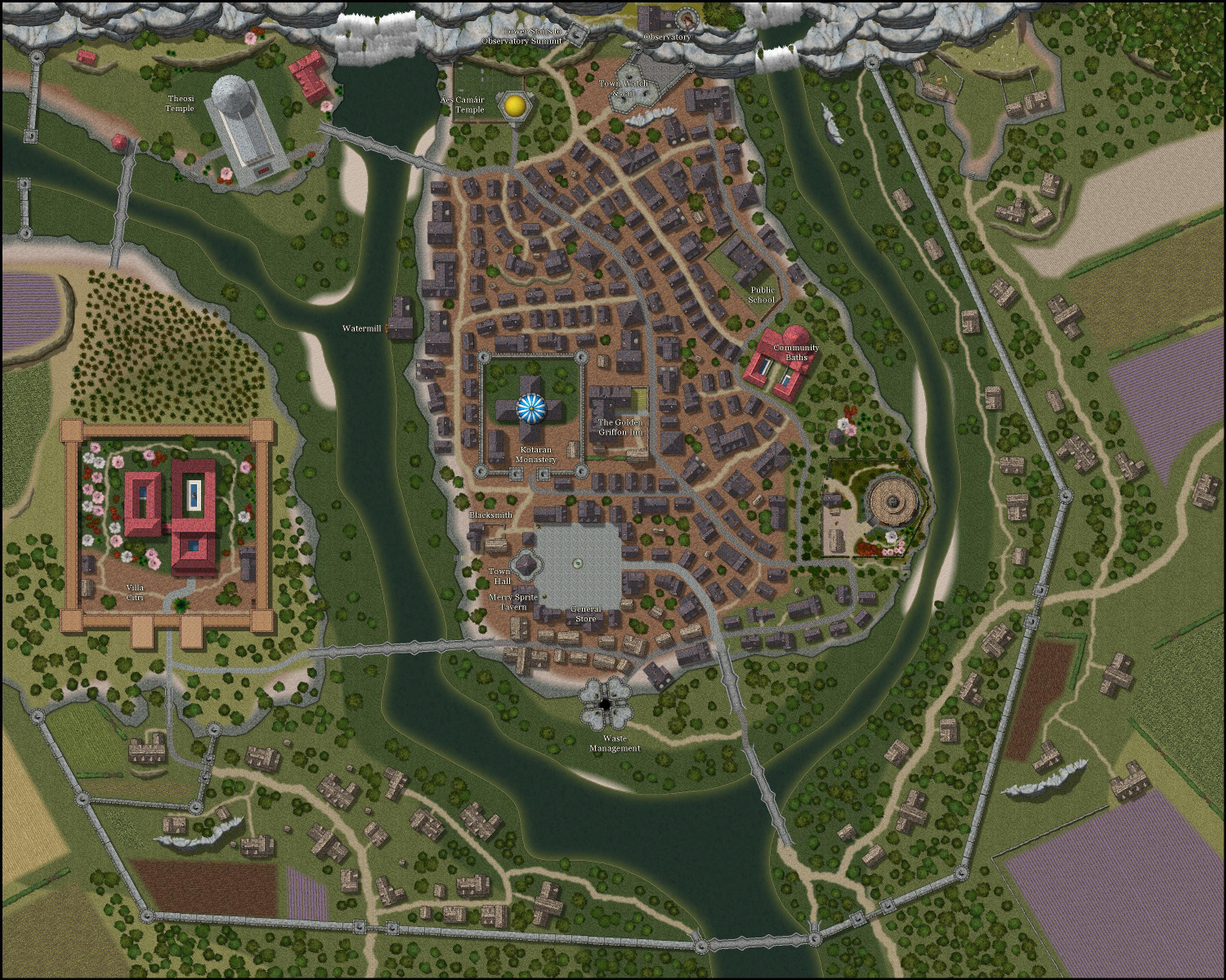
[WIP] Tyr Alomere Township
Coming along. Still need to finish figuring out the various shops and merchants that surround the town square (I have a general store and an apothecary so far), and then do proper labeling.
-
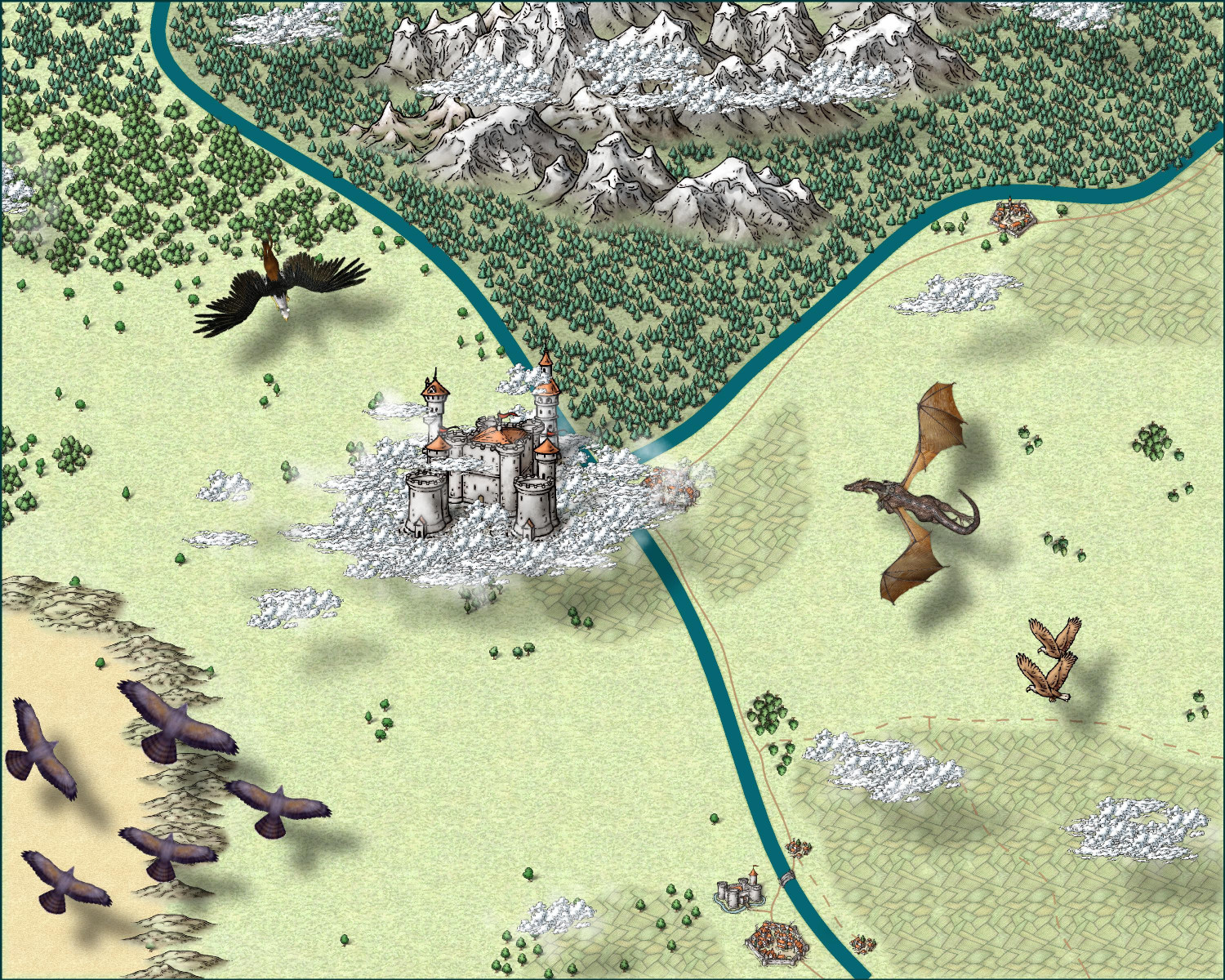
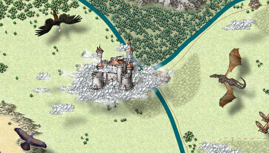
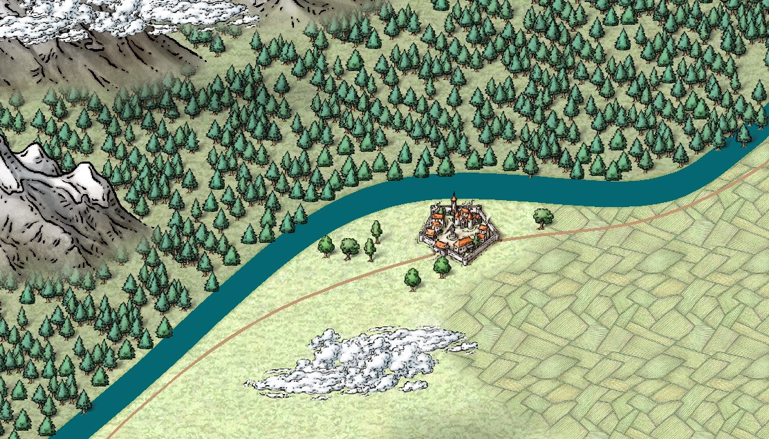
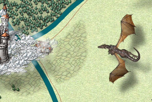
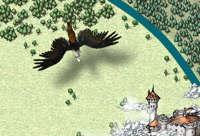
Castle in a Cloud
Thank you, everyone, for your help.
After a bit of wrestling (and an evening of downloading massive files), I was able to install the Dundjinni symbols that Wyvern recommended. I added a griffon and a dragon with a rider. I also swapped out the giant hawks in the lower right side for a pair of eagles from the Mike Schley Overland that I missed. My flying creatures are a bit oversized compared to the castle, but I figure it's a bit of forced perspective, with the flying creatures coming in from above and closer to the viewer.
(I also trimmed back some of the farmland on the right side so that it's now mostly around the towns and cities.)
I belatedly discovered that Mike Schley's clouds also have a vericolor version, so I could add in some light gray ones to add a little texture, but I haven't done that. I will get the 2014 Annual with the Alyssa Faden clouds in a few weeks and try them on a whole new map from scratch.
Ricko, I am enjoying your tutorials. Thank you.
-
[WIP] Town of Kukaar (Ancient Cities Annual)
Hi everyone,
Thank you for the feedback, it was very helpful. I put the legend back to the original size and location, and it actually looks pretty good. There's room for some lines to wrap if I make it slightly larger, but it seems legible enough as is. Also, I made the roads stand out a little more by changing the transparency effect from 50% opaque to 75% opaque.
Also, are the numbers on the map okay? Should I make them bigger? (I just noticed that some seem to be different sizes, so I will at least have to standardize that.) Are there effects that would make them pop more, like a stronger white glow? Is there anything else unlabeled that should be labeled? I just provided a few sample businesses (inns, blacksmiths, etc.) figuring that a DM could make up something on the fly if players were looking for a specific type of business, but I can add others that folks think are necessary.
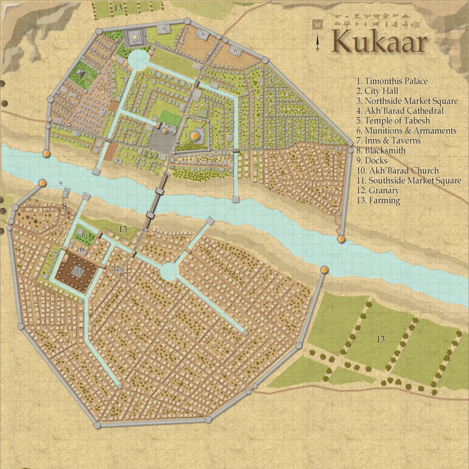
Neighborhood maps are a good idea if anyone wants to do a full campaign here (rather than an adventure limited to an inn or a temple, where the rest of the map just provides a general context). I have a whole laundry list of maps I want to do first, but once this is published in the Atlas (after the contest is done), I would welcome anyone to take a neighborhood and expand on it.
-
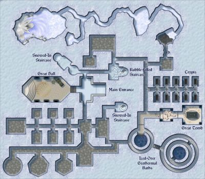
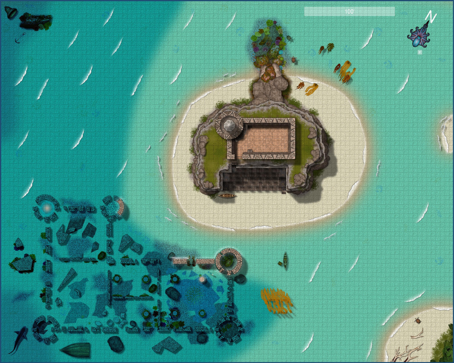
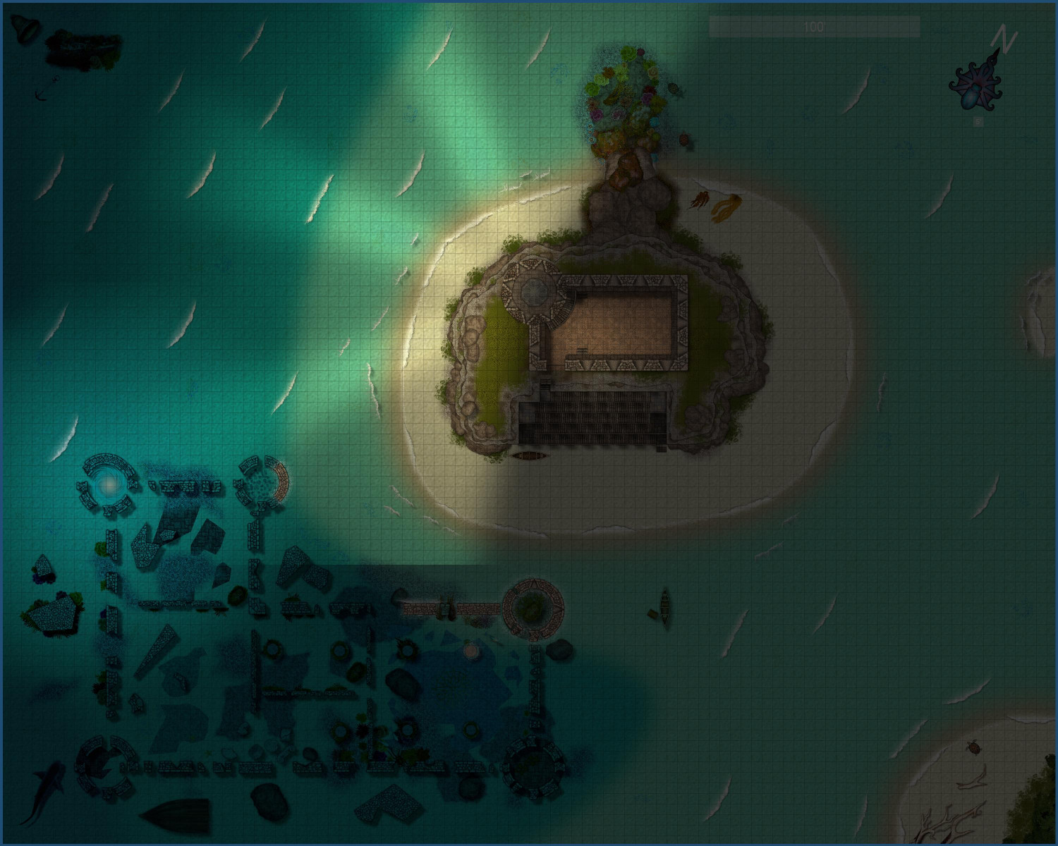
[WIP] Marine Dungeons Lighthouse (more May Annual Stairs & Steps)
Added a few final touches (a friend was confused about the seaweed washed up on the beach, so I added a little more floating in the sea, and a few other minor tweaks here and there. Not really sure what that line cutting off the light in the nighttime version is from.
Here's the "final" (is anything ever really final?) version of the daytime and nighttime full maps. More details maps in my galleries.


