


Royal Scribe
Royal Scribe
About
- Username
- Royal Scribe
- Joined
- Visits
- 9,940
- Last Active
- Roles
- Member
- Points
- 3,476
- Birthday
- February 5, 1968
- Location
- San Francisco, California
- Website
- https://legacy.drivethrurpg.com/browse/pub/31814/Royal-Scribe-Imaginarium
- Real Name
- Kevin
- Rank
- Mapmaker
- Badges
- 16
Latest Images
Reactions
-
Live Mapping: Naomis Floorplans. 28 Nov
I probably won't be able to watch this live next week, as it is Thanksgiving in the U.S. and I may be running around getting ready to go out of town to see family. (But who knows, if I'm super organized, maybe I will have time to catch it before I leave.) If I can't watch it live with all of you, I will definitely watch it later.
I loved Christina's anecdote when she tackled this style for All the Annuals about how she used this to design a tavern in the middle of a gaming session! I may give myself a little speed test to see how quickly I can whip something together. Good practice if I ever do find myself needing to pull something together in a hurry.

-
Looking for Symbols
It doesn't look like it, from reading the description of the offer, plus the bundle includes a lot of things I already have. But when the offer was emailed, it included a discount code for folks who want to buy something else instead, so I plan to take advantage of that opportunity.

-
Starfinder rpg site, with maps
I sent him a direct message in August checking in but didn't hear back. The last message he posted was in April, saying his surgery went well. I think about him a lot -- he was the most prolific poster when I first became active a year ago.

-
The Lands of Strauvuvrorr
These are the Spectrum Overland settlement symbols? How clever!
-
[WIP] Spectrum Overland Waterfalls x 2
This is excellent advice. I had a vague sense of the concept but having these numbers as a guide is very helpful.
-
[WIP] Spectrum Overland Waterfalls x 2
Oooo, I like that. I really appreciate the time you take to mentor me and others here.

-
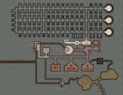
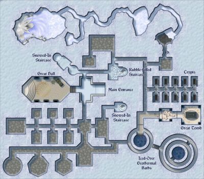
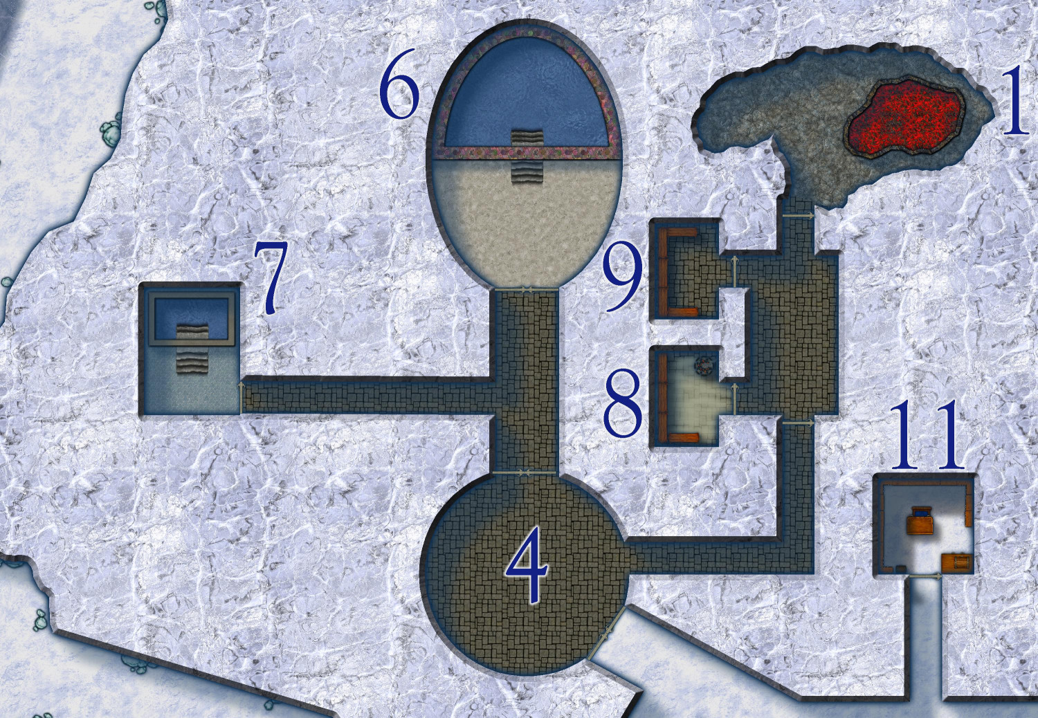
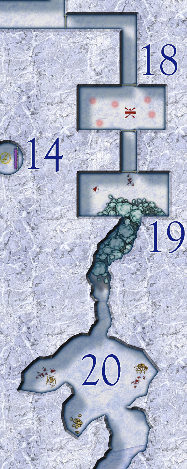
[WIP] Temple of Déine ap Gáeth
Here are some zoomed-in portions:
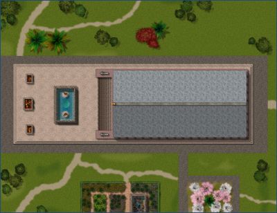
The Baths
Hot pool, cold pool, steam room, and dry sauna -- with heat provided by a small lava pit.
The Ice Temple
An under-ice temple to Déine ap Gáeth as well as shrines to her sons, the Four Winds, and icy bedrooms for monks preparing for their graduating initiation rites.
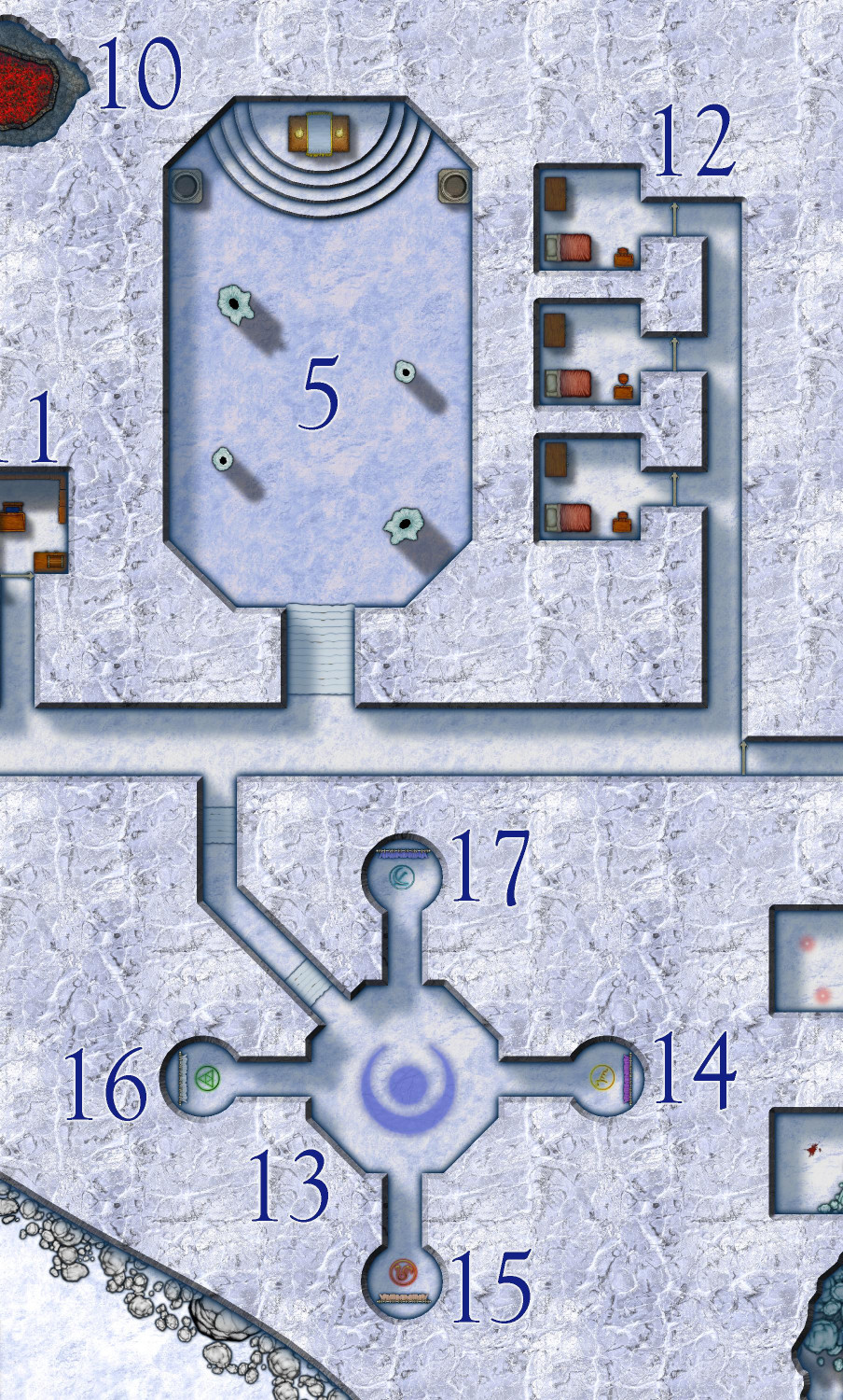
The Yeti Lair
-
Moon Islands
Amazing!
-
CA The moated city of Thyra
This is really lovely. I like the ornamentation in the lower left corner.

-
The Other DM Lucy Introduction
Welcome, DM Lucy! Jim was such a kind mentor to myself and others here, and I’m sure we would all be happy to help share back that mentorship. I’m so glad you decided to take up the mantle. I was first introduced to D&D in 1979, but I’ve only been mapping with Campaign Cartographer for about a year.
