[WIP] Greco-Roman Temple revisited: Dungeons of Schley style
I have been working on recreating my Greco-Roman temple in a Dungeons of Schley style. (The original, shown here, used Marine Dungeons as a starting point but also imported a lot of other fills.) The one thing I kept from Marine Dungeons was the brass inlay fill and inlay symbols.
This one attempts to limit myself to only Mike Schley fills and symbols. I allowed myself the option of also using Forlorn Trail and Monsen's Mines assets, since they are intended to complement the Schley style, but in the end I don't think I used anything from either. I did use some things from DD3 to supplement.
Since designing the first one, I've learned some new techniques that really helped. One was learning the "Shaded Polygon (Angle by Edge)" technique for shading the roof. (On my previous temple, I literally drew a black polygon as a shadow and added it to a sheet with a heavy transparency effect.) Now my roof will react properly to changes with the global sun. And I also used how to resize using independent XY parameters, which came in handy with the stairs (I'll describe below).
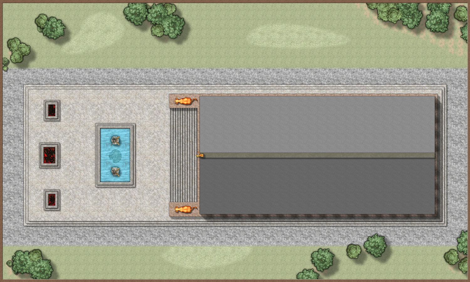
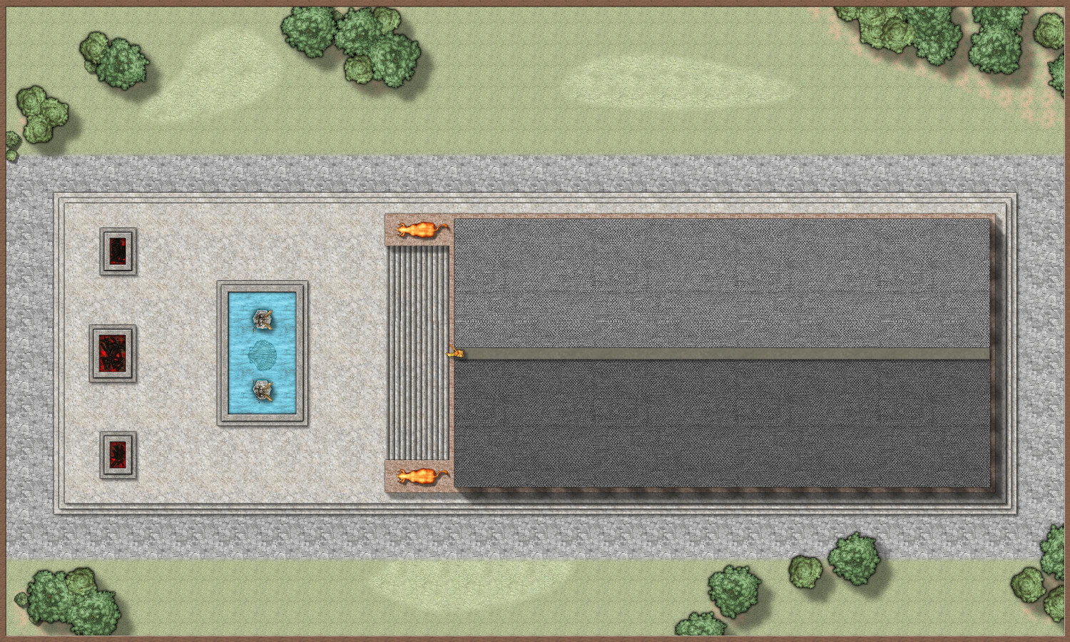
Here is the outside, shown with two different styles of roofs. I'm curious if folks prefer one over the other?
Stone Slab Roof
Gray Tile Roof
The fire pits use molten lava from DD3 because the Schley lava was a little too bright for my taste. And I think the burnt wood comes from Darklands City? I opted against having anything roasting on the pits (my previous version used Bogies Redthorn Tavern symbols but they're too photorealistic for this style). I thought about using Mike Schley's flames from the isometric monthlies, but opted against it.
The water is a little weird looking. I had to remove the Glow effect when I added a transparency effect to see the inlaid brass symbol. I tried playing around with other sheet effects (Adjust Hues/Saturation, RGB color matrix, etc.), but nothing looked right.
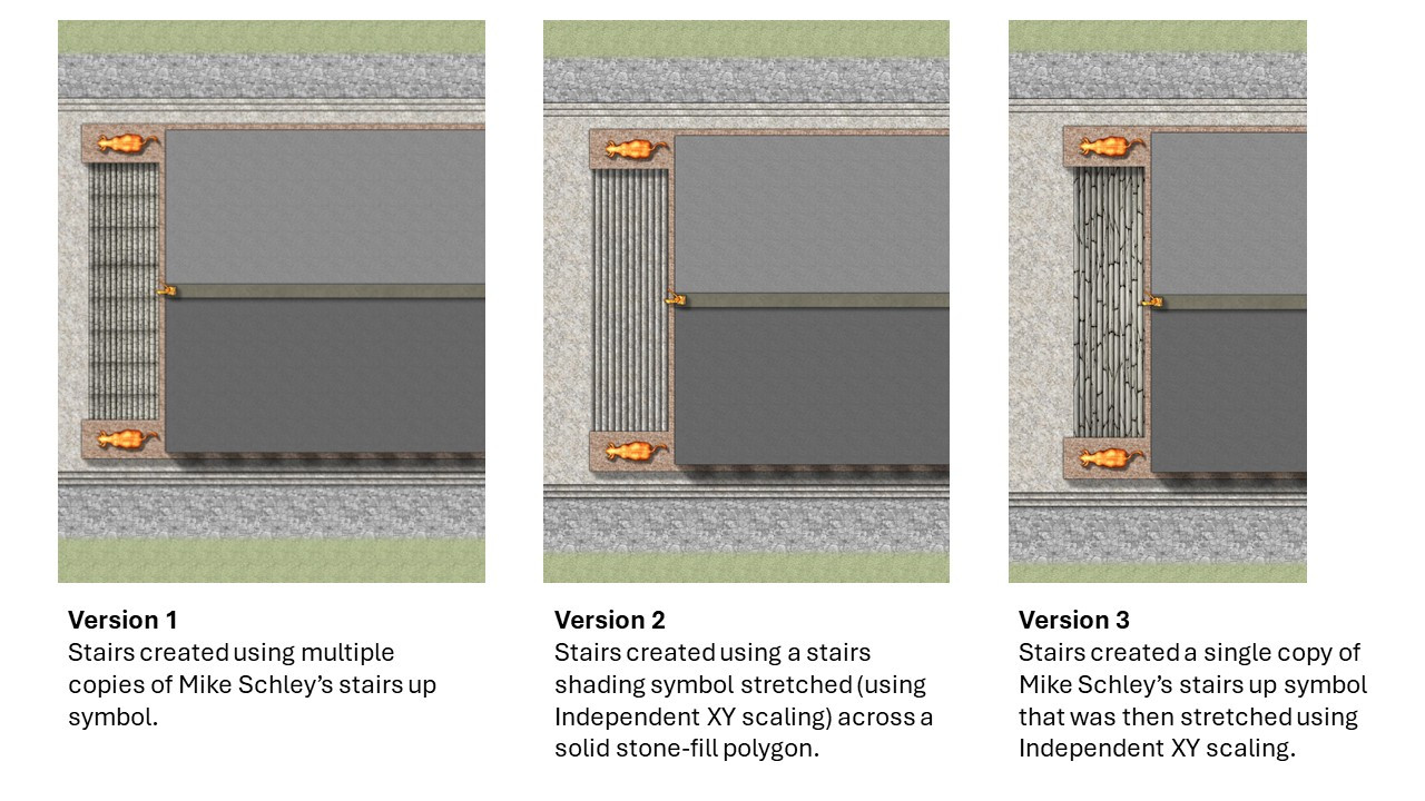
Here's my other big question: the stairs.
I did the stairs three different ways:
- Multiple copies of Mike Schley's "stairs up" symbol, placed side by side.
- A stone slab with the "step shadows" that Sue provided in this thread from 2016.
- One copy of Mike Schley's "stairs up" independently stretched to span the entire stairway.
My favorite is #2. I don't like the shadows between symbols in #1, and the stone blocks in #3 look funny stretched like that. But question: if I were to adopt the shading technique going forward, would that be acceptable for something submitted to the Community Atlas? I don't think the shading counts as an official CC3+ symbol, does it?
I will show the insides of the temple in a follow-up comment.


Comments
You are correct about the step shading not being part of the accepted assets.
How about using a set of 11 "STEP" sheets (sorry if I counted wrong, but my eyes kept jumping as I counted them). Each one with an overlapping polygon of some kind of stone texture with a dark glow set to outer for the step shadow? Put them all under the level of the platform you have the statues on.
Here's the inside of the temple. The floor uses white marble tiles that come from DD3, I believe.
The reflections, as with my original temple, are custom-made symbols that are meant to be reflections from the glow of mosaics made from luminescent crystals. I need to remember to remove them when I share the FCW.
The pillars use Mike Schley's ornate columns. Zoomed out, they look a almost "smudged," and the plain columns look sleeker. But zoomed in, the details of the columns' base is nice, and probably more like what a fancy temple would have.
Okay, I'll try making steps on 11+ sheets. Do you have a recommendation for the Glow settings? I can play around, but I appreciate any advice anyone has to offer.
Here are the new steps, each with their own sheet with a Glow (Outside) with a Strength of 12.5% and a Blur Radius of 2. I didn't add the Glow effect to the lowest step, thinking it would be flush with the plaza, but maybe I should add it. I first tried it was a stone fill that was one shade lighter than the plaza, but I think it looks better one shade darker.
I have a habit of showing my work-in-progress and then forgetting to post the final. So here it is with two different roof styles. (For comparison, you can see the version done in the Marine Dungeons style in my gallery.)
Oh, and here's the FCW if anyone is interested in using it.