[WIP] Greco-Roman Inspired Temple
I’ve been working on a temple inspired by Greek and Roman architecture, and while I think I’ve made some decisions in areas where I was vacillating, I’m open to feedback.
The temple is for a fictional religion in my campaign that shares elements from Ancient Greece and Rome (in architecture and in how the gods are depicted, like their attire). This temple is therefore not intended to be historically accurate: it intentionally mixes elements that were unique to Greek temples with those unique to Roman temples, and it intentionally deviates from both in certain ways.
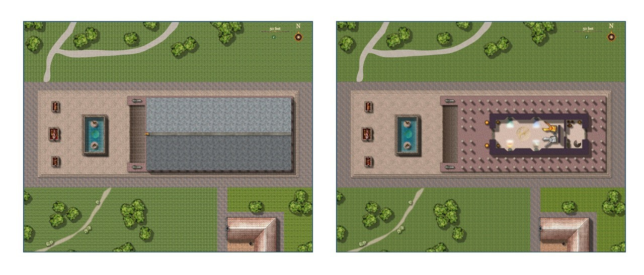
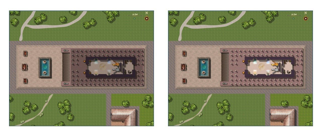
I got to learn some new techniques as part of this. I used the Marine Dungeon from the 2021 Annual in large part because they include my favorite pillars, an essential part of a Greco-Roman temple. I used the color key effect for the first time in an actual dungeon (love the bronze inlay symbols). I made an effective use of layers for the first time, combining all of the roof elements from different sheets onto a single “roof” layer (called the “pediment”), which allows me to show or hide the entire roof by hiding or revealing a single layer – basic stuff, but it’s the first time I really paid attention to layers effectively. I also created my own custom symbols for the first time (for reflections from mosaics on the walls illuminated with luminescent crystals used by dwarves in my world to light their subterranean homes). And I played with lighting effects for the first time.
Both Greek and Roman temples used the temple’s pillars provide the ratio for the size of the temple. The space between pillars was always double the diameter of the pillars (except that the middle pillars might have an extra gap between them, sufficient to let two people walk through them side by side). The height of the pillars was ten times the diameter. (In my temple, the pillars are five feet wide, so there’s a ten-foot gap between each and each are 50 feet high.) There were always an even number of pillars in the front, from four to twelve, and the number of columns on the sides was based on the number in front. The Greek formula was double the number in front plus one, while the Roman formula was twice the number of pillars on the front minus one. (For the eight pillars in front of mine, the Greeks would have 17 on the side and the Romans would have 15.)
Greek temples were set on a series of three steps called stylobates, which surrounded the temple on all four sides. The Romans instead had the temple sit on a raised platform called a podium, with an impressive staircase entrance in the front (like the entrance to the U.S. Supreme Court building).
I intentionally mixed and matched Greek and Roman features to suit my fancy. I put the three stylobate steps at the base but extended it far in front of the temple to create a plaza area where temple priests in my fictitious religion could ritually sacrifice a wild auroch or boar so that the gods could feast on the aromas before the remains were used to feed the poor. I put then put my temple on a large, marble podium, but then used the Greek formula for the number of columns. (I used marble a lot -- are there any styles with granite fills?) I also used double rows columns because it looked cool, though I have no idea whether I used them in a “proper” Greek or Roman manner.
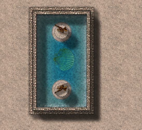
I also created a fountain or reflecting pool in the plaza, mostly so that I could play with the fun water effects (like the ripples at the fountain walls and the pedestals in the fountain with statues of the gods of the sea). That also gave me a chance to use the submerged bronze inlay effect. The inner wall with ripples had ripples on the outside of the wall, too. I wasn’t sure how to handle that, but I ended up adding an outer wall without ripples as a lower step, and that seems to have worked.
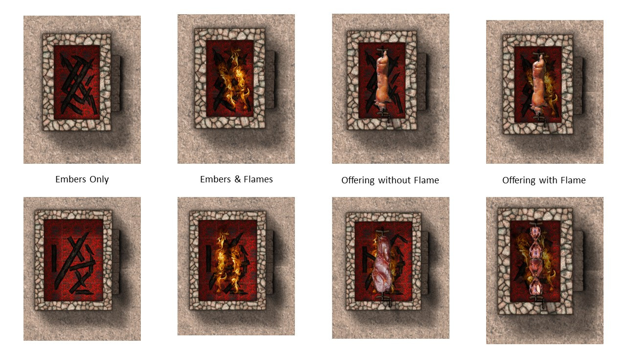
And I created three “barbecue” pits that temple clerics would use for their rituals.
The enclosed building of the temple is called a “cella,” from which we get the word “cell” used for where monks sleep (and later prison cells, and eventually the biological term for plant and animal cells). I added a door to the back room to allow priests to go back there without having to circle to the temple’s back entrance. And I added stairs going down to not-yet-designed crypts, which will include a tunnel connecting the crypts to the basement of the rectory, the building in the lower right. (If there’s a more appropriate Greek or Roman term for a rectory, please advise.)
The niches inside the cella are not historically accurate, to my knowledge. The Greeks and Romans both had rectangular rooms. They niches aren’t meant to be stained glass windows. They have mosaics on the walls that reflect light because they use luminescent crystals that naturally glow.
Here are some areas where I experimented with different approaches:
The Pediment, or Roof
Originally, I wasn’t going to show the roof, but I realized that players might not realize that the portions within the pillars were all under a roof, even the parts not enclosed by walls. So I added a shadow over the portion that would be under the roof, an effect inspired by the trees of the Forest Trail (where you can hide the trees but still show the stumps and the trees’ shadows, so players can know when they are under a tree or hiding behind it).
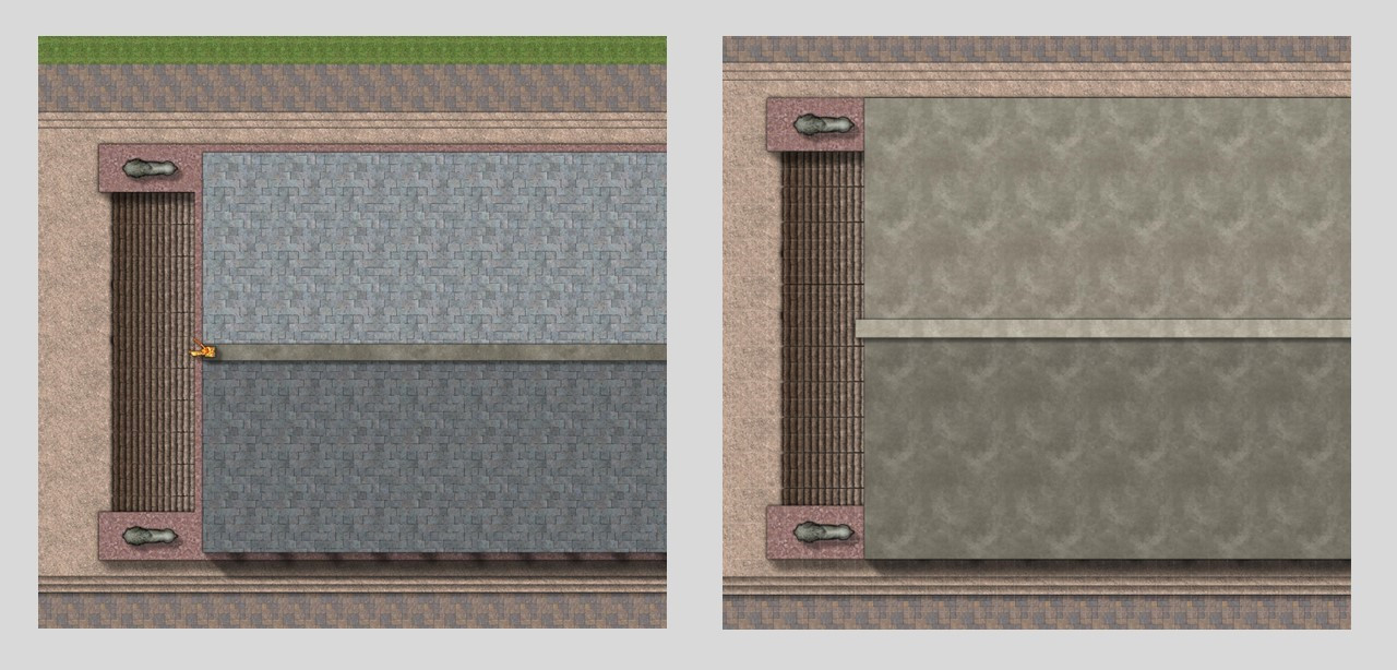
But then I decided I wanted to be able to show the temple roof, like when I recreate this for a full city. I experimented with different techniques for the roof’s material, and for allowing one side to be a little shadowed.
In one version, I used two different shades of stone from the CA161 Rycroft Town template to show the shadowed side. In the other version, and this is the version I’m leaning towards, I used the stone roofing tiles from CA177 Darklands City template on both sides of the roof, but then placed a black rectangle with a transparency effect (20% opacity) over the shadowed side.
Question: Do you prefer one roof over the other?
Offering Pits
For the sacrificial offering pits, I used a molten lava fill as the base, and then piled on some burnt wood from CA177 Darklands City. That template had some great flames, too. (Originally, the only flames I could think of were Mike Schley’s, which are great but in a very different style.)
The offerings come from the free Bogies Redthorn Tavern symbols, which are great but maybe a little too realistic?
Question: Are the flames too much? Are there other “barbecue” symbols you’d recommend?
Lighting
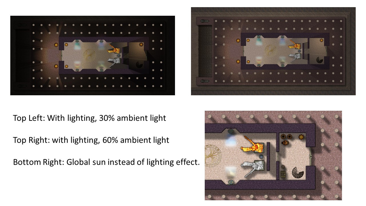
In a previous thread, I asked if there was a way to have lighting effects without disabling the global sun so that I could have an inside and outside (without having to recreate all of my sheets to have indoor and outdoor versions).
https://forum.profantasy.com/discussion/13954/adding-lighting-effect-without-changing-global-sun
The answer was no, so I had three options: (1) revamp all of my sheets so that the outdoor portions were on sheets after the end of the lighting effect; (2) use semi-transparent colored circles to simulate the effect of the glow from colored lights; or (3) create a separate copy of
That’s what I have so far. Any suggestions? (It’s my birthday, so please be kind!)
Oh, here's the FCW file if you're interested.





Comments
Mappy Birthday!
It's a very nice temple. I don't think I particularly prefer any of the roof or offering options. They all look nice.
My main issue with the map is the grass around it. The scaling makes it look very repetitive. I would consider changing the scale of it a bit, and perhaps try to fill out the areas a bit so you don't get those large unbroken areas of plain grass. That do apply a bit to the paving around the temple area as well, perhaps change the scale so they don't repeat quite as much.
I will play with the grass scale to see if I can reduce the repetition. It actually started at a higher scale that was t00 close-up for a map of this size (which is 500' x 400'). I am also open to recommendations of other grass fills that you all think would be suitable and less repetitive. Any thoughts?
Any recommendations for other park-related symbols that I could use to fill out the area? More trees, of course, but are there other symbol sets to recommend? I looked for things like park benches and gazebos, but the ones I found were for styles that didn't seem compatible. If I don't own the Annuals with the symbols that people recommend, I can consider purchasing them.
Thank you!
Lovely :)
A lot of hard work has clearly gone into this. I particularly like the pool.
And Happy Birthday :D
The smaller/zoomed in bits of the map look really good.
I've been experimenting with different grass fills at different scales
Here are three different fills at three different scales (10x10, 50x50, and 100x100), with the full-sized version on top and a zoomed-in portion below. It's hard to find a fill/scale combo that looks good at both the full 500x400 screen as well as when zoomed in. I suppose I could use one scale for creating a full-sized JPG export, and then change the scale when doing zoomed-in exports.
Does anyone have a favorite among these nine options, or a recommendation of another fill to try?
Per @Monsen's recommendation, I am also going to break up the larger portions of the lawn a bit by adding more symbols, though I don't want it to be too cluttered and distract from the temple itself. I am going to replace the trees here (which come from the Jon Roberts Dungeon symbols) with trees from the Jon Roberts City symbols, because his city trees have more variety. I may add a gazebo, and maybe a portion of a municipal botanical garden or rose garden.
To me, scale 50 or scale 100 look good, except for green 3. In that one, I think scale 100 looks best.
I think scale 100 looks best in all.
Another way to deal with redundancy like that is to add a couple more sheets with Edge Fade, Inner sheet effects on them and draw irregular patches of different grass textures on them.
I will try that. Thank you!
I was worried that my temple wasn't looking as cohesive because I was drawing fills and symbols from so many places that didn't quite mesh. In particular, I wasn't happy with how the trees looked. (I also added a gazebo at the top and a botanical garden at the bottom.)
In the end, I decided to try the grass fills and trees from Forest Trail. Here they are without contour patches of other grass shades, at 50 and 100 scale.
And then I tried adding patches of grass of the same fill style, but with a shade higher and lower. I really don't have an eye for this sort of thing. Should I have bigger patches? More numerous small ones. Should they blend in more?
For the botanical garden, I couldn't find flowers among my symbols except for potted plants. It was supposed to be simple so as to not distract from the temple, but I got carried away.
Not really sure why the botanical garden didn't post properly. Trying again.
I think it doesn't really matter where you put the patches of lighter and darker, unless you are trying to make the ground look like a certain shape of hill.
Looks good to me :)
Have you tried the CSUAC and Vintyri Archive collections?
Yes, I do, although I just realized that I didn't finish installing them. Initially it looked like the plants and flowers were potted plants, but I just looked again and there are some that would be suitable. For now, I think I will keep my botanical garden as it is (unless I find a carnivorous plant), and keep these assets in mind when I do a full botanical garden.
Thank you, all!
Revisiting this old Greco-Roman temple, one of my early maps.
A friend of mine is GMing a campaign that I am not in (he and I are also players in another campaign). My friend's campaign is Greco-Roman flavored, so when I mentioned this map, he was interested in using it for his campaign. I'm dusting it off, fixing the gardens, and adding crypts that he really wanted.
Above
At the time I designed this, I only had a handful of annuals. I used Marine Dungeons for this with a little bit of Forest Trail and Darklands City. My botanical gardens were a weird mix of styles, including some of Mike Schley's stuff that's really beautiful but doesn't mesh with the more magic realism style of the rest of this map.
Now, though, I have all of the annuals. I ripped out the flower beds and replanted using trees and bushes from the Japanese Temple annual.
The temple always had stairs going down, but I never actually designed what they lead to. Now I have.
Underground
This is the "show everything" version of the underground map, including removing the lids from the sarcophagi and showing the secret areas that are on the GM's map.
This has a sacristy where the priests can change into their vestments, and a common area where they can assemble, practice their sermons, and get into formation before the religious ceremonies.
This map shows where municipal pipes bring water in for the fountain and the aquagarden (the gardens have a pool with coral and sea anemones). It has a "Purification Chamber" -- I imagine that's used for acolytes to do some sort of ritual purification before they are ordained. There are three libraries: the Muniment Room, where records like births, baptisms, and marriages are stored; the Scriptorum, where scribes transcribe and make copies of books and other records; and the Archives.
Much of this underground area is dedicated to the dead. The Putridarium is the chamber where bodies are cleaned up before burial. The Shrouding Chamber (a term I invented because I couldn't find a better one) is where the deceased are dressed in the attire they will be buried in. And the Chapel of Rest is where they lie in state before being entombed.
Then there are the crypts. There are a few gated tombs but the rest are open niches, with some vacancies in the northwestern area. On the eastern side, there are three circular columbaria, where urns with the ashes of the cremated are maintained.
This version of the map shows that there are secret doors connecting the Water Garden Maintenance Room with the Archives. Could be used for all sorts of things: a crime lord's hideaway, perhaps, or a ritual chamber for an illegal cult. A passageway heading south is caved in. It's just there to give the GM options. It could be easily cleared away to provide access to another underground area, or an escape route out of town. Or it could be permanently closed off if the GM doesn't have a need for it.
Whelp I learned a few new words today. Muniment was definitely top of the list.
I learned it by Googling "what is the name for the room in a medieval church where baptism records were stored?" ;-)
Got "Purification Chamber" with a less pleasant query.