October challenge: City Street submission WIP
 Lillhans
🖼️ 7 images Surveyor
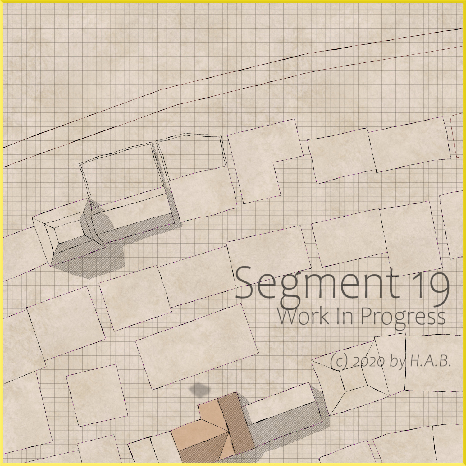
So I picked area 19 of the October community challenge. And this is the current progress of my getting in way over my head. I figured it would make an excellent opportunity to further the Castellfollit approach on the encounter map format (and will probably live to regret it).
Tagged:


Comments
That's looking really good already :)
Are you drawing these using path tools? How did you get the varying thickness of the lines?
Closed fractal polygons. Width variation comes from bounding back to the first node from the last with fractals dialled up slightly on the way back.
That's brilliant @Lillhans.
Would you mind sharing your fractalize settings?
I don't ever remember seeing any other CC3 map that's managed to create that Photoshop 'fake hand-drawn' so well.
I'm looking forward to seeing your final map. ?
Big reveal: It's the default setting.
One or two pips up from a straight line with the Up/Down buttons does the trick. Better width control with tighter node intervals, granted.
Timewise it is probably more draining than actual hand-drawn, but I am getting way better mileage out of it than I ever could from pen and paper. Best part is if November is coming up too fast, I can always revert to a low-details thing.?
That is bloody brilliant, though I understood next to nothing of the process...
Thank you.
I don't understand much of the process either, to be honest - if it can be called a process.
Was exploring comfortable levels of rooftop detail and possibly a night-time version when, suddenly, Blend Mode took things from Faber Castell to felt-tip.
So, I had a Transparent dark blue cover the entire map - with Blur for achieving the window light wherever the Colour Key is at work.
Now, the problem obviously is that the shadow from the house can't be given the same Blur so as to give way to the window light: doing that would be wonky for the edges that are not interupted by such light sources-
And I still kind of want the house shadows around because moonlight.
Thoughts?
What is the window light? Is it an actual light or a pinhole in the blue sheet created by a colour key?
Colour Key. I essentially will want to block out the shadow. Thinking about it, perhaps grafting a "lit" section ont top of all is the best - bar using some fancy schmancy light effect. :)
I am really not sure what you are talking about - wanting to block out the shadow. I was under the impression that you wanted to keep them because of the moonlight.
Any setup where there are two completely unrelated sets of lighting is going to be immensely tricky, and that is true of most 2D apps. It's not even particularly easy in 3D apps.
I would suggest using a real lighting setup instead of pinholes in your blue sheet.
Oh, blocking them where window light falls only. I have a plan though: blurring in a second set of the Background texture, Background colour, and street colour sheets immediately on top of the shadow ought to do the trick.
Sheets stacked like so:
Background texture
Background colour
Street
Shadow
Blurred background texture
Blurred background colour
Blurred Street
Darkness cutout
The theory being that the blurred alts do not interfere with their original counterparts.
Exectution could be better but alltogether an improvement I should think, @Loopysue . All that fuzz for a softer edge! :D
Oh I see now :)
Thanks.
Sunshine, moonlight, good times, vampire assault boogie.
Moat needs sorting out next, I think.
It's good, but I feel like there is a fog or something. What blend mode are you using for the blue sheet?
It does seem like there's a bit of a fog, but I think it adds to the atmosphere of the piece. Makes me question whether I should be out on a night like this.
No blend, in the end.
Shadows and contours go to the same sheet, taking some off the curb line: going to need to revise that.
Also, did add some Glow'd "rays" which probably make up the remainder of the fog feel.
@thehawk makes a good case for adding fog proper. :)
High probability this part of town is called Garden City by the locals. Cleverly, only the properties next to the city wall need that added detail.
Very much undecided what to do with the remaining space between properties and wall, however. Perhaps the greenery has spread beyond the walls of the well-off over time, creating a bit of a park-like thing.
Excellent mapping going on here :)
Wouldn't that space be kept clear by law to ensure defenders could access the wall easily? I think if I was the Lady of a medieval city I would make sure that no one cluttered that space, and that no trees obliterated the view of the wall itself. I suppose that in very crowded and badly run cities you might end up with stuff right up to the wall, but it would seem to me to be a bad mistake.
Maybe there are features there that just wouldn't show up on the main map. A killing field between the outer wall and a much lower broad raised platform of some kind, like a wide segmented ditch just inside the wall where anyone who managed to make it over the wall would end up becoming trapped with no way out and all the king's men stood higher than them all around?
Contours are - probably - a bit too thick for encounter map zoom level. But that' allright.
Considering greening up the area between city wall and mansions - toning down the dirt feel.
Watch out! We have a temple and/or grogg hall now...Half-circle stairs leading up to the gates pending.
Looking pretty.
Is the grogg for before, after or during mass?
Yes.
Throughout then, I guess :)
Can I join their church?
The exit risk eliminator: if I can't make the colours work, I can always go with the sketch version, right?
I do prefer the non-purple colours or the sketch
It's coming together nicely, I think. Two more gardens and some rooftops and then it's a wrap. An excellent moment to procrastinate.