Curse of the Crimson Crown (Pathfinder Adventure Path)
 Raiko
🖼️ 32 images Surveyor
I'm about to start running Paizo's adventure path "Curse of the Crimson Crown" converted to Pathfinder 2nd Edition.
I prefer redrawing the published maps, to have a consistent style and resolution when loaded into a virtual tabletop (VTT). So I'm redrawing them using CC3/DD3.
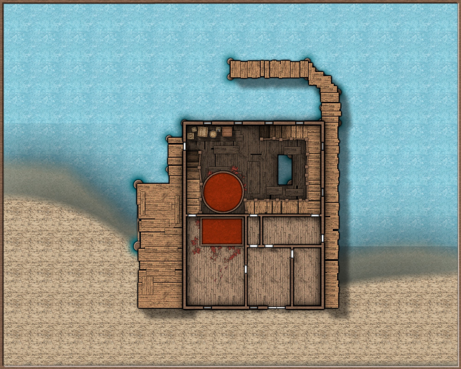
Here is my work in progress of map for the first encounter area "The Old Fishery."
I'm planning to post my mapping progress in this thread as we play through the Adventure Path.
Some parts look a but weird at the moment - particularly the steps down from the walkways and the wall shadows. These will be tidied up later, I've been experimenting to see what looks good and whats stopping things looking good.
The river and the shore are placeholders.
Tagged:


Comments
Looks like you are off to a great start. Make sure you deal with the repetiton in the textures, either by adding details that cover it up a bit, or changing the texture scale a bit.
Thanks, the texture repetition is one of my pet gripes, so it will definitely be gone in the final map.
If it does, and you are now asking your screen how the heck I knew that, I'm looking at the horizontal bands across your map.
This can happen if you have really wide glows, shadows or edge fades in operation (which by the look of things you have), and it is caused by the width of each pass. If the object casting the shadow, or the edge of the polygon with the edge fade on it isn't visible in the current pass width, CC3 can't see the sheet effect, even though the result of it falls within the pass.
You can check the pass width by typing EXPORTSETMPPP on your keyboard and hitting return. Check the number that shows in the command line. Unless you have changed it before the default value is 4000000 (4 million). You can increase it by typing 40000000 (40 million) and hitting enter. Try rendering the map again with the same settings as before. Hopefully by increasing the width of the pass this way you will get the whole map in one pass and those horizontal lines will vanish.
Thank you Sue, that is very helpful indeed.
The river will redone completely, so those big shadows will likely be gone, but I've had similar issues before and not known how to fix that.
I had a bit more time to carry on tonight.
Still no details outside of the building, but less of a placeholder shore and I like water river texture.
It's one sheet of just colour #70, and then a second sheet filled with "Water Blue Light" from CA54 (Jonathon Roberts Dungeons) and set to Multiply 30%.
The rock texture is from the same annual.
Now I'm really looking forward to the rest of it.
I've not had much time today, but I've added some neighbouring buildings.
I've had a busy week with work stuff (even had to visit the office!).
But managed some more mapping tonight - here is the latest work in progress:
I'm too sleepy to do any more tonight!
Slowly, but surely making progress. ?
It's looking hugely different. You've clearly done a lot of work with the sheet effects. Those are always what really makes a map in the end.
I'm loving the fine details you're putting into this, especially the water around the dock posts
Thanks, I've forgotten quite a lot of CC3 tricks as I've not done many maps at all for a couple of years.
I've been reading lots of the blog articles to remember what's what, and to learn new things - some of the functions that you and Sue use, e.g. the RGB matrix, I've never really dabbled with before.
The water around the posts is from butchering one of Sue's edge-stripe patterns, downloaded from the blog. I just quickly scribbled some white lines over the existing black lines and then renamed it. I was going to experiment later, seeing what difference it makes if I do a neater pattern. ?
It looks great, Raiko. I wouldn't bother making it tidier.
What a great use of stripes, Raiko. Very impressed, and I agree with Sue's comment above.
I had some time to carry on tonight. Nearly done with the main level.
I'll probably switch to the villain's hideout hidden beneath the offices next, before finishing tidying up this part.
The non-Profantasy symbols are all by Tom Cartos from his Patreon site.
Going really well! A little sugestion to make the map even better: work on the water. It takes much of the screen and deserves more attention. On these maps you can even play with doing waves, curls, etc...
This is a mostly complete, unfurnished export of the villain's hideout below the main level. There's some weird geometry, that used to cause confusion, but was clarified in the anniversary edition of Curse of the Crimson Throne. There is only a three foot clearance above the area between the rotting ship and the hideout itself and the "walkway" floats on the river. The door into the hideout is only a 2.5 foot square hatch.
I'm not so sure it really needed very much, but that's a matter of personal taste ;)
Yes, I agree actually. I'd originally just made the water shading as subtle as I could, and I'll probably switch back. I can always place a map legend in the corner if it looks too empty.
I've not had much chance to work on this recently, but got back onto it tonight.
There's lots of ropes strung between the woodwork in the hidden area beneath the old fishery, and I wasn't sure if I could make them look good just using lines and paths in CC3, but I had a quick play around and I'm quite please with how they turned out.
I just need to add furniture and junk now, more ropes to tie up the boats and I'll be mostly done.
There is a higher resolution copy in my gallery.
I'm trying to get some of my battlemaps finished this weekend, especially this one, as I've taken far too long doing it - mainly due to distractions and also tweaking the sheet settings and symbols to see what happens.
Here's this afternoon's update. ?
Playing with sheet effects to see what they can do is the only way to really learn how to use them in the future. Too many people never even try the less common ones, but they all have quite interesting uses.
I've pretty much completed the hideout underneath the old fishery now. Here is the latest WIP.
I'll copy the tweaks back into the main level, finish that and then post completed Roof, Ground Floor and Hideout maps together.
Again, a higher resolution copy is posted in my gallery.
Oh I like the transparent water... or are those transparent rocks, around the base of each support :)
Looking great!
Yes, hopefully my mapping in this series will speed up, now that I'm satisfied with most of my sheet and symbol settings.
I'll need to be converting the maps at the same speed that the players get through the campaign! ?
The rock symbols are at 25% opacity, and they're placed above the plain blue background, but below the multiplied Jonathon Roberts water texture (which is at 60%).
Thanks Medio. ?
Okay, I'm nearly done now - I've spent ages copying sheets and sheet effects back to the main floor map, and made a few tweaks to each map. I should have the main floor finished tomorrow I think. Need to update the outside shadows on the hideout map as well.
The Old Fishery - Main Floor [WIP]
The Old Fishery - Hideout Underneath [WIP]
As usual, I've uploaded higher resolution copies to my gallery.
These are so beautiful, with so much attention to detail. Your players are so spoilt.
I love it when people start to experiment with the effects and what they can do with them :)