

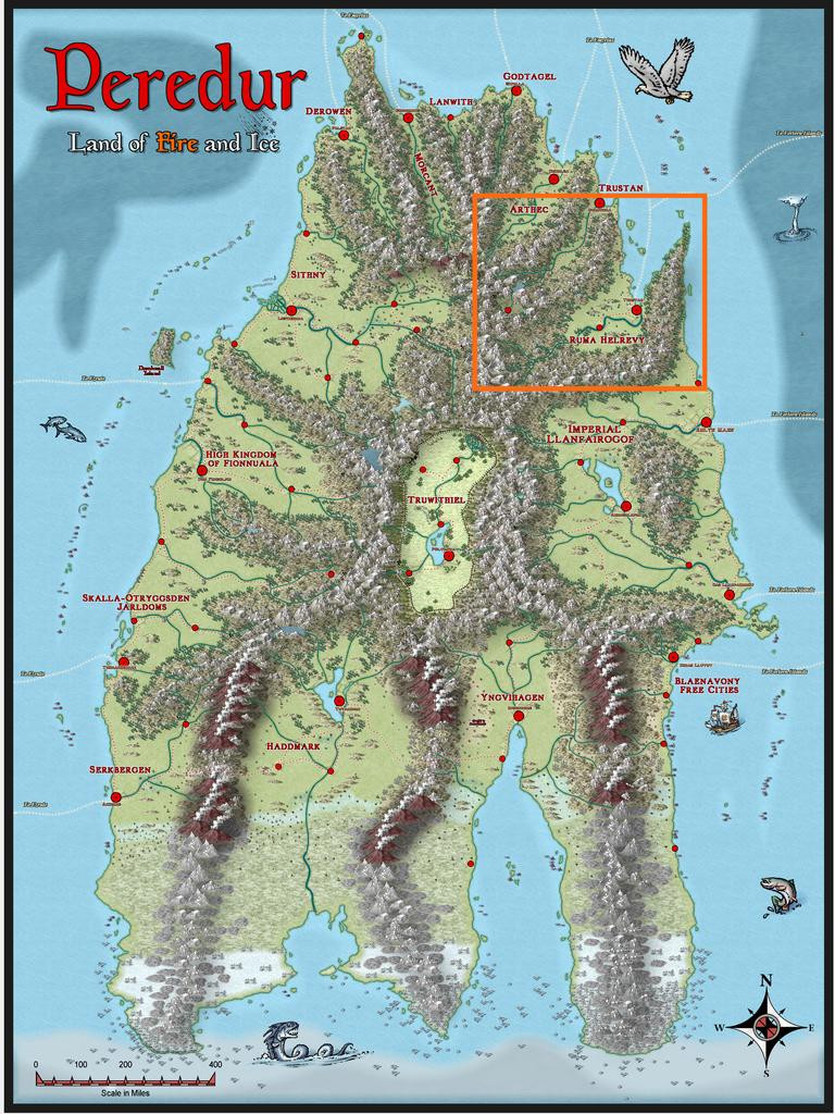
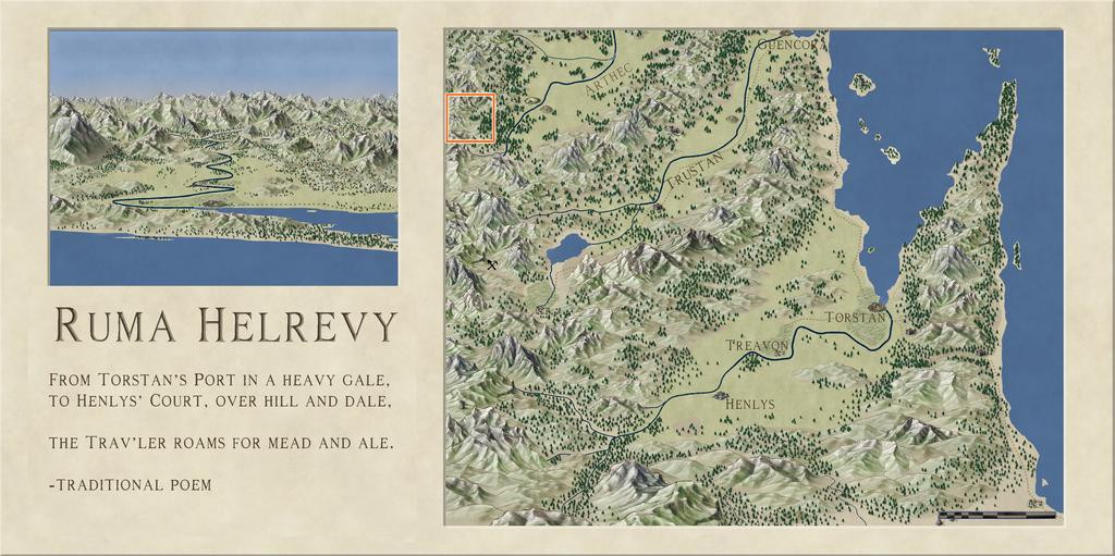
Community Atlas: Oracle Mountains Area, Ruma Helrevy, Peredur
 Wyvern
🖼️ 293 images Cartographer
Wyvern
🖼️ 293 images Cartographer
Having concluded my recent diversion to The Dying Earth of Jack Vance, it's now time to resume mapping for the Community Atlas. The next maps were intended for somewhere in the substantial Ruma Helrevy region of Peredur, as noted previously in the final post here:
This also brought a switch to a new Inkwell Ideas Dungeonmorph Dice set, as the next four dungeony maps were to be from designs in the Lairs pack. These are quite a contrast to the recent Trailblazer set's layouts, because most of the Lairs ones are caverns, or otherwise irregular spaces. As luck had it though, one of the dice designs randomly selected here was something transitional, with a square entrance room leading into a large series of caves. These dice also have an accompanying Inkwell Ideas book of suggestions for every design, "Dungeonmorph: Delves and Descriptions - Crypts, Lairs & Sewers Edition".
As usual, I checked through the book notes, with random rolls, to spark off some initial concepts, in conjunction with examining the existing Atlas maps for the region, and any notes with those, to find a suitable spot to locate this map. Almost nothing has been mapped in the Ruma Helrevy area, except the main settlement of Torstan, and most of the map's notes revolved around that more southerly broad valley as well. Meanwhile, what I'd determined/adapted from the Inkwell book were some Ogre-sized Badgerfolk who'd broken into the cellar (the square entrance room), which was a former summoning chamber in the base of a ruined wizard's tower. This led, by a now shattered secret door, to the cavern complex. In the caves were a Naga in a pool cavern, a whole group of Spidermages, one of whom was a strange, oracular creature, all of which mages had originally inhabited a far deeper world, led to by a great chasm, come nearer the surface to collect ambient magic in their special web-nets, and a second entrance, via a narrow, open-sky cleft, where a group of Wyverns (yay! 😁) were nesting.
The whole magic-from-the-air concept led me to think of a stone windmill-like wizard's tower, with four fixed, stone-framed sails, now partly ruined, designed to draw magic from the sky in a remote mountain valley (because of the Wyvern-cleft). And suddenly one map became three, because aside from the dungeon one, this needed an area map, and some sort of design for the surface tower too.
There are plenty of mountains in Ruma Helrevy, and I quickly narrowed the options down to a zone in that map's northwest, away from the more civilised parts. Ordinarily, I'd have gone with a 20-mile square area for this, which has become fairly, if not exclusively, typical during this project. That looked ridiculously tiny here though, so I doubled-up, and went with a 40-mile square instead, right on the extant map's northwestern edge:
Following what's become my normal practice, I set-up a, here, 2-mile square grid across that area, and randomly-rolled for locations of interest among those. I also randomly rolled up some name-options for the leading creatures from Mythmere Games' "Nomicon", and a whole series of mostly single-word idea-prompts for more names from the random tables in the "Knave: Second Edition" RPG rules (Jacob Hurst & Swordfish Islands LLC). However, for the location details, I decided to try out another, much newer, Inkwell Ideas product, the "Hexploration Kit". This comes with a large group of pre-drawn, coaster-sized, hexagonal terrain maps printed on card, and five separate card decks with an evocative illustration on one side (by The Forge Studios), and random tables of text ideas on the reverse. Several cards per deck have ideas and random tables on both sides, to further expand the options. I used cards here from three of these decks, "Stranger Places", "Into the Wilderness" and "Settled Lands", with suitable random rolls and further adaptations.
With all this decided, finally, I could start mapping! I opted to stay with Ralf's Hand-Drawn Fantasy style again for the area map (and the dungeon one too), and set-to.
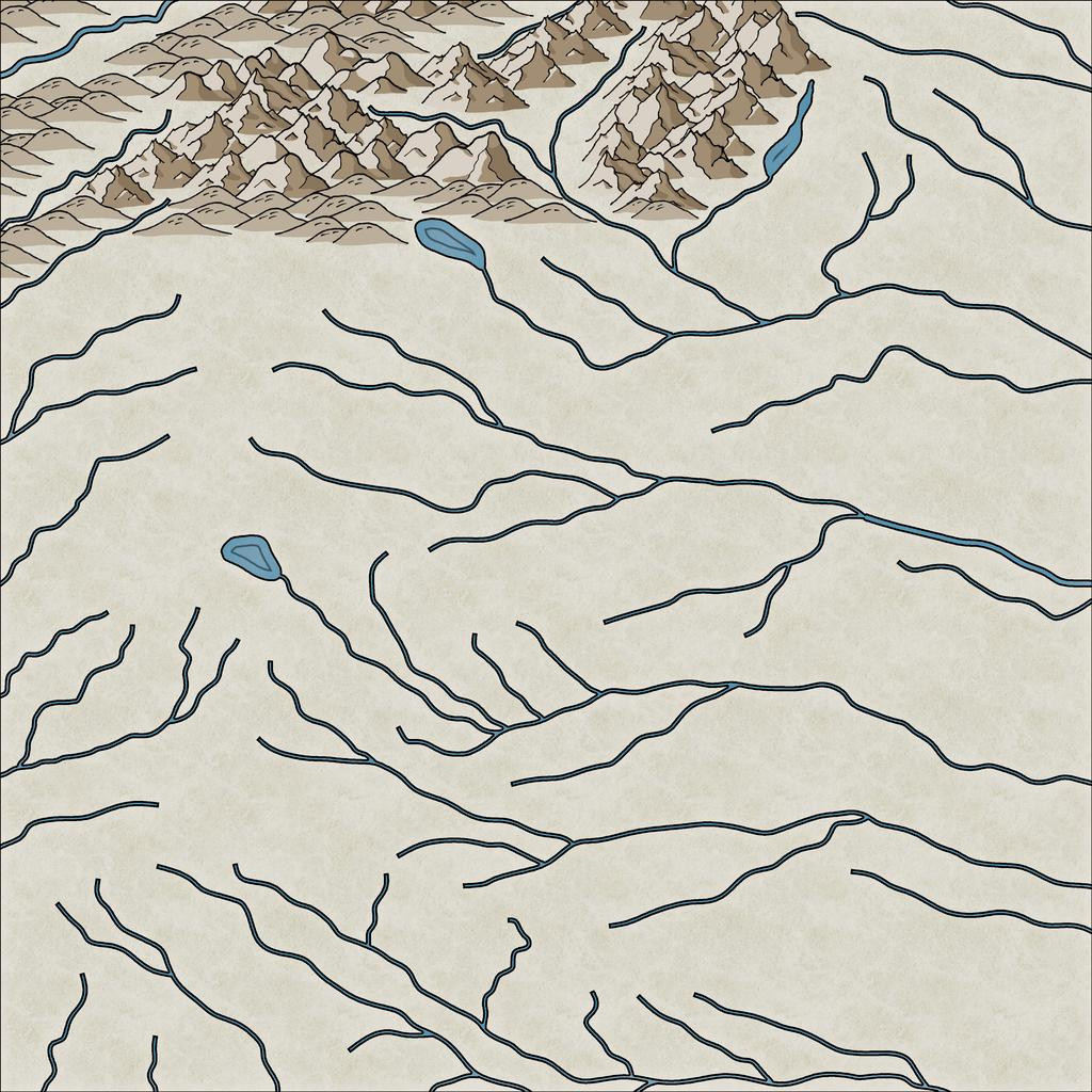
While using the gridded map to place locations, I'd been struck by the flowing lines of the Jon Roberts' style mountains, and thought those lines could be readily adapted to show rivers. This first image illustrates how I drew those, still with the imported, semi-transparent, gridded base bitmap showing:
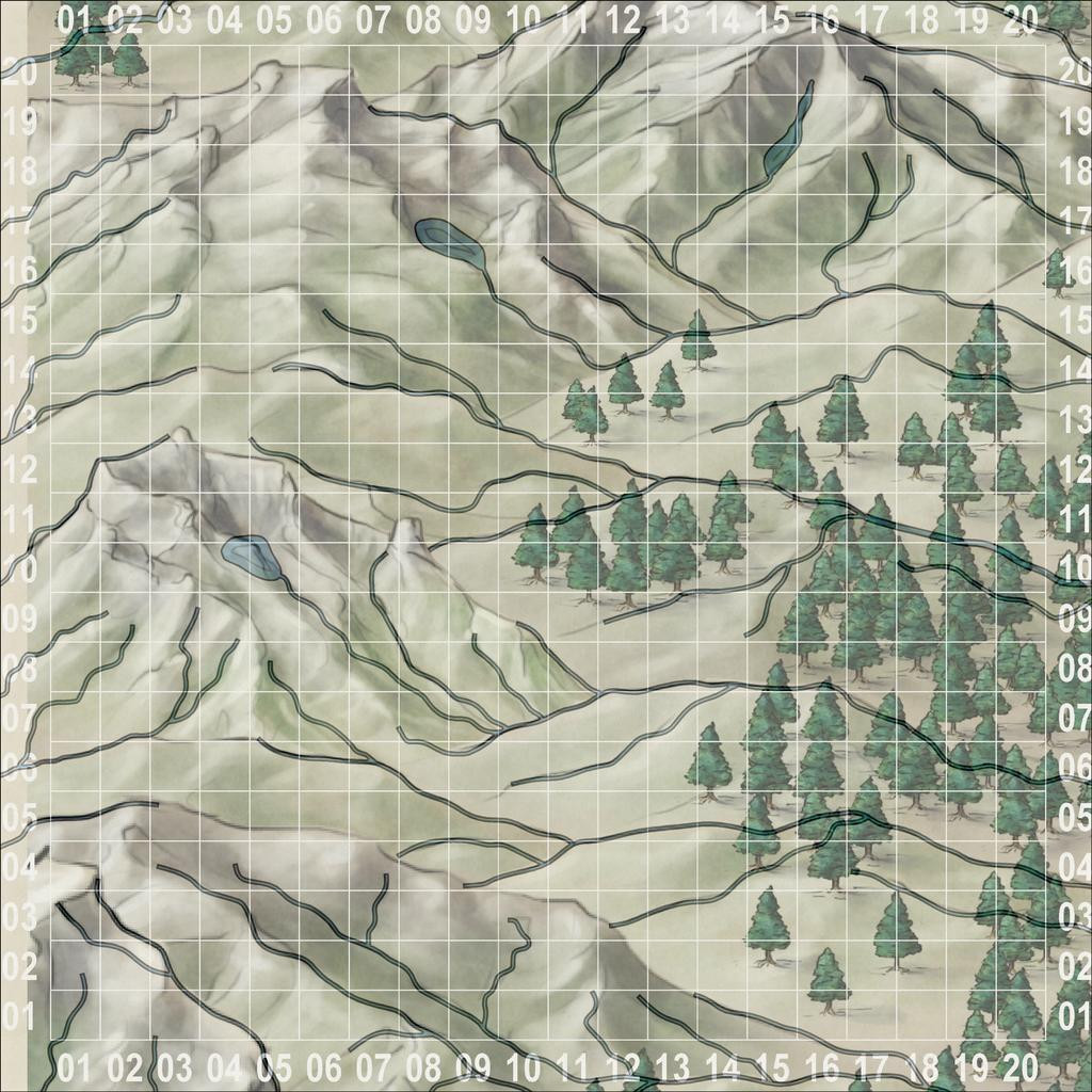
I also added a few small lakes, partly because I'd developed a mental image of how I wanted the ruined tower to look (aimed for the lake-head around square 0411, facing southeast down the valley), and it seemed likely such glaciated mountains (this is around 53°S latitude) would have small lakes of this kind. As you can see too, I've not simply gone with the valleys from the Jon Roberts symbols, but have used some of the crest lines too, essentially because that looked more interesting!
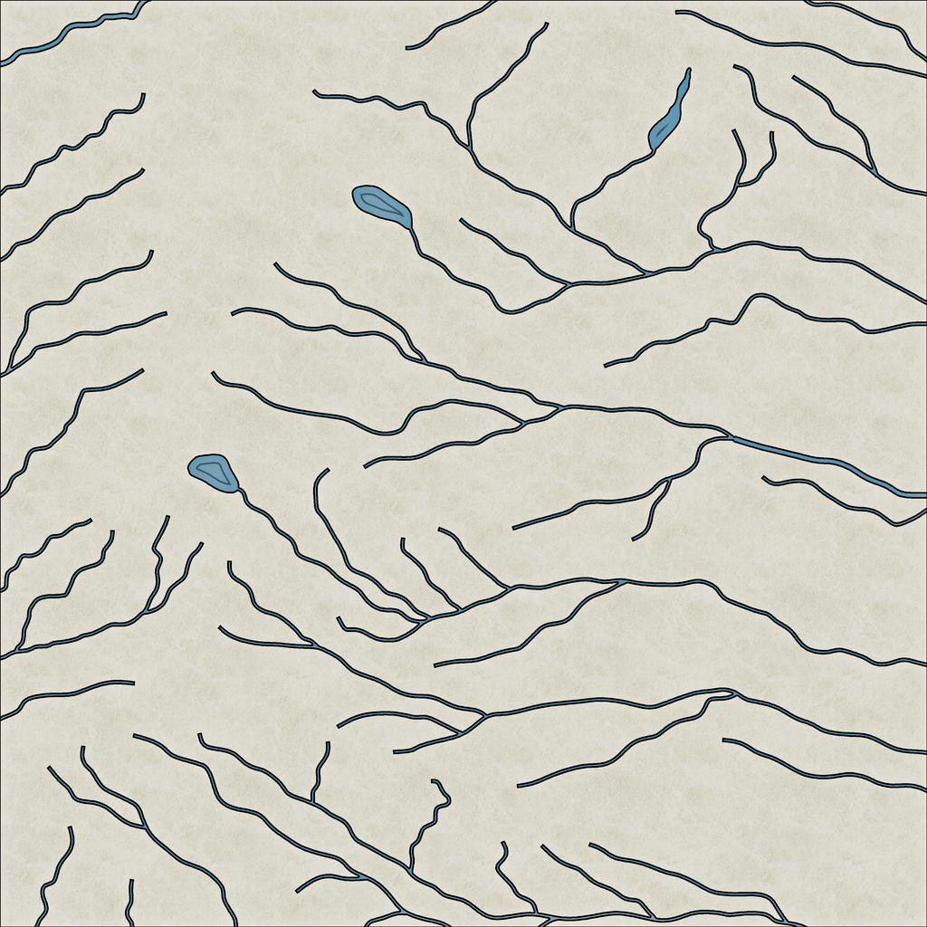
This shot gives a better idea of the final riverine layout:
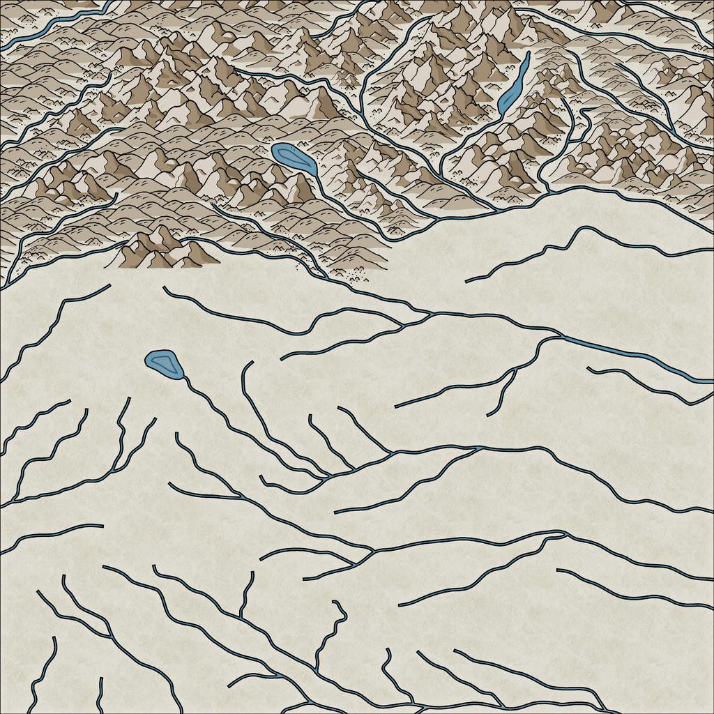
With that completed, I started sketching-in the physical terrain:
This still needs a lot of tweaking - hiding the ends of the river lines, filling-in the blank valley bottoms, and so forth. Here's a shot partway through that "cleaning-up" process, and a bit further along more generally:
I tend to do this in segments of the map, to try to avoid too many problems with the ordering of which symbol overlies which ("Sort Symbols in Map" can create as many problems as it solves with styles of this sort that involve fade-out lower symbol edges, unfortunately). Thus all this took a couple of mapping sessions, and another couple more to complete the whole terrain layout:
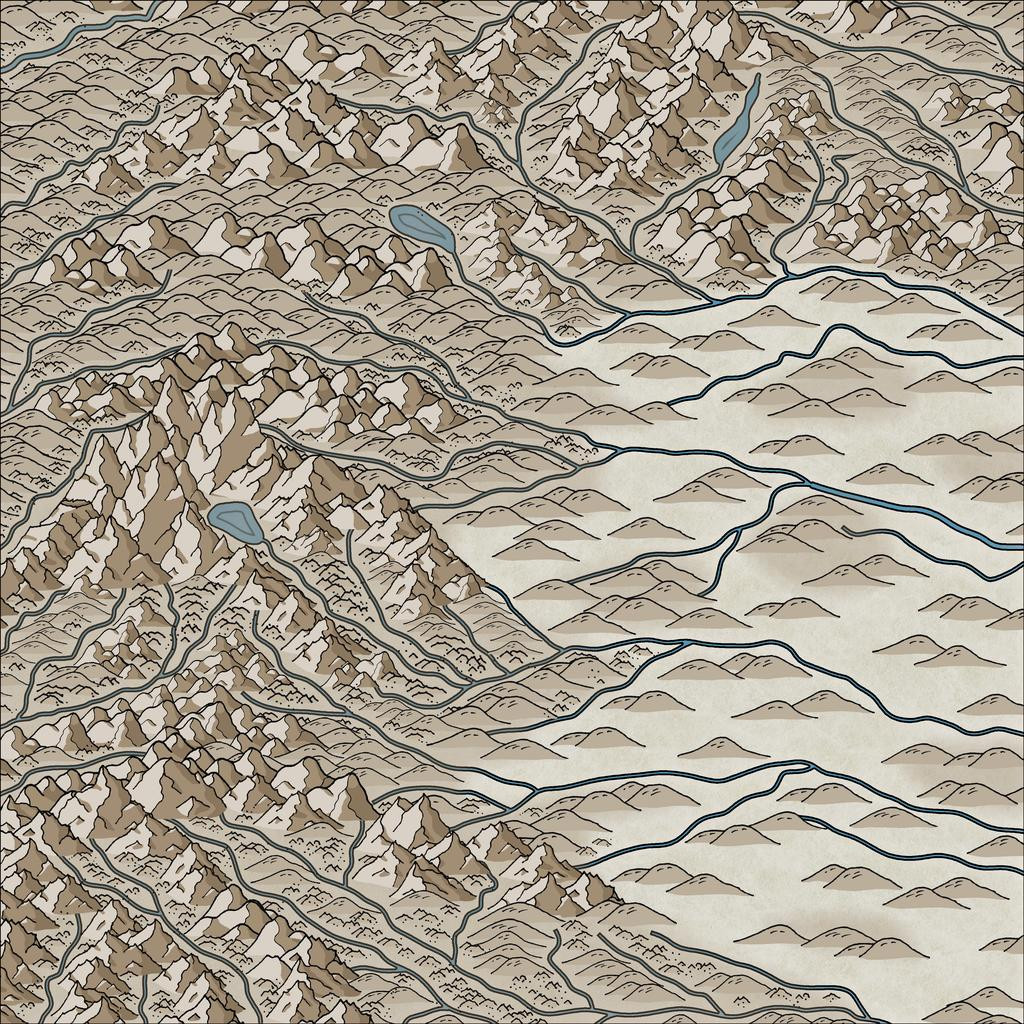
By this point, I've also added the background mountain-shading polygons as well. The absence of smaller terrain features in the lower-lying areas is because there are going to be woodlands here, which would make many such smaller symbols redundant, as largely hidden away.
Still quite a lot more to do, but that's definitely long enough for today's round-up, I think!


Comments
Time next to start adding some vegetation, initially just based on the extant Ruma Helrevy base map, and again with added background polygons for the denser woodlands (although the hill and mountain symbols often hide parts of these):
Next, the randomly-located places were dropped-in (albeit a few had been swapped around to make better sense):
And yes, the Inkwell cards actually do include unusual roads and trackways, shown here by the solid red and orange lines. The dashed lines are my own trackway additions, linking to the somewhat more populated outlying sites.
Aside from the ever-popular 'fiddling about to get the dashed lines to look right' activity (a mixture of over-long dashes in parts needing nodes shifting or removing to look better, and adjusting the variables on how the selected style of dashed lines are drawn, so as to actually look dashed), there was here too the endless fun of trying to get them to lie above and below some of the terrain and other symbol features! Much of the latter was accomplished by using different sheets for different symbol types, although one trail line ended up being cut in the right spots (in the mid-left part of the map), where it was meant to pass behind a mountain peak.
Still in need of some tweaking in parts, of course, and the sharp-eyed may notice I've slipped-in a couple of the newest free "Alien" symbols, not in fact because there are aliens lurking in them thar woods, but because I needed a couple of more rustic location symbol options, and these fitted the bill quite nicely - as well as one for the ruined tower by the mountain tarn where the dungeon map will go eventually, as there aren't any suitable ruin symbols in the style (as yet - is that too subtle a hint?!).
Although there's not much to show today, it actually took three more sessions to reach this point, so the final tweaking, additional dressing and labelling must wait till the next update now!
The last part of the area mapping involved adding a lot more fine detail, to make it look more like a living landscape:
Further small adjustments have been made along the way. A couple of marker-stones have been added by that central-right red roadway, because it is actually a way-marked route, and the marker-areas have especial significance (the Atlas notes will have more details). I've also changed-up one symbol in the lower-centre of the map, to what now looks like (indeed is!) an inverted obelisk hovering above a crater in the ground. Originally, the hovering stone (it actually looks like a huge stone shard hovering over a crater) was drawn with a couple of rescaled, one inverted and mirrored, varicolor mountain symbols. However, reducing their sizes so dramatically meant their lines lost too much definition, making it hard to see where the marker was on the map, especially after adding more little stones, bushes and extra trees nearby. I hadn't been happy with it earlier, so the change here was one of the first things done. The crater's not altogether ideal, a vertically squashed version (different X and Y scaling) of the varicolor dormant volcano symbol, but it doesn't look too bad with extra dressing over and nearby.
The final stage was to add the labels, always something of a challenge. I'd hoped to make more use of the idea from the Peredur notes, that names from the region should have a vaguely Cornish form. However, when I looked-up a couple of online Cornish-English dictionaries and translation options (yes, I know; albeit, perhaps luckily, Google Translate doesn't consider Cornish a language, apparently), a lot of the key words - such as "oracle", "relic", "griffon" - remain the same as in English, and the whole started to feel more effort than it was worth. This was especially so, as my opening thought had been to have a toggle to swap the Cornish and English name-labels in the final Atlas FCW file. Sadly then, just the vague "Mummerset" of the dungeon location's "Quezzal Tower" name makes a token not-really Cornish element here. Even that came merely from a slurred "Quetzal" in the random-word lists extracted from the Knave RPG!
Thus the completed map:
As to how the map's name came about, that's largely because several of the Inkwell card random option notes came up as magical vision-gates and oracular settings. The PDF notes will have more.
Next time, the start of a closer visit to Quezzal Tower...
I really like how the smaller foothills provide texture to the terrain. Very nice.
Excellent, thanks for going through the process with us!
They're mostly the varicolor rock symbols, with a colour chosen to more or less match the ordinary hill symbols, though I did rescale some of the normal hills in places as well. The rock symbols have little dots with some, which helps make the terrain look a little vegetated as well, which with the bushes, fills things out really well for just a few clicks here and there (because the symbols cycle through the options randomly if you don't expand all the catalogues).
Part of the purpose of this whole not-any-more-it-isn't-Dungeon24 project, was to have the chance to try out new styles and mapping ideas along the way. Something I realised early on though was that it would be difficult to use an isometric style, because the base dungeon maps I was using were all drawn top-down, often with complex features that the extant isometric dungeon-mapping options wouldn't manage. Even so, I'd been trying to find a way to use at least one of the options before now, without success.
Fast-forward to Quezzal Tower, however, a map that didn't exist in any form at all before I began, except as a vague idea, for which I thought it would be an interesting opportunity to finally use one of the isometric options from the Cartographer's Annual. Hence partly why I've decided to present the maps from this group as a WIP on the Forum here, something I don't often do otherwise. It proved to be rather a challenge overall, partly because of the very limited symbol options, mostly because of my unfamiliarity with this style of mapping. It's also something our sadly missed Forum mapping friend JimP kept experimenting with himself; and indeed, I was reminded of some of his comments and struggles with it during my own battles!
I decided on using the CA66 Isometric Dungeons style by Herwin Wielink, and started by re-reading the PDF mapping guide for it. This recommends doing a trial map before embarking on the full-sized version, both to get a feel for the style, and as a means to better estimate the size of mapping area needed. So I did:
I'd worked out in advance that the surface level of the Tower needed to be about 60 feet square, based on the first part of the subterranean map, with its square entrance chamber, as noted previously in this topic, so I set a size a bit bigger than that as a square map border for this initial trial. Naturally, this is very basic as a drawing, just a floor area comprising 10-foot-square symbols, plus some 5-foot wall pieces and corners. The front walls have been left off here, as this had already given me the information I needed on the general mapping area required.
My original thought had been for the Tower to be around 60 or 70 feet tall, and to taper-in as it rose. With this first experiment, that gave a ballpark figure for what size the mapping area should be, estimated as somewhat larger, as I find it's easier to shrink down a map's area than expand up (usually using the Stretch command, adjusting the map border, any frame and the background). So this is what I did, with the opening segments sketched-in to give a sense of scale:
This may seem a bit odd, which is not surprising! A closer look at the mapped segments:
This was mostly because I started the wrong way round, except it was actually the right way! I wanted to show the initial part of the underground level on this map too, but I first needed to know what the surface level of the Tower's layout would look like, so as to work out how to fit the descending stairwell into that. Hence the subterranean stairwell currently hangs in the air above the surface level plan.
Several problems came up very quickly. The stairs can be shown only in the two orientations used here, thus can't be used to show a classic compressed staircase, such as you can find in many houses, because there isn't a "reversed" option. Then there was the difficulty of working out where the internal wall lines were in relation to the size of the map, and also, even using the 5-foot isometric snap-grid, getting them correctly aligned with one another. The doors proved even more tricky, as at least with the walls, there's a definite lower edge to work with; the doors though have a broader footplate, so the closed ones are slightly recessed into their frames and the walls. Looks nice, but a nightmare to align properly!
And then there was the descending staircase going below floor level... Numerous "Escher" moments ensued trying to click on all the symbols required, whose edges were NEVER where I thought they should be, to "Bring to Front" or "Send to Back". There can be essentially just the one SYMBOLS sheet for everything on these isometric drawings, so such ordering is essential. And then there was getting that wall behind the stairs slotted in, something I only realised was required after, finally, emplacing the stairs correctly... It is possible Naughty Words may have been said!
Let us draw a veil over such matters and move on another session or so, with the various Tower floors now sketched-in, just as a crude layout scheme:
Copy & Paste works wonders sometimes, along with selecting and moving entire levels together, using the Ortho option. Thus the completed subterranean segment at last underlies the surface level one, the next level up is underway, along with the initial resizing of the level above that. The thin black vertical link-lines hopefully show how each level connects with the next.
Of course, some of the problems I encountered are because I'm trying to draw something the style wasn't designed to accommodate - a mostly above-ground tower structure. There are, for example, no windows, so I had to resize the open doorway arches to serve instead, and while they don't look too bad (even on an unblurred version, with a resolution that you can actually tell, unlike here on the Forum!), they're not ideal. Needs must, though, and indeed in much the same way as I'd had to resize the great central pillar and its magical mechanism cabinets on the ground level (repurposed sarcophagi). The pillar runs through to the Tower's top, and was originally to channel magical energies drawn from the air outside through the static windmill-like vanes there, down to the surface level and on into the cellar's summoning chamber.
Which is where we'll leave it for today. Plenty more to do still though!
One thing I forgot to mention last time was the map's frame. While this may seem rather broad, I'd already cut it down in size by this point, and changed the effects on it. Initially, there was an unusual, quite strong, use of the Edge Fade, Inner effect set up on the MAP BORDER sheet, along with a Blur. While this seemed OK when zoomed right out, closer-to, it started to look odd, with a vague mistiness due to the fade extending some way into the drawing. I swapped that out for a basic Bevel effect, and reduced the Blur somewhat, which is what's seen here.
Back at the mapping, I started using some simple linear templates to help me get a better feeling for the sizes and placements of various features as the drawing proceeded. This is very much a WIP shot giving an idea of what this meant in practice:
Also seen here (just!) is that the staircase in the "front" room has been shifted towards the back wall of that second above-ground level, that resizing of all the subsequent levels has been completed, a new staircase embedded into the floor of level three and placed on level two, with a red-line diamond and staircase just above level three, to illustrate how I was using that template to set-up the staircase placements. As the floor space decreases with height per alternate level, the red diamond shape is the size of the floor above, which, after placing the stairs on the next level above, is then moved down with a copy of the stairs to make sure they'll be in the right spot on the lower level, so as to pass through the floor above, and not drift off into space!
Looking closely, you may notice too that I've somehow managed to accidentally copy and paste a 10-foot floor tile in all this, tucked behind most of the top corner of level two here... There's so much to concentrate on with these isometric drawings, it's easy to lose track of things like this, particularly when coupled with the difficulties of clicking the right symbols when you want to move, reorder or copy them.
A little further on now, still with the drifting red-line diamond (having everything vertically aligned here was important, so as to be able to simply use the Ortho option when copying and moving things around, in conjunction with the snap grids. Often this was the 5-foot isometric grid, although the separation of the levels was done using the 10-foot, 2 snaps, square grid:
Progress here involved adding that great central pillar to most of the upper levels and the linking lines between levels one and two, completing the internal wall lines for level two, and adding the outer walls plus "windows" on level three, as well as sliding it down nearer the other levels. It was becoming clearer now that this overall drawing panel was going to be shrunk quite considerably in its final form, but for now, it was fine to have plenty of space to move things around in. I was starting to have doubts about that smallest, top level though.
Another session brought me to this stage:
All the levels have been brought into their final locations, more or less, the stairs emplaced except up to that topmost level (which probably now won't survive), and the red diamond has gone, replaced by a black rectangle, a guide for keeping the level separations straight. It's also clear how much space can be removed at the top of the drawing, and the frame is starting to feel quite oppressive here, as too dominant compared to the interior drawing.
The penultimate session achieved this stage, just before all the labelling and fine-tuning, but after the frame's final resizing:
That small upper level has gone, replaced instead with a double-height level six one instead, where the pillar structure angles over to connect with the vanes on the outside. Token efforts to show part of the vanes using repurposed symbols or drawn lines came to nothing, unfortunately. The symbol orientations are too limited and with too few options to construct something suitable, and the available space meant the kind of sketchy lines possible never looked right. It had been a battle to get the ruined uppermost level to look reasonable as it was - again, the symbols available aren't designed for ruined exterior walls, so I just did what I could. There's also an unfortunate "tide-mark" because of the wall-colouring that darkens at the base, and which looks messy when stacked like this to give a double-height chamber.
Hopefully, the labelling helps distract a little from such imperfections. Two versions, one with, one without, the isometric 5-foot grid (which is only labelled when the grid is shown):
I thickened up the grid lines a little from their default zero-width, so they'd show-up on higher-res images, and also added one of the compass roses available in this style. That was then labelled using the technique outlined in the mapping guide to the Ancient Tombs Part 2 Annual, using the Perspectives 3 3D projection mechanism on exploded text. It is somewhat unfortunate that the labelled orientation has to be northeast, not due north, but within the limitations of what's available, that was unavoidable! There'll be some descriptive notes to go with the drawing in the Atlas too, and higher-res versions with and without the grid are in my Forum Gallery as well. These are amazingly tiny files, for once!
Next time, we begin the delve underground to see where that Old Summoning Chamber leads to...
Inspiring use of Perspectives for this tower. I am motivated to do something similar, and thanks for all the tips.
Having performed the usual New Dungeon Map Ritual, in consultation with the CC3+ Wizard of the New Drawings, and imported the hand-sketch for the map to a fresh Bitmap Sheet and Layer, as normal, the first section of the subterranean level could be prepared, essentially amplifying the Below-Ground Level of the Quezzal Tower map:
As we see, I'm using Ralf's Hand-Drawn Dungeon style again here, and it's likely also obvious to those more familiar with the style, that there are a couple of cavern walls missing here. These are where the next areas connect to this one, connections which are somewhat complicated by the fact the link-areas are actually cliff-lines in the cave, indicating steep rises and falls in the level. This part of the drawing already shows what happens when floors are all drawn on the one Floors Sheet, which has a nice inner glow effect on it, that the walls increase with their own glows. All the floors flow straight into one another, without any such shading effects. That's great if all the floors are on the same level, but cliff-lines mean they aren't. Thus, enter some new Floors Sheets:
Only it's not quite that simple, because to fool the eye properly, the floor level above the drop-line needs to be lighter up to its edge than the one below. Thus the floor level apparently above the drop line has to be drawn a little longer there, on a Sheet BELOW that on the other side of the drop-line. So the way I had the floor edges on the initial snapshot image here was only correct for the broader of the two connection points. The narrower passage one had to be edited after the fact to extend under the next upper, though actually lower in Sheet order, floor. And as the second shot above indicates, there were sometimes going to be multiple levels on the same passageway...
This wasn't actually quite so bad as it may sound, because I'd already discovered how to get round the problem when drawing the map for the Tomb of General Chengdai previously. Although I didn't draw attention to it there, nearly all the adjacent floor areas of that dungeon map are on different Floors Sheets as well, and the sliding walls have had an additional external glow effect added to their Sheet to help maintain a similar darkening close to them too.
Even so, it needed a couple more sessions to get the whole layout drawn, and I had to add an extra Sheet at one point because, for entirely unfathomable reasons, one of the new Floors Sheets started causing transparency acne problems with the next Floors Sheet in the stack (but none of the others did so, despite all being identical, and having minor overlaps in places, nor did the problematic Sheet with others that weren't adjacent in the stack...):
The freestanding rock stacks were drawn using the Cave, Cut-out drawing tool, that makes use of the Color Key effect to punch through the grey stone floors to show the brown stone background, and make it seem like they're upstanding features within the caverns. Occasional tweaks were needed to get rid of a few too-sharp fractal points along the edges, taken-out individually rather than using the "Simplify" command, which I find sometimes takes away a bit too much on this kind of smaller map.
One element that slowed things a little more was adding the cave walls after various segments of floor were completed. "Trace" does help hugely in this, although the individual floor patches meant constant chopping and changing as to which part was being traced at times. So this didn't leave a lot of time to start adding the first interior details:
Just some debris and the floor circle in the Old Summoning Chamber, the pool in the next main cave along (yes, that's going to need its own pool-edge drop-line at some stage!), a large central-cavern chasm, and, ooh, glowing spiderwebs! What can those mean? More next time...
I love these type of dungeons, but have never done one in CC3. I'll have to give this a go.
Yours looks really good.
Thanks @Don Anderson Jr. The cave drawing tools in some of the dungeon styles can be a bit tricksy sometimes, as being drawn fractally with too many nodes, which sometimes need trimming-down, and not all the cave styles have walls (although you can easily create your own drawing tool to do this, of course). However, I do find it makes a change from the regular shapes and rectilinear layouts that are often seen with dungeon maps (although they have their place as well, of course). It's fun to play around with a combination of the two though, which can often feel more "real" sometimes (relatively speaking!).
Back at the mapping, one element I decided against adding from the original geomorphic dice designs, were some steps cut into a couple of the cave passages. With all the drop-lines, using multiple ones of which is often my way of drawing irregular steps in caves, that felt a bit too "samey". Instead, I decided to add some arrows to indicate sloping passages in the caves:
Once the labels go on, these will be labelled too, of course, but for now, we must simply remember the arrows all point downwards. I've added more dressing to the Old Summoning Chamber, and to that long, curving "cave" in the top right corner, most of which is actually an open-air crevasse in the mountainside - hence the small bushes and weeds in places, as well as more rocky rubble. This is the Wyverns' lair, with that small, half-blocked cave as their larder... There's also a curious dark line linking the outer edges of three of the four rock stacks in this part of the drawing now. That indicates the lower sliver is actually covered by a rock ledge, so is a more open-air part of the caves. It was drawn with a dashed line that looked fine on the CC3+ drawing, but which seems nearly solid here (and on my higher-res test image at this point too), so is going to need tweaking further. Again... Dashed lines are never easy.
That was done at the start of the next mapping session, and all the larking about with line styles led to me add the grid at this point as well:
As normal, the partial coverage required was achieved using the Color Key effect on the Grid Sheet, although I opted for colour 4 (yellow) instead of the typical magenta (colour 6), in case it wouldn't play nicely with the colour 6 Color Key already on various of the Floors Sheets. This is how it looked with the Grid's Color Key turned off:
The Transparency Effect's still on here, hence the arrows are visible, and I've shown this shot, because the effect looks rather interesting overall, if a bit weird. The yellow mask was drawn in two sections (plus the smaller areas for the rock stacks and central chasm), with an overlap, to form the single piece here. It's much more strident with both effects off:
Further additions have been made too, including the drop-line for the pool, and some rocks so the creature there can more easily get into and out from said pool.
Beyond this, there were more dressing elements added, as well as the labels, and a hint of other decoration, bringing us to the final look of (no grid):
And with grid:
Yes, not merely spiders, but Spidermages! The Silk Warriors are animated skeletons wrapped in magical webbing, making them much more difficult to deal with than typical undead skeletons. The web over the Chasm is collecting magical energies flowing up from an inter-dimensional rift in the depths, and the PDF notes in the Atlas will say more, as usual. The two decorative roundels are from Token Treasury 1, for those unfamiliar, illustrating something of how the Spidermages can appear, as well as the Whispering Naga of the pool cavern. I did have to import the compass rose and and scalebar (which was adjusted for use here as well) from the Hand-Drawn Fantasy overland style, since the Dungeon style has neither at present, which all helped fill the space left by the cavern layout.
When I was typing-up the notes for this, it also occurred to me it would be helpful to add an extra item to show where the surface level of Quezzal Tower lies in relation to all this, which should be available to toggle in the final Atlas FCW file, thus:
For once, the dashed line looked OK without too much extra tweaking!
Next time, it's a return visit to the Forlorn Archipelago, to Fisher Island there, hunting for a suitable location in the Silent Forest of South Basher Bay...
Loved the dead bodies in there. Noting every area with a description rather than a number is a nice touch.
Filling the empty space with tokens is cool, I was wondering what was going to fill the emptiness.
It's really good. The only negative is my own, its not my colour pallete preference, but that's a me issue.
Thanks for sharing!
Thanks @Wyvern. They are now in the atlas.
I'm impressed, Remy - must be the fastest additions ever! Thank you!
Ah, well the bodies (actually stunned or injured) are there because that's the wyverns' larder! And I like to mix up the options on maps as to how things are labelled, although often that depends on how much space there is, and what needs saying.
As for the colour palette, well, that Color Key yellow's a bit strident for me too 😉! (The main palette is simply what's available in contrasting colours that seemed to work well in this case, from this style.)