Hexcrawling starter maps
 Wyvern
🖼️ 287 images Cartographer
Just to make sure I'm not leaving anyone behind here, some brief explanation. From the early days of RPGs, those running the games have been encouraged to design areas for the players to explore, frequently using random generation systems to do so. "Hexcrawling" is the overland version of this, where each hex represents a fixed distance (if sometimes a little vaguely defined, given a hexagon is not the same size from its centre all around), commonly 5 or 6 miles, though larger or smaller sizes than this are not infrequent. What are now called "Old School Rules" (OSR) RPG systems often make use of this technique, and these have seen a particular upsurge in popularity this year, following ongoing problems from the current owners of "Dungeons & Dragons".
One of the unexpectedly phenomenal successes of recent times in the OSR line has been a new RPG called "ShadowDark", which presents a very streamlined update on the OSR theme, that incorporates improvements from modern RPGs more generally. I've been very taken with the whole ShadowDark RPG conception, particularly as the Core Rules include everything needed to play the game, such as a random generation system for hexcrawls.
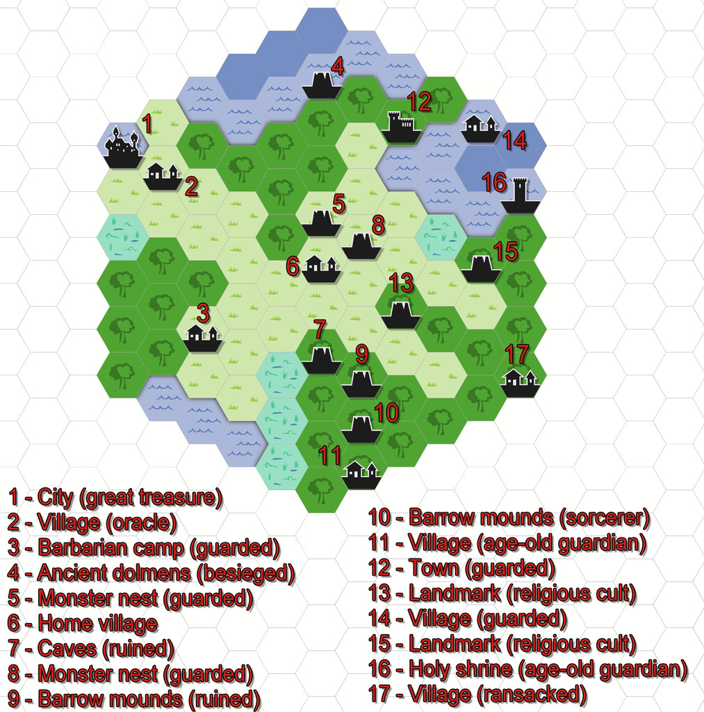
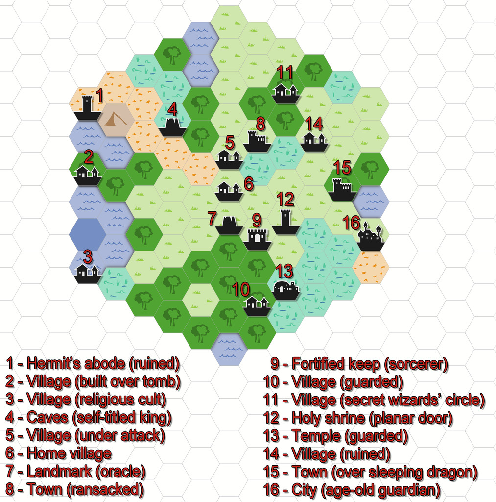
Last weekend, I did a couple of small test areas, to see how the system worked (hexes here are 6 miles in size), and although the system which will appear in the printed Core Rules has been tweaked a little since then, I prepared the maps in CC3+ through the week, to see how they'd look, using the 2010 Overland Hex style. These are the basic maps as generated by the random system rolls, with a list of their contents, and a separate key:


Comments
There's an obvious couple of problems here. One is there isn't a great enough diversity of symbols to cover even the fairly small range of non-settlement features that might be useful, and which only an expansion of the style (either by PF or personally) would solve. [There is a further issue here too, in that none of the location symbols actually work to the standard snap grids used in this Annual. I'm not sure if that may have been amended since I downloaded my copy, however. I ended up having to place most by eye alone, certainly.]
The other is that anything placed in a coastal hex looks as if it's really in the sea, because that's just how hex maps of this sort work. That though is something I could resolve. Plus as I'd been randomly rolling terrain up, I'd noticed there was no "Hills" option in the current ShadowDark tables, so decided to tweak that a little to include some.
So the maps, and additional keyed terrains, came to look like this:
All I did for the coasts was add a small section of land from each adjacent hex over the coastal sea.
The published maps and artwork for ShadowDark all tends to be black-and-white. I don't mean greyscale here, but sharply-contrasting black-and-white line hand-drawings. It would be good to have something similar for CC3+ (especially for dungeon-style maps, as the current CC black-and-white dungeon styles don't have sufficient bitmap options, or high enough symbol and bitmap resolutions, to look sufficiently clear and presentable - I did some tests for this too), particularly given the current popularity of OSR systems overall, which tend to favour this kind of map look in general. It is though easy enough to convert these maps to at least greyscale, simply by adding a suitable RGB Matrix Process effect to the whole map:
Oh, and a minor tweak to the colour of the lettering!
I remember those types of maps; common in Tunnels and Trolls for both overland and dungeons.
Yes. Mostly this black-and-white line drawing style happened because with offset litho printing (best option available back in the late '70s and early '80s), colour printing was somewhere between difficult to do well to prohibitively expensive, especially for publishers of fanzines. Plus such basic drawings needed less impressive artistic skills to hand-sketch, a further key element for those of us with limited to no artistic ability!
Nice work Wyvern!
I agree with you about the OSR style B&W style maps in CC3+, the resolution is not fantastic.
As you're talking about hex maps and such, above is a quick test I did for a hex dungeon using SS4. It can be done and resolves the pesky diagonal movement issues.
Thanks @jmabbott !
I tried playing around with some of the CA97 B&W drawing tools, fills and symbols, which is what made me realise that if only the resolution of some of the original images for the fills and symbols had been a lot better, it would have solved many of the current issues. Of course, whether the original drawings were of any higher res, I don't know. The style's about eight years old, so maybe we could suggest a makeover for it as a few others have had lately, especially given the current popularity of OSR systems overall. [Is that too subtle a hint? 😁]
It's interesting that hex maps never really caught on for dungeoneering. I recall one of my early close-acquaintance DMs used a clear plastic covered hex map and erasable marker pens to draw out key settings on the fly, but that was pretty much of a rarity (this was back in the very early 1980s). I think they have continued to appear from time to time, though quite rarely. Of course, as your drawing neatly illustrates, hexes do create the fresh problem of partial hexes - there's just no winning whatever we try 😉!
Although the ShadowDark dungeon maps use squares on the solid floors (only), which gives a sense of scale to the drawing and in use, the rules are deliberately very free-form-vague about distances overall, with just Close = 5 feet, Near = up to 30 feet and Far = within sight, which (finally!) pulls the game further away from its wargaming roots, of sometimes ridiculously precise needs for measurement on the tabletop.
Yeah, there’s issues no matter what you do. Re the partial hexes, I say PCs/NPCs can occupy half hexes but nothing smaller.
Not exactly a starter hexcrawl map, but it IS very definitely a hex map, of a flat world in the shape of a hex, no less; that for the Hyperborea RPG, which has just been announced as coming to KickStarter before the end of this month, in two options as a complete poster-sized map. In case this may be of interest, the KS preview page is here. Not cheap, of course, but it is quality stuff - and don't even get me started about the shipping costs... (They are what they are these days, sadly.)
There's certainly a lot of additional content available out there in PNG format that could be converted to CC3+ symbols for personal use, though it's less easy to find suitable black and white line-drawing content, and I'm not seeing anything that would fit to a typical overland Old School/ShadowDark style among the Digital Hexplorer items, certainly. The Worldographer mapping system by Inkwell Ideas has a lot of Old School style mapping icon packs available, as a more useful alternative in this regard, for instance.
As the CC3+ Overland Hex style (CA43) uses vector symbols, it's relatively easy to draw your own additional ones anyway, but it would be nice to see an official expansion/revision of the style, particularly given the recent upsurge in interest in Old School RPGs more generally. That's even more the case for the dungeon B&W style (CA97), as that uses raster images, which are much less easy to replicate.
I'd just like to add another vote for an update/upgrade to the CA97 OSR Annual Style. I'd like to make old school B&W battlemap printouts, and the CA97 has the perfect vibe for what I want to draw, but not quite the resolution to make really crispy prints.
I'd especially like to see an expansion of symbols for more outdoor maps for both wilderness and urban encounters.
I recently realized how cheap it is to print poster sized B&W on plain paper from a local printshop.
For $2.75 US I can get a B&W printout that will fill my six person game table. I'd love to have a nice generic, high-contrast, battlemap-friendly style for my go-to when I'm prepping my sessions.
Hello,
I know this is a older post, but I just found it.
I while back I was tinkering with the CC3 Overland Vector BW to make Hex Crawl maps.
I kind of gave up, but I think they would be great for a hex crawl maps.
That's certainly a fresh possibility, although having tried it out recently, I think the Annual 121 B&W Fantasy set provides a broader range of mapping options, given it's a normal style, and not hex-based, so you can fit symbols to the hexes, yet still have it look more naturalistic. It's what I used for my Whispering Wastes map at least. Even so, that style would benefit from expansion with a wider range of symbol options too (then again, we always want more symbols, don't we 😉?!).