

Looking for advice on coastlines and reliefs
 Timeskipper
Traveler
Timeskipper
Traveler
So, I started the map for the continent my campaing will take place in and hoo boy, it's sure overwhelming. This is the area the first chapter will be set in (the green-bordered kingdom and the archipelago).
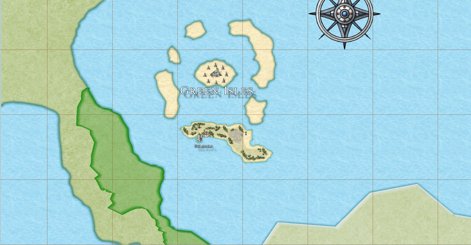
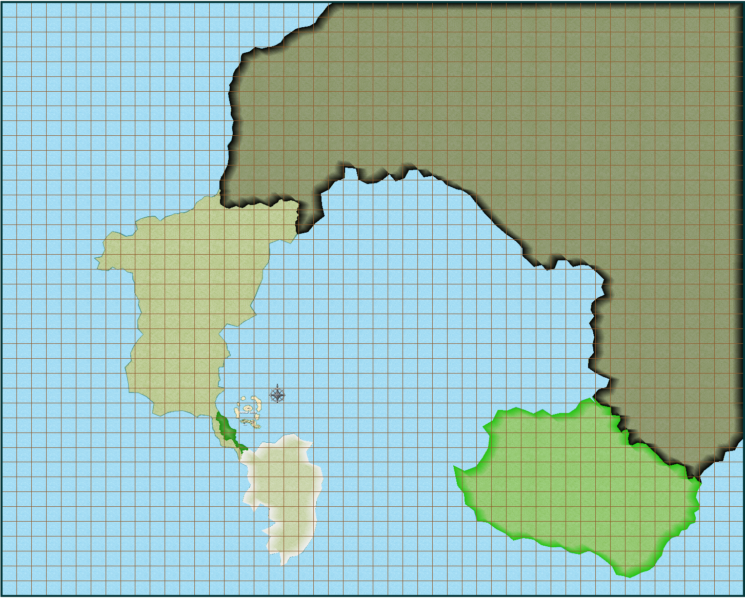
While this is the full world mapin its entirety.
Right now, I'm looking for advice on how to make the coastlines look good. I'm never fully satisfied with their look, and I'd love to have some advice on how to make them look defined but not intrusive. Any good advice? Similarly, I'd like a tip on how to make a mountain chain look convincing on the map, so that it doesn't look like a jumble of symbols.
Tagged:

Comments
That is quite a large area to cover, and quite a small scale of symbols you've chosen. That's enough to make anyone feel a bit overwhelmed.
It may be better to use larger symbols on this map and do a series of smaller regional maps showing just the archipelago or another smaller region as you explore the world. The world map doesn't need to have such an intense level of detail, so the symbols can be much more symbolic and much larger. If you have already tried the mountains their small size may be the reason they don't look their best. Try them larger, and if looking good means they are 3 or 4 times the size, then so be it. Set the default symbol scale to that new size and make a map with nice clear symbols on it - even if that means the mountains are hundreds of miles wide. They are symbols, not actual mountains. Each one may symbolise an entire range of mountains.
On the coastline question that really is a matter of taste. Where you are just at the beginning of your journey you won't have seen half the solutions, never mind know how to do them. I can see there are some existing sheet effects on the LAND sheet. Try adjusting them - again making them bigger might help quite a lot. At the moment they are barely visible.
Hmm, fair enough. I admit I chose such a huge scale because I was afraid I wouldn't be able to fit the detail I wanted into my islands and all the kingdoms.
I guess I constrained myself due to the idea that the black area was the majority of the continent, and the rest (the free nations) are a small fraction of what is left. Should I just delete the symbols and scale the map down? Or maybe I could cut out smaller regional parts of the map and make them into separate maps?
No need to change the map.
You can scale symbols by holding down the CTRL key and moving the cursor. That's the easiest way to work out what the best scale is. Once you've got a scale you like right click while you have a symbol on the cursor and a little dialog will show up. You will be able to see the scale of your symbol as it currently is in that box.
Then click the Drawing Properties button and modify the Default symbol scale to match that best scale, and you're all set to go. All the new symbols you paste in your map will be that scale (unless you change it manually using the CTRL key)
Very well. Another thing, how should I handle mountain chains and the like? Because I'm not sure if I should add a contour or not.
And in case I wanted more terrain textures, where can I find some good ones?
You can do contours if you like, but it's easier just to place the mountains in a line 2-3 mountains wide along the line of the range, starting at the top of the range and working down the map. Then place the hills here and there either side of the mountains to bring the elevation down to ground level more gradually.
Don't worry if you get them slightly out of order with one in front that should be at the back. You can use Sort Symbols in Map in the Symbols menu to sort them into the right order when you've done pasting them. The same applies to forests if you paste them as individual trees.
Once the mountain ranges are done there is a Mountain Background drawing tool you can use to draw a rough shape around them all to put a more rock-coloured texture beneath them.
There are lots of good fills in the Mike Schley overland style. It's got probably the largest range of terrain fills of any overland style. You can see them all if you open the Fill Style Properties dialog by clicking the active fill style in the top bar and then opening the dropbox in the dialog that appears. I think there are somewhere in the range of 25 or so in there, and that's a conservative estimate. You can use fills from other styles as you wish, though it is pretty difficult finding fills that match MS Overland as most are too dark in comparison.
As for the coastline, I am not sure why you don't like it. For me, it depends on what part of your map I am looking at. Some of it has very straight lines giving it a blocky appearance.
If you were to draw a new map, then make sure you are using the fractal land drawing tool. It looks like this is what you are doing and it is usually the default. When you are drawing sections, you can see how the coastline is going to look before setting it. If it is blocky like this, don't use it. Instead, hit the space bar and it will change it.
Additionally, I would probably make each segment smaller. You can increase or decrease the amount of fractalization by using the up and down arrows.
Another option is the fractalization tool. You can set the values on that and I would pick smooth instead of waves. Then use it on your coastline. I suspect that the long straight sections don't have any nodes on that line. If this is the case, it won't work as well. However, you can go and use the add node function and go to those straight lines and then add more nodes. Then use the tool. The nodes are what are moved when using the tool.
There is one potential downside when using the fractalization tool (I used to use this all the time). If you try to trace the coastline with say the terrain tool, it won't trace how the coast currently looks for some reason.
This is probably just a me problem, but I can get the style you are using (Mike Schley) to look good. I have scene some great maps, but this style all looks crappy when I try to make a map in it. For my taste, it requires a lot of micomanaging.
However, if I use a different style, especially those that have come out over the past ~4 years, they are so much easier to use. Things look great with little to no tweaking. The downside is that these styles have far fewer symbols. Another nice thing about alternative styles are the PDF walkthroughs. I have learned a lot from them. Things I have learned I use in other styles.
I've changed the general concept. I wasn't liking much the fact that the Lost Territories were so isolated from the rest of the continent, it didn't fit the story I wanted to tell. So, I remade it.
Oh, that's okay. The shape of the coastline is something I can take care of on my own, I've had a few tries at the fractalization tool and I like it, I'm experimenting with it a bit. My issue in truth was more about the outline of the landmass. I didn't like the thick, plain color default lines. But I think this new style with alpha blur and inner edge fade is unintrusive enough.
Just in case, may I ask what styles you recommend? And is it possible to convert a map to a different style entirely without having to redraw it? I can replace the symbols but I'd like to not have to remake the whole coastline...
@Timeskipper a lot depends on what you are looking for. Here is a link to all of the Annuals with images: https://forum.profantasy.com/discussion/10366/cartographers-annual-all-the-issues-linked-in-one-place
There are two main differences I can notice between older and new styles. The first is that the quality of the symbols and textures is better/higher resolution. The second is that these styles have significant sheet effects and they are usually set to be default when you start the map. Outside of style, these help make the maps look better to me with less effort. There are many older styles that I also think are great.
If I had to pick one style to replace the default style, it would likely be Spectrum Overland. It looks amazing and probably has the most symbol and terrain options of overland maps for Annuals.
Darklands is also nice, but not as many options. However, for this map style you are drawing the water instead of the land mass.
Herwin Wielink is an older style that I think everyone has access to with CC3+ (I might be wrong). It is a great older style that looks good with minimal fussing.
However, if you are looking for large overland maps where there is not going to be much detail, then I would suggest something like Jon Roberts Revisited.
Thank you! As for a way to replace the base assets with a different style in CC3+... is there one? Or would I have to manually change everything?
You can change the style by creating a new map in your chosen style of the same size and then copying and pasting the contents (excluding the background, screen and map border) into the new blank file*. This will give you a hybrid style with all the fills and symbols of the old style, but also all the fills and symbols of the new style.
Then the job becomes more manual. You will need to use change properties to switch the fills in your polygons, and the Symbol Manager to switch the old symbols for the new ones. Remy did a video of changing styles here: https://www.youtube.com/watch?v=uqMbXZJbscA
*There are other ways, but this is the one I use.
Thanks! I'll give it a try as soon as I have time!
Assuming you have not added much more to the map than what is posted, it might be faster and easier to simply start over.
Current state of the WIP! This is the world map (a bit zoomed in so you can't see everything but still should give you an idea of it)
And this is the starting region:
Please take this as an attempt at constructive criticism. The Kingdom of Amar and the Republic of Voryehn look to blocky to me. You can change this by increasing fractalization on your land masses. It will change the shape of the coastlines and you might have to adjust some of your symbols but your coastlines will look more natural. Plus are you using a bevel on the Lost Territories or just a glow? The bevel effect can add to the depth of your land masses better than a glow in my opinion. If you set it low enough it can also help with showing a more defined coastline. Just my two cents.
Yeah, they're the parts of the coastline I haven't gone over manually yet. I find the default fractalization in the program a little disappointing - maybe I need to change some numbers, but it doesn't feel like it makes for very realistic coastlines.
I haven't yet figured out how to use a bevel properly, tbh - I know it's supposed to make shadows, but I'm a bit... confused.
I've been using bevel lighted recently discovered that close in to a road and zoomed out, it looks way different.
So I go for a bevel that looks good at different zooms. Difficult at times.
Quick comparaison between bevel vs bevel-less:
This is with bevel (Length 5.7 map units, strength 30%, fade 90%).
This is the old version, with glow and inner edge fade.
Also, WIP of the western portion of the free kingdoms. I decided to populate the Maranean desert a bit more, and decided that the northwestern portion would still be in the Kingdom of Amar's territory, while the southwestern portion would be inaccessible badlands that were quickly lost. The entrance to the badlands is closed by two Amarian forts.
I think the bevel is cancelled out by the blue line. Is that another sheet effect or the coastline? Try hiding that blue to get a better idea of the bevel.
The best way to work out what effects work for the way you want your map to look is to play with them until you find the right combination.
Fractilization works with what you start with. If you start with long blocky lines, it isn't going to work very well with one application of the default values. Additionally, you need to check the smooth option. If not, it will still be pretty sharp.
I would try changing the dept to at least 2 and then click smooth. You may need to also apply the fracialization two or three times. Each time I would do a different random value.
It's not cancelled out but it's pretty subtle, might have to crank it up. The blue line is it the default Mike Schley Overland coastline.
I ended up manually fractalizing the coastlines. Probably more work than I should have, but in for a penny, in for a pound I guess.
I like your small little river system.
Thanks!
I was also trying to figure out how to give "wavy" borders to the landmasses like in this picture: https://forum.profantasy.com/profile/gallery/4615/Loopysue/67
I think what you are talking about is edge striping. That is a sheet effect you can add. However, if the style you are using does not have it, then you need to navigate to where the striping symbol is located. I think it is cc3/filters/images is where you can find them.
Thank you! I was wondering how edge striping worked.
I've experimented a bit and I've actually settled on a solution that I like for the coastline. All I needed was painting it a sandy yellow and applying a nice inner edge fade to make it look like a beach.
Now, I need to find a good texture for the edge striping. All the ones I've tried didn't look all that good...
The Edge Striping effect can be scaled if you edit the effect. That will make whichever one you use quite a lot bigger.
You can also make your own quite easily by opening one of the existing ones in GIMP or some similar bitmap editor and saving/exporting the png as a new filename.