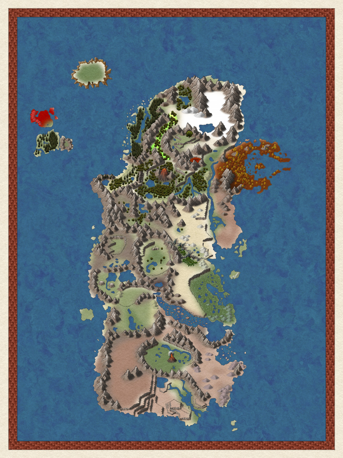
[WIP] Kalimdor
I am using Darklands style for this. I like the options of Spectrum, but I don't think it has the right feel. However, Darklands is missing a lot of options in comparison. I need snow covered mountains. I also need some more tree options.
I was going to wait until I was gone, but I have a decision to make with trees. I needed more jungle looking trees and the palms from Darkland just didn't feel right. So I used Spectrum. I think those work. But, there is also a place where I needed autumn trees. So I decided to go ahead and use Spectrum's trees for that. I think it looks fine, but I don't think it looks right with the other Darklands trees.
So before I go and add more forests, I need to decide if spectrums and darklands trees work together. If not, then I need to either delete the autumn trees or the darkland trees. If I remove the darkland trees I can just use spectrum. On the other hand, if I remove spectrums autumn trees, then I need to either leave the area blank or use an outside program to convert darkland trees into fall leaf colors.
Thoughts?


Comments
Try the varicolor mountains from Herwin Wielink Overland style. Not perfect but they do fit the feel of Darklands and the white look pretty good. Sample below
Thanks for the mountain suggestion. I almost went with that style for the whole map, but thought Darklands worked better. I will play around with those mountains.
Still not sure what to do about the trees.
Use both use the spectrum trees for the snowy areas and the darkland trees for the other areas and throw in some autumn spectrum where you think they would work. In my Endoria map I'm currently using symbols from 4 different styles even though the overall map is spectrum overland. Also using fills from multiple styles so consider using the snow fills from spectrum where you need them.
Her is a sample using spectrum, darklands and the HW together. And yes the terrain is the rusty metal from darklands. Thought it fit well for what I was trying to do for the area
I also like the de Rust mountains
This map is a gift, but I managed to sneakily get feedback on what trees were preferred. She preferred the spectrum trees, so I swapped them all out for that and made new trees spectrum.
The fissure was supposed to be filled with lava. I couldn't add a sheet over it and get it to look right so I switched to cliff and added lava. Not completely sure how I like the cliffs. I feel like I need some more jagged options.
I tried to blend the two style mountains together for the snow area. Not sure if it works I not.
So I've added text. So, what do you think? Text or not text? I'm a bit torn on if it looks better with it or not. If I leave the text, should I change any of it to look better? I am happy with the font, but not sure about the color or effects added.
I would reduce the font size and to me the white glow makes the text blurry. Mane change the text to a lighter color with a dark glow.
I think the map looks better with text.
Font size / color and effects look good, als long as the final map will be published as a larger image than the version here.
Better with text.
Looking at the comments above me, it looks like people have a bit of different opinions on the text size, but personally, I think the text size is fine for the current size of the map, but keep the actual display size of the final presentation of the map in mind when deciding the text size.
The final map size will be 24x18 inches printed at 300 ppi.
In relation to the text/map size, I'm assuming the larger the map the larger the font size needs to be?
Not necessarily. The idea with text is that it needs to be readable, so the larger the physical presentation, the smaller the text can be (in relation to the map, absolute font size will increase).
But there is also a certain decorative element in the text, which is lost if it becomes to small, so it is a tradeoff
The general rule is the larger the map the smaller you can get away with. To take extreme examples if you were going to print this as a postcard (A5) the font would possibly be a bit small. But if you were printing it on several rolls of wallpaper to paper a whole wall with it, each of those letters would be maybe a foot tall, obliterating much of the map with text you can read from the other end of the house.
EDIT: I was going to say a lot more, but Remy summed it up quite nicely before I got to it.
So this is likely the final version of the map. I've added the title. I was going to add a banner underneath it, but I think it might look better without it. I may still tweak the text a bit I suppose.
I think the text should be a bit larger. Otherwise great map !
Not the title, the rest of the text.