[WIP] August Competition - The Southern Gatehouse
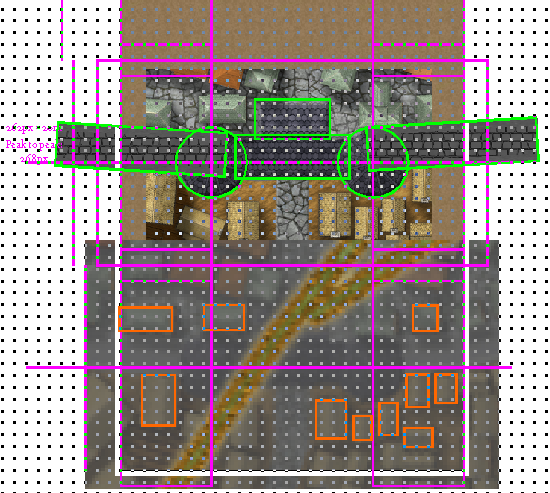
When I decided to enter the competition I said I would be taking the southern gatehouse. And while everyone else is posting very advanced progress pictures, I've spent most of the time figuring out which style to use, measuring, placing guides on top of the parent bitmap, thinking about the layout I want to achieve, and testing one drawing tool (I don't think it's visible, but if you manage to spot it, don't mind the acne... yet).
So, instead of exporting a render of my progress, I decided to screenshot my work area:
I sure hope I can finish this before the deadline. I expect once I get through the "planning" stage, I should advance more quickly.
Tagged:


Comments
Starting to take shape...
I think I got all the walls placed in a way that I like now...
Vacations are almost over. Luckily, I've been making good progress:
I really like having all the floors in one image. However, that's not ideal for sharing in this forum, so I'm also including individual floors:
Yup, I agree. Kind of what I'm going for actually. I guess some comments, clarifications, and... disclaimers (?) might be in order:
In my mind, the bunch of crates and barrels in floors one and two, would indeed be better if replaced with weapon racks and ammo. Either I don't have any such assets installed or I was too lazy while searching. I guess I could scourge thoroughly through all the assets to see if there's something I could use. I should add: I don't have the many community assets installed (Vintyri, CSUAC, Bogie, etc..) and, if possible, I'd rather not mix too many styles. Worth revisiting though.
The first floor has to have a stone floor for defense and structural reasons (did you notice the murder holes? ;) ). But now that you mention it, there's no reason for the towers to have stone floors except for the ground level, right?
I like the idea of changing the basement floor to some sort of dirt. I'll see what I can do.
Texture-wise, I do see why cobbles aren't a good choice for indoors. TBH I just looked for stone patterns in the base style and didn't find too many. But it's a great suggestion.
Finally, I expect filling in the currently empty room on level one will take me quite some time. Basically there are no ready-made symbols for what I have in mind (I'd rather not spoil it, but you've probably guessed it already) so I'll try to do it "by hand".
It looks like I won't have much time from this point forward, so my plan to build the winch mechanism "by hand" is unlikely to happen.
I did discover a ready-made winch in the examples for DD3:
And since a new Humble Bundle is out, I now have access to Munsons Mines. And that style does come with a few winch symbols:
Which winch style do you think fits best with the rest of the map?
The bottom one I think.
Yes, the bottom one.
Long time no WIP...
I haven't made much progress, but there's still a thing or two that you might notice:
Looking good :)
You seem to be having trouble with your labels. If you change the colour to the darkest grey, or the darkest brown, that speckling should disappear.
Yes, thanks!
I'm actually working on acne right now. :)
I had acne in many places. The labels are the most obvious, but even in these downscaled images, you can notice some in the ground level floors.
My original plan was to create an acne-removing layer, but changing color is far easier (especially if I later decide to move the text). I'll still need to use the intermediate layer trick for other stuff... but it's a lot more unlikely I'll need to move the floors than the text.
Oooh... I just noticed some strange shadow/masks on floor one.
I'm sure most of you noticed that I've "masked" the inaccessible areas in each of the floors. But I wasn't too convinced with using only a partially transparent fill:
I did quite a few tests, with different fills, hatches and one color-key effect that I didn't quite like. I think I'm settling with a scalable crosshatch on top of the 70% solid fill:
Thoughts?
I would use a white fill rather than black - say Solid white 20. (no need for transparency) Otherwise the map is just too dark. I have used a solid white fill rather than black because otherwise it made my maps too dark.
https://atlas.monsen.cc/atlas/ezrute/hi/drunken bear inn first floor.png
Yup. It does look better, thanks! I went for white 30 in the end:
... and here's the second floor, for your enjoyment:
Hm... now I'm thinking that on the ground floor is not so clear that it's an inaccessible area..
... maybe if I keep the crosshatch?
Then again, all floors are shown in the same image, so... I have to mull it over.
Not too fond of the crosshatch, looks a bit weird IMHO.
Also, looks a bit weird that the direction of the paving stones doesn't follow the direction of the wall, maybe angle them slightly to follow the wall direction.
Is it intentional to have the larger street-sized paving stones inside the two gate rooms at street level?
Not too fond of the crosshatch, looks a bit weird IMHO.
I'm not 100% convinced either, tbh. Luckily, I placed them in a layer of their own, so I can turn them off easily (at least while I think it through).
Maybe blur would do the trick?
Also, looks a bit weird that the direction of the paving stones doesn't follow the direction of the wall, maybe angle them slightly to follow the wall direction.
...
Could you align the paving stones on the top of the city wall walkways with the wall itself left and right of the towers? This should be possible by making them "Shade Only Copy" shaded polygons aligned to the outer edge.
Yeah, that's kind of in the bucket list. I don't know if I'll be able to finish on time.
Oh, and the city walls are not a polygon. They're a line. A very thick line. With an outline. And since there's no such thing (I think) as a shaded line, I'd have to redraw them. Not the most complicated thing, but I am short on time. Hopefully next weekend I can spare a couple hours to sit down and draw.
Is it intentional to have the larger street-sized paving stones inside the two gate rooms at street level?
Yes? At least originally.
I'm not sold either. It seemed reasonable when I first sketched it, but it does seem a bit weird.
The blur works well.
I wonder if I can insert an image from my gallery, so it can be displayed in a better resolution...
@roflo1 wrote:
I wonder if I can insert an image from my gallery, so it can be displayed in a better resolution
It's technically possible, but please don't. The restriction for image sizes in posts are due to many people browsing the forum either with a slow connection, or with limited data plan. When someone visits a post with an embedded image, they don't get a choice if they want to display it or not, which is why the large versions of the images should stay in the gallery which require a conscious choice to view. You can link to the image in the gallery from the post instead. (Just don't put the link on a line by itself, the forum post editor software takes that as a sign it should be embedded instead of linked.)
Got it.
Not on my computer right now, but I removed the image from my previous post.
All those interested can visit my gallery if they wish.
In the end, alinging the texture on the city wall's walkway was a lot faster that I expected.
First, I realized I could use Offset to convert the thick line into two of my polygon's sides. For the next step, I was starting to go through Line-to-path and then combine, when I realized I could draw a new poly and snap to endpoint.
Now I have to figure out what to do for a border. I don't like my first attempt above.
And I'm not used to borders. But I made the decision to place all floors in one drawing... and now I feel like it's begging for a border.
EDIT...
>> Is it intentional to have the larger street-sized paving stones inside the two gate rooms at street level?
Yes? At least originally.
I'm not sold either. It seemed reasonable when I first sketched it, but it does seem a bit weird.
Still mulling it over.
I think I don't want it to use neither the street paving nor the room paving.
Didn't like any of the border attempts I made.. Guess I'll leave it without a border.
Then again, we could call it a white border, right?
I'm running out of time, and I still want to "fix" a few small details (that probably aren't even visible in the image above, once the forum downscales it), but I'll fix them anyway.
There's still several other tweaks I'd like to do. Let's see how much I can accomplish.
Just turn the frame border off and crop to the image size, or change the screen color to black and crop just outside the image and have a plain black border.
What are your export settings? By that I mean how are you exporting it at the moment - are you doing rectangular exports where you pick the corners, or just letting CC3 decide the extent?
Just turn the frame border off and crop to the image size, or change the screen color to black and crop just outside the image and have a plain black border.
Thanks for the suggestion. I'll definitely try a plain black border. Might just be what I'm looking for.
What are your export settings? By that I mean how are you exporting it at the moment - are you doing rectangular exports where you pick the corners, or just letting CC3 decide the extent?
Uhmm.. I usually let CC3+ decide (when I want to export the full image), but... perhaps I didn't manage to convey what I meant: It's not that I'm having any sort of trouble with CC3+, my problem is that I'm not sure what to use as a border.
That, and the fact that I want to submit my entry today (since I'm pretty sure I won't have time tomorrow, let alone the 30th).
Ah, I see :)
I thought you were trying to get rid of the border.
Despite my effort (pickyness?) to keep all floors aligned with precision.. I managed to mess it up. LOL. As far as I can tell, this error is present even on my second post in this thread. But.. I fixed it.
And then, just as I was typing this message, I spotted a few minor mistakes. Fixed as well.
Anyway. I'm keeping the plain white border (not visible below, but you can check it in my post for the competition).
Thanks to all for your encouragement and feedback!
Didn't like any of the border attempts I made.. Guess I'll leave it without a border.
So, stand-by to repel borders, then? 😉
As for alignment issues and other minor mistakes, this is all very familiar territory! The worst ones are those you find only after you've submitted something, of course, usually after the map's been published somewhere...