Pen & wash question
 Lillhans
🖼️ 7 images Surveyor
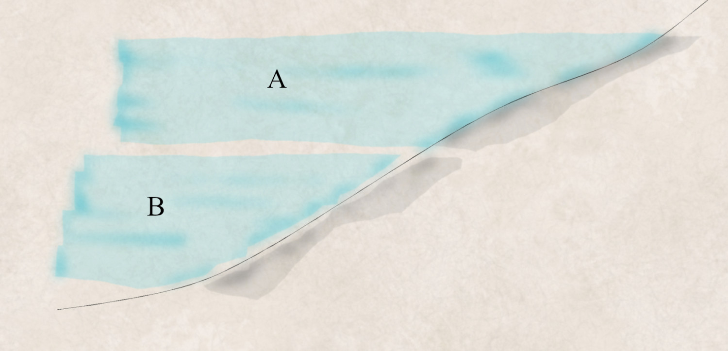
- How do you like your pen & wash paintings?9 votes
- A: Hug the line or it's not happening44.44%
- B: Embrace your inner Brunelleschi's Dome tourist pamphlet illustrator55.56%


Comments
Weeeelll,
For me, it's shades of grey. 😁
I like them both. Not much help, I'm afraid. Perhaps if I saw the examples in greater context.
Cal
Proably should have clarified it's for an encounter map....article! It's for an article. But also an encounter map. An article about an encounter map.
A real pen and ink wash almost completely ignores the lines. Well, they do when I paint that way. The way ink and wash was explained to me at art school was that the ink lines were the structure and detail, while the wash was an impression of the colours and shadows. So my interpretation of that is the ink is like a slightly scruffy technical drawing, and the ink wash is like a translucent dabby impressionist sketch.
So naturally - I prefer it that way. Sticking to the lines is for formal paintings that take weeks to complete and include every eyelash.
I voted for a because avoiding the line as shown in b makes it look like an overly cautious preschooler was doing the wash. I'd much rather see slop over the line than avoiding the line. A good color choice will enhance the line with the overlap.
Realistically, and much as Sue already said, if you're aiming for a hand-done pen and wash style illustration, it should look like a watercolour painting, where the wash sometimes covers the line, sometimes runs short of it. There isn't a voting option for that, and I really don't see this as an "either or" choice. So sometimes that'd be "A", sometimes "B", but more often a mix of both, with some additional overlap too.
My take away from the available online reference material is that it's kind of all over the place and very clean at the same time. Will have to see where it's going!
C: wine before, during, and after
I think it really depends on the final piece. In the example you posted, I want it touching the line. However, when I have seen art, it often looks better when it does not.
As with all art techniques, there are as many variations of ink and wash as there are artists who practice it. I googled it to pick up some examples, but really there are so many different individual styles that its just easier to paste the search.
Part of the time-sink is going down the rabbit hole of looking at pretty paintings for sure, @Loopysue . Then, once you have sort of started figuring out how to set up sheets it's eons of looking at pretty paintings again. Because that's what paintings are for, after all.
Then, you remeber how layers mean you could have at least sixteen different versions of the same map accounting for season, time of day and weather and around that time - "wouldn't ink and brown wash be just amazing?".
I think the core message of the article is perhaps not so much the time you pour into the map you make but the ones you don't.
And sheet effects that can go well together, of course!
Maaaaaaaaybe 😂
I notice how the lines are changing colour on you there.
Have you considered putting the colours as the background and multiplying everything else (paper and lines) over the top of them?
I am currently figuring out how to best achieve higher concentration as either the originating or end point of the imaginary paint application (assuming it's the coloured polygons you refer to!)
No. I was suggesting a rearrangement of the sheets. But I don't think it would work because your lines are too pale to not pick up the colour and go bright green or blue.
Which blend mode are you using?
Another possible solution is to put the lines on top of the colour and remove any transparency, but I think that would probably cause new and different issues.
Don't worry about it too much, Hans. I think I woke up in an extra nit-picky mood this morning. The effect you have achieved is something amazing as it is.
Is there any other way to wake up, @Loopysue? 😆
Lines are actually in front. They do have slight transparency though so that just might be it: my potato powered laptop isn't giving me the best on-screen feedback at all times so there is that...
The Blur distance of the colour sheets is short enough, I think, that a colour keyed cutout could dispel the issue. I am not relying on outer glow at all so the integrity of the colour field borders is not a factor- which leaves me thinking I might be better off with simply copying lines to the colour sheets as is.
It doesn't help when the package on the doorstep is 6 spray mops instead of the 3 recycing bins you ordered! LOL!
I don't think there is anything wrong with the colour sheets at all - a marvelous effect. I was thinking out loud about that extra colouration of the pale grey lines where they appear to have been turned quite bright blue in the water. Or... was that intended?
Please don't destroy your beautiful work!
Hmmm. I am entirely lost as to what pale gray lines, then. Screen shot and scribble?
(OR I WILL DESTROY IT! 😂)
These ones.
Are they meant to be that colour, or is the colour just an accident?
When I first looked at the drawing I thought they were meant to be grey like the other lines, but maybe I was wrong?
Aha! Yes those are colour rather than pen: I need to find a way to get the concentration of paint you get from brush pressure at the edge of strokes. EFI-ish only EFI pulls it off far too consistently.
Well, then - I was trying to solve a problem that didn't exist ;)
Is there any other way to solve problems?
It might help to start with a problem to solve, instead of none...
Pfft, nonsense: this addressed the fact that it, in fact, wasn't at all self-evident. I mean, it seems preferable that the visuals are able to speak for themselves. I wasn't too happy with the result, and it was confirmed I had good reason not to be. :)
I guess that's a good result then :)
I am going to go ahead and suggest that the bottom tree knows what's up, and that the rest could do with some online tutorials 😆
Well, it is easy to know what's up when you are at the bottom.
Only if you know that you're at the bottom. Not knowing is the cause of so many of the world's problems today.
I guess it was just a matter of time. Very happy with the lake, so far. Cliffs a bit meh, but it's a fun detour from the other...uhm..detour and that original project which I did set out to complete by year's end. So we're on schedule, after all!
Exploring wrought iron fences for a holiday-appropriate thing.
Which has the better line width, you think?
Hi!
Both very nice. I don't see much difference... Yet, I prefer A.