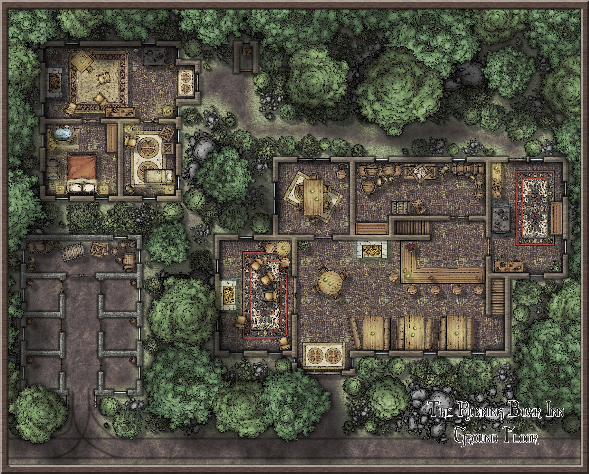
The Running Boar Inn (I think taverns might be my favorite thing :p)

Tried something a little different this time - I added a basement. I'm currently building an island kingdom for my first homebrew campaign, and this is the second inn for it.

From the outside, the mix of wood and stone walls are charming, and the warm atmosphere and enjoyment within can be felt from outside. The tavern is usually packed, with workers - lumberjacks - taking the larger tables, whilst the bar is occupied by people on the verge of having too much to drink, the most popular drink being Gavin's homemade Ashglade Mead. As this is the only tavern on the road between two villages, and located in the middle of a dense forest, it's a sight for sore weary adventurers and merchants alike. The bunk rooms are nearly always booked out, leaving guests with the choice of a more expensive room... or the basement! Nonetheless, The Running Boar caters for all people!

Comments

  • pixelkittehpixelkitteh Traveler
    edited May 2017
    First Floor. (whoops there's windows popping through the roof!! It's fixed now >_<)
  • Thank you JMunsonII :)
  • Another great inn. Love to see this, or others in the Atlas
  • @Quenten I'm making these particular one's for my personal campaign - BUT - I really do love them, and I think they could slot in great with the Atlas. So as long as no one minds that I'm using them for a double purpose, I will be submitting them to the Atlas as well :) when I get to the towns that is!
  • MonsenMonsen Administrator 🖼️ 81 images Cartographer
    Posted By: pixelkittehSo as long as no one minds that I'm using them for a double purpose
    Not at all. There is no reason to do double work if you can make a map that fits both the atlas and your personal campaign.


    That said, now that there are plenty of areas in the atlas to choose from, if someone wants to run their campaign in an area of the atlas, and reserve all mapping activity of that area to themselves (I fully understand that a GM wants some control), I would say that is certainly possible too, as long as the area isn't too large (no entire continents), and as long as that means several maps back to the atlas for others to enjoy. Then again, having others supply maps can certainly take away some of the burden.
  • DogtagDogtag Moderator, Betatester Traveler
    edited May 2017
    This is extraordinary, top-notch work. To say I'm impressed would be an understatement. Once again, I find myself thinking of the role playing — and possibly other types of encounters — these maps provide. You've quickly found your way around the different fills and symbols available in CC3. And you seem to have quickly developed your own style! I particularly like how you depicted the basement.

    Also, I'm a huge fan of Mike Schely's Symbol Set 4. I can totally envision these maps as featuring in the old Dungeon magazine.

    If I can offer two small critiques that I hope will help? First, it looks as though the roof over the outhouse is shaded in a fashion we might expect on a roof, but the other rooftops and overhangs do not appear to be shaded. If it helps, you may want to take a look at the Shaded Polygon commands. In particular, for roofs, you may want to look at Shaded Polygon (Angle by Edge). It not only shades fills so they appear to be sloped, it also rotates fills so they align with the polygon the way you want them to. Both commands are available by right-clicking the Polygon button on the right toolbar. If it helps, I also made a slightly long-winded, but hopefully helpful and entertaining, video tutorial about it.

    Second, it appears the fill on the stable and residence is scaled up a lot. Was that on purpose? It seems a bit jarring to my eyes. While it does not really diminish the beauty of the map, it does call attention to itself when I look at the map.

    And lastly, more of a question than a critique... is that a window behind the latrine in the outhouse? Yikes.

    Absolutely beautiful map overall. Great layout, fun details. Another real gem. *doffs cap*

    Thanks for sharing,
    ~Dogtag
  • Much better than the Inn I made in CC2.
  • This is a fantastic map. I like it all but one of the things that stood out to me was the shadows of the trees on the left hand side falling on the roof of the two side buildings. They are nice large shadows. Great work.
  • pixelkittehpixelkitteh Traveler
    edited May 2017
    Posted By: DogtagThis is extraordinary, top-notch work. To say I'm impressed would be an understatement. Once again, I find myself thinking of the role playing — and possibly other types of encounters — these maps provide. You've quickly found your way around the different fills and symbols available in CC3. And you seem to have quickly developed your own style! I particularly like how you depicted the basement.

    Also, I'm a huge fan of Mike Schely's Symbol Set 4. I can totally envision these maps as featuring in the oldDungeonmagazine.

    If I can offer two small critiques that I hope will help? First, it looks as though the roof over the outhouse is shaded in a fashion we might expect on a roof, but the other rooftops and overhangs do not appear to be shaded. If it helps, you may want to take a look at theShaded Polygoncommands. In particular, for roofs, you may want to look atShaded Polygon (Angle by Edge). It not only shades fills so they appear to be sloped, it also rotates fills so they align with the polygon the way you want them to. Both commands are available by right-clicking thePolygonbutton on the right toolbar. If it helps, I also made a slightly long-winded, but hopefully helpful and entertaining,video tutorialabout it.

    Second, it appears the fill on the stable and residence is scaled up a lot. Was that on purpose? It seems a bit jarring to my eyes. While it does not really diminish the beauty of the map, it does call attention to itself when I look at the map.

    And lastly, more of a question than a critique... is that awindowbehind the latrine in the outhouse? Yikes.

    Absolutely beautiful map overall. Great layout, fun details. Another real gem.*doffs cap*

    Thanks for sharing,
    ~Dogtag
    I'm crying with laughter about the latrine comment! Thanks for your critique, wonderfully helpful as always. The latrine roof is shaded because it's in the shadows of the trees and the other roofs are larger so they only got part of the shade, BUT this shaded polygon thing sounds interesting and I'll be having a go at that.

    The roofs were scaled up a lot yes... I really liked that style of roof but I had to scalexy to get it to fit over the area I wanted, unfortunately this made the texture... oversized. I'll see if I can fix it so it's a little less obvious.

    And finally, the latrine!! Hahaha!! oh my!! Ok so the second picture I forgot to remove all the windows, but in the first picture, yes, that is a window, let's just say it's one of those tiny slit windows up really high!

    Thank you again. :)
  • Posted By: Monsen
    Posted By: pixelkittehSo as long as no one minds that I'm using them for a double purpose
    Not at all. There is no reason to do double work if you can make a map that fits both the atlas and your personal campaign.


    That said, now that there are plenty of areas in the atlas to choose from, if someone wants to run their campaign in an area of the atlas, and reserve all mapping activity of that area to themselves (I fully understand that a GM wants some control), I would say that is certainly possible too, as long as the area isn't too large (no entire continents), and as long as that means several maps back to the atlas for others to enjoy. Then again, having others supply maps can certainly take away some of the burden.
    Excellent, I am more than happy for my maps to be shared, I would love to hear what adventures people come up with in them!
  • Posted By: JimPMuch better than the Inn I made in CC2.
    Haha no don't say that! Everyone has a different style and way of doing things and that is part of the reason I love this so much. Thank you for the comment. :)
    Posted By: warhoundThis is a fantastic map. I like it all but one of the things that stood out to me was the shadows of the trees on the left hand side falling on the roof of the two side buildings. They are nice large shadows. Great work.
    Thank you very much! I'm glad you noticed the trees shadows, it's one of my favorite details as well. :)
  • Well, my CC2 maps kinda look I tossed the maps and symbols into the air and then posted to my site what came down. Your's is far better. I working on improving my maps.
  • ScottAScottA Surveyor
    Once again, lovely attention to detail.
  • Posted By: JimPWell, my CC2 maps kinda look I tossed the maps and symbols into the air and then posted to my site what came down. Your's is far better. I working on improving my maps.
    We all just kinda toss symbols in until it looks good I think, I'm sure your maps are lovely!
    Posted By: ScottAOnce again, lovely attention to detail.
    Thank you :) the details really are the most fun part I think. A thick forest, a few crates stacked up, and a lantern on a table, make all the difference I think!
  • I haven't read everyone elses' comments yet- I love it!! I am envious of your skill! I just need more time.
  • Posted By: crb31I haven't read everyone elses' comments yet- I love it!! I am envious of your skill! I just need more time.
    Thank you ^_^ haven't seen any of your maps yet but I am certain you have plenty of skill, and we are always learning and improving!
  • Posted By: pixelkitteh
    Posted By: crb31I haven't read everyone elses' comments yet- I love it!! I am envious of your skill! I just need more time.
    Thank you ^_^ haven't seen any of your maps yet but I am certain you have plenty of skill, and we are always learning and improving!
    I haven't had that much time recently- I'm doing some fiction writing and CC3+ helps me visualize certain scenes. Some will start showing up as I try to figure things out- but seriously, if I was at a gaming table- real or virtual- and your map was plopped down...What a impression!
  • Posted By: HadrianVIGreat job!
    Thank you :) I'm very fond of this one I must admit!
Sign In or Register to comment.