

Path along the coast
 Fersus
🖼️ 11 images Surveyor
Fersus
🖼️ 11 images Surveyor
After a long hiatus I made a quick battlemap to get the juices flowing again.
I used transparency and drop shadows to make very quick shadows of the trees, although I'm not quite happy with the intersection of the drop shadow and the wall shadow of the treestumps.
The stranded ship is just a room with a wooden wall. This works quite ok, but I think there is some decoration missing to make it scream "ship"
Trying a thicker grid this time with a strong transparency effect, not sure if I like it yet. On screen it looks good, but let's see what my printer says tomorrow ^^
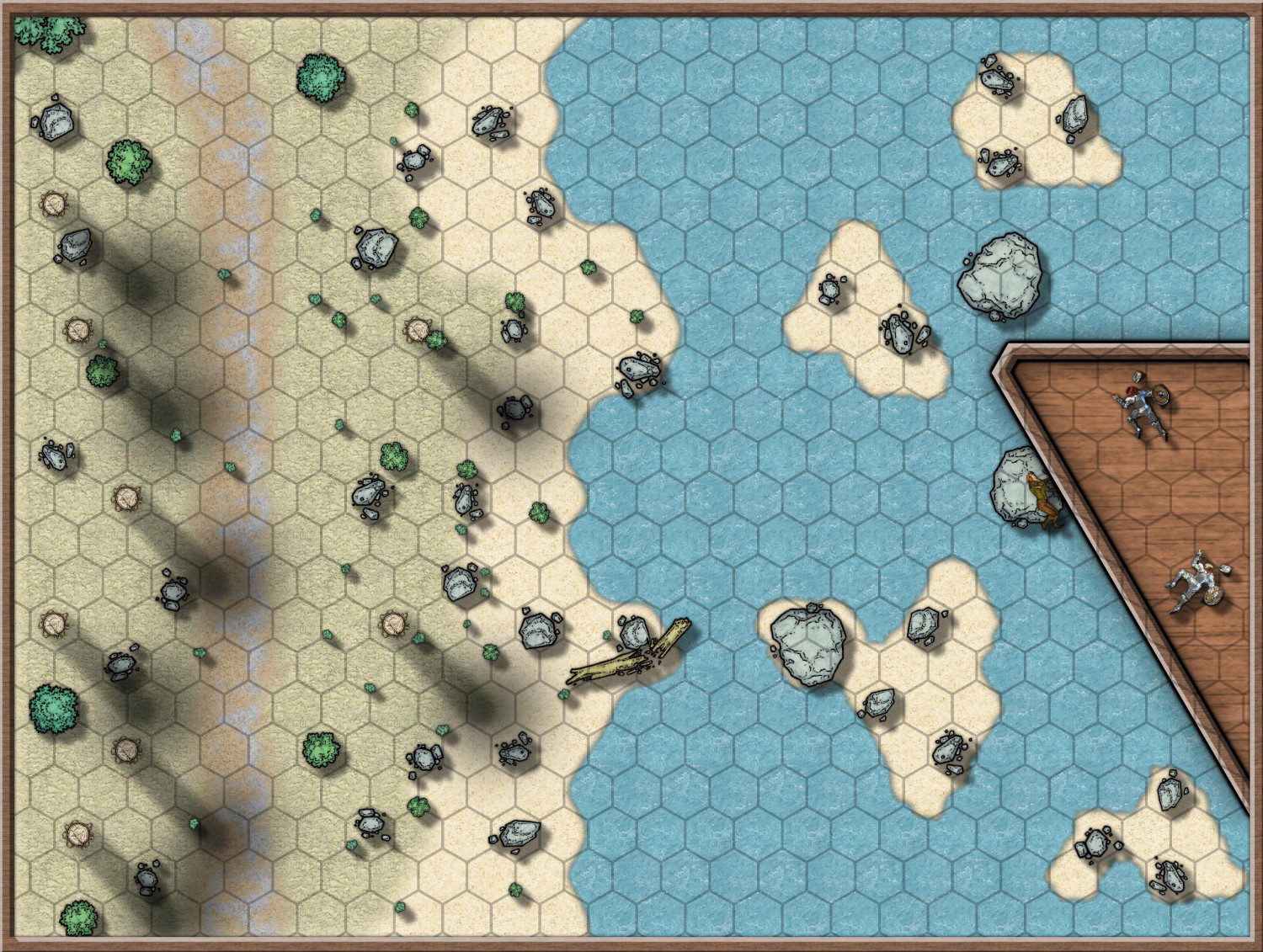
from my point of view, setting up a template months ago definitely paid off, the layout of the map was quickly done, the small sandbanks where just cut out with the color key effect. but my greates weakness, placing props to make the map interesting, got even worse with my long pause. I always think my maps either look bland, like here, or totally overcrowded...


Comments
Part 2:
This time with a proper ship deckplan template from the annual 172.
the upper and lower deck are placed in the cutouts on top. So the players can decide to either enter the shipwreck where the boulder tore the hull apart or to climb to the maindeck directly. the evil symbol painted in blood of the dead crew in the crew sleeping quarter on the top right does not bode well...
Things I'm still not 100% happy with:
I like it, but in answer to your questions:
...
I'm finding the alginment of the deck texture more distracting than anything else.
If you right click the Polygon tool on the right and pick 'Shaded Polygon (Angle by Edge)', then pick the edge of the deck polygon that you want the fill to be aligned with you can make those planks line up with the ship.
The second step is then to cancel the 'roof shading' of those aligned polygons (that's why it went dark looking), which you can do by typing EDITSHADING on your keyboard and picking one of them. This dialog appears. All you have to do then is check the little box called 'Shade only copy' and hit OK
I love the positioning of the rocks and bushes in the grid area, it's perfectly clear what could be an obstacle... or an advantage. Congratulations!😎
@Loopysue Thank you so much for this explanation! I did not like the planks as well and tried to adjust the fill png in gimp and then import it again. Which did not yield the desired effect, and thus I gave up on this. With this and your other suggestions it looks way better now! :)
@Ricko Hasche Thank you for your kind words! In fact this is the first rule of my design principles: Design the maps in a way that ambiguity is minimized as much as possible. I really dislike when a beautiful map is drawn, but it doesn't really align with a grid at all. So I avoid half filled hexes (and squares, but I vastly prefer hexes over squares for several reasons). That way, the work of clearing up ambiguity is done while creating the map and during the game itself we don't loose time because players have to ask how a bad alignment of the map and the grid is to be interpreted...
As you can see in the update above (now with the grid), it's hardly a problem, except when I have to cut through a hex. To remove ambiguity in those cases I place objects there, such as the cargo in the lower deck or the fittings on the main deck. that way it's either clear that this is occupied and the ambiguity is gone...
That looks really great now, Fersus :D
Thanks to you! :D