CC3+ Going back to the basics-Dungeon
 Kathleen Ann Cox
Surveyor
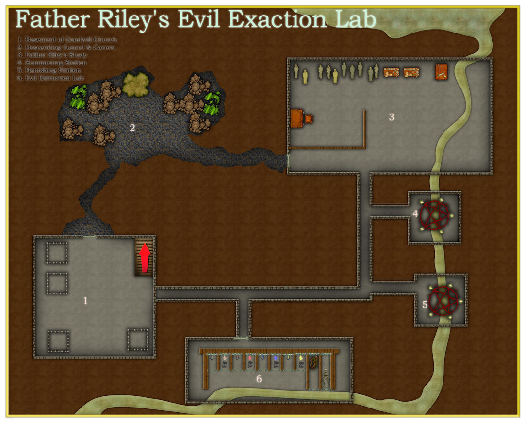
Welcome to Father Riley's Evil Extraction Lab!
This map is my first experimental map from the Dungeon Essential Guide. The map is super simple and not very good. I think the first big problem is my scaling from room to room. I was focused more on trying out the different features and not on having the map make sense. I also have to explore the room shapes and bitmaps for walls and floors more.
I removed the sun direction shadow effect on the walls because it make no sense to me in an underground location. I think lighting is waiting for me in more advanced tutorials. The readability of the text is awful, but I thought that is just something I will continue to work on in every map.
I really do kind of like the sludge river, especially when it passes under the pentagrams. I was probably influenced by the fact that I am playing in Descent to Avernus right now and I have the river Styx on the mind.
Location 6 inspired a plot for me. The dungeon trap symbol "Fire Blast" comes with a variable color version and so does "Gas." There is also a variable slime symbol that sort of looked liked the smoke in the Fire Blast symbol. So I thought what if this lab extracts the color from the black/dark? I thought about some sort of soul stealing, but then I thought maybe just the essence of evil (should such an essence exist). I probably need to rethink the design and structure of the lab but at least I got a first pass done of it.
Thus, NPC Father Riley was born. A good cleric who started out with the intention of extracting and eradicating evil and making the world a kinder, gentler place for all. Once a again, I think Avernus and the fall of Zariel must be influencing me. I haven't worked out all the details of Father Riley, but the idea for him came to while playing with the symbols. I have a feeling it hasn't turned out all sunshine and butterflies...
Does anyone else have stories come from maps instead of making maps to fit the ideas they already have?
I have dipped my toes in the dungeon making waters and as icky as they are, I am ready to dive a little deeper.
Oh, and I misspelled EXTRACTION. geez


Comments
But it has potential! :)
Oh man, I know someday I am going to love creating dungeons but today is not that day. If making maps is "play" for me, going from overland mapping to dungeons feels like going from Baldur's Gate to Dark Souls. The level of detail and precision required in making dungeons seems so much more intense and less forgiving of sloppiness and mistakes than the wide open spaces of overland spaces. groan
So I started the tutorial map for DD3 in Tome of Ultimate Mapping. My progress seems really slow, but I figure that is because I lack experience with the program. The focus of this post is making irregular shaped rooms in dungeons. Through the magic of a few tools, you can go from a purple haze of circles (see p. 281 for details).
to a nice new solid dungeon room:
In theory at least, as you can see I had some issues.
The Explode button is the main tool used here and I got it to work partially.
Since my reference material is published product for sale by ProFantasy, I am not sure how much detail I should pull from it for the posts, so I apologize for being a little vague (and a lot silly).
Mapmaker Sings the Blues
After some node breaking, path making, combining paths, and making a poly
I got to the end and stared at my folly.
I had rounded some walls, but the rectangle I made didn't want to mingle
and refused to hook up with the curvaceous new space and chose to say single.
---end---
Remy covers the need to flip endpoints so the joining process works. I am guessing the poly I made closed along the line along the east of the circles and did not include the rectangle, but I couldn't fix the problem. So instead of deleting the room, I deleted the rectangle and just went with the circular area and ended up with that mess in the southeastern wall.
Today, I am awed by Dungeon mappers everywhere and applaud you.
Oh dear!
I'm sure you will get the hang of it quicker than you think right now.
Have you thought of doing a bit of video research to help when the Tome and you don't see quite eye to eye? Joe Sweeney did a good short series on dungeon mapping here:
https://www.youtube.com/watch?v=Ekhz1CICTkM&list=PL1FFD4E50759762F1
PS - I know I shouldn't have because it's not really funny when people can't get things to work, but your blues did make me giggle - reminded me of my own first dungeon mapping experience ;)
Thanks Sue! As much as I whined, I learned some really nifty new things and had brief flickers of fun. Even though it was far from perfect, I also experienced a little thrill of accomplishment when I turned those circles into a room.
And you were supposed to giggle at the blues. Being silly is the way I stay sane sometimes.
I will check the video out right now.
@WVFaeryWoman As a frequent visitor to this forum, (Sadly I spend more time reading about mapping these days than I do mapping), I just want to express how much I have been enjoying these "Back to Basics" series of threads. Thank you so much for taking the time to document your progress and frustrations!
@KenM -Yay me! I just did my first mention/link here! Thank you for your kindness and encouragement. I am a little worried that this is becoming a blog and may not be appropriate content for this forum. I committed to this project (and the posting) because I have been so silly and stubborn about just wanting to figure the program out by trial and error and created harder and less successful work. I have no background in:
I am a words and story person for the most part, so thinking I would just magically be able to use the program without training was pretty naïve. Thank goodness the tool I picked up using this trial and error method wasn't a chainsaw!
And I kept my word to Sue and watched that little video series by Joe Sweeney and here is the map after saving to PDF and then converting to JPEG:
It's not real big or fancy, but it is doing everything I attempted to achieve with it. I just noticed the pillar underneath the wall near the bull. I put it on top of the wall to try and cover the slight gap at the connection point of my circle and then changed my mind but I didn't delete this one. The same gaps occurred in the southeast where I added the curves too. Joe's maps had these gaps too and I don't think he fixed them. I wonder if the process Remy uses in the Tome (which I think creates single entities of the floor and the walls using the explode button) has this problem.
A couple of the cool things I know now:
And here is something I stumbled upon which may or may not apply to anyone else's installation. When I clicked on the DD3 button, it removes the CD3 button. I get it back if I click the CC3+ button. But here's the interesting thing, when I was in the DD3 mode, I did not have access to the Print Wizard on the File Menu, but it also comes back when I click CC3+. Sometimes when I print to PDF, no matter what options I pick on the Print menu, I get a multi-page document, but the Print Wizard always gives me the single page map I want.
I am also having a problem with changing symbols types by clicking on the buttons. I figure this is related to installation of the programs, but the work around is easy enough so I am not worried about it at this time.
Try reinstalling the latest update. That should repair the menu files.
That's quite a huge step better than the first. Well done :)
I can see Joe's influence there - in fact I saw the large room and in the first split second I thought it was Joe's map!
I installed latest update and menus appear fixed, but but I have a problem and a couple of questions now.
When I open the program I get these three error messages:
I am guessing this is a Perspectives issue. The only perspectives version I have is PER3, so I don't know if installing it would help or not. I can "OK" through these and start the program, but how would I fix this issue?
I have the entire Profantasy Catalog including the annuals, but I have purposely only installed CC3+, DD3, and CD3 to help me focus on the basics for the time being. Should I reinstall the update every time I install an add-on?
Those errors means that the update thought you had perspectives installed, and installed a library from that extension. I thought that issue should have been fixed, but anyway, you can either install Per3, OR you can go into the CC3+ install directory (not the data directory) and delete the CC2Per.dll file in there.
@Monsen Thanks, I will probably just install PER3 and ignore it for now :).
I went back to Father Riley's Lab and I used a combination of the techniques in the Tome and Joe Sweeney's Videos to create the bubble rooms at the top. I think the main difference is that the floor is all one entity and the walls are too. In Joe's maps I ended up with several entities that looked okay. When I was almost done, I realized I wanted this to be at least three levels. Some aboveground and some underground. I figure there will be tutorials on multi-level dungeons, so I just closed out the map and will move on.
I haven't abandoned my quest, but I have been struggling with making the SS4 Dungeon example map. I am currently stuck on trying to create a wall mask because I can't get my trace to work because of the way I created my floors/walls.
I imagine everyone thought I gave up on my project, but I didn't. I have been working on a dungeon map based upon the guide for the Schley Dungeon Symbols (SS4) for about a month. In my experience so far, dungeon mapping is much more complicated and unforgiving than overland mapping. I kept running into problems executing what seemed simple tasks. I would put a window in a wall and it would work perfectly and then I would try to do it again on the same wall and the window would disappear. The program also crashed more in dungeon maps than in overland maps. The last few days, I finally seemed to have a breakthrough, but today as I finally tried to use lighting, the program crashed again.
I am posting the map at my last save, I lost quite a bit of work, but I do think I understand "wall mask" now and got it to work. Since I rarely created a dungeon map, I have never used lighting. I really want to learn how to do that, so that will be my focus when I go back to working on the map.
It looks pretty good, though there do seem to be a few artefacts of something not quite right around that join between the cave and the rooms beyond it.
Check that you haven't doubled up on the walls anywhere. That is the most common cause for windows and doors not cutting the wall as expected. If there are two walls the door/window will only cut one of them and then be hidden by the other.
Use List from the Info menu on a piece of suspect wall to find out how many walls are really there.
Thanks, Sue. I knew it was something like that. My commitment to following the guides to draw the example maps has kept me from skipping steps that I can't get to work or finding a work around and never learning the "right" way to do things. I have to admit that my struggles with dungeon mapping combined with my stubborn commitment to finish it according to the guide made me start to dread mapping instead of enjoying it. I am still glad I didn't give up and plan to continue working through the available guides and tutorials.
Hi Ya @WVFaeryWoman
Excellent series of maps and great progress. TBH, even though dungeon maps can be more problematic in some ways, I find them easier than overland and city maps. I think it's an issue of scaling; the vast majority of dungeon maps are drawn at a fixed scale of either 5 or 10ft grid square where an overland map can be anything. The default settings generally work OK for symbol size most of the time, but in the overland and city styles if you either have a much smaller or much larger map than the norm for the type, i.e a 3000 x 2400 city map or a 400 x 320 overland map to me the scaling is off, in that while it looks correct, it's hard to get a decent looking map for print, where you can't zoom in to see the detail...
Hi @jmabbott
Thanks for the compliments. Dungeons seems much more technical to me and just not nearly as pretty as an overland (or even city) map. I know my limitations using the program exacerbates this feeling. I still think I miss the aesthetics of overland maps. Dungeon maps take a lot of effort and time on my part but I am not currently creating them for any reason other than my desire to learn and to map. The same is true with overland maps, but I still feel like I have something beautiful and worth sharing after I am finished. It is like an overland map does not need to justify its existence or serve a purpose other than being something that speaks to me creatively and artistically. Yeah, I know that probably sounds weird.
Here is the newest incarnation of the map. I started over because I like the repetition to help remember what I am finally learning. The program crashed again as soon as I started playing with the dungeon lighting effect. It even crashed a second time when I was just trying to print to PDF it to show here, but third time is a charm. So if anyone has any idea why this might be happening or what is causing it, I would love to hear it.
The process of mapping the dungeon has inspired a Pony Express/Kingdom Courier service idea, but it is very rough. I have been fighting vampires in a video game lately, so my rebel smuggler den is now the home of something undead. I think the commander of the couriers may have an undead wife.
@Loopysue I am being much more careful with my walls/floors/etc. and I am having far fewer problems with wall features. When I do run into one, I have been able to fix it pretty fast. So thanks again!
So I realized it is much easier for me to learn the program if I have some goal I want to achieve. Well, I ran into a dungeon mapping goal that has obsessed me. I wanted to create a swamp battle map for a green hag scenario I am thinking of creating perhaps in the feywild. Unfortunately, I couldn't find anything that made me happy (I am still searching). But my desire motivated me to make a few symbols of my own and diddle with dungeon mapping. Below is the early result:
First, the symbols I am using are too nice and homey for what I what at the end. They are just placeholders to see how things look and work.
I learned about textures and blending and am still exploring it here. I just can't get my ground to get the swampy look I am looking for, but I'll continue to play with it.
I created the "treehouse" by tweaking and using existing program assets and then taking photos of giant tree slabs/slices. I erased the backgrounds, made them transparent, and ran a comic book sketch on them. I did a few more touch ups then I cut out the center areas to create a floor symbol and a wall symbol. I imported them into a drawing as symbols.
I built the treehouse by laying down the base tree with branches and leaves on its own sheet, then I put down the floor cut outs on the floor sheet, and finally added the outside of the tree to the walls sheet. I had pre-cut door openings in the walls symbols because I could not get the program to recognize the symbol as a wall entity and didn't auto break when I placed doors and windows (assuming the program isn't built to do that, but I could be wrong and plan to look into more later). The windows are just place on the wall features sheet which goes over the walls and even though there is no break, I think they look okay. The doors are on the same sheet so when I moved it, the doors no longer have that "embedded" look they are supposed to have, but I can live with it for right now.
I think the large stairs at the top look more integrated into the tree because it is on a lower sheet but placed where it is not completely covered. My idea for the second smaller set of stairs is to perhaps create a few symbols of leaves and branches to throw on top of it.
I think placing the wall features symbols is tricky because my tree walls don't seem to be recognized as walls even though they are on that sheet. I considered creating a second wall sheet and placing it over the wall sheet. I would draw a hidden wall on the wall sheet and then cover it with my wall tree symbol. I thought this might trick the behavior of the smart symbols to almost work with my tree wall.
Last, I am now at the point where I have to read the instructions and learn how to make a symbol catalog and drawing tool sets, I think. I have been able to add/change the draw tool settings, but I don't know how to give symbols settings about sheets and layers and stuff.
Excellent work :)
Unfortunately, bitmap symbols don't work as walls. You can't cut them in any way, so you would have to create your rooms with built-in doors and windows.
There are a couple of videos that might help with symbol catalogues here:
These links were borrowed from Remy Monsen's wall of video links. There are more videos there which might be of use to you either now or in the future.
Really liking the look of the tree interior, and how it's presented here.
@Loopysue Ah, this information is great Sue!
@Wyvern Here are the symbols I used to build the interior of the tree. You can see here where I made the premade cuts in the wall section, but it could have used better planning with the leafy tree base, I think. Tree slabs or slices come in so many shapes and colors I think an entire tree village could be created from them, but I am not sure I can get a unified feeling to it.
One possibility for doors (and maybe window shutters too) would be using the cut-out piece of the wooden wall AS the door or shutters, but placed angled-out a little to show there's a doorway there - while also indicating it looks like part of the tree trunk when it's shut.
This is beautiful work, WVFaeryWoman :)
If there is anything you want to know about as you continue to work on your new style, just ask...
Thanks @Loopysue for the compliment, encouragement, and offer of help.
@Wyvern I think that is a really wonderful idea and I will try it.
I am thinking of moving my work on this style to a new thread in Show and Tell because as I am so wont to do--I skipped from basics to more complicated dungeon goals because I got a finished piece in my head and this has turned into a mapping project.
I think I just figured out why my fill styles keep getting messed up when I don't change them. When I am creating maps and experimenting with them, I often do shortcuts or workarounds. One of the things I have a habit of doing is drawing something with a draw tool because I like the effects in it and then I change the bitmap to a tile I have imported. I just read one of Remy's posts about drawing tools and he mentioned they are all saved in their own files and you should never change the originals but make copies of them. My question is this: Does changing the bitmap after a draw tool has been used somehow alter the file? I wouldn't think so, but I am always having this issue and have to rerun the updater. This is TODAY's best guess from me as to why.
No, changing the entity in the drawing after creating it with the tool doesn't affect the original tool. The tools are only changed when you hit the advanced button in the select drawing tool dialog, and make some changes there and save them by hitting the save button, or just saying yes to saving changes in the popup.
Are you perhaps changing the map style using the dropdown in the drawing tools dialog? Only the tools that belong to the style will work properly (unless you manually import the required fills), all other tools will always look messed up.
I am going to have to keep track of everything I am doing and how I am doing it more carefully, but I may be changing the map styles. I also may have clicked yes to the save button thinking I could save to new after I made the changes when it prompts you to save the changes at the end of the process if that matters.
I was struggling with getting lighting to work when the Hollow Tree Style distracted me, so I went back to try to do it today. First try, it worked fine. The lighting isn't good but all I wanted to learn how to apply the effect and that goal was accomplished. Someday when I need it to accomplish something I want to do, I will play with improving it.
Dark Fantasy Overland Style (Annual #140)
The Ice Queen's Throne Room - WIP
The Ice Cave is a part of the Ultimate Mapping Guide's Dungeon Tutorials.