Looking for a style to match Paizo
Hi,
I'm new to using CC3. Up to now I've been mostly mapping for use on VTTs using tile sets and some editing in photopea. I wanted more control over my maps so I got CC3, but I want my homemade maps to match the style of the published maps I'm also using.
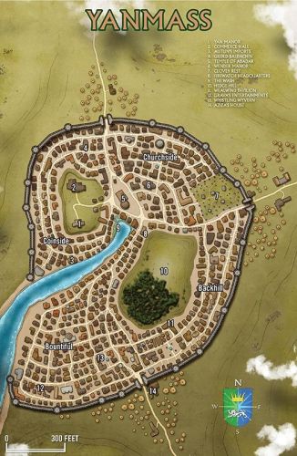
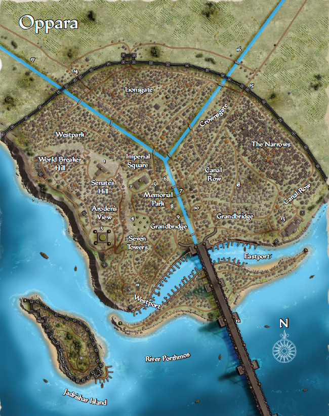
So, any suggestions for how to match the maps below? I started with CD3B and I'm pretty happy overall, but I'm having a hard time getting the right look for the water, walls, and trees.


Comments
Hi there and welcome. I'm confused, these are the published maps you want to emulate or the ones you've drawn?
Thanks!
Sorry, these are the ones I'm trying to emulate!
Hi Joe :)
Please can we see one of your maps so we can focus on the aspects of what you feel you need to change?
Ok, the only one I've made significant progress on is the water. I'm pretty happy with it, but the darker tone blue along the coast looks too uniform, and I want to add some spots of highlight throughout to add more variablity.
I'm using the watercolor style from one of the annuals, so lots of layers with variable transparency. That uniform blue is the result of an Edge Fade, Inner with opacity reversed.
Brighter patches for areas with houses seems the way to go - depending on what colours you bring in for the houses of course. You may want to go Blur only for those Sheets: if the polygon is small, EFI will do weird, sharp bits where edges are too close to one another.
Walls I would probably do myself using circle and box tools.
So the bright gray here is the circle and box, respectively, which I gave a polygon contor and a splash of darker gray for variations. Easy enough to multiply strips of the same width for the wall and then the same with towers.
For crenellations I would probably then proceed to pick a bright gray for a line of the appropriate thickness and a set up dotted pattern to my liking:
So end result being something like this in this particular instance. Colour mileage may vary, of course :)
Edit: used an appropriate width with circle and line tools respectively when superimposing the dotted contour.
I'll give that a shot, Lillhans, thanks!
How can I get the dotted line to scale as I scroll out? It seems no matter what options I have checked, the dashes change depending on scale.
@Joe Jerolimo You have to change the "paper scale" for your line style. Remy explains it in this video (link jumps to 1:07:12 for convenience):
https://youtu.be/6y-kQ6XDsDU?t=4032
I need to bring the light grey darker, and dark grey lighter, but I'm overall happy with the outcome!
Now I just need to get the vegetation and water effects. Maybe a fill bitmap with open spaces? Not sure.
I'd start off with Fractal Circles of a darker tone. Once you have cranked up the fractal count you can stamp random iterations real quick, Ctrl+Scrolling for size adjustments as you go:
I'd then dot them, similarly, with a brighter green:
...and perhaps run Straight-To-Smooth and throw in a third colour for the foliage, also adding a brown patch on the ground, just because:
The undergrowth admittedly makes for a bit of an effort, if done similarly, but there you may opt to simply have individual dots towards the edge of the patch - as opposed to make the entire patch out of individual dots, like the below example.
Patches of trees could, of course, be done that way too: one polygon for the bulk of the body and then individuals for the edge/canopies.
Water's a little trickier (I can't really see what they do in the Oppara map for instance). I forget what the sheets are called in the Annual but I could use a high EFI and transparency sheet for tone shifts in the water (using a brighter blue) also throwing in fractal lines as wave-stuff.
Colour of the wave-stuff fractal line would of course make it more or less prominent depending on the pick. For depth variation, you could simply use a darker blue on a sheet with a slightly lower EFI - to distinguish from surface colour shifts.
Shoreline? Well, that's just anybody's guess I reckon 😆
Again, not sure this is in keeping with the Paizo details but it's - to some extent at least- consistent with the the vegetation.
I guess there's no shortcut for what I want there. Oh well
Ran into another issue. I had buildings in a style I liked, but I made it from a different template. I tried to use that style in this map and it's not working. I imported the bitmaps, but the roofs keep appearing as solid varicolor. Not even the ridges are showing up! Something weird must be going on, but I don't know what.
Figured it out! I had copied and pasted the bitmap into a separate folder, and the one I selected in the house style was linking back to the original file. Renamed it, and now I'm all set!
Note that unless you actually edit the actual bitmaps to make your own variation of the originals, you shouldn't copy the official files to other folders. That's just going to put in into trouble the next time you are viewing the map on a new computer since you will also need to recreate your copied folders exactly as before as well, instead of just relying on the installer putting things right (and it will also prevent others opening the map properly if you ever give someone the map file.)