WIP - Rise of the Runelords: The Rusty Dragon.
 Raiko
🖼️ 32 images Surveyor
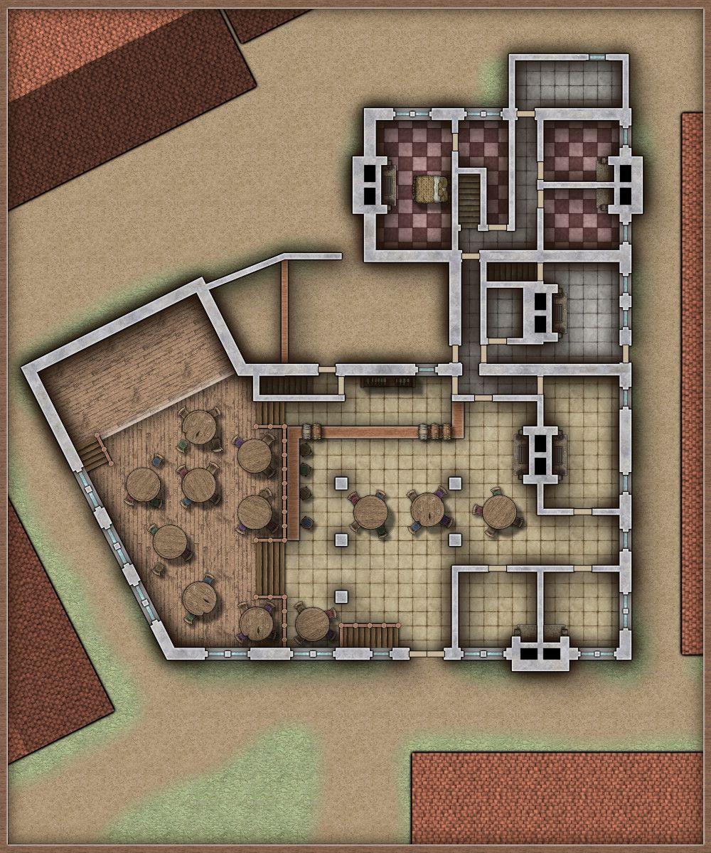
The Rusty Dragon is the most famous, and perhaps the best inn / tavern in the town of Sandpoint - the starting location of the Pathfinder campaign "Rise of the Runelords." It's normally the home for the adventurers whenever they are in Sandpoint.
I have an official version of the floorplan for The Rusty Dragon, from the Sandpoint sourcebook / guide, but when re-doing it in CC3, I wasn't happy with a few things. So in this case, I'm taking the general shape and a mixture of the layout of the provided map and the written descriptions that existed before that map. The awkward shape of the building means that this is version 3, and the first time I'm happy with the layout.
Here is a first export of the ground floor, there's quite a lot of work still to do, I just wanted to see how things were looking outside CC3.
The Rusty Dragon - Ground Floor (work in progress).
As usual, textures are from SS4, Jon Roberts and DD3.
Symbols are from SS2B, SS4, Forgotten Adventures and Tom Carto.
I have an official version of the floorplan for The Rusty Dragon, from the Sandpoint sourcebook / guide, but when re-doing it in CC3, I wasn't happy with a few things. So in this case, I'm taking the general shape and a mixture of the layout of the provided map and the written descriptions that existed before that map. The awkward shape of the building means that this is version 3, and the first time I'm happy with the layout.
Here is a first export of the ground floor, there's quite a lot of work still to do, I just wanted to see how things were looking outside CC3.
The Rusty Dragon - Ground Floor (work in progress).

As usual, textures are from SS4, Jon Roberts and DD3.
Symbols are from SS2B, SS4, Forgotten Adventures and Tom Carto.
Tagged:




Comments
Should answer most of Dalton's questions. The building to the right is the "Goblin Squash Stables," the owner of the Rusty Dragon has an arrangement with the stable owner, so that's the horses taken care of.
Upper floor and cellar coming soon, although not actually as important to my gameplay as the ground floor, so maybe not until I've finished the Catacombs of Wrath map.
I'll probably provide a key to these maps, as my map differs from the official Paizo one and theirs doesn't provide any key or room labels anyway.
Is there a particular reason all the fireplaces have double flues (even where there's only one fireplace on the wall)? Appreciating that may be simply something from the original (which I've not seen), of course!
The plan was to start the upper floor map with copies of all the double chimneys, and then edit the ground floor ones.
But I'm not really happy with the look of the fireplaces anyway, I'm meaning to have a go at making all the chimneys & fires look better, so they're sort of placeholders I suppose.
The original map doesn't actually have any fireplaces or chimneys at all, except for one in the kitchen - which is in a different place in that map. That was one of the things that I disliked about the official map.
It's the second best inn/tavern in Sandpoint (of four I think) and serves the best food, with the best inn being too posh for the average adventurer or local. Story-wise I'd say it's the most well know occupied building on the "Lost Coast" (the region of Varisia in which Sandpoint is the largest settlement).
The bunkroom is a common-room/dormitory for guests who don't want to pay for private room, or cannot afford one. The private guest rooms are upstairs.
The parlours are snugs, most large old pubs in England have them (ie the ones that used to be coaching inns), and Aragorn takes the Hobbits into one at the Prancing Pony. I've left them in the same place as they appear in the official map - though that had three rather than two.
There are only two permanent staff at the Rusty Dragon (regardless of how realistic that may be), Amiko and her cook/maid (a very busy Halfling lady called Bethana).
Bethana, lives in one of the small family bedrooms, which is perfectly fine; it's established in the story that she is more than just staff. The second small family room is unoccupied, or used for private guests of Amiko. This has made me realise that perhaps I should swap-out the furniture in Bethana's room for child/Halfling sized furniture.
Normally such an inn would need more than the two of them though, and it does say that Amiko hires in additional staff during busy times and festivals, so I will at an attic with dusty disused servants rooms. There is no attic detailed in the original plan, but I'd been considering adding one anyway - if only to be able to add the huge metal dragon statue that Amiko's got on her roof!
I like the look of the walls and chimneys better now, so I'll stick with this style.
Click for higher res version from my gallery.
Maybe not the best place to have the hole in the ground arrangements - right next to the well like that, but a good map :)
New day, work stress out of the way for now, so trying again.
@Loopysue Thanks! And that's a good point, the outside privies didn't exist in the original, and neither did the well.
I'll probably remove the well entirely - or put it outside the inn - and move the privy to where the well is currently. That moves it further away from the owner's room (and the guest rooms above).
@DaltonSpence, thanks again for the tips.
You've mentioned the bar stools a couple of times, but standing at the bar is normal where I live - especially at busy pubs. The Rusty Dragon is very busy at night, so that's a standing area - and also used by the busy halfling to carry hot food through.
I agree about the thinner walls, but I'm probably going to leave them as they are for now and print them that way for my game with the kids. I like the look, so I'll get around to making nice looking wooden walls on a map where it's more important. I might tweak them later on, as I'm hoping to revive my Rise of the Runelords game with my old tabletop group via VTT soon.
Also agree that the extension/outbuilding is probably a poor choice for the bath, but it's there in the original so I'll leave it - I doubt my kids will bother (or my grown up group for that matter).
The water is filled / topped up with kettles / jugs / cauldrons heated over the fires and carried in - as were medieval baths (in this part of Europe anyway). I guess Bethana the busy Halfling just needs to fetch more jugs during the winter.
As for waste water, I don't know. I guess I could add a drain in the floor of the outhouse and then forget about it....
How did medieval inns with no sewers deal with the dirty water if someone had a bath?
Me too, I've not decided whether to add that kind of thing, but I might do.
The exterior looks okay for my purposes already, but if I add any more detail, then wagon tracks would be one of things that I add.
I didn't think it was rude :)
Ditto.
Not quite finished, so I've posted in the WIP thread.
I need to find some flame symbols that I'm happy with to add to the fires, and then maybe add a couple of additional exterior lanterns, away from the inn.
Once the night map is finished, I'll tweak the day one to include the lanterns, etc.
I'm using my uppermost WALL sheet as the Wall Shadow Point Light Setup sheet, as that's got gaps for the windows, and then I'm also that effect on my symbols doors sheet, but the walls are illuminated even though they're the shadow casting entities.
I don't like how much the chimneys glow, but this happens even if I use my lower WALLS SHADOW sheet instead (higher on the sheet list).
Is the only way to remove the glowing chimneys to duplicate the walls sheet above the sheet with the Wall Shadow, Point Light Finalize effect (ie later on the sheet list)?
I had this issue with my own recent lit dungeon map, and solved it by duplicating the WALLS sheet, naming it WALL CAPS, and moving it above the lighting setup to hide the tops of the lit walls.
I then added an RGB Matrix Process to dim the colour of the copied walls to be the same as if it was still within the lighting setup. In this case I had used 35% shadow opacity in the Global Sun settings, so I set the Unity matrix to .35 instead of 1 all down the diagonal.
If I hide the WALLS CAP sheet I have the same issue as you do.
In fact I have it even more than you do, since the orange lights mix with each other over the tops of the walls and produce a strange green glow.
Only put the walls on the WALL CAPS sheet, since things like windows and doors are symbols and are not dimmed by the RGB Matrix Process. So they just look really odd.
Well it just looked odd with the capping all bright like it was daylight ;)
An RGB Process Matrix works better than an HSL in this case.
I think I'm happy with the night time map now, so I'll get back to my next map.
Oh yes - that looks more convincingly 'lit' doesn't it :)