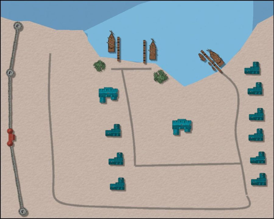
YAWIP: Sea Star, a Dark city seaport
 JimP
🖼️ 280 images Departed Legend - Rest in Peace
Started this, this morning... I was going to go shopping, but my allergies decided to let me known Hurricane Ida hadn't forgotten me. Rain washed out the pollen from the air, dampness brought the mold and pollen back. Me sneezing through the store would likely upset folks, so I came home and started this.
Seaport part of a city. Since it is a seaport, I went for dark blue, instead of black buildings.
Anyway, here is the very preliminary map. This will eventually go up on my Old Crestar site, on an island I hadn't really placed any detail on before.
900 pixel jpg, 2000 in gallery.


Comments
The YAWIP stands for Yet Another Work in Progress. In between sneezing and wheezing, I think I'll stop on this map.
900 pixel jpg, 2000 in gallery. B is barracks, S are sailors' stores, things like harpoons, nets, hammocks, etc.
The small houses could be first and second mate homes, and/or officers of the town watch or the wall guards.
The longer docks on the right belong to the richer merchant family, who also have 3 smaller coastal boats for trade.
Two of the roads go further into the city, and sailors tend to stand around, if looking for shipboard work, and tell travelers that their part of town is further inland away from the docks. The town watch makes sure no rough stuff happens.
My Internet is trying to flake out.
Here is a bit, further inland.
I was going to put an Inn with stables in there from CD3 Vector Classic, but decided not to.
Oh, not so much detail as folks on another forum wanted less, so they could add things in for their campaign world.
This will be going up on my Old Crestar site.
Think I'll start over on the main map, larger, and use the lack of detail one for Old Crestar.
Any suggestions on where to but a more detailed version in the Atlas ?
I think this looks a bit better, and I changed some of the effects, glow, on the water.
Added some text and buildings.
Have you tried making the coastline smooth? Looks a bit harsh in the corners me thinks.
I'll look at it later, busy afternoon.
But the coastline bothered me to. I was thinking of a 5 depth fractal. Maybe a 10 depth.
Looks like my web host is down. Hopefully it isn't hacked again.
Looks like servers at my web host are coming back up.
That is the seaport area. The town is larger. I'll be adding more city squares to Sea Star.
Here is a smooth coastline.
I'll check and see it the map I posted on September 12 still matches this updated seaport map. If not, I'll redo it.
Jim, can I suggest the left hand tower be resited so as to meet the coast, and perhaps be as big as the right hand one.
Also, I prefer city dwellings to be closer together and more numerous, but that is your choice. When a wall was constructed, land within became a premium, and so people built up, rather than had a lot of space around them.
This is just the seaport area, there are more parts to the city.
My feeling is that if the towers are too close to the ocean, they will be undermined by wave action. But I can make it larger.
Here we go. I think this will be the seaport area, just ignore the other versions.
This is a preliminary map part 2 of the city. I think I'll expand it out next maps will be 3 across, connecting to just this one.
I used some symbols from Fantasy City annual. I don't like a city that is too dark. The main evil city on my game world has some bright color buildings.
I hadn't thought about that.
How is this ? Upper left, I'll change the upper right if this looks good.
Forgot to add in shadows.
Yea, that looks pretty good. The foamy sea fill has some oddities though. Does it have a drop shadow?
The foamy water textures should all be on the sheet called "WATER flow patterns", which has a generous edge fade inner effect and a blend mode on it.
I moved it. I put the shadows on the rocks under the tower and wall.
But now I can barely see the sea foam. Some places the DDG I was stationed on, the sea foam was more obvious. That is in port.
This is with edge width at 20 units and opacity at 70%. It was at 40 and 50%.
That looks a lot better :)
In that top right of your map, get those sea nodes outside the map border a bit so you don't get that weird edge cause by the smooth poly.
Okay, I'll work on that Saturday.
This map is getting better each time. I agree with Dalton - but perhaps a pebble beack like those pesky english beaches.
And I still think you should make the houses more crowded, with bigger ware houses (and room at the back to manouvre) near or at the seafront.