[WIP, Feedback Requested] Practice by mapping Glorantha
 Nevermet
🖼️ 11 images Traveler
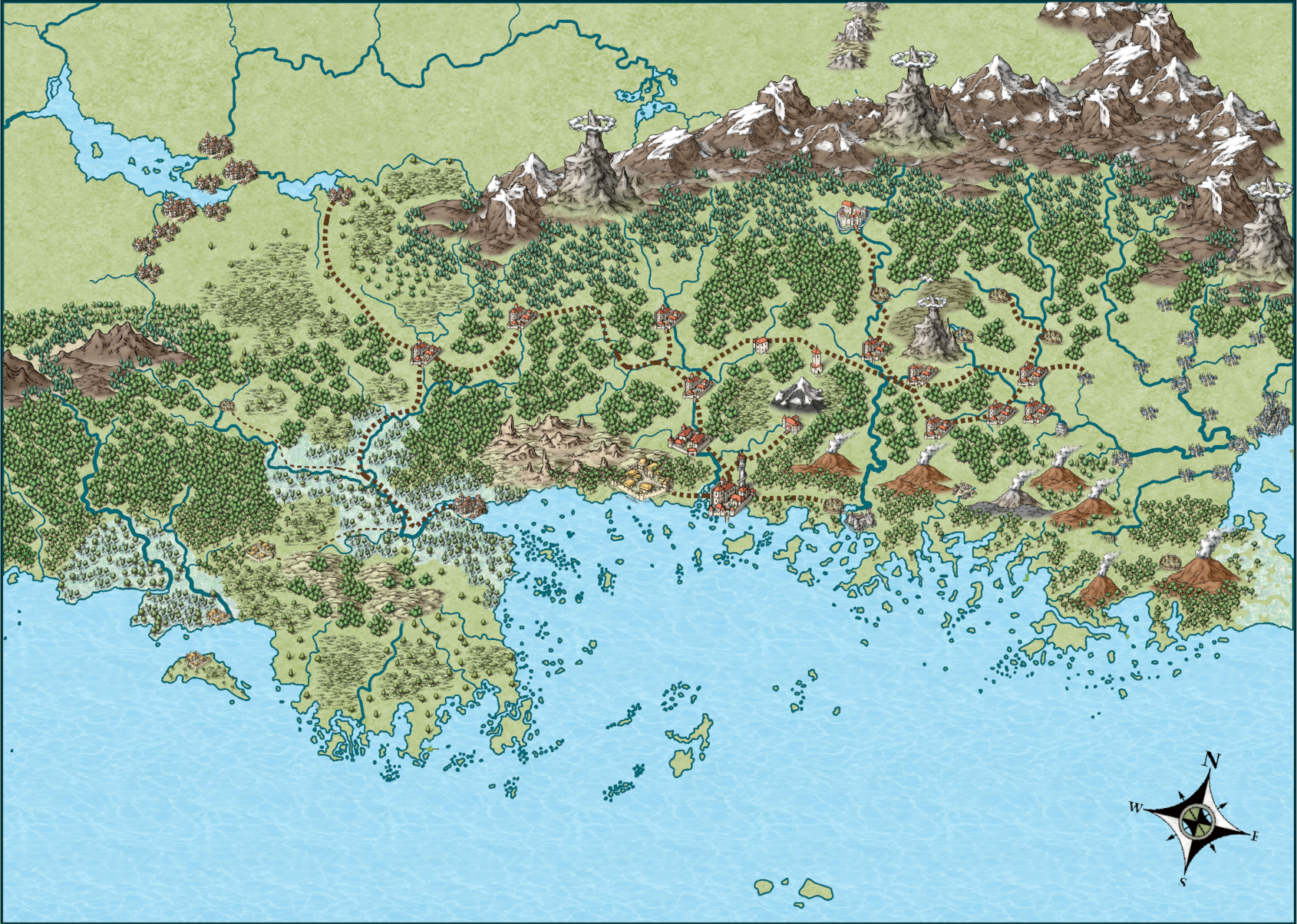
A few weeks ago, I started learning CC3+ by reading the manual and doing tutorials. I also decided that I was going to practice by trying to make a map of Maniria, a relatively out of the way part of the RPG setting Glorantha that is about 700 km across.
The resulting map is, IMHO, a bit busy, but I'm not 100% sure how to improve it. I'm literally so new to CC3+ still, I don't know how to identify what I'm doing wrong lol. So.... I humbly request any comments at all. What isn't working? Why isn't it working? What would work better?
Thanks in advance.


Comments
That's an excellent first map, Nevermet!
I look on it as interesting and absorbing more than crowded.
Thanks :)
The problem is that I would ideally want a map where you can quickly identify the communities (especially those in the center of the map), the rivers, and the trade route. I'm still working on how to emphasize those things.
Also, for reference, here is the map I'm building from. It is from 6 pages that I stitched together in GIMP:
Now, for each individual page, that map works fine. But trying to take it all in with this level of detail is a bit much. Beyond just practice, I wanted to work on making a map that was more "readable" at this scale, assuming it would all be on a screen at once, or possibly printed out.
I guess I should have said that, but I didn't fully realize it: I want certain details (especially settlements, rivers, & roads) to be easily readable while looking at the entire map. Also, I want a pony lol
The art of cartography is abstraction. Showing just the details that are important for the purpose of the map and the medium in which it's done is tough work and takes a lot of practice.
One thing you could play with is adding sheet effects to the trees and land textures that desaturate them a bit. The Schley style is bright and colorful and by making those things a bit less saturated it might help them fade into a background while the rest that is bright becomes a foreground.
Thanks JSLayton for the succinct statement!
And thanks DoubleDouble, I will try that.
You might alternatively try adding a Glow Effect to your settlements, roads and rivers, which would help them stand out more as well. You may want to move, or remove, some of the trees where they're hiding the river and road lines too.
I've decided to try and redo things from scratch for a few reasons.
I want to try a different style
I want to more consistently use the CONTOURSM command.
I want to organize sheets with some perspective (for lack of a better term) in mind.
So... yeah. We'll see what happens. I'll likely have something to show later in the week.
wow, if this is your first map, I can't wait to see what you do once you actually learn the program! This map is phenomenal!! I especially love your coast line, which is NOT easy to do in the Schley style. I know... I've tried.
I personally don't think it looks all that busy... but if you want to tone things down a bit, I do have a couple ideas of how you could do that. It may take a little more time, but I think it would get the point across.
I'm thinking that you believe that your forests are what is making this map look so busy. A way that you can make it look less so, but still show how massive the forests are, is in the use of different symbols, with a 'color wash' underneath them. I made a small little map to show you what I mean. It also shows you what effects can do for your maps, as I have some glows, transparencies, and edge fade inners, on various parts of this map.
Hi Nevermet,
I would reduce the size of the settlements and roads, and as Wyvern said just move the trees a little around those features.
I find the size of the settlements too big in Mike's style, and always halve (at least) them for the maps I make, which have all been in his style so far.
Thanks Dak
I've been redo-ing the map in a different style (Annual Jonathon Roberts), and it was looking better until I ran into an effects issue I'm having trouble fixing.
This is what it looks like now. I'm more happy with it. Using textures for the forests rather than trees helped a LOT.
I don't know why, but I no longer can activate effects on this map (I have all sheets & layers visible and thawed), with the exception of 2 sheets. I need to fill in some land in the SW, and add villages, but yeah, it's coming along.
Reminds me of the islands around Greece for some reason.
You're not the first person to say that! The general shape of the map is, again, not my making. I'm honestly unsure when the first map of this area of Glorantha came out (probably in a Runequest zine circa 1990?). However, I wanted to practice by recreating it, and that's definitely been educational.
Here is my final version. I redid it in a new file, and avoided the sheet problem (somehow). I'm overall pretty happy with it, though there's a few things I don't love (the settlement styles, the hills in the center of the map, the trade routes, etc.)
I like it, but would you be really mad at me if I said I preferred the Mike Schley version?
I like both versions, but the settlement symbols do not suit this style - try the Jon Roberts overland ones, or the Spectrum ones, but make then a wee bit smaller.
I like the trade routes, and your hills could be improved bt using green hills (try varicolour hills in Jon Roberts) or Green hills in Spectrum (which would still go OK with the overall Jon Roberts style it seems to be in.
And for all those (including me), especially @LadieStorm (who mentioned it above) who have had problems with the Mike Schley coast style, I now get rid of the coastline sheet, and use and effect on the land sheet, of an outer glow, colour 66, radius as you like it, and very low or no blur, and mid strength (20-30%). No more trouble with sharp angles, or small islands.
Thanks for the advice, Quenten
And Loopysue, I completely get it. The brightness of Mike's style is what drew me to it originally.
I'm going to continue to tinker with this, but I'm going to also move on to other things, such as floorplans & cities.
So much to learn!
LAter today, though, I will tweak things according to Quenten's suggestions to see how they look.