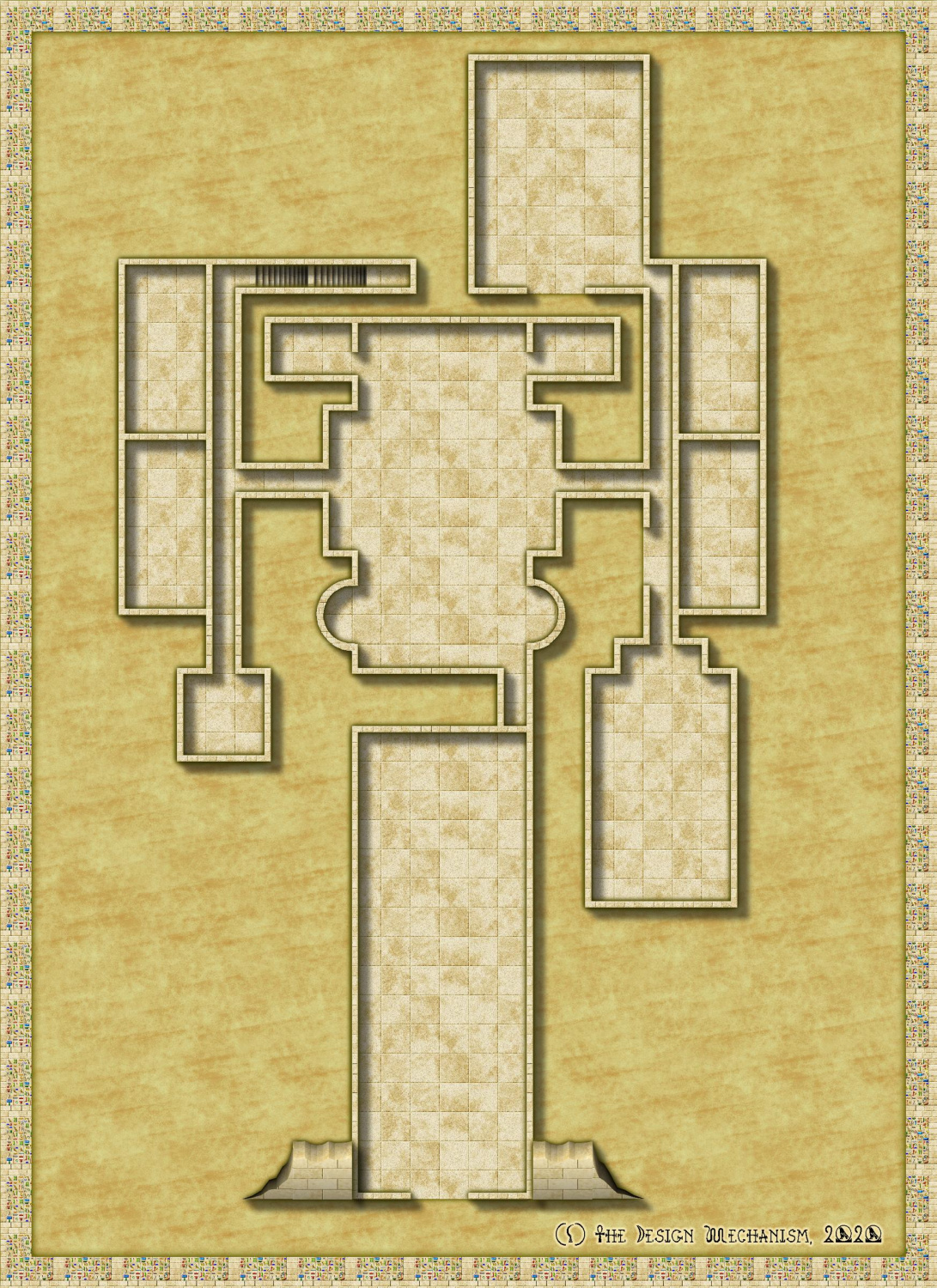
WIP Commission, Ancient Tombs
Hi Folks,
Here is a WIP pic of the 1st Level of this pyramid dungeon.
I'm glad the manager for this product line sent me the text as well as the author sketches. Because the 2 do not agree in several places. But anyhow...we do what we can...
Got to add the doors, some other furnishings and some interest to the floors. This is just the basic layout thus far. Where the semi-circular alcoves are I made 2 circles (inner & outer walls) with the circle tool , modified the default wall tool to be a polygon rather than rectangle and traced the circles. Then I just made 1 circle with the floor bitmap of appropriate size , placed and copied it. You can tell if you have a really good look. This will therefore be an area that gets some pretty floor patterns...?


Comments
I keep saying this, but it's true. This is a really beautiful style. Good choice :)
@Loopysue I 100% agree. How could you not use it for Egyptian themed adventures! Normally, for this line (Classic Fantasy) the publisher prefers old-school B&W like the Create Your Own Style, OSR Dungeons and Inked Dungeon Annuals, I'm super happy they allowed me to use this! The others, while all good styles, would be a waste, and let's face it, pretty boring, in this instance.
@DaltonSpence I see what you mean. If this was for a personal project I'd probably muck around with it a bit but I'm not going to waste the time with these maps - I don't get paid anywhere near enough for the time I spend on them as it is! I'm a tad anal about my maps, I could do them much quicker, well, once I get more familiar with CC3+ it will be quicker than current, but I wouldn't be happy with them and I won't submit something I'm not happy with.
One thing I'd like to see added to this style is some statues, particularly those based on Egyptian themed deities.
If you want to tidy up misaligned or mismatched textures, the easiest way is using multipolies.
Creating a single multipoly that includes both curves and paths / lines is one of the most painful things you can do in CC3 as the direction of paths / arcs is critical, and unlike combining selections in PS / GIMP overlaps create voids.
So the easy way to do it is to draw a small square right in the top left hand corner of your map and multipoly that square with the straight edged parts of your dungeon.
Then draw a second identical square in exactly the same place, and multipoly that square with all the curved parts of the dungeon. Use "select prior" to easily select the second square, or click both and then deselect the first multipoly by unselecting the straight edged area.
Both multipolies will then tile from the same origin and the textures will exactly align.
You can place this square outside your main mapping area, underneath the border or concealed by a mask sheet to stop it being visible. Or you can use a "point" rather than a square. Either way it just needs to be in the top left of the map and aligned with the grid if you want your texture to be grid aligned (eg if using a tiled floor as a dungeon grid.
In the image below, there are two square tiles in the top corner. One is part of a multipoly with the upper rectangle, the other is multipolied with two circles. The textures are therefore aligned, and so the overlap is invisible.
Note that the bottom rectangle is not part of either multipoly and the texture of its top left corner is identical to the square in the corner, as the origin of that particular texture is the corner of the rectangle
Here is the same 'map' without using multipolies, note that the overlapping circles are now visible and that both rectangles now have identical top left corners.
I've not commented there yet, as it's the first time I've visited there for a couple of years and I'm already active on three forums including here. Don't want to spread myself too thin!
@Raiko Thanks for that. It's just a little past midnight over hear and my brain is not comprehending that well at all. I'll have a proper read over the weekend.
Here is an update. I've got to draw a shaft still fir area 17 and the trap for area 9.
Very good, though it bother's me somewhat that the pit trap in room 7 is not central to the room, when the room is only just big enough to contain it :)
Makes it a little easier on the sanitation engineering staff for when they need to get the sand and cobwebs out of those far corners.
It's actually easier for them to get the bodies out for necromantic rites...?
@DaltonSpence To answer your questions: There is a shaft to be drawn in area 17, I'm not keen on the doors in this style so I haven't finished placing them, this pyramid is not so much a burial monument, it's more a temple to an evil god where a foul ritual is to be performed to release the god from it's prison. I will have another look at the annuals symbols and see if there is something more fitting.
@Loopysue I agree about the pit but I was just too tired to fix it last night, I have to reposition the text labels also.
I doubt I'll furnish every room, I think it will make the map too busy, so I'll just concentrate on the main features. For those that are wondering, the colourful walls in area 4 (using the border symbols) are actually illusory walls. I'll also most likely add some decorative elements to the floors in rooms 4 & 8.
Overall I'm pretty happy with how it's going. That's about 3-4 hours work so far (including writing and deleting a room key) mostly fixing errors I made in the original and symbol searching.
Thanks Raiko. Some of the earlier ones were done in Dundjinni but otherwise were done in Photoshop. I'm pretty lucky with these commission pieces I normally get very good sketches to work from.
A quick update. It doesn't look like I've done much, but there was trying this and trying that. I may need to change the colour of the shaft (17). It's getting there.
BTW: I checked and the pit in room 7 is centred. What throws it off is the left & bottom walls. In this style when you use the wall symbols, rather than a polygon, these align to the inside of the floor, not the outside...making the rooms look not quite square.
If you want to know how to make the shaft look like a hole, there is this video by Remy - towards the end of it:
No updates to look at tonight, it's too late. As the walls align to the floor on the left (V) and bottom (H) I've moved most of the offenders over and down by 1 map unit respectively by using co-ordinates - got to love them, they make perfect placement easy! If you've not done it before it's pretty easy. Click in the coordinates bar, top left of status bar and make sure it relative, i.e. @T. Then select what you want to move, hit D for Do it (or right click and select Do It). The command prompt will ask you to select a point to move from or you can enter the co-ordinates. Type 0,0 and press ENTER. Enter your new co-ordinates; a negative value in the X co-ordinate (the 1st one) moves it horizontally to the left, a positive value to the right, a negative in the Y moves it down, positive up. Very simple. In this case I selected the walls and used a value 0f -1 and 0 for the appropriate axis, viola my walls exactly where I wanted them.
Still have to tidy up some corners and stuff but overall, really happy. The Pit is now in the centre of the room as it should be.
@Loopysue that's the technique I used, the colour just doesn't work for me!
If it's a shaft, and there's no lighting down there, then the hole itself needs to be nearly black, not mid-brown. Maybe that will help?
I think what I'll do is change the colour to a dark grey with a transparency to allow the texture to show through and see how that goes. With the brown it looks a bit cartoony and does not suit the map at all.
I went through the sketches (they're all drawn on graph paper where 1 sq = 5ft) for all the level and noted the dimensions, then I cross referenced to the text and there are a lot of discrepancies. 1 particular room was drawn as a square 10 x 10 ft but the text said it was supposed to be 60 x 60 ft! I sent the publisher and author a list. i've been instructed to hold off on the rest of the dungeon levels until I get updated sketches or the text is updated. I offered to redraw the lower levels, this level is already done so the text is being changed, but made it clear that would be a lot of extra work and would incur additional cost.
Hi Folks,
Here is a bit of an update. To do: A little more furniture required in a couple of rooms; shaft still needs to be redone; dashed lines for the cells (9) under room 8 need to be drawn; the mask applied, room keys re-positioned and some sort of key added.
Not sure it will work well enough, but for the pit, you might try drawing a thin line around the top edge of it on a Sheet above the rest of the pit, and apply the same Wall Shadow Effect to it as the rest of the level's walls already have. That should shade the pit the same way as the walls, and hopefully make it not so flat.
@Wyvern I've got a few ideas re that but I think an outline as you say, will certainly help.
If you do go down the "shadowed line" route, you'll probably need to fiddle about with a mask for part of the pit too, to stop the shadow going into places outside it you don't want - sadly, I remembered that only about ten minutes after I came offline yesterday...
Also - just seen this now - there's a gap at the SE corner of room 16. That may have happened when you cut the wall to insert the open doorway if you started the wall at the corner of the room originally. I learnt from one of Joe Sweeney's videos early on to always start a dungeon wall along one of the straights you won't be cutting a doorway into later, to avoid exactly this kind of issue. It's also easily forgotten when you're busy drawing walls, however, as I've discovered ?.
@Wyvern thanks for that. I thought I'd got all the corners!
This style has either a polygon drawing tool for the walls (see the curved alcoves) or symbols for the walls (all the rest). An issue with using the drawing tool is that the fill is horizontal, so the bricks run the wrong way on vertical walls. An issue with the wall symbols is that vertical walls align to the floor on the left edge and horizontal walls align to the floor on the bottom edge, therefore the left hand and bottom walls encroach on the floor area, hence my post above about using co-ordinates to move them. This corner is a result of moving the wall down and across 1 map unit. I'll need to stick a 1ft corner piece in.
I guess I could 'fix' the wall symbols by changing their anchor/alignment point (I forget the proper name for it) to the centre of the symbol which would be ideal. I'm certainly not going to for this map, though I may do that for the next two levels. Only the most observant GMs/players would likely pick up the difference in the maps.
So just use those two fill styles and draw 1-foot wide rectangles for walls - they're indistinguishable from the wall symbols.
You can also use them for diagonal walls by using shaded polygons and the values from JdR's excellent shaded polygon guide:
https://jdr68.jimdofree.com/tutoriels-tutorials/cartographie-mapping/shaded-polygons-roofs-and-more/
I can't find a thread for that particular tutorial on the forum, so linked directly to Joachim's website.
@Raiko Thanks, I didn't really look that closely and just based my decision on Ralf's video. The diagonal walls (of which I have at least 2 to draw on the next level) could be problematic...
I guess though that if I use the tools for the walls, then the door symbols will break them properly...
Ok, this is nearly done. Mask, text, compass rose and scale bar left to do.
I'm not 100% happy with the "shaft" but I'll see how it looks with the mask applied. It's supposed to be a natural shaft with stairs cut into the side...
Thank heavens I have Auotsave on in background mode. CC3 crashed when I was almost done with the mask, I was just coming around the shaft to finish at the bottom right of the entrance. But that's done it for me tonight, no more mapping. I opened the autosave drawing and thankfully had lost nothing else and saved it properly.
At first look the "shaft" appears to be 'different' from the rest of the map.
Would something like this help?
@pvernon Indeed it is. It's supposed to be a natural shaft with carved stairs spiralling down.
@Loopysue Absolutely. How long and how many sheets did it take you to draw that piece of brilliance?
One sheet, about 30 minutes.
I drew a circle, traced it with one of the drawing tools, fractalised it... (you can't fractalise a circle)... then changed it's properties to Solid 20 Bitmap fill and drew a step on top of it touching the edge. I grouped them together, then used circular array to make 10 in a ring (rotation centre in the middle of the irregular circle), and picked them one by one to make each successive rotated step a bit smaller than the previous one - starting at the visual second step down in the series.
Here is the FCW.
I don't mind if you just copy it.
Thanks @Loopysue. At first I thought you did it somewhat like you would do a raised dias. I'll have a look at that file, thanks for sharing!
I've had another impressive idea for the shaft that was going to be a tad more convoluted and quite a bit more time consuming than yours but I might combine the 2 now! Also been watching that Live Video as time permits, quite a few useful tricks in there also for future reference.
When I need a circle that needs to be altered (I am usually cut off parts) I make an ellipse that is a circle then I blow it up. You should be able to fractalize it as well.