

Progress Report - Historical City Maps
 Morrgans
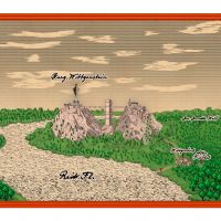
Traveler
Morrgans
Traveler
Ok, after I vented my frustration with myself in this thread --> http://forum.profantasy.com/comments.php?DiscussionID=10108 I decided to put that project on hold after I have better skills.
In order to get these I scaled back the aim of the project (a map of the Warhammer Town of Bögenhafen which is a) a more plausible map than the original and b) resembles a city map of the same period as close as possible)
Now Warhammer plays in something between 1650 and late 18th century. That is, why I tried my luck with the Renaissance City Style of the 2019 Annual.
The original citymap of Bögenhafen can be found here http://www.gitzmansgallery.com/warhammer-maps.html.
The end of the project should be something like the map of the city of Munster, which you can find here -- > http://tudigit.ulb.tu-darmstadt.de/show/Sp_Muenster1647/0001/index.htm/image or a coloured variant here --> https://www.pinterest.de/pin/299982025173320599/
But for now I will try something more simple. In the 18th century there were also maps which resemble modern city plans. Meaning, individual buildings are no longer shown, execpt for importand ones. As an Example of such a map I will look at the city map of Hannover, Germany which can be seen on the wikipedia page https://de.wikipedia.org/wiki/Stadtplan_Hannover. Especially the ones from Lotter or Matthäus Seuter. Also the plan from 1822 which is mainly the old one but with colours. ( In this regard it is interesting how the industrial revolution has impacted german cities. For 70 years nothing much has changed and then in the space of one generation the city expanded in all directions.)
Comments
First I want to do some studies concerning fillstyles and sheet effects. You will notice that the historical maps are doing the shadowing by hatching. The colours in the maps, if present are mostly light, especially if it comes to areas like fields are meadows. In the Munster Map the most prominent colour is the red of the roofs, which is IMHO done to emphasise the streets. Anyway. The first obstacle is to get a good method for using hatching but also get the shadowing (mostly right).
For this I choosed the city battlements. Now, city walls were becoming a thing of the past because of the prevalence of cannons, the cities had earthen walls around the city, something Bögenhafen curiously lacks. So I will add it to the city. Also the battlements are supported by a water moat, which is feed by the river (see Hannover, Munster).
For the first map I will choose Annual Early Modern as a basis, but change the background to colour 252 (very light grey).
New Drawing tool: City Fortifications
Polygon, Straight, in a light grey colour.
Fillstyle could be either solid or something hatched. Widht is 40 map units on a 2000x1600 map. I experimented a little and the result so far is: For grey scale, a hatching style is quite nice actually. So If you colour the battlements in 253 od 254 and use narrow hatching the result looks quite nice. If you use a colour like light brown or something for a coloured version than I am not so sure. I have attached the results below.
I put the battlements on an extra sheet (City Fortifications) and added the bevel lighted sheet effect. The Bevel effect has also its merrits but it looks weird in the narrow corners, I think. I am not quite sure, if I would like to have a curved bevel or a straight one...
Next up is water.
We do have a medium scale city style that copies the Ferraris Map in the 2020 Cartographer's Annual (it's closest to the modern 1:10,000 scale) if you are interested, though I would place it's ease of use level somewhere between moderate and hard, owing to the technicalities of reproducing a hand drawn map effect as accurately as possible. Despite it not being the easiest style to use for new mappers, the fills are all bitmap fills and would negate the issue with hatching fills altogether.
Should you decide to go down this route and get into difficulties, please don't hesitate to ask for help. The author is usually not far away
The 2020 Cartographer's Annual, which shows the Ferraris Style as the default image at the top of the page.
I am currently not sure, if I indeed will use the hatching or not. As I am using the map in a virtual tabletop, the printing issue is not that prevalent (truth be told, when I printed the map, it was indeed very faint... and quick... no lines on it whatsoever... like the "Nordfriesische Flagge" (white eagle on white background)) Sorry I disgress.
But onto the water moat and fortifications. I added some more drawing tools to simulate the raised level of land and added also a second water sheet, because the original glow sheet effect blacked the small moat completely. Next up is going to look at the road tool and try to have something similar for the water. --> The early modern Annual has this cool feature, that the filling of the roads blends in one another, however the outline gets cut.
Anyway it looks like this now:
Otherwise I highly recommend the Annual 2020 for this fantastic style alone. (And I have not delved into the other ones... hatched dungeons is next)
Cheers
Olaf
That's quite a map, Olaf
You really pushed me in the right direction. And it is a beautiful drawing style. (Ralf should get you a bonus :-) ) Anyway I have a question concerning ramparts and water. In the picture above, you can see that the river flows through the town. Therefore I can not just make a big water polygon like you did in the example map. Because of the docks, which I modelled by adding node points and moving them to the river polygon. Some is valid for the small stream comming from the heath in the soeth west corner.
The problem is, if there is no water seperating the lower from the upper ramparts, the filling looks funny.
So far it looks good if exported to png, however in CC3+ it also looks a little strange. Do you have any suggestions?
This dimpling effect has unofficially been called transparency acne, or TA for short, and is caused by the way the bevel effect compares the pixels of the sheet it is on with the pixels of the underlying sheets.
You may be pleased to know the solution in this case (it's different for different fills in different maps) is just to add another sheet directly underneath the RAMPARTS sheet, call it RAMPARTS BACKING, and copy the ramparts onto it. And that's it cured.
Here is the example map with the water sheet hidden to simulate the effect in your map
[Image_15206]
And here is the same area again with the water still hidden, but with the backing sheet added behind (on top of in the sheet list) the RAMPARTS sheet with a copy of the RAMPARTS on it.
[Image_15207]
I only wish I had been able to help you sooner with it before you started playing around with the sheets and going through all kinds of contortions to try and get it to work. But on the other hand it is good that you tried to solve it yourself because the only real way to master sheets and sheet effects is to experiment with things.
When TA strikes and the affected sheet has an Edge Fade Inner effect on it, the EFI must be copied and pasted to the backing sheet so that the purple extent doesn't protrude around the edges. Sometimes, because the purple is quite powerful, you might need to duplicate the EFI on the backing sheet a couple of times to make it vanish completely.
I have attached a small sample as a png and as a Profantasy drawing. I hope that all the symbols and stuff are in it.
Laon is a little bit harder. There are maps online like at Old Maps online (apparently there was a battle there which was note mentioning. The maps are from early 19th century (1814) and you may be able to tweak Ferraris to resemble something like that.
I for one am now trying to get an own style working for the street maps as mentioned above (munster and others are there) One thing might be the housing but ramparts and water I will probably try to do like Sue.
Happy mapping!
Olaf
You took that style and made it sing
Some of he Hanover maps off that link you posted are amazing.
One thing I have been able to do a few times is find an actual map that works for me and paste it in as a BMP and then draw on top of it anything I want to add etc. For example I might add a building icon with label and link it to a floor plan. But you have to get lucky and find a real map in high enough resolution and with a style you can use.
So much easier creating an imaginary place than trying to duplicate something that existed historically.