

Lillhans
Lillhans
About
- Username
- Lillhans
- Joined
- Visits
- 2,008
- Last Active
- Roles
- Member
- Points
- 2,066
- Location
- Sweden
- Rank
- Surveyor
- Badges
- 13
Latest Images

Reactions
-
Video outtake
Closest I've come to a complete video. But then, at the very end, I made the mistake of trying a three-colour canopy, and I wasn't prepared for that. So therefor, obviously, no video :D


-
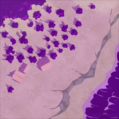
Inbetween failed video takes distraction
From a year ago: The Rot - Gothenburg cathedral now in colour!
It's actually a little tempting to adopt a two-year cycle with the first being devoted entirely to sketches, followed up by colourizing. You know, slowing down the time to map completion even more!


![[Deleted User]](https://secure.gravatar.com/avatar/c75d9a245b74d9c59be0999ea81ca541/?default=https%3A%2F%2Fvanillicon.com%2F92add7f8c954488718110edc4896ad39_200.png&rating=g&size=200)

 and 1 other.
 -
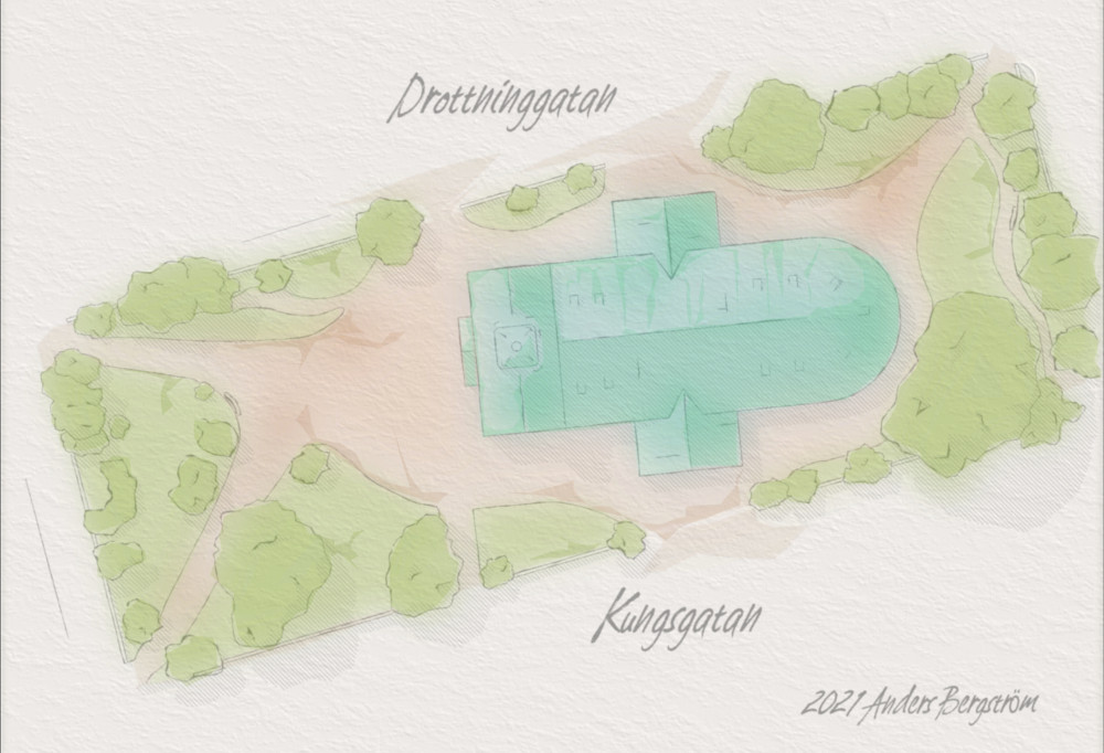
Fuchswald Memorial
That's awesome, @Elfling; do show and tell!
I think for a video, geometry is probably the best topic!
@Monsen would insist that it's not really a map, of course. Which kind of makes me want to put continents on it. An entire world sitting in a corner of a box is probably one of the cooler takeaways from the Men in Black series.


-
Barnacton Keep (WIP journal)
The Green - even more theorycrafting
Seemingly an act of procrastination, I shift my focus to out of town once I am satisfied the streets are going roughly the right places. But it's not entirely coming from a place of feline attention span: I need to figure some things out, you see!
Because it's a stupid-large project I want to make sure I get consistent everything. And by everything I mean level of detail and look. And by consistent I mean of course that if individual stuff looks a bit wonky - that particular degree of quality repeated throughout will still create a whole that makes sense. I don't want looks that are all over the place; it's supposed to be drawn by a single person, not fifteen, after all.
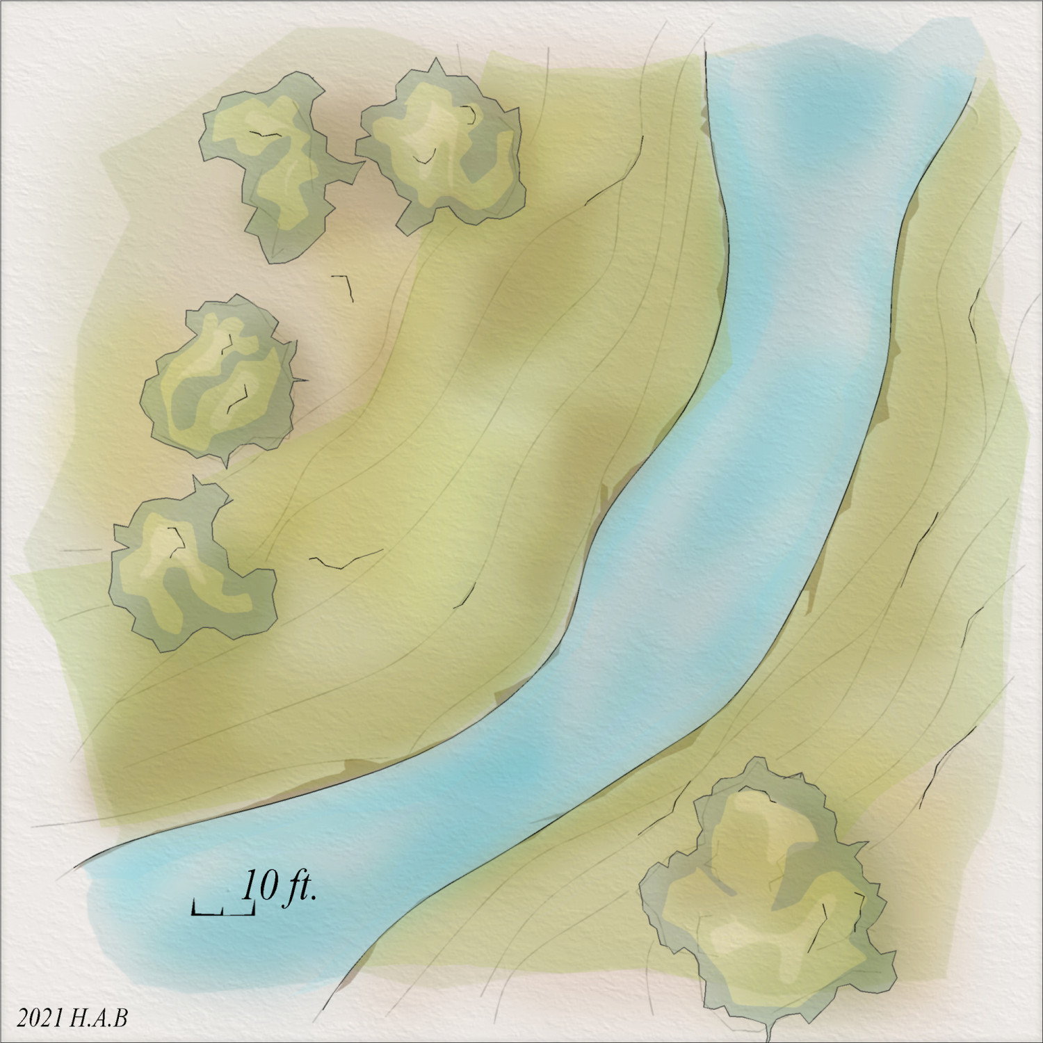
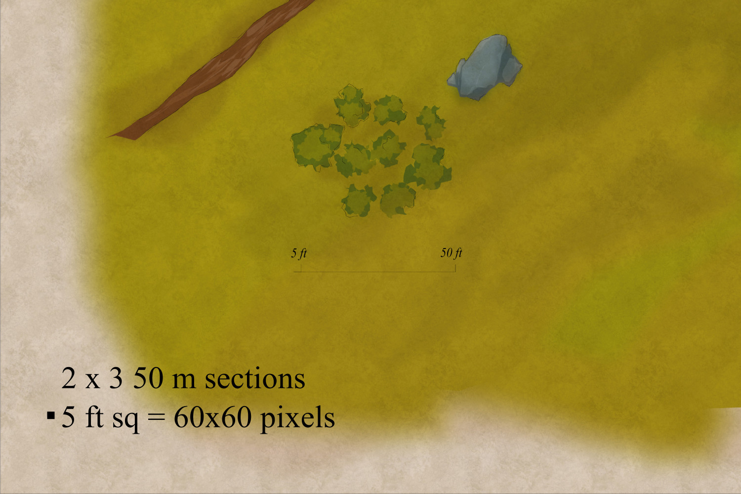
Look and level of detail both tie into image resolution, which ties into file size. Because I am primarliy concerned with virtual tabletop (and therefore bandwidth) I want images that aren't too taxing - especially with regards the encounter map level.
For an outdoors map, I want movement speed and range increments to matter at least some distance beyond the dimensions of the standard 4-6 people dinner table (where narrative combat otherwise typically begins). But what does that mean for file size or clarity of the presentation?
The above sections together make up 6% of the map. Dropping to 70% image quality, the sample section still weighs in at 1.09 MB. At 60 × 60 pixels to the 5 ft square, there certainly is room to shrink the map dimensions. But there is only so much shrinking to be had before lowering the image quality will become counter-productive.
Anyway. About those details. Here's a portion of the above map, as is, when zoomed out a little in a VTT environment.
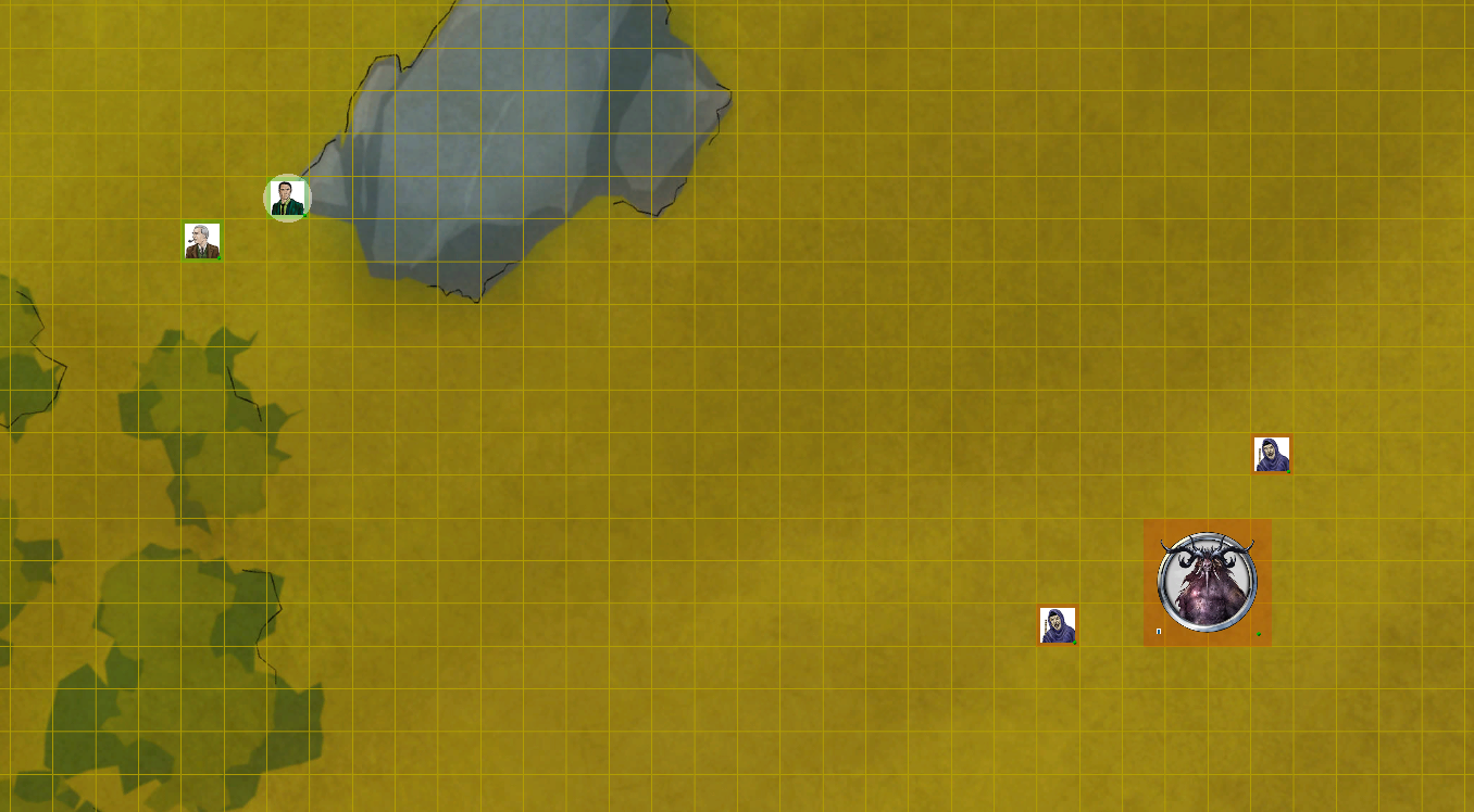
The sizeable rock formation was done with four colours - whereas the trees only got two (not counting the smudgy/spongy tone shifts and contours). While both work at the overview level, the rock formation seems better equipped for the transition to the encounter level. A different pattern and perhaps introducing a third colour for highlights seems appropriate for the trees.
The topographic features, at their end, are actually doing quite fine although the self-cast shadows make for a more noticable pattern from afar. As the trees show, however, using the distinct base colour sheet means more effort needs to go into details to keep things neat and clean. For this scale of a project, I think the necessary amount of embellishments for that would very much get in the way of completion.
So, I am happy to suggest that the demon and cultists are roughly at the same level of elevation as the two investigators - and that the two groups are separated by a hollow. With regards to terrain features, I am also inclined to suggest there is no apparent need to go any smaller than what would fill up most of a 5 ft square - perhaps even only rarely going below a 10 ft square area.
On the one hand the resulting general lack of minor features will make parts of the map stand out as bit empty (encounter map-wise). And if you cover the left half of the above combat encounter scene, for instance, it's not entirely clear where the evil trio even are. Grass field, or the elemental plane of sick?
On the other, this plays well into the fact that the larger the feature, the better preserved when shrinking the map dimensions in post-production. Wargaming seems to be doing fine with keeping terrain features to elements which has an impact on actual gameplay (i.e. for line of sight, cover, etc.). Of course, there are examples of the opposite, but at the end of the day I don't need ultrarealistic terrain: I need a good, clear overview of the battlefield and the above example seems to provide just that. Besides, there are no 25 mm minis to marvel at anyway.
More importantly - keeping the minor features at around 25-100 ft² sets the expectations for the overall level of detail of the map. Arguably, the town and castle are probably going to need to go beyond the level of detail/embellishment of the wilderness - but only so much as to make it clear what's what, and keeping within range of the rest of the map.
So, the land will be the baseline of sorts - with the ocean and mountains probably stepping down, and the town and castle stepping up on the details. Starting with the town, I think I would probably slide towards too high a level - because it's fun to make things look smashing. And that would push up the demand for higher levels of details outside the town wall. Which I decidedly do not want.

-
Cave Study
It's basically the Watercolour Maps style from the 2019 Annual with a few changes (as in, everything is changed except for the one texture). You are essentially looking at the below structure of sheets going from back to front as per the sheet stack order we all know and love. In reality, the contour sheet (top) sits in front of the others. I put it at the top for the display because that way you also get the actual order in which each segment was done: back to front.
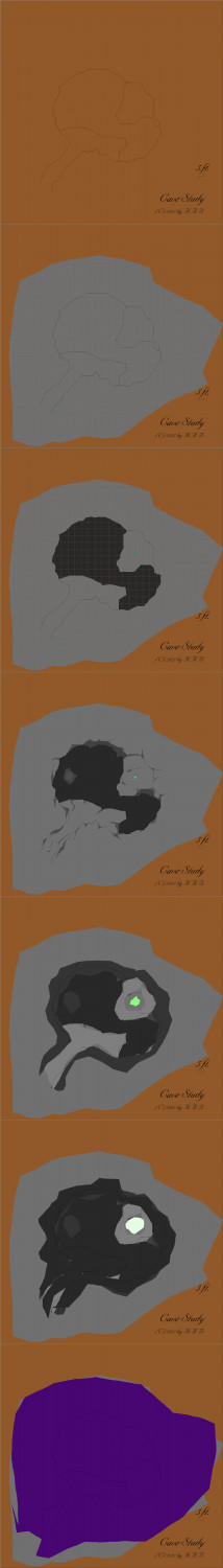
As the below version demonstrates; the function of the texture is, in fact, primarily to add colour variations. Notably, the resulting distortion/irregularities has the greatest impact where gradience is achieved by way of Blur or Edge Fade, Inner - or any other sheet effect with simliar....effects :P
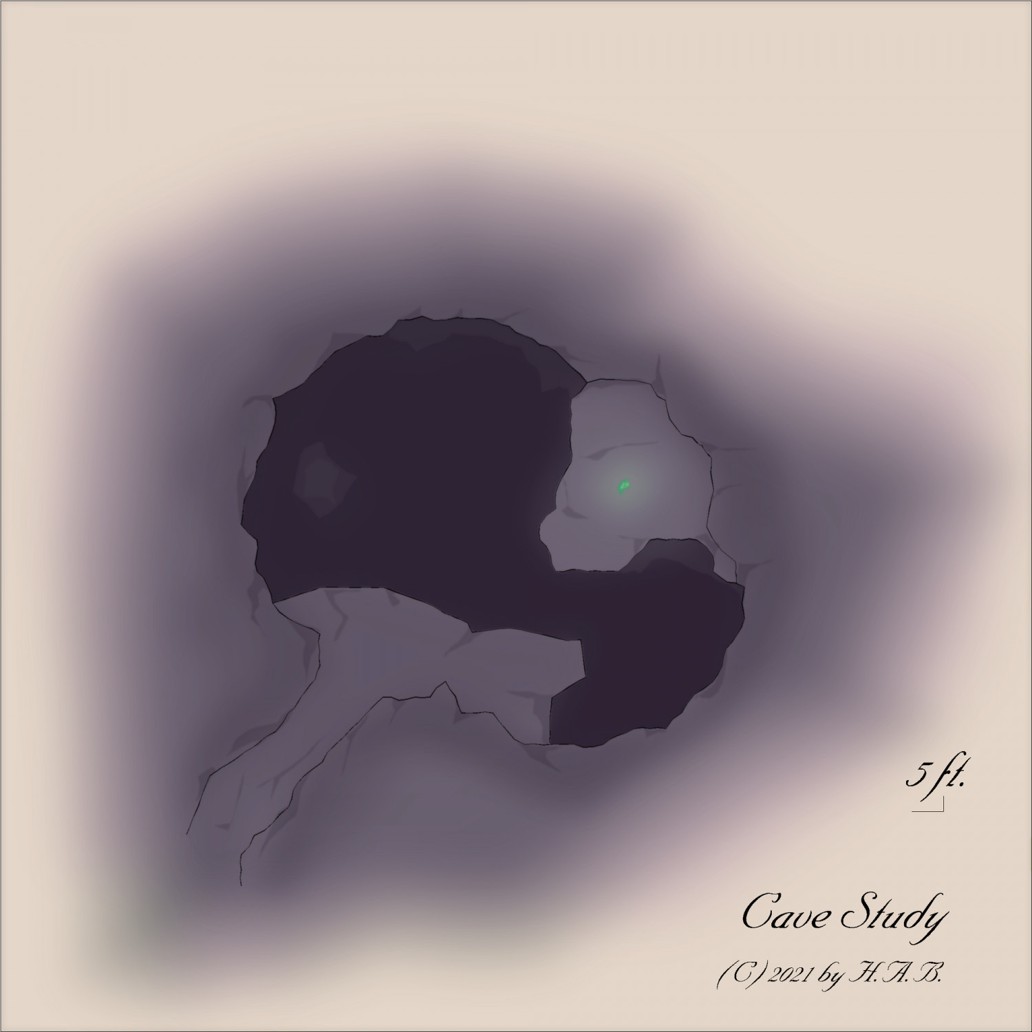
So it's a sort of low effort/high impact environment - or the goal is for it to be that, at least. As further demonstrated by removing that last purple blob:
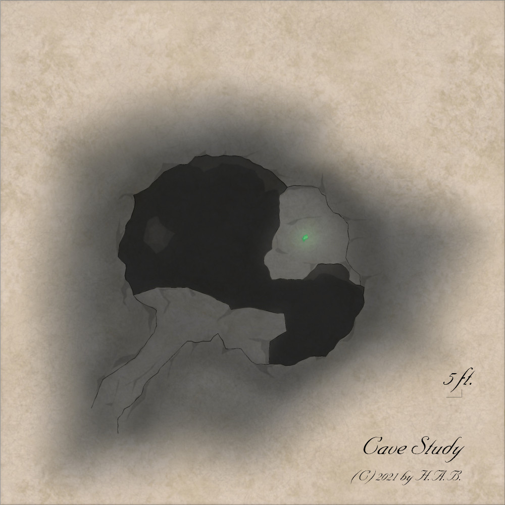
(It's just not the same map without it, right?)


