

Lillhans
Lillhans
About
- Username
- Lillhans
- Joined
- Visits
- 2,008
- Last Active
- Roles
- Member
- Points
- 2,066
- Location
- Sweden
- Rank
- Surveyor
- Badges
- 13
Latest Images

Reactions
-
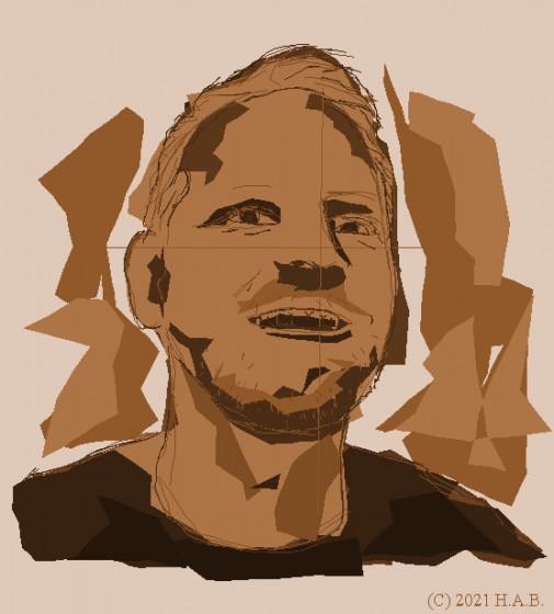
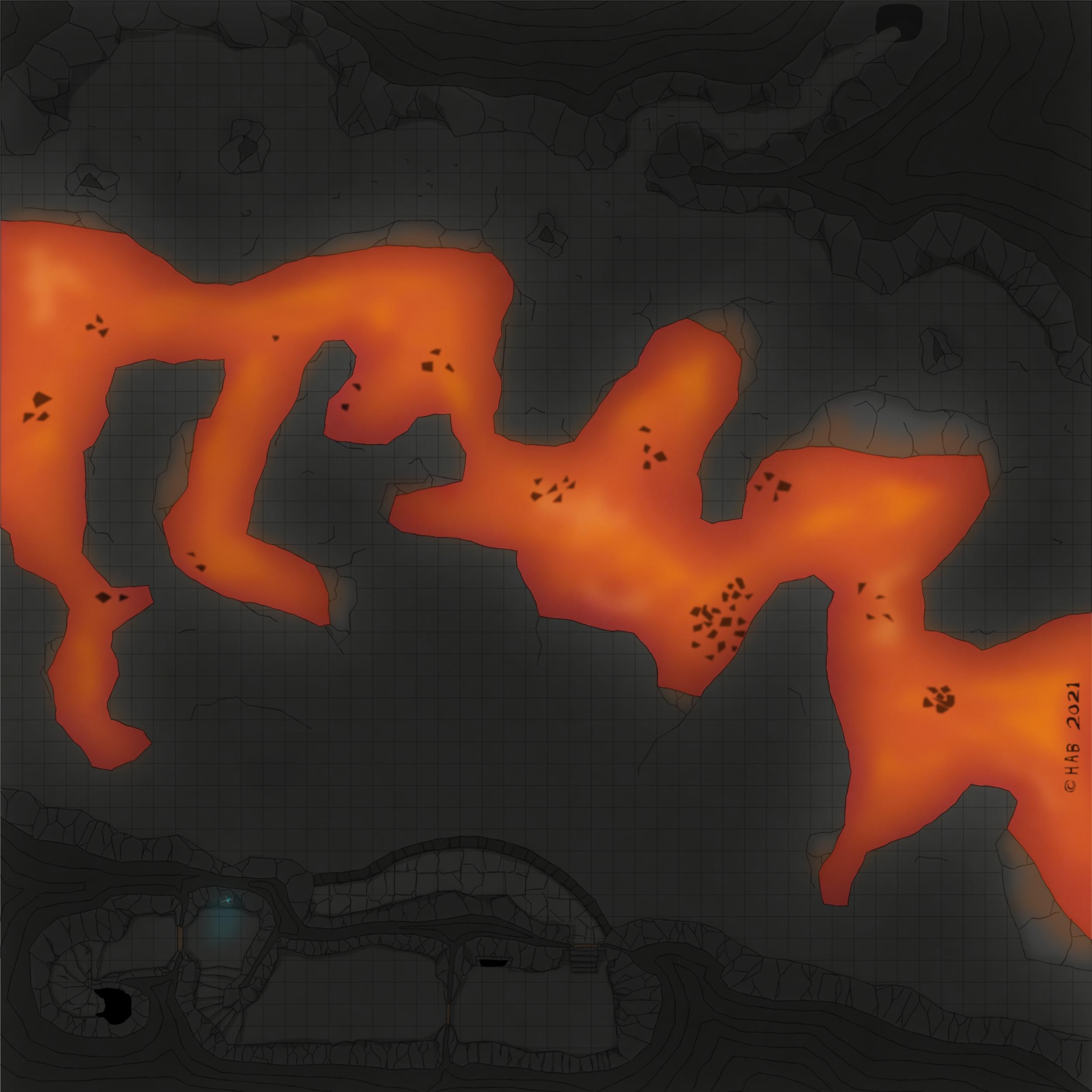
[WIP] Community Atlas Competition entry: Thing beneath the Iron Mounds
It woudn't be like the maps you get in game supplements if there wasn't at least one feature which renders the map useless to some extent: if it's not a matter of fruitless attempts to align your VTT grid with that of the map's - which utlimately forces you to crop the the damn thing in segments (cutting and pasting) - it's some text or otherwise invasive blemish which has to be GIMP:ed out somehow.
Almost there now: the "exterior" rock wall on the south needs to be defined in a manner closer to what's going on up at the north end, and then it's just making shadows less sloppy and then I think it's actually done. To think the pillars got to stay this far into it!
Next time you get to see it, it will be accompanied by a fancy write-up and the .FCW file. And, might I say, what a rewarding project this has been: getting to explore the application. Such fun!


-
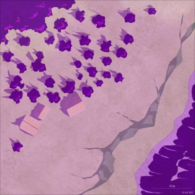
[WIP] Community Atlas Competition entry: Thing beneath the Iron Mounds
That's a definitive probably on the protective sigils, I think. Now to design the rest of 'em :D
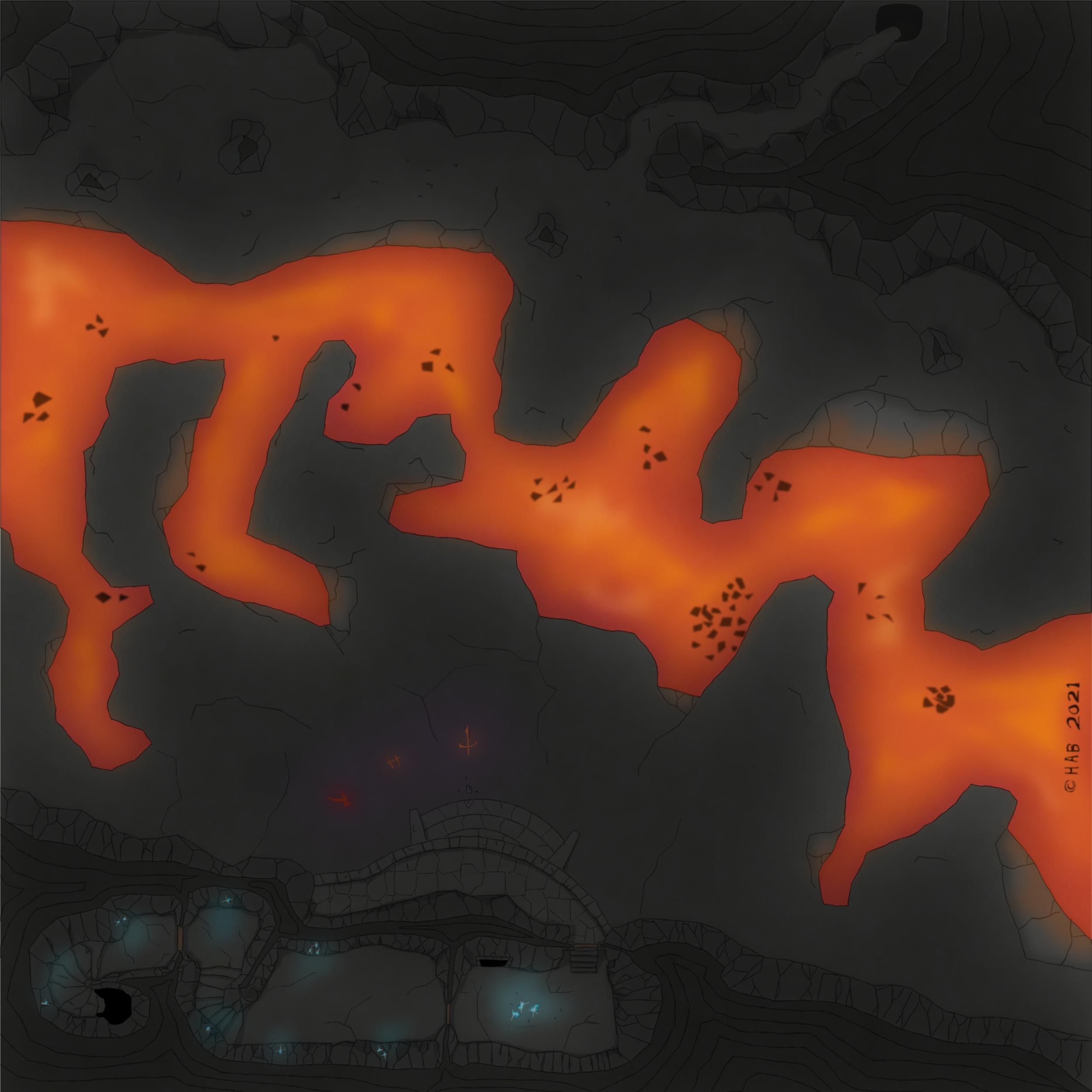
Had to try the "seeping colour key" effect with a different colour from the light source on the lava bit also, and - as seen below - it looks just a little bit more hazardous. More red-bluish=hotter if I recall? Too much for the current map, but certainly keeping that for large scale magic fires or otherwise funky coloured light.
Kind of looks like a fuzzy still from a shit 80's animated movie, come to think of it. Cool stuff!
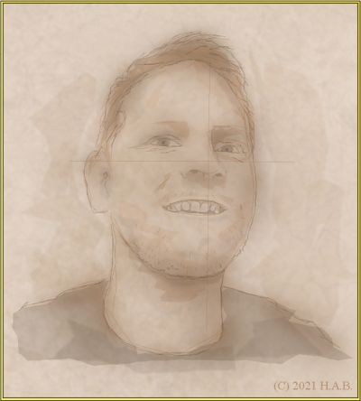
In response to your question there @jmabbott, you understand correctly: CAD tools are that awesome and anyone who tells you otherwise just hasn't seen the light of the Polygon. Here is what it looks like without the superimposed Leonard Cohen-sheet and effects turned off:
I keep getting back to how I couldn't pull this off in GIMP/Krita. I mean I think - given some time - I could figure out what brushes to use and how to work with the toolbox offered in such applications. And then, I couldn't consistently replicate the look anyway because I can't be bothered to acquire actual free-hand drawing skill: this is MS Paint precision at best - as the absolutely fantastic polygon assembly above attests to.
All I need to worry about is where to put the things in order for it to come together nicely. Like a flannelgraph. A cool flannelgraph.


-
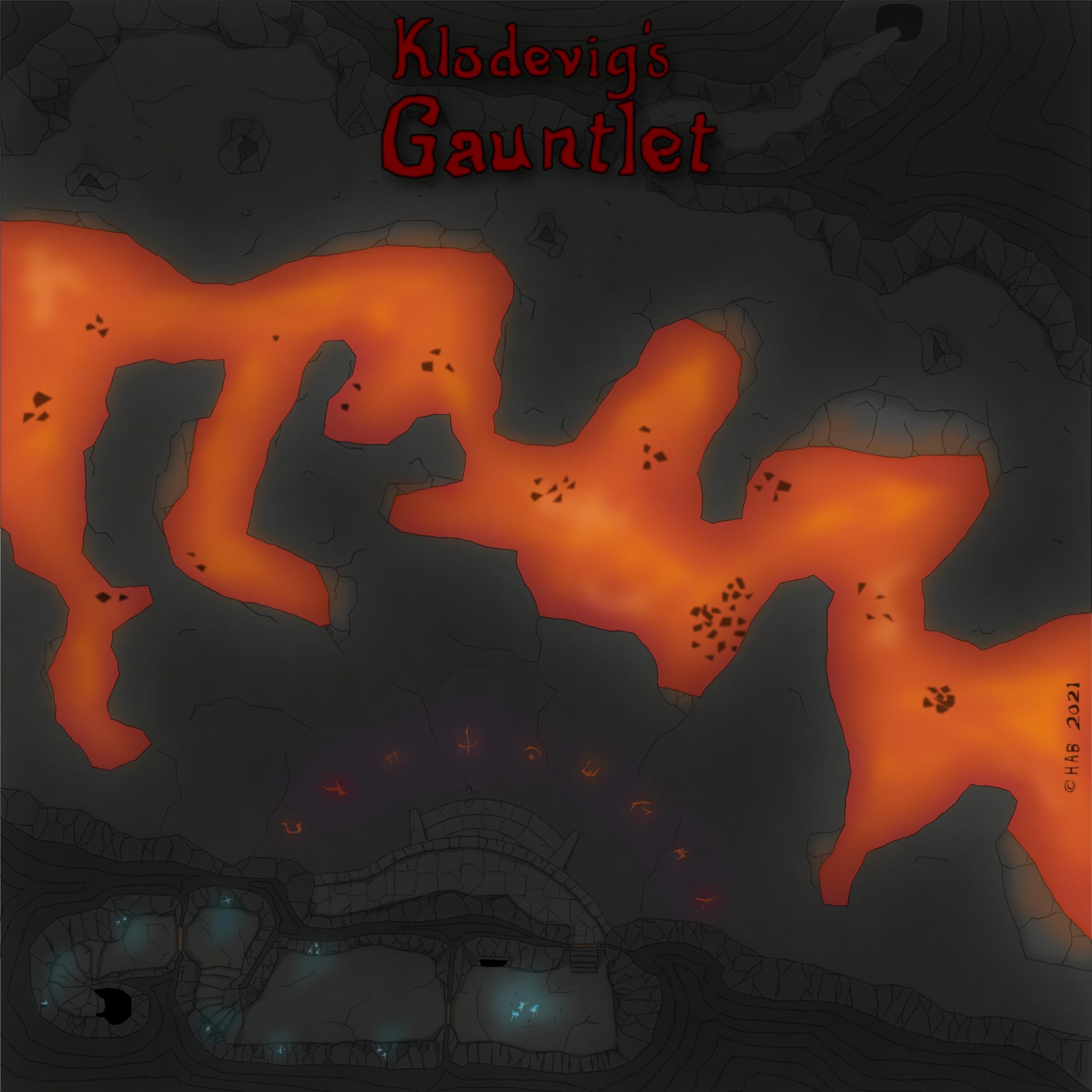
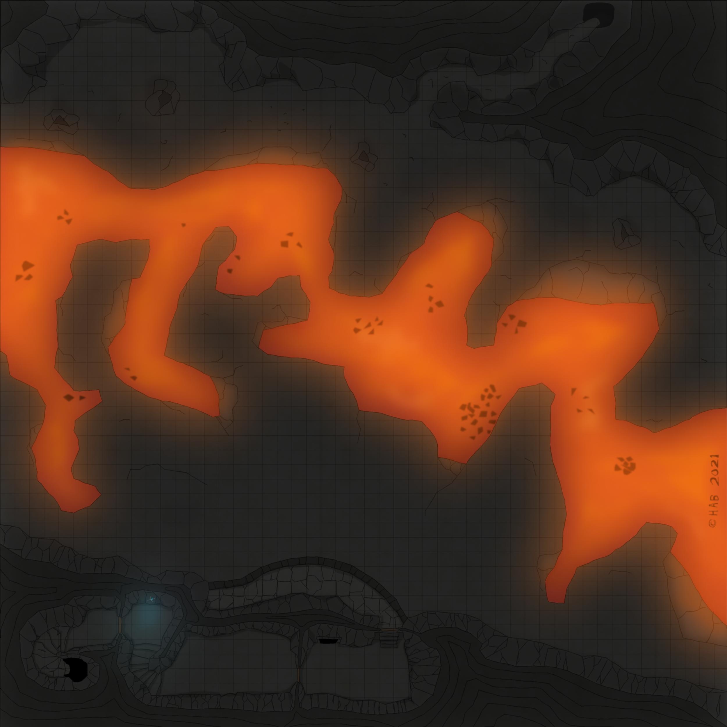
[WIP] Community Atlas Competition entry: Thing beneath the Iron Mounds
The battlement needs to have the colour choices sorted out and its stairs added...at some point.
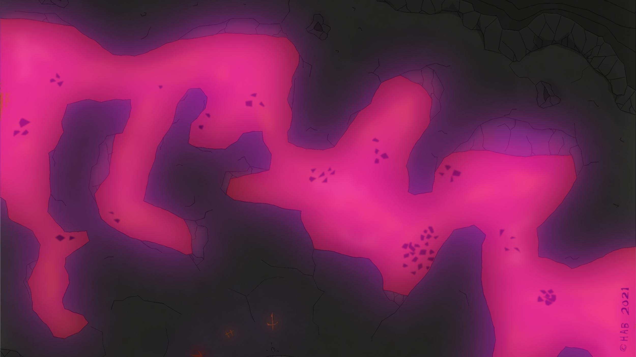
I seem to recall a Leonard Cohen line about killing the flame but I think it might be a bit too dark at the present time. But that could just be my fantastic laptop and eyesight playing tricks. Overall though, I think this is probably the right move for introducing shadow play on otherwise very flat-looking cave walls, which aren't supposed to be served by the light from the lava below.
It's not that I don't like the preivious look of things, but it's just that going back to it now seem a bit impossible - so that means it must have been an improvement, right? :D
That would be "not working with shadows" to "cover everything in shadow" over a few days off. It's adding some time to the process but also gaining something in the totals: it feels like it's no longer about *figuring out* how to uncover the good stuff, but rather a matter of making it so.
Anyway.
For the curious, the below is what Colour Key, Blur (with a generous border) and Transparency turn into the above.
The Transparency regulates the Leondard Cohen of the screen (black square polylgon)
The Colour Key (mixed fruit yoghurt colour bit) cuts out the parts that should be default bright.
And Blur, finally, extends the cut-out by toning down the edges of the black polygon - which is treated as now including also where the Colour Key area ends. The latter allows, of course, for adding more dots of "luminated" areas as seen where the fluorescent gem is doing its thing. Somewhere, there is probably a Lighting Effect I should be using instead...
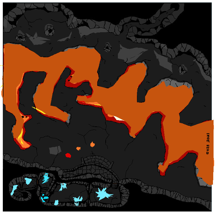
Super printer-friendly map!
Also; I am not saying I will necessarily be doing it, but here is what things look like if one keeps multiple Colour Key below Transparency in the sheet effect stack. This means the colour of the Colour Key will seep through to some extent. Keeping mutliple Colour Key Effects one can then have a colour specifically suited to the light source's colour. Obviously, needs more discipline in regards to how far the glow should reach: seen here is "light" in places which - again - probably should not be as illuminated.
Options, options, options.

![[Deleted User]](https://secure.gravatar.com/avatar/c75d9a245b74d9c59be0999ea81ca541/?default=https%3A%2F%2Fvanillicon.com%2F92add7f8c954488718110edc4896ad39_200.png&rating=g&size=200)


-
[WIP] Community Atlas Competition entry: Thing beneath the Iron Mounds

looooooooool
-
Why should I buy CC3+?
I think everything one will ever need to know about The Learning Curve narrative can be summarized by that one time an individual "blessed with the ability" to draw (in their own words) - as opposed to having developed their skill over time for the cost of effort, one can only assume - worked their necromancy, bringing to life a 5 months old inquiry as to the perceived benefits of the platform in order to bemoan said learning curve. Creating an account just for the occasion.
Unironically, I respect this level of dedication to an idea.
Imagine, if you will, going to a drawers' community asking the drawers why you should persue the format. Out of nowhere, an individual blessed with the ability to take pictures with a camera materializes, offering that the learning curve of drawing just isn't worth the trouble. And they should know, because they are quite skilled at learning new things that follow patterns they are accustomed to - of which drawing isn't one.
In other words - if I can't be bothered to get into the woods proper, this fact will invariably affect the quality of my mushroom pies and - as a further consequence - the position from which I make assessments of such pies. If this comes off as a tad bit salty - well your body needs salt and sometimes it is also an essential reading companion.
Let's take a brief moment to reflect on the apparent shift of meaning of the word "intuitive":

I get that one person's idea of a "steep learning curve" is going to be radically different from another's. To suggest otherwise would be as out of touch as saying - with a straight face - that a platform which generates tutorials is intuitive. The latter will never not be hilarious to me; how you opt to review the above collage of quotes is entirely up to your own sense of humour.
Coincidentally, the bang you will get out of Campaign Cartographer is also entirely depending on your own preconceptions. You get to decide for yourself, to a surprisingly high degree, how difficult things are going to be with the platform. Espeically if you consider yourself to be above tutorials. Again: if your amibition for your use of spreadsheets is to make squares for calendars that you print, don't expect that Excel will sort out quantifying your mushroom pie-cooking progress over time *for you* any given day now.
No - Campaign Cartographer is not trippping over itself in its eagerness to get out the door and tell you how to do things. But nor is it quick to suppress your potential for creativity. It is telling you, in effect, that any creative limitations you might run into are of your own making. Including getting started.
The exectution of styles and use of the available tools is in your hands - entirely. If you think your maps are a bit shit straight out of the box and it's all very frustrating it is because you can improve - both in regards to the tools at your disposal, and your visual expression: chances are that if you can't fail with your maps, you are operating in a severely restricted environment - creatively.
This is somehow elitist and standing in the way of the platform being rebuilt into something else. Come one now, why aren't you happy with the alternatives? I mean, there must be a reason why people keep coming back to how "if only" with Campaign Cartographer. It's almost as if people want the results you can get out of it, but...
----------------------------------------------------------------------------------------------------------------------------------------------------
I should probably point out that I have no opinion about Wonderdraft other than that the output on public display suggests that the options are a bit too limited for my taste. I am simply not seeing it for all the benfits of vectors and polygons, currently, and the avalanche of opportunity that comes with how the CAD environment allows me to achieve anything I could possibly hope for. So..for now: yeah, also, not too impressed with how WD requires a dedicated module for making combat maps. Yeah, there is Dungeon Designer for us with CC3+. But that's convenience, you see, in the same way we get various sourcebooks of practical implementations for HERO System or any other game really: such products are not rewriting the rules out of necessity - they are simply expansions within the premises of an established foundation. That we pay for. Because it's convenient. Mushroom pie time!
Anyway. To round things off and seeing as I've steered into the realm of flexibility; with a straight face, people will tell you how much of the flexibility of CC3+ really just is an expression of people's experiences - as opposed to the objective truth about its qualitites in this regard. Because it's got an outdated interface? What the florpunt does that even mean? Where does the illusion of the flexbility end, and reality begin? And more importantly: in which of the Nine Hells do I need to be in order for the Mark of Interface-Cain to be clearly visible on my finished products?
I'll tell you what it means; it means we're all a bit stupid in that we reject this other (actual) reality - where you just can't make maps with Campaign Cartographer - and persist in making the damned things anyway! Commercial-grade maps, even.
Ever the elitist fools, blind to the errors of our ways and flaws of the platform, we accepted and adapted to the premises of it. And what is worse - we seem to thrive.
Oh, and welcome to the forums.


 and 5 others.
