


Lillhans
Lillhans
About
- Username
- Lillhans
- Joined
- Visits
- 2,008
- Last Active
- Roles
- Member
- Points
- 2,066
- Location
- Sweden
- Rank
- Surveyor
- Badges
- 13
Latest Images


Reactions
-
Shadowrun Annual?
Well, @JNefzen, it really is quite simple:
Your background is going to be a polygon of the square variety, of the colour of your liking. Here it's the darker end of the turqoise spectrum.
Then add grid of the required dimension, with sheet effects BLUR and GLOW.
For structures, then, it's simply a matter of using GLOW and possibly BLUR sheet effects. It's all drawn using simple line tools of varying width and a colour - preferably brighter, I guess, than the background.
BLUR will give lines softer edges and GLOW, of course, will provide that sense of leaking light/terminal screen extravaganza
So that would be
- Polygon
- Lines
- BLUR/GLOW-combo
- Qapla'

-
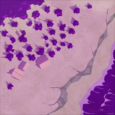
Completed: section as regional map
Oh for sure! I seem to recall a similar shape from the colony megastructure in Aliens, also.
It would seem that it is a prerequisite that arcologies in sci-fi are are constructed in such a way as to defeat their purpose of being arcologies.

-
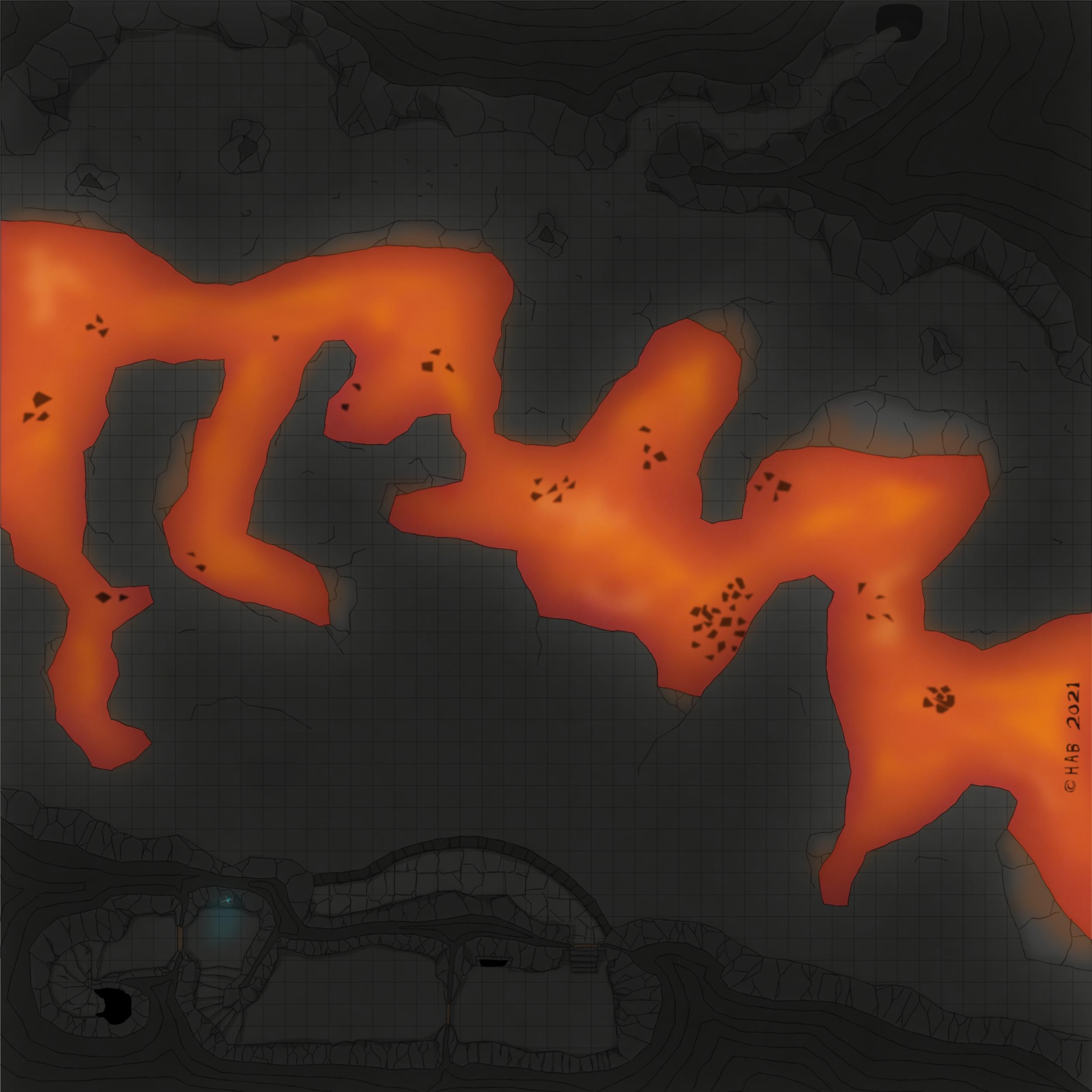
WIP: BD-like - a process output extravaganza
Range difficulty modifiers, people.


-
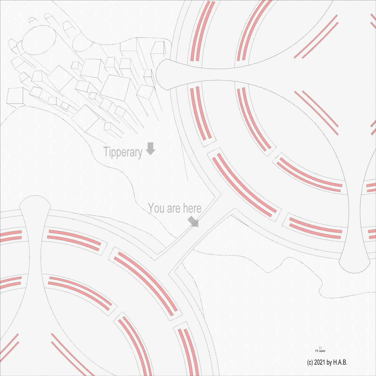
[WIP] Community Atlas Competition entry: Thing beneath the Iron Mounds
The battlement needs to have the colour choices sorted out and its stairs added...at some point.
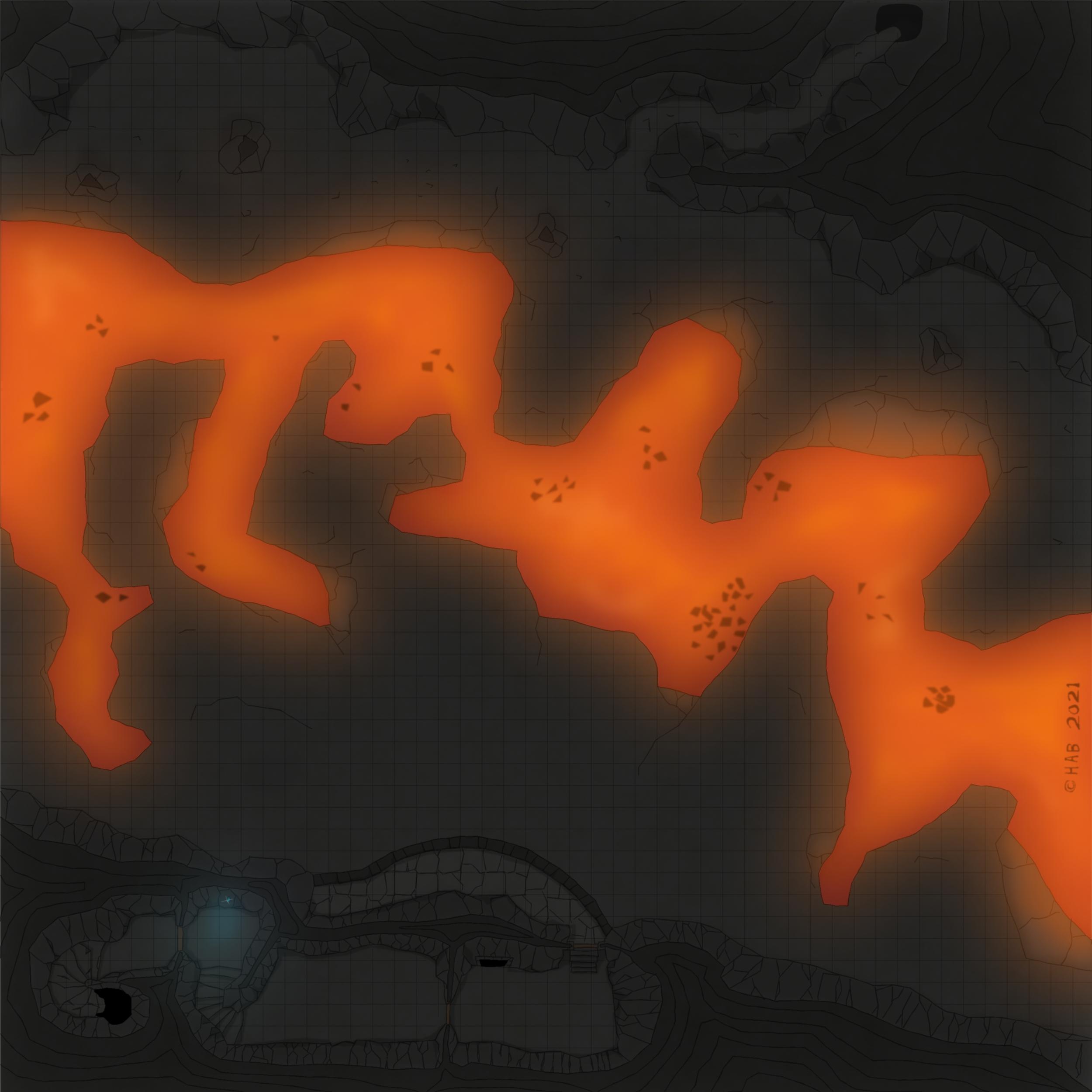
I seem to recall a Leonard Cohen line about killing the flame but I think it might be a bit too dark at the present time. But that could just be my fantastic laptop and eyesight playing tricks. Overall though, I think this is probably the right move for introducing shadow play on otherwise very flat-looking cave walls, which aren't supposed to be served by the light from the lava below.
It's not that I don't like the preivious look of things, but it's just that going back to it now seem a bit impossible - so that means it must have been an improvement, right? :D
That would be "not working with shadows" to "cover everything in shadow" over a few days off. It's adding some time to the process but also gaining something in the totals: it feels like it's no longer about *figuring out* how to uncover the good stuff, but rather a matter of making it so.
Anyway.
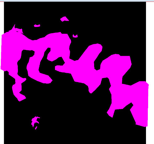
For the curious, the below is what Colour Key, Blur (with a generous border) and Transparency turn into the above.
The Transparency regulates the Leondard Cohen of the screen (black square polylgon)
The Colour Key (mixed fruit yoghurt colour bit) cuts out the parts that should be default bright.
And Blur, finally, extends the cut-out by toning down the edges of the black polygon - which is treated as now including also where the Colour Key area ends. The latter allows, of course, for adding more dots of "luminated" areas as seen where the fluorescent gem is doing its thing. Somewhere, there is probably a Lighting Effect I should be using instead...
Super printer-friendly map!
Also; I am not saying I will necessarily be doing it, but here is what things look like if one keeps multiple Colour Key below Transparency in the sheet effect stack. This means the colour of the Colour Key will seep through to some extent. Keeping mutliple Colour Key Effects one can then have a colour specifically suited to the light source's colour. Obviously, needs more discipline in regards to how far the glow should reach: seen here is "light" in places which - again - probably should not be as illuminated.
Options, options, options.

![[Deleted User]](https://secure.gravatar.com/avatar/c75d9a245b74d9c59be0999ea81ca541/?default=https%3A%2F%2Fvanillicon.com%2F92add7f8c954488718110edc4896ad39_200.png&rating=g&size=200)


-
Why should I buy CC3+?
Well, it was a bit of a Trollkin Necromancer insurgency. That much was fairly obvious, I should think. I mean: liking the community more...from a distance? Like...stalking?
