

Monsen
Monsen
About
- Username
- Monsen
- Joined
- Visits
- 725
- Last Active
- Roles
- Administrator
- Points
- 9,029
- Birthday
- May 14, 1976
- Location
- Bergen, Norway
- Website
- https://atlas.monsen.cc
- Real Name
- Remy Monsen
- Rank
- Cartographer
- Badges
- 27
Latest Images
-
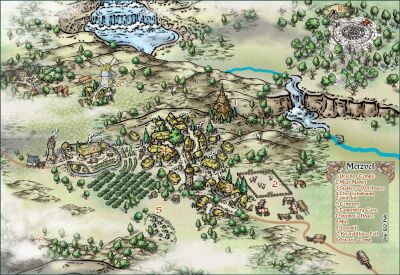
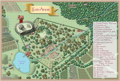
Community Atlas: Errynor - Aunty MacKassa's Home & Vehicles
This set of maps have now been added to the atlas. Thanks for the great contribution.


-
Tool Bar Buttons
Everyone have the CC3, DD3 and CD3 buttons, as both dungeon and city tools are included in the CC3+ base these days (Only the tools, you need the products to have the artwork, but the tools are very useful with artwork from other products, like SS4/5 or the annuals)
The WW2 button should be added as long as you have the WWII.mnu file in your data directory (which should be put there by the installer).

-
Where are the Tutorial File locations?
You should find the full user manual in @Documentation, as well as the Tome if you own it. All the files in @Tutorial should belong to one of the pdf's in @Documentation. Remember, even the quick start guides and essentials can have support files, they are mostly similar to the annual documentation, with a quick walkthrough of the program/add-on and making a sample map with it. The files in @Examples are just pure examples for you to look at, with no accompanying documentation.
For a Schley-based tutorial, I guess the first map tutorial in the manual would be the place to go. (And/Or the one in the Tome)

-
[WIP] Custom Map for Dune Boardgame
The mention of Dune and your maps make me think back to the original Dune II computer game. It set the standards for the future of the RTS genre, and provided me lots of fun in my younger days. Fond memories.
-
Export effect difference
Looks like your effect is set up to "Percent of View Width" instead of map units or percent of drawing extents width. Go in and edit the effect in question, and change this section. Do note that you may need to tweak the size of the effect after doing this, as you basically change the baseline for the sizing.


