Lillhans
Lillhans
About
- Username
- Lillhans
- Joined
- Visits
- 2,008
- Last Active
- Roles
- Member
- Points
- 2,066
- Location
- Sweden
- Rank
- Surveyor
- Badges
- 13
Latest Images

Reactions
-
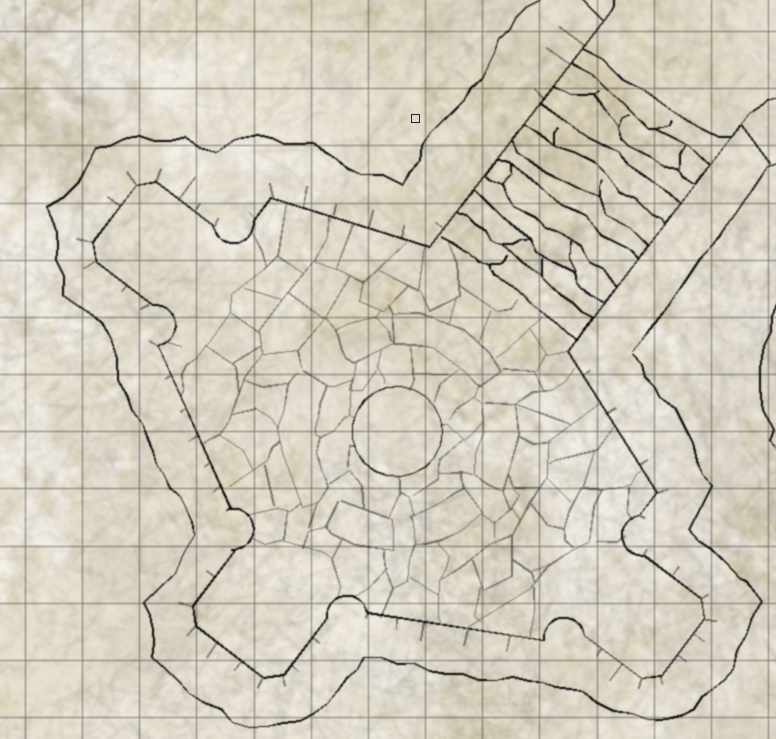
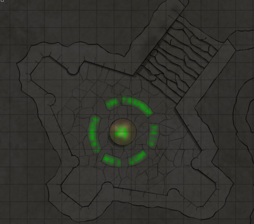
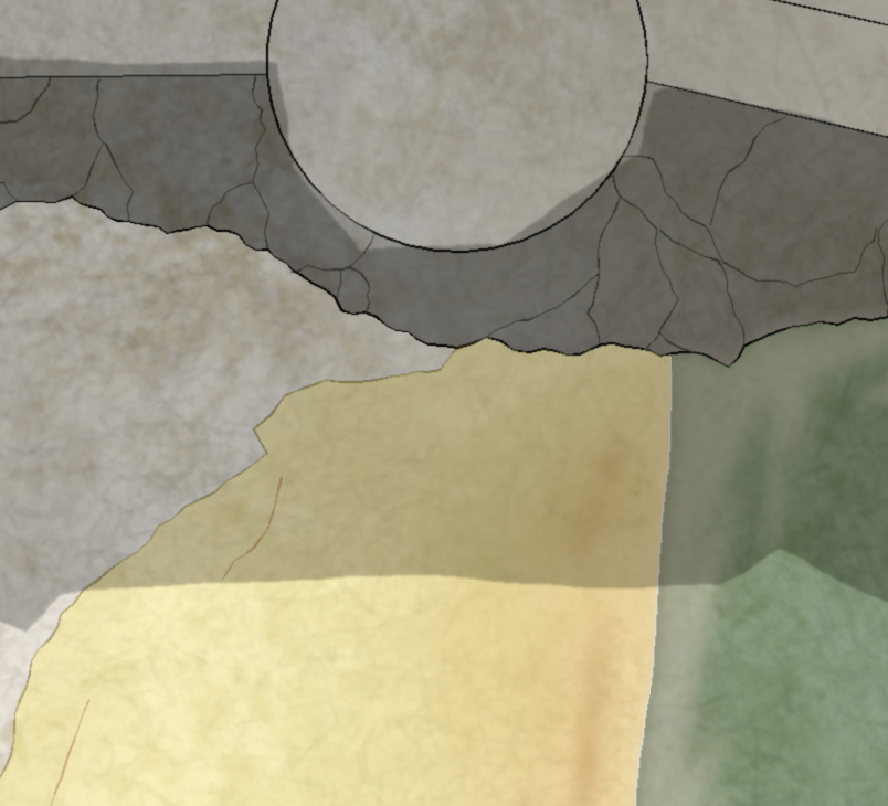
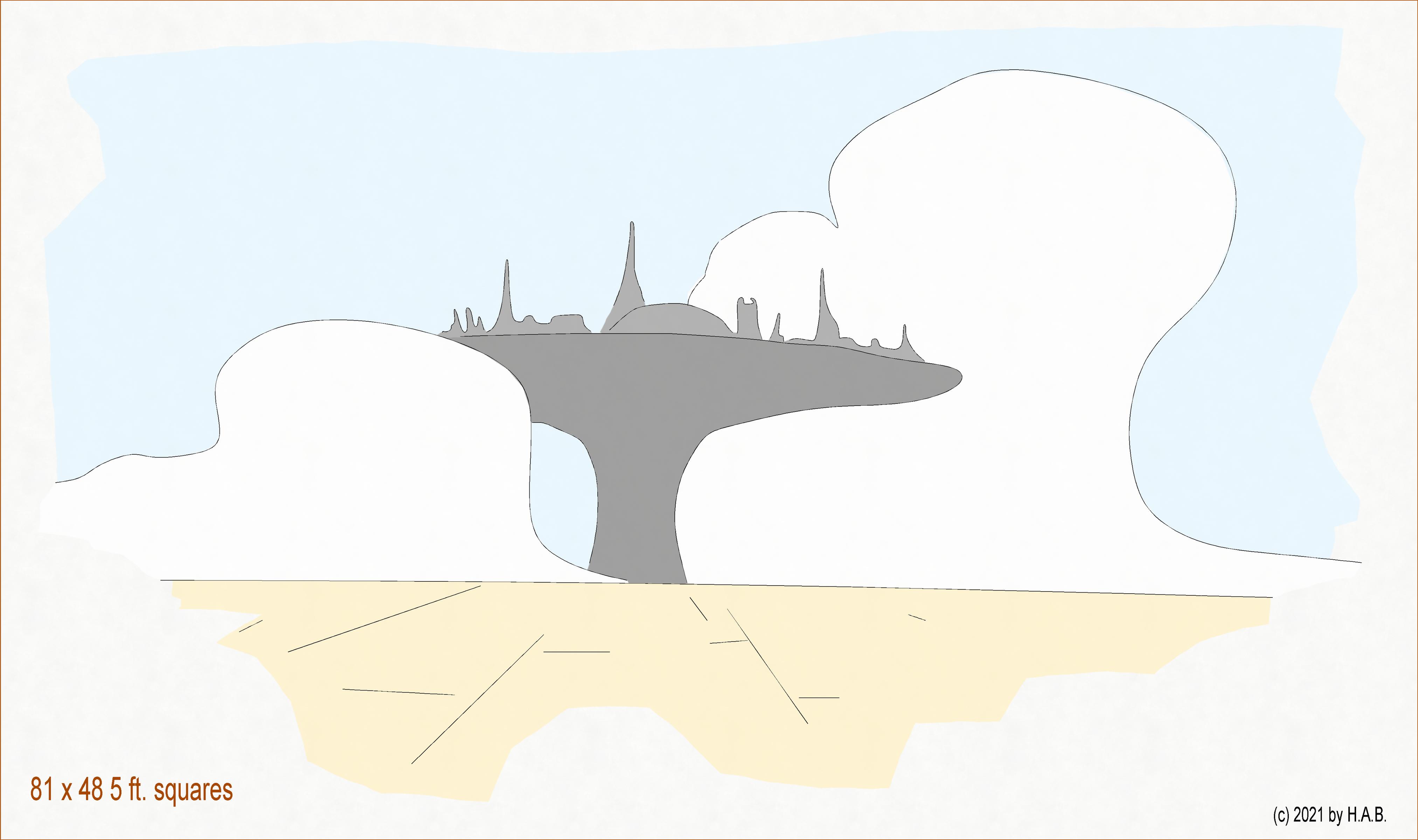
[WIP] Community Atlas Competition entry: Thing beneath the Iron Mounds
It woudn't be like the maps you get in game supplements if there wasn't at least one feature which renders the map useless to some extent: if it's not a matter of fruitless attempts to align your VTT grid with that of the map's - which utlimately forces you to crop the the damn thing in segments (cutting and pasting) - it's some text or otherwise invasive blemish which has to be GIMP:ed out somehow.
Almost there now: the "exterior" rock wall on the south needs to be defined in a manner closer to what's going on up at the north end, and then it's just making shadows less sloppy and then I think it's actually done. To think the pillars got to stay this far into it!
Next time you get to see it, it will be accompanied by a fancy write-up and the .FCW file. And, might I say, what a rewarding project this has been: getting to explore the application. Such fun!


-
Pseudo-Architectural Shenaningans (WIP)
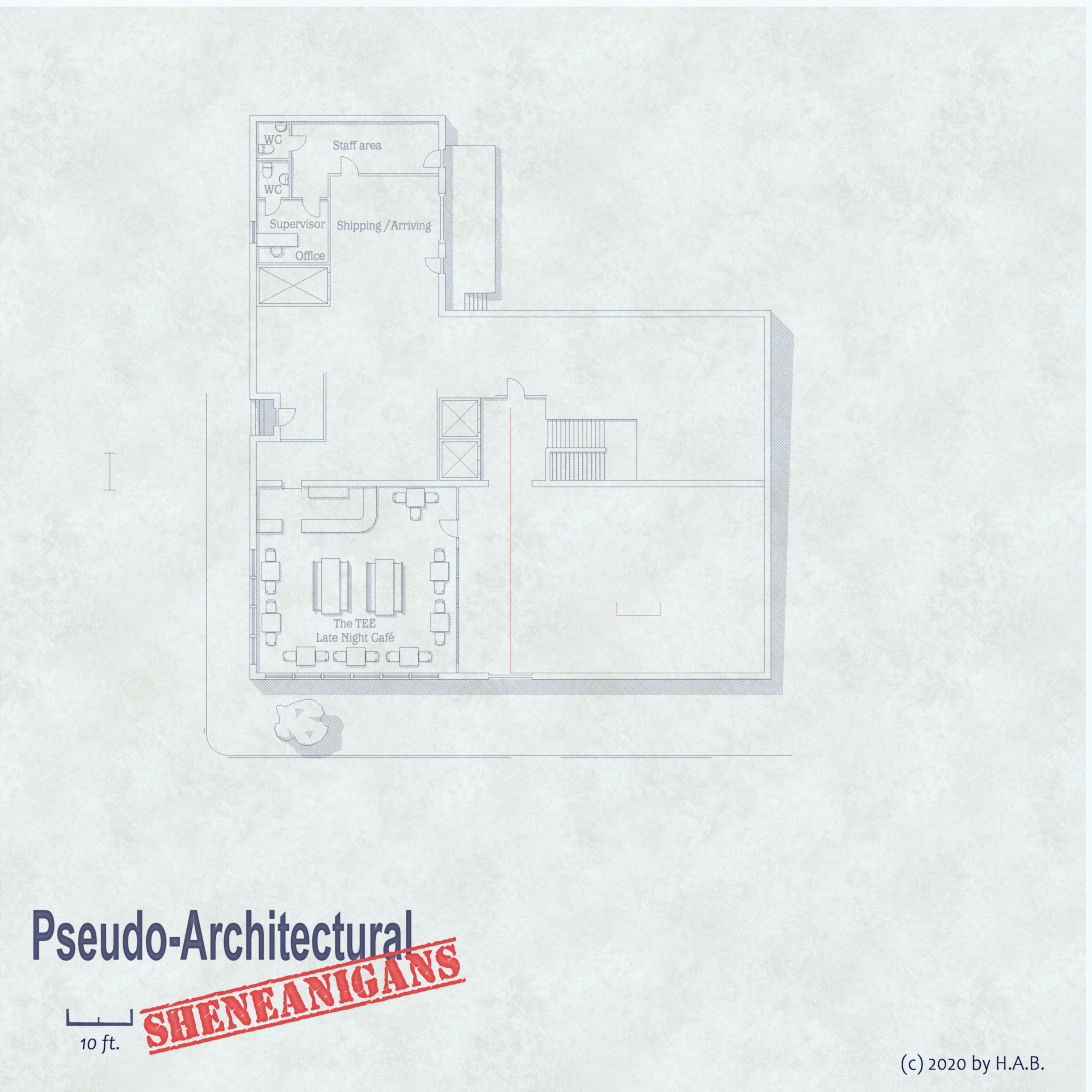
So the elevator/stairs core is probably off by a whole lot, structural engineering-wise, but since the building is for dynamic entries and kinetic activities (and other murder-deathkill stuff!) who cares!
TEE kitchen and staff area needs sorting out - as well as the NE/SE quadrants. Suggestions more than welcome at this point: I'm procrastrinating my way into 2021 as it were. Utility room/shafts? Travel agency? Realtor? Art exhibition?

![[Deleted User]](https://secure.gravatar.com/avatar/c75d9a245b74d9c59be0999ea81ca541/?default=https%3A%2F%2Fvanillicon.com%2F92add7f8c954488718110edc4896ad39_200.png&rating=g&size=200)


-
Office Hours Shenanigans
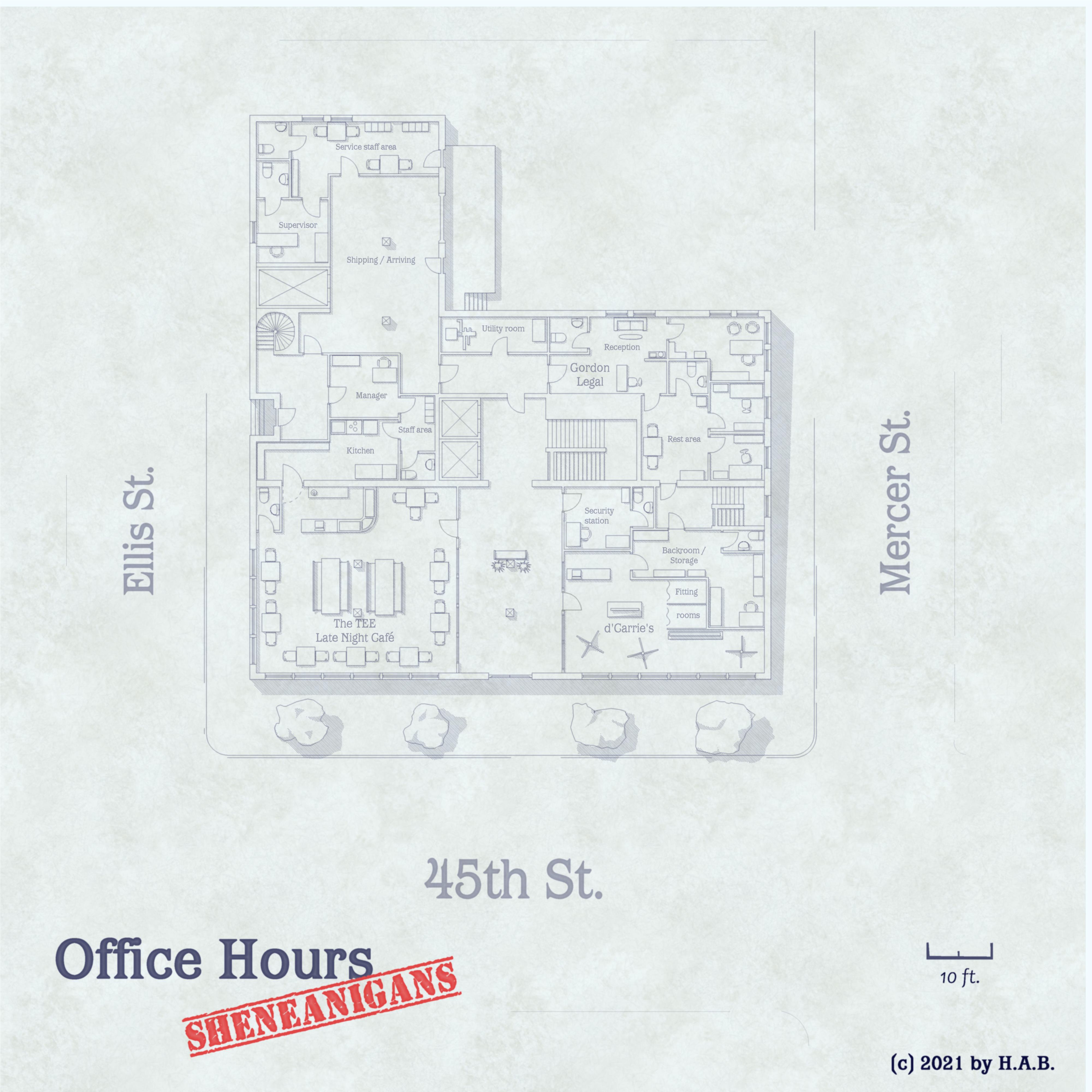
It's a wrap! Gold team, standing by.
Edit: realised a toilet had been scaled up upon pasting. Loooool. No more toilets now.


-
Panzer sample thread
Brighter, but lost it's red-tone in favour of full gingerbread. The quest for the right tone continues!
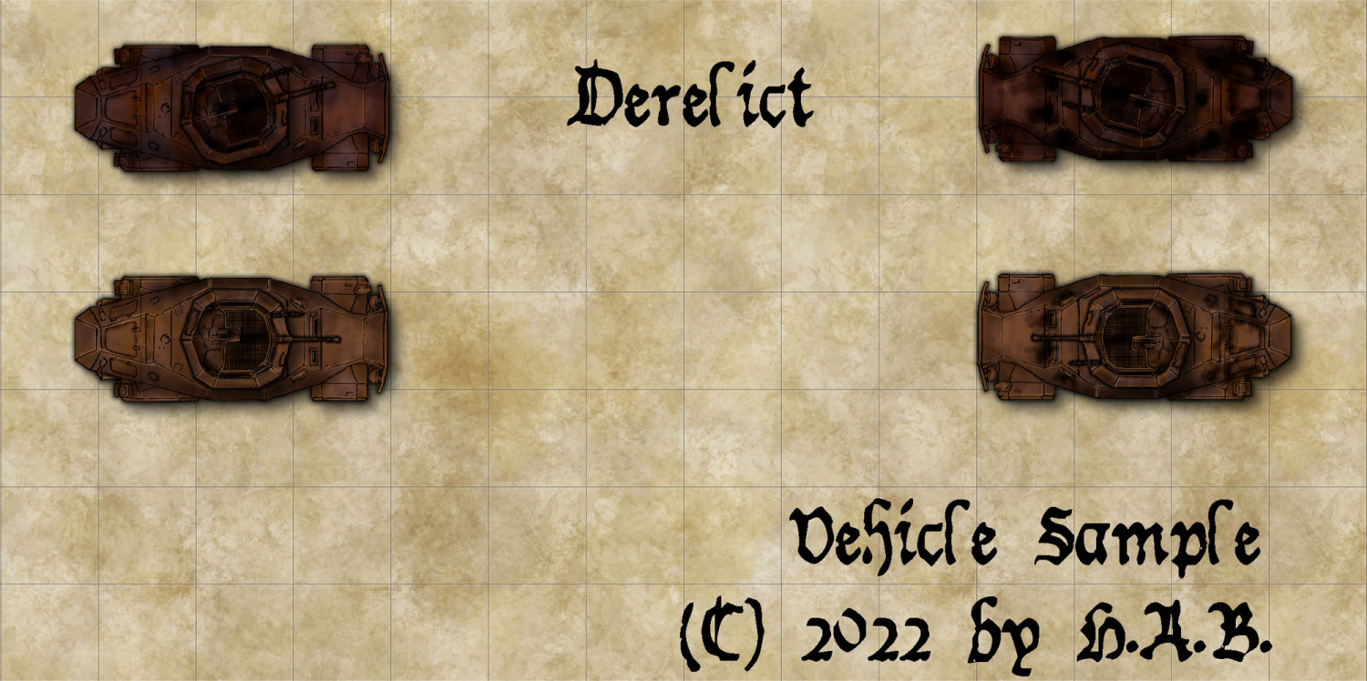
Agreed, @Wyvern: it has that certain design quality to it....which also kind of begs for it to be parked next to a Sd.kfz. 231, 6-wheeler.


-
WIP - Quay thing
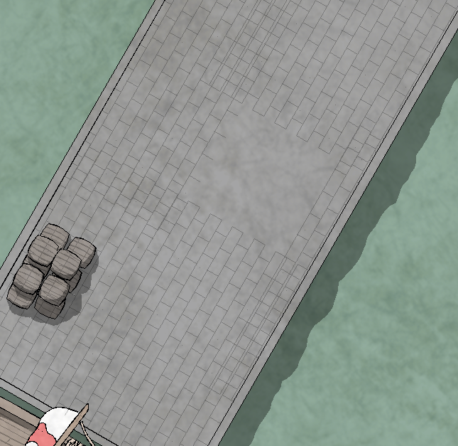
So this is a bit of a setback: using the Gres Symbol fill style and editing the angle to accomodate that of the pier (in this case) gets a rather peculiar result. Rotation being a no-joy, then, I turn to other methods for tiles.
- I start with the size of the stone.
- Then, one PATH drawn in such a way as to get the end node at the top right corner of the rectangle. This would be the base form
- This is the yardstick for....
- ...knowing how many iterations of copy-pasting the basic form I need, length-wise. I then join all bits with Line-to-Path and ....
- ...put enough of 'em next to eachother for the width of the pier.
I'd like to think it's less cumbersome than copy-pasting the single stone/rectangle and allows for better precision at a quicker pace. In theory, this will also make fancy-ass patterned cobblestone sections a breeze!
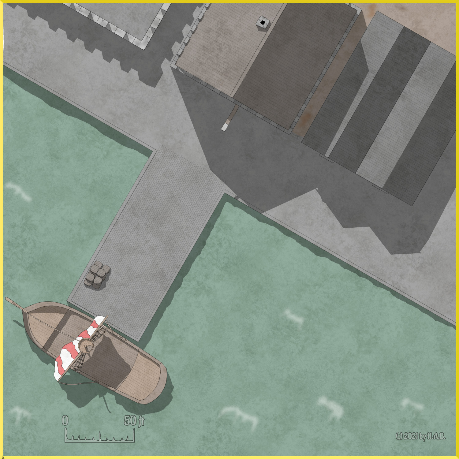
I think it's going places!


-
Festive Winter Card Challenge WIP: Ensamheten
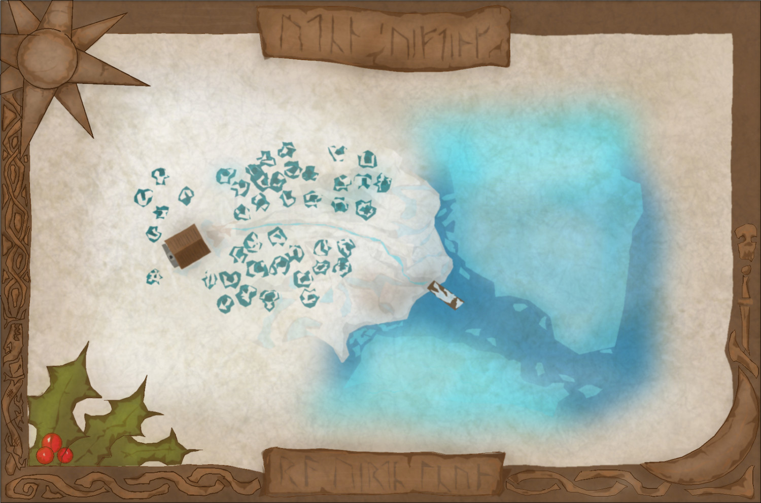
oeoe!
-
WIP - Water's Edge Exercise Distraction
Sure thing!
For fractal paths I use a custom tool since it allows for dialling up or down on the frequency, but the rest is the standard arc/smooth/etc - everything but the pencil tool, really.
Colours primarily on the one sheet (smudge/embellishments go elsewhere). This of course allows for flannelgraph maneuvers with a minimum of covering-up.
It's very much this:
Arcs, fused with paths and then some fractal paths. Adding colours for bells and whistles like so:
Process isn't too bad, for time, once you get where you want to be visually.
And here's a section of the water's edge folly for comparison:
Process very much in progress for water's edge specifically, but the working theory of the proto-dwarf portal thing above shows (I think!)

-
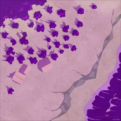
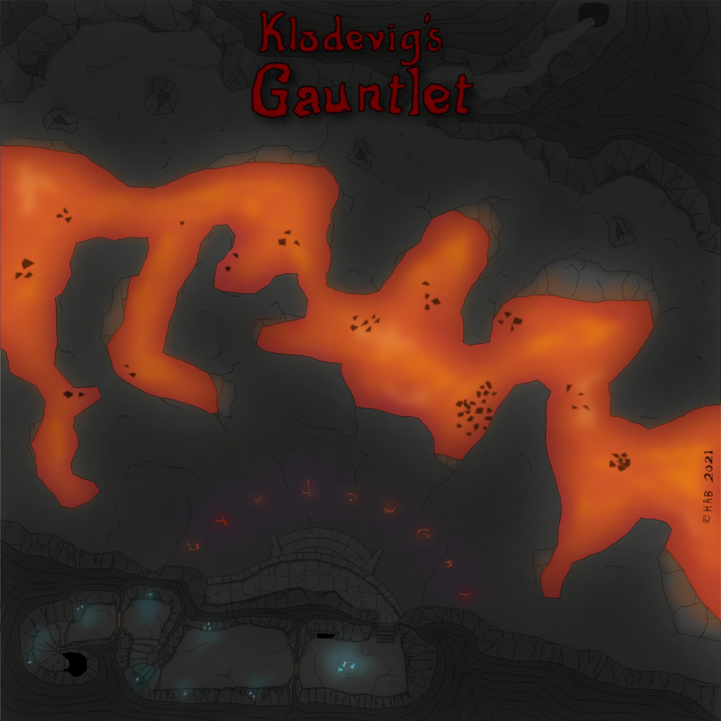
WIP: Fire Fields
Find attached an alternative way to get that lava glowing:
The Dark Cover sheet (added) works on the premise of using Colour Key to make cutouts where the light source is. The resulting edges will get the full Blur + Edge Fade, Inner treatment. This is also why a default square polygon tool was used - so as to not have those effects bleeding into the picture across the map border.
The (also) added Lava Light sheet is operating simply on Blur and Transparency - and you can see how these shapes roughly cover the same area as the underlying lava floor texture and Dark Cover cutouts. Other than taking control over how the lava "feels" this essentially is the coloured shading as suggested by @Loopysue above.
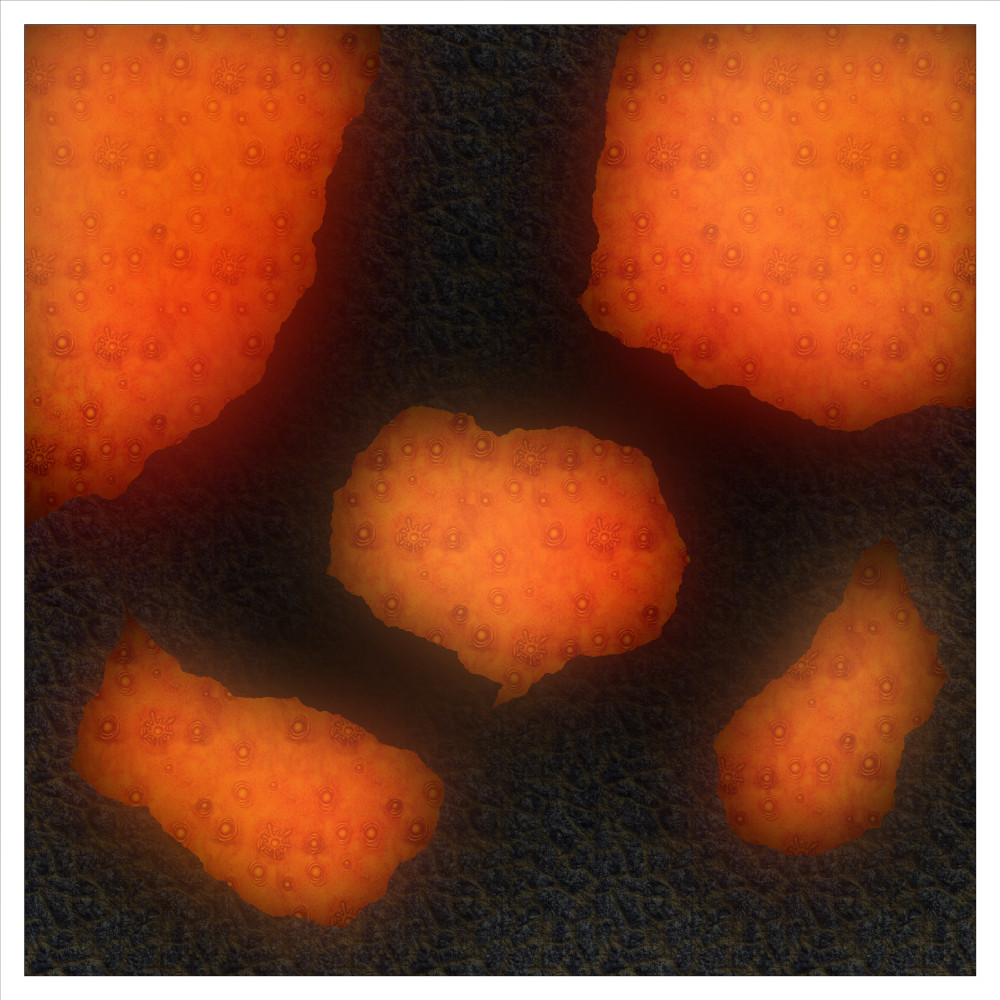
Using the same floor sheet for both liquid and solid lava, rather than involving a wall sheet, seems to have done away with undesired wall shades as well.
If shades are still desired to differentiate between different levels it's just a matter of adding more floor sheets and stack them in the desired order.

-
WIP: BD-like - a process output extravaganza

-
Multisheet symbols (first impression)
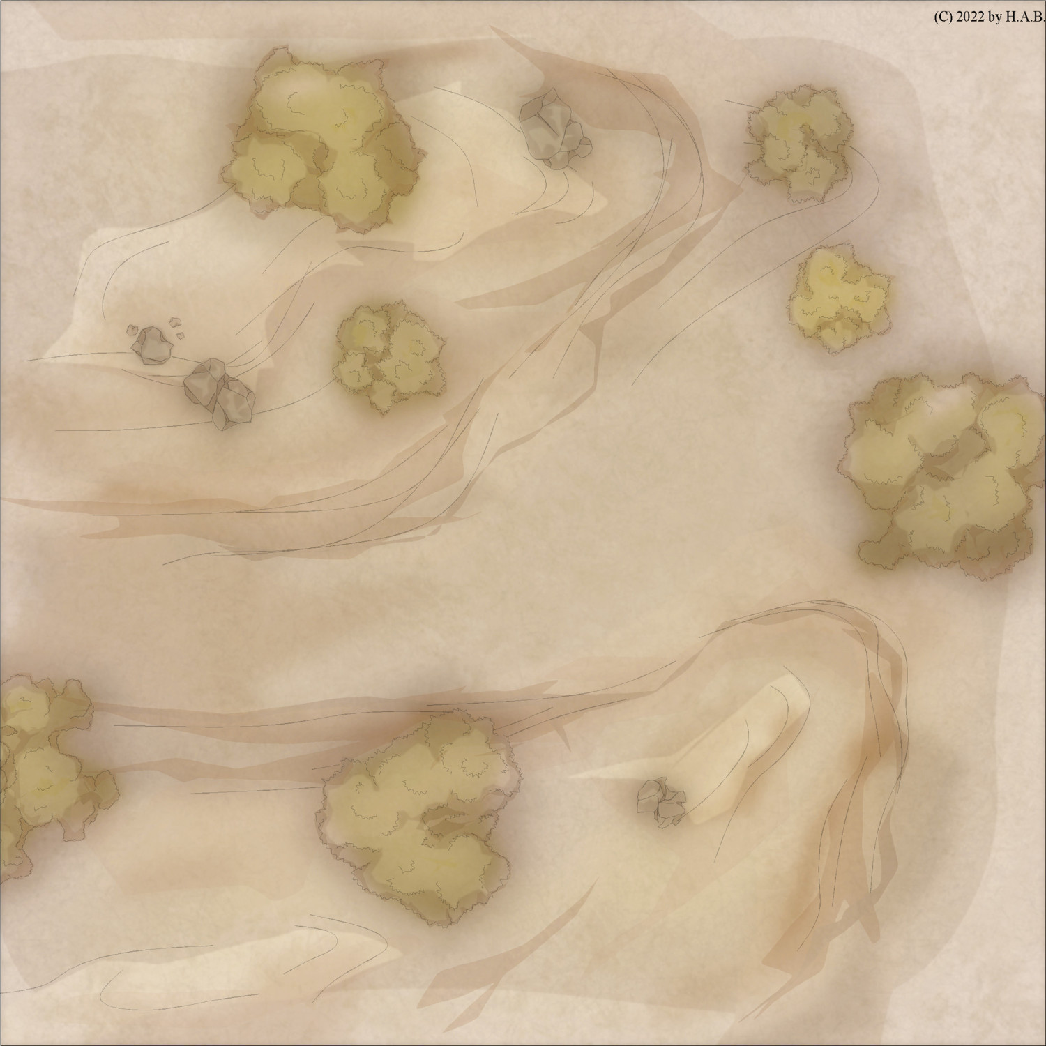
Expanded the "wilderness" catalogue with rocks: I got a comission from a friend to do a couple of encounter maps for their upcoming sesssions and decided to take it out for a spin.
They haven't decided on style yet, but the fainter contours for trees and rocks (bottom iteration) would be my personal choice - especially with this take on topographic features.