

Lillhans
Lillhans
About
- Username
- Lillhans
- Joined
- Visits
- 2,008
- Last Active
- Roles
- Member
- Points
- 2,066
- Location
- Sweden
- Rank
- Surveyor
- Badges
- 13
Latest Images

Reactions
-
Multisheet symbols (first impression)
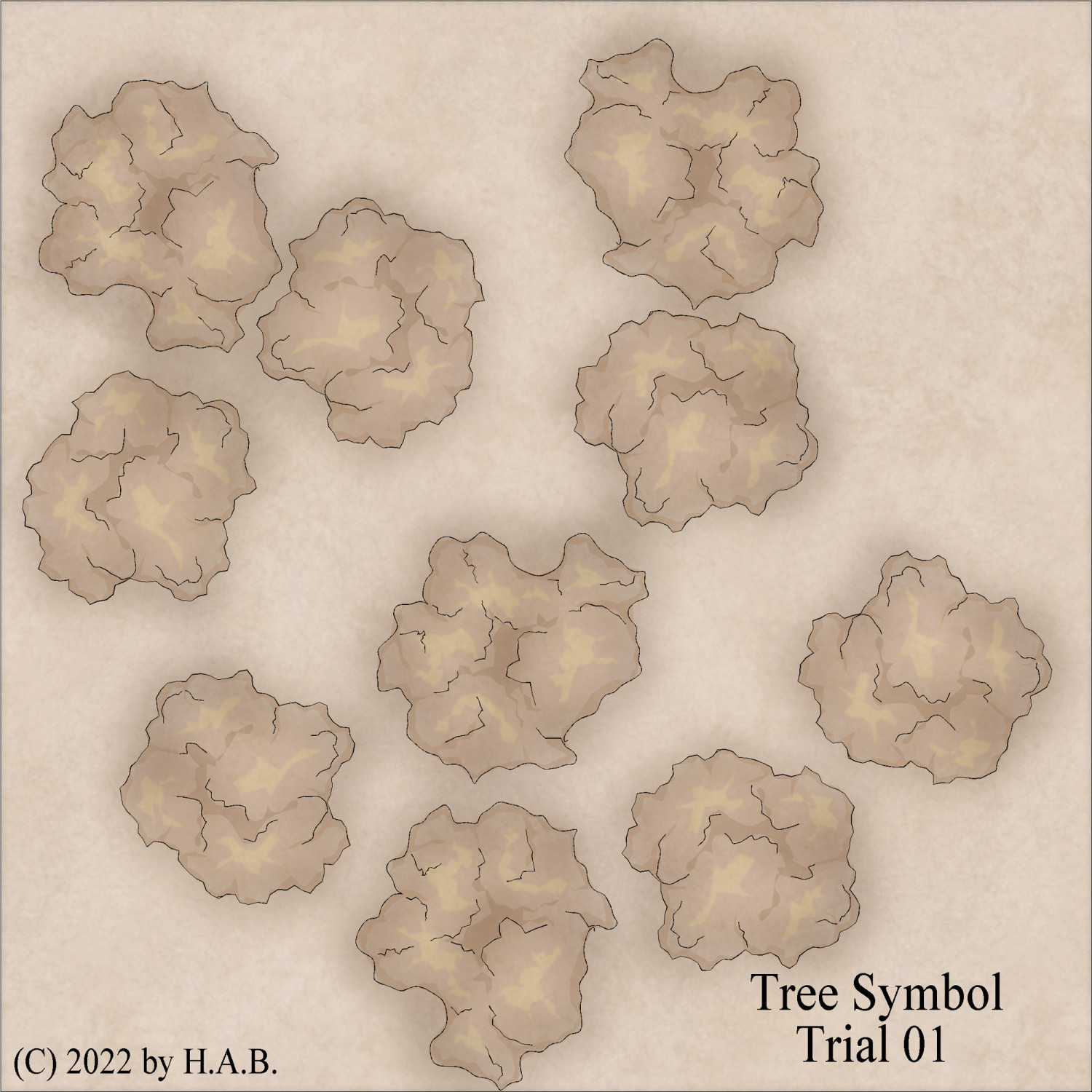
Not gonna lie: the Random Transformations options (rotation and mirror, specifically) make for rather convenient speed painting!
Between five variants for each size category - small, medium and large trees - variation certainly isn't going to be an issue!
I am getting some wonky Layer selection output but it's a start.


-
Panzer sample thread
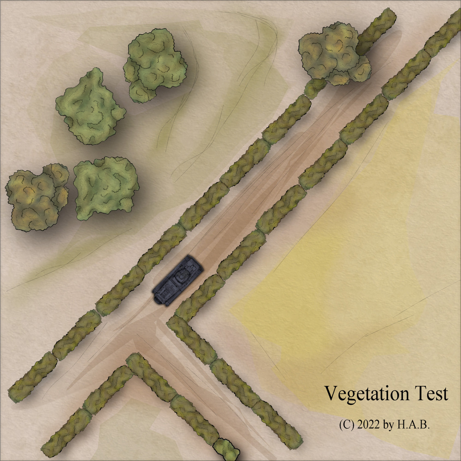
Paper theatres were brought up the other day. Obviously, a slight detour from the halftrack-o-rama was unavoidable.
Against the fake-uarelle backdrop, the tree symbols in particular come off ever as flat - in no small part thanks to the sheet shade effect. Top-shelf paper theatre visuals.
But! As - especially, I think - the hedgerow coming out at seven o'clock from the top-right tree shows: it isn't without merit to use sheets effects that pull the symbol closer to the rest of the style either.
I'll need to create faded-ended hedgerows and also mid-sections... Back to half-tracks!


-
October challenge: City Street submission WIP
The exit risk eliminator: if I can't make the colours work, I can always go with the sketch version, right?


-
Pen & wash question
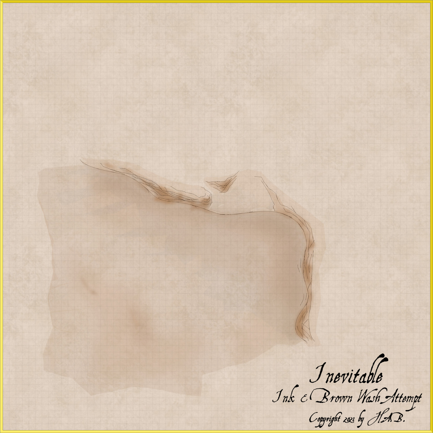
I guess it was just a matter of time. Very happy with the lake, so far. Cliffs a bit meh, but it's a fun detour from the other...uhm..detour and that original project which I did set out to complete by year's end. So we're on schedule, after all!
![[Deleted User]](https://secure.gravatar.com/avatar/c75d9a245b74d9c59be0999ea81ca541/?default=https%3A%2F%2Fvanillicon.com%2F92add7f8c954488718110edc4896ad39_200.png&rating=g&size=200)

-
Riverside Shenanigans (brawl map)
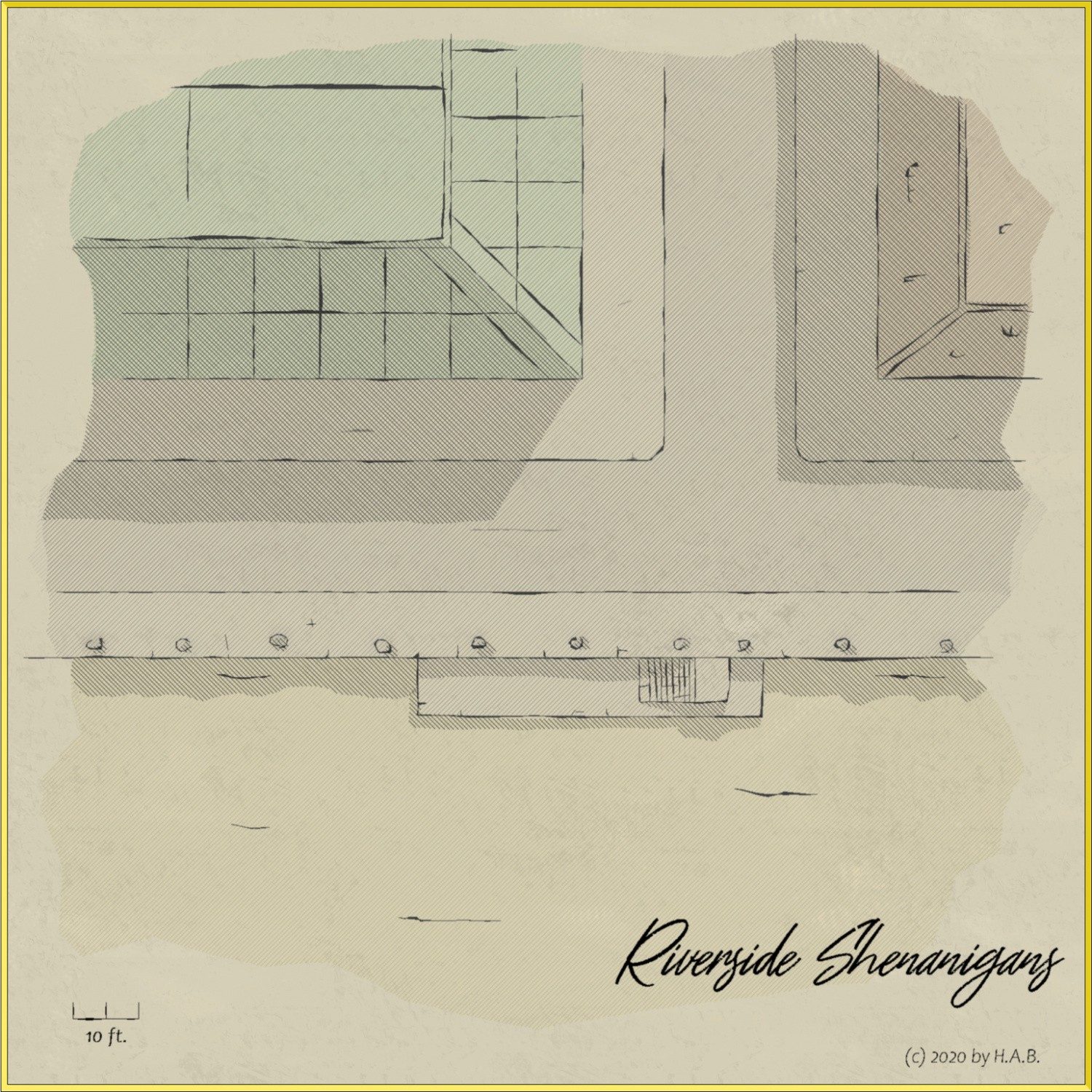
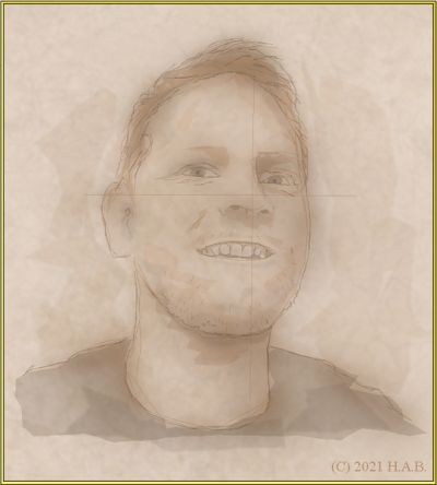
Beigified Faber Castell, on beige canvas (best viewed through beige sun visor for a more complete beige experience).
-
Fuchswald Memorial
That's awesome, @Elfling; do show and tell!
I think for a video, geometry is probably the best topic!
@Monsen would insist that it's not really a map, of course. Which kind of makes me want to put continents on it. An entire world sitting in a corner of a box is probably one of the cooler takeaways from the Men in Black series.


-
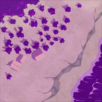
Sad and At Sea
The craptop was fixed. Stuff recovered. Uppwards and onwards. Here's a Merz-inspired nautical encounter map.


-
Submersible Shenanigans part II (batteries not included)

Too much motion for a good encounter map, probably (I tend to like my battlemaps as static as possible)
Still: rather happy with what is both my first top-down submarine and creature-in-the-water.
-
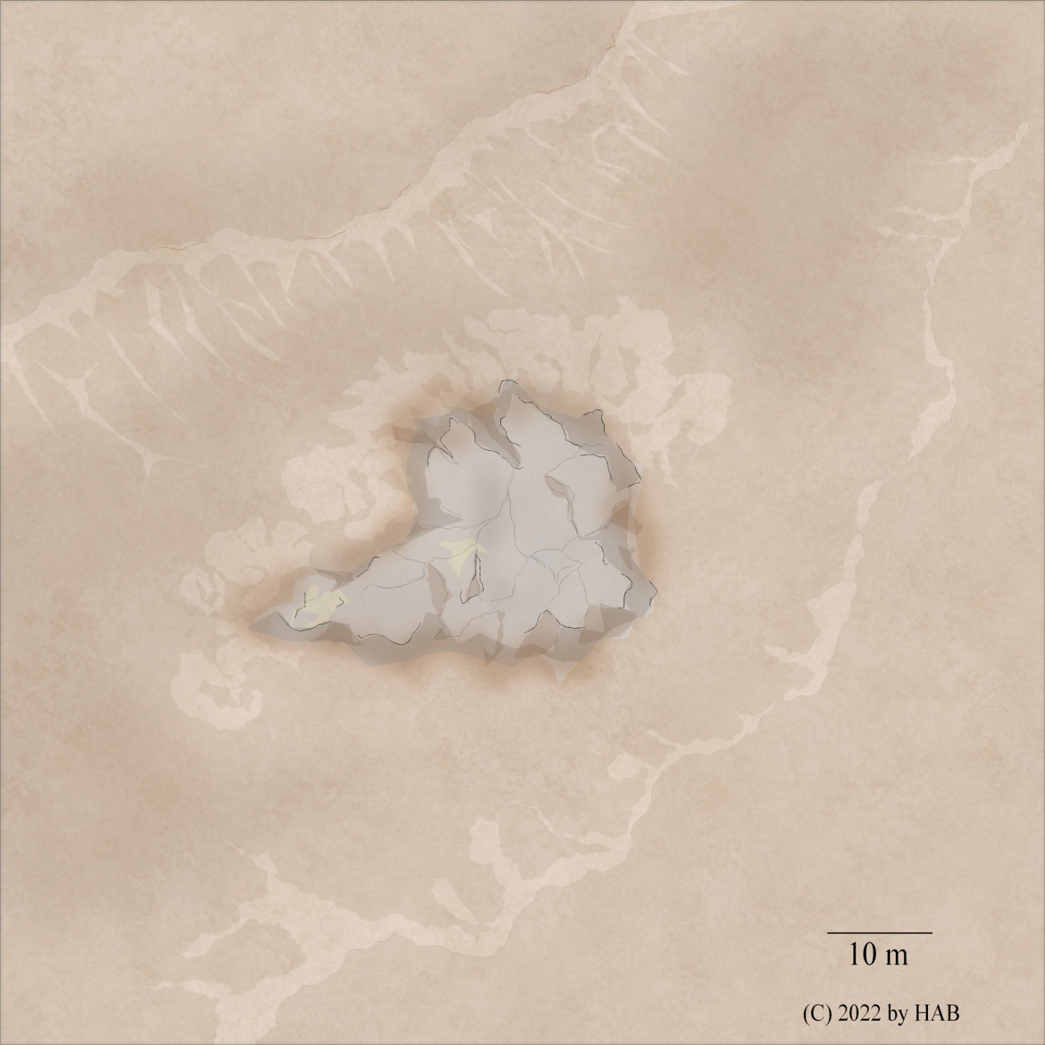
Cave Study
It's basically the Watercolour Maps style from the 2019 Annual with a few changes (as in, everything is changed except for the one texture). You are essentially looking at the below structure of sheets going from back to front as per the sheet stack order we all know and love. In reality, the contour sheet (top) sits in front of the others. I put it at the top for the display because that way you also get the actual order in which each segment was done: back to front.
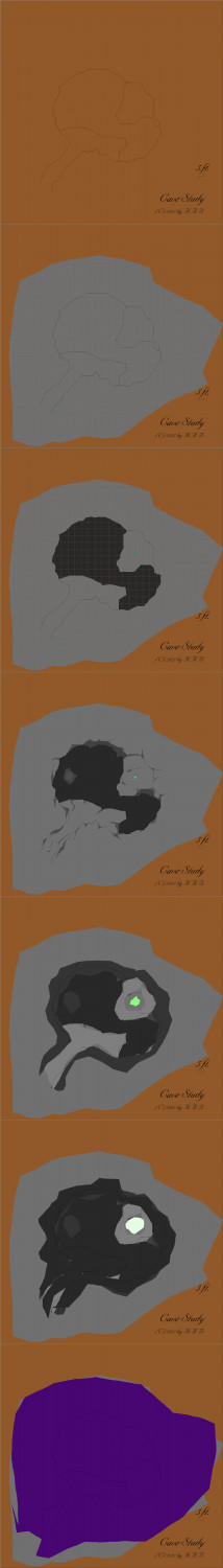
As the below version demonstrates; the function of the texture is, in fact, primarily to add colour variations. Notably, the resulting distortion/irregularities has the greatest impact where gradience is achieved by way of Blur or Edge Fade, Inner - or any other sheet effect with simliar....effects :P
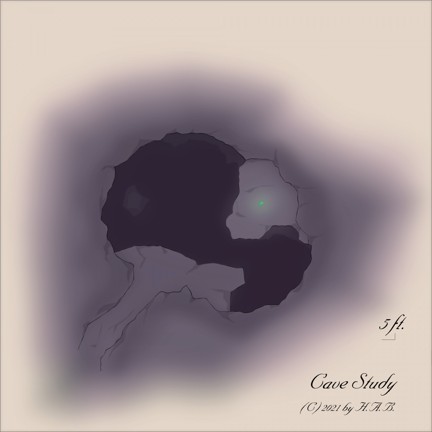
So it's a sort of low effort/high impact environment - or the goal is for it to be that, at least. As further demonstrated by removing that last purple blob:
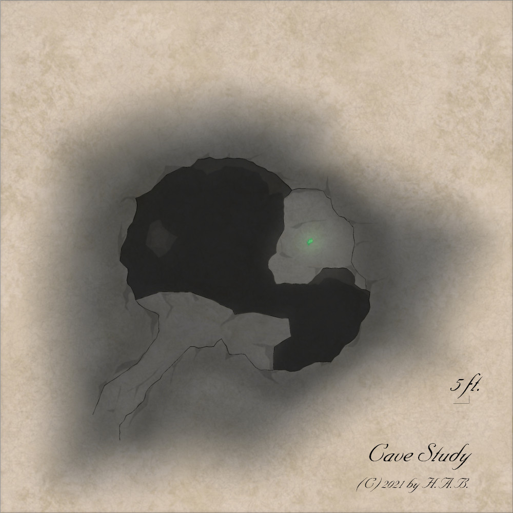
(It's just not the same map without it, right?)

-
WIP - Quay thing
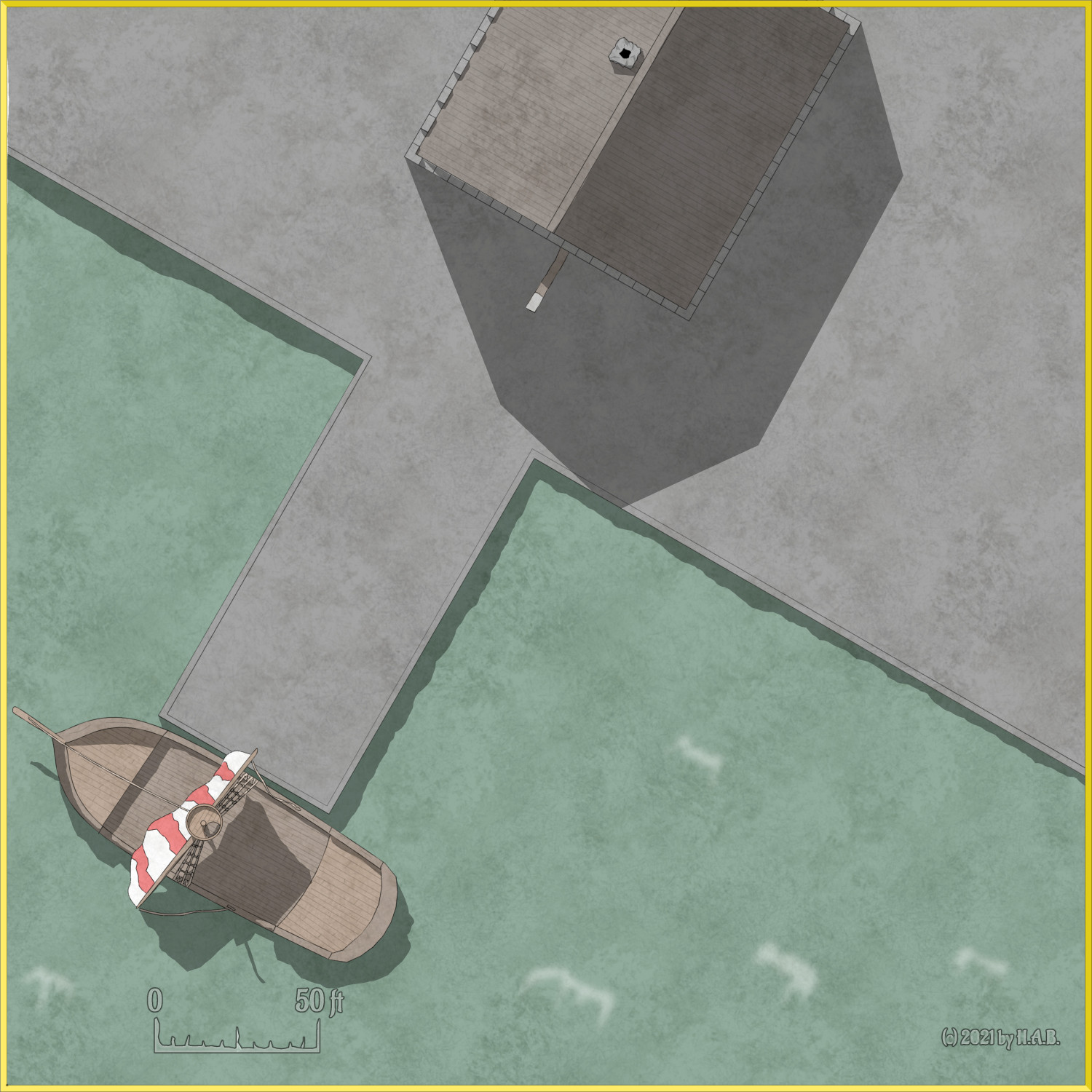
Two thirds of the crenellations are missing out on sweet sweet accentuation-by-shade, but it was that or the gable roof not really coming off as such. Beam/lift needs shadow too I reckon but there is lunch to be had!

