

Lillhans
Lillhans
About
- Username
- Lillhans
- Joined
- Visits
- 2,008
- Last Active
- Roles
- Member
- Points
- 2,066
- Location
- Sweden
- Rank
- Surveyor
- Badges
- 13
Latest Images
Reactions
-
WIP - Quay thing
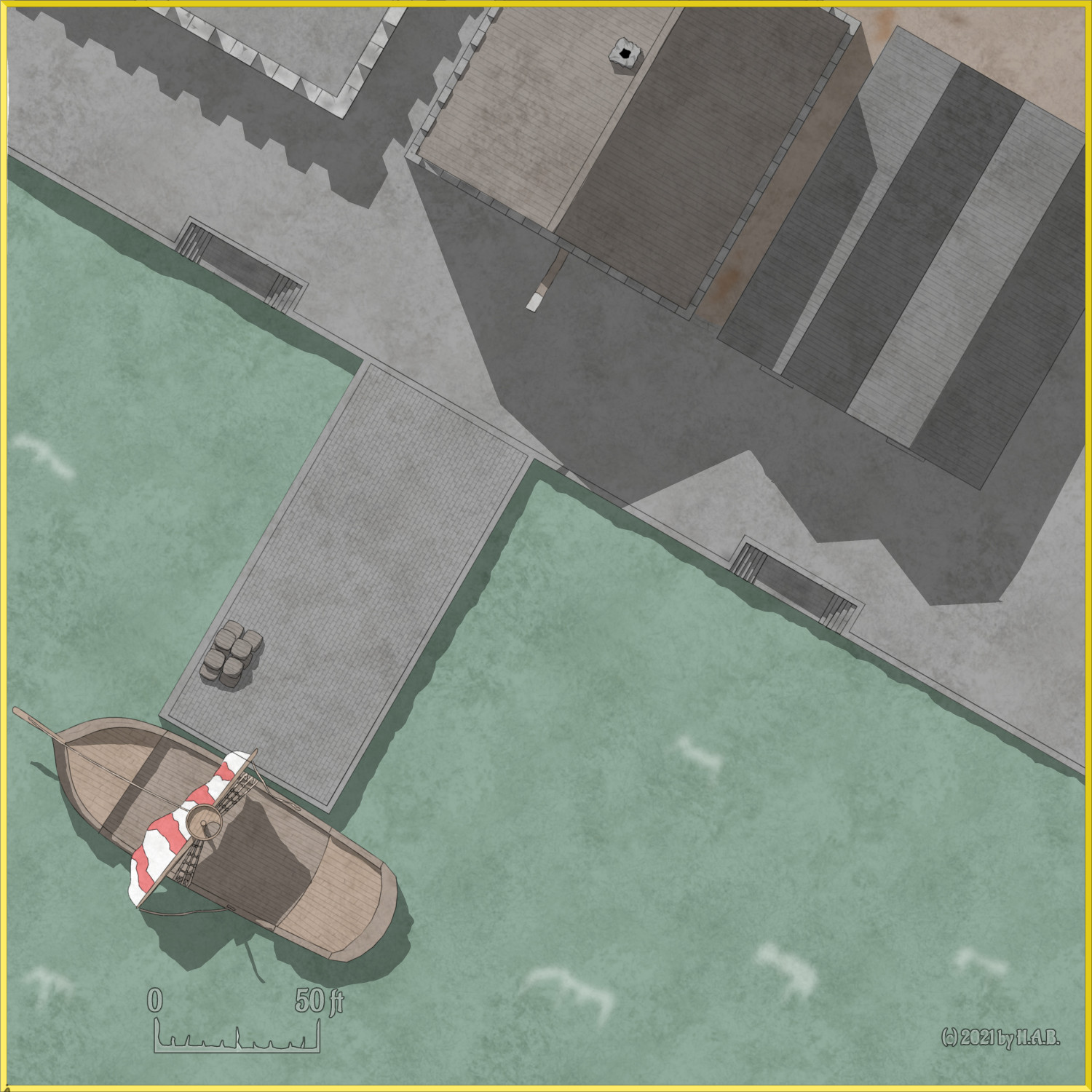
Floating wooden docks coming up, methinks! Smaller vessels, too. And then it's the streets!


![[Deleted User]](https://secure.gravatar.com/avatar/c75d9a245b74d9c59be0999ea81ca541/?default=https%3A%2F%2Fvanillicon.com%2F92add7f8c954488718110edc4896ad39_200.png&rating=g&size=200)


-
Mountain-side thing
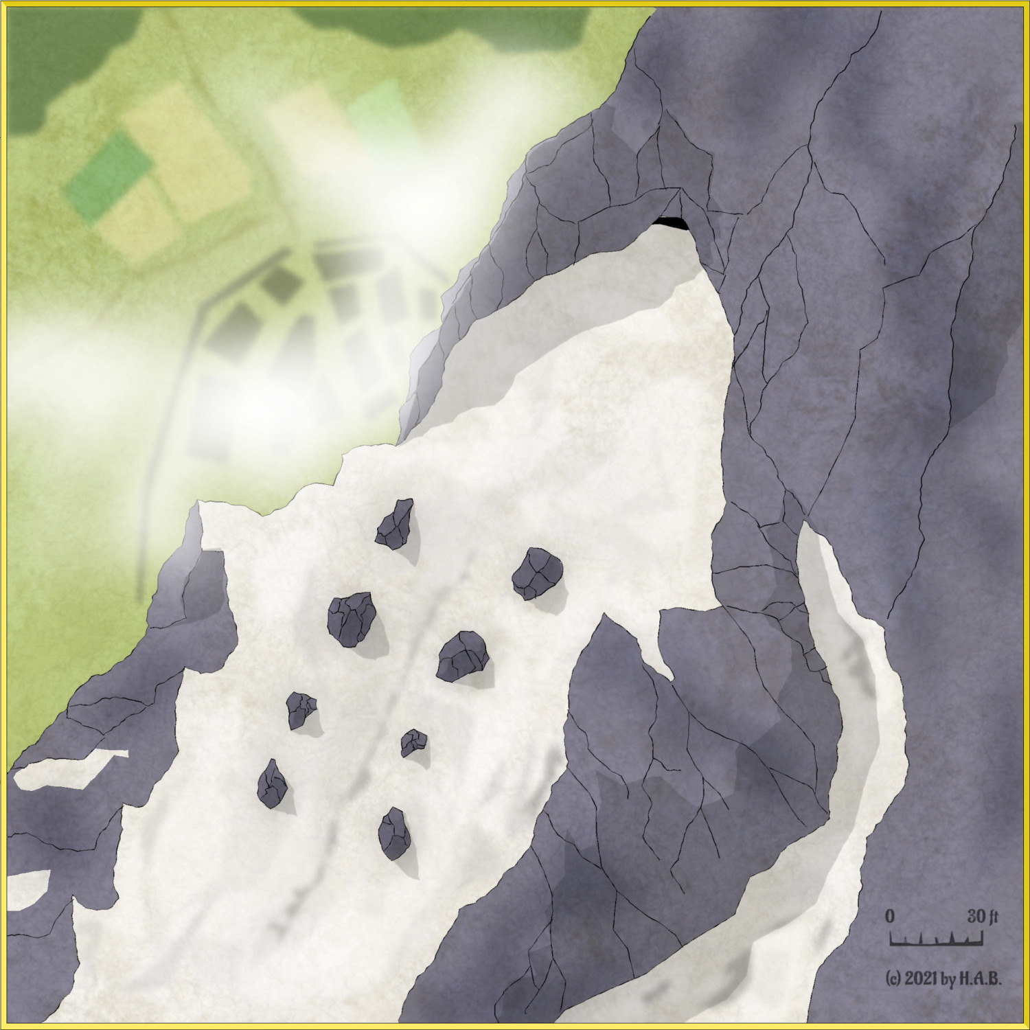
Certain death, some snow, and rock.

-
Isoblocks
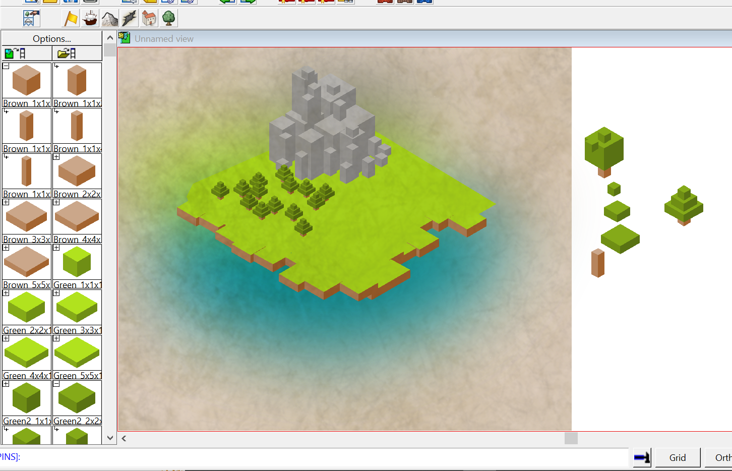
So it has basically been an awful year from a hobby perspective for me.
Anyway; find attached Isoblock catalogue. It's basically 25 blocks; 1² through 5², each at 1 through 5 blocks tall.
The range currently covers six colours (2 greens, brown, grey, white, and yellow) and a varicolour set-up for a total of 175 symbols. And one can easily add more as seen fit. The varicolour variant simply adds to the "top" side of the block - as seen in the above coastline - but should be equally suitable for anything that works with brown sides. Such as cakes.
With Group and Scale, sub-assembly certainly is an option. I used an isometric grid, clocking in at 1.524 (old habit of using metric units over 5 ft squares..) creating the polygons - but I reckon there is no such thing as a "master" scale to it. It's blocks, after all - and we can build what we want to.


-
Bog Standard WHFB Tower (shenanigans)

Played around with different Blend Mode settings and a tried and true texture, also throwing in some RGB Matrix Process in the bottom two (Sepia and Gray respectively) with some minor colour adjustment. Dialled down the transparency of the backdrop brown "paper" for a more darker tone to "tame" the Sepia in particular. For the Grey iteration different colours would probably be required to make the hill look a little less wonky.
As with the Grey, I think better colour selection can make it work even without the texture (below)
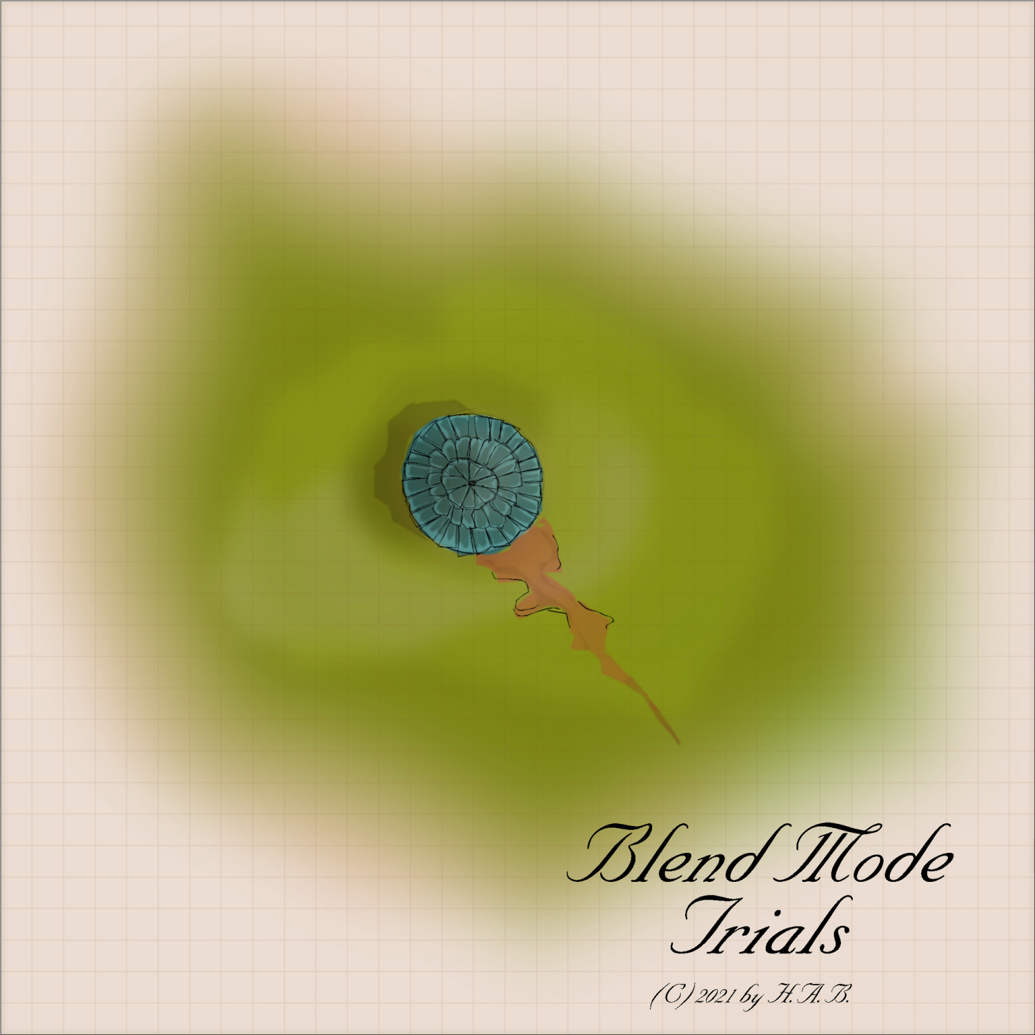
...which is kind of neat because keeping multiple sheets for different Blend Mode settings (with or without RGB Matrix Process) basially means I get to switch between very distinctive looks for the map with a very minimum of effort (i.e. hiding "filter" sheets not in use).
So...yeah...gradience was less of an issue with this approach meaning fewer polygons overall - and consequnetly less time for colourizing. So I had no choice but to dabble with the time-sink that is the practice of highlighting. Obviously.


-
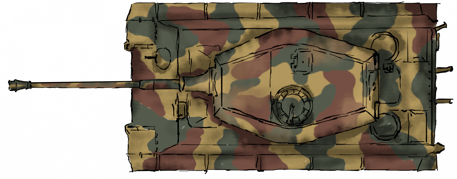
Panzer sample thread
All work, no play of late. But the catalogue is growing! Seen here is the SdKfz 222 in a sort of derelict state of existence.
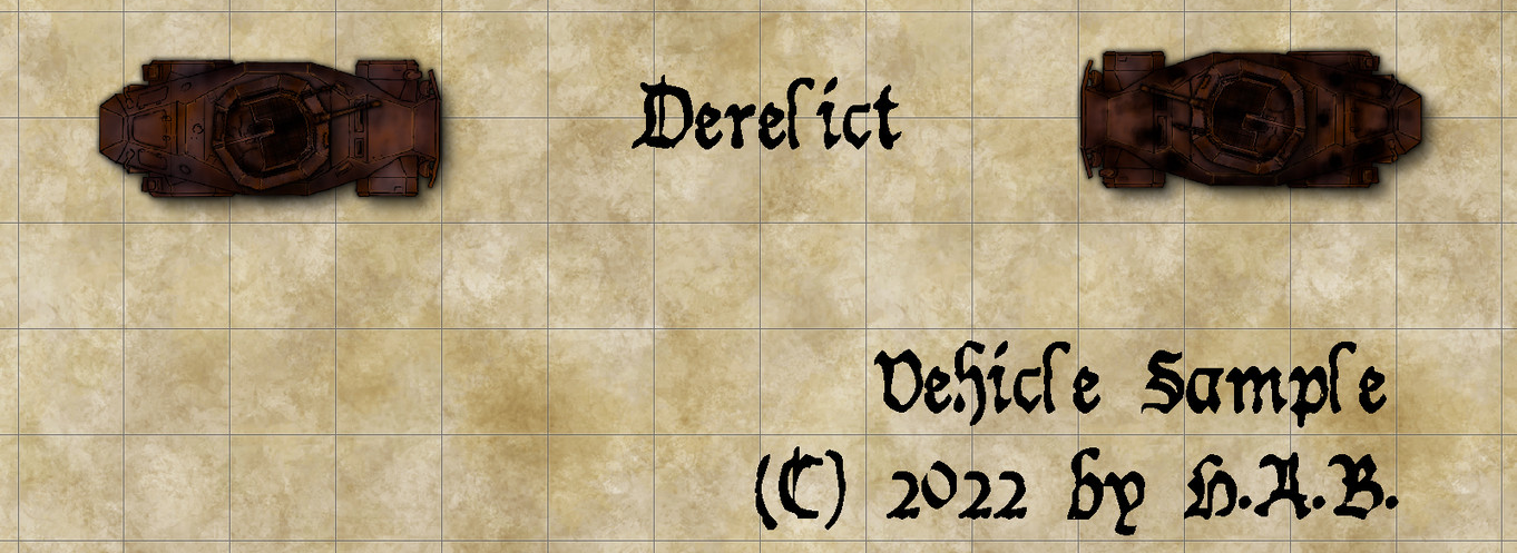
I have done a simliar chassi double (right hand side) for the base, desert, and cammo patterns too.
Thoughts?


-
Eldtrich Tickets, Please
And it's done.


-
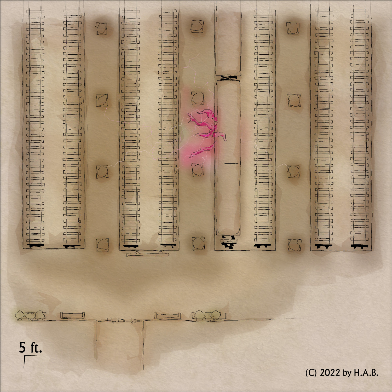
WIP - Quay thing
Not so, I would argue!
It's lines over a total of 3 sheets, for enabling layering and various "pen" settings...
....superimposed on slabs of colour over like three sheets - tops - for the same reason as the lines.
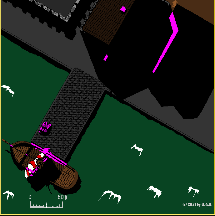
.....which essentially comes down to the cunning use of sheet effects.
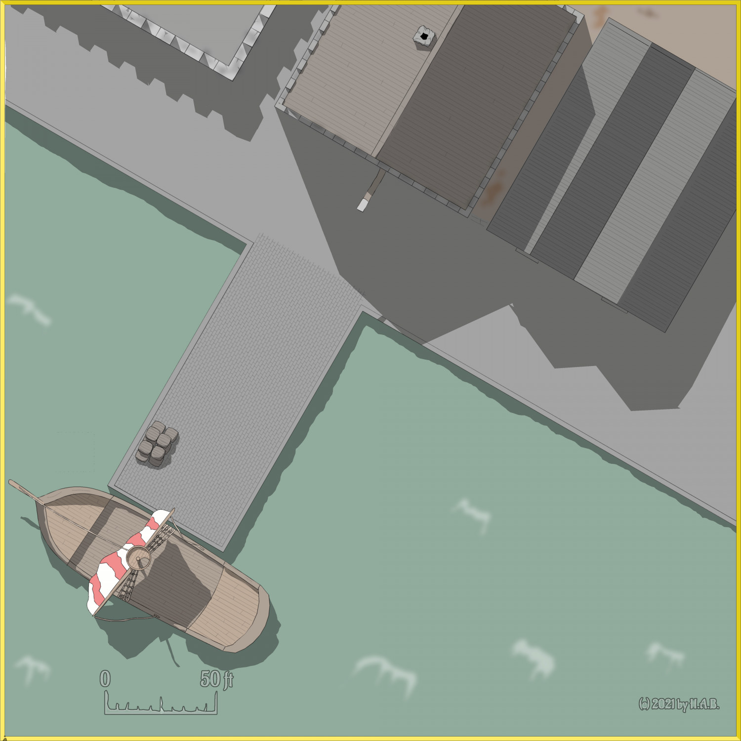
It would of course be quite possible to get all the juicy texture from using one of those colour sheets: see the crenellations and waves, specifically. But that would take forever - therefore; backdrop.

-
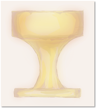
Fuchswald Memorial
I'm not saying it's the Holy Grail of articles on fake hand-drawing in CC3 - but 13 pages in: we get the Schnaps Goblet of Doom!
-
Searching for symbols for WW2 and modern military vehicles, artillery etc.
Another take on the VI. I think the trick is probably to do turrets as a seperate symbol entirely, @Lizzy_Maracuja: it allows for rotation options - and with or without the turret that also gives you a nice platform for wreckages.
-
WIP - Quay thing
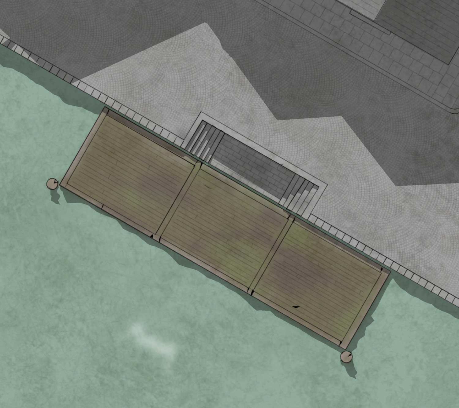
It's a start! Embelishments certainly need sorting out here by I think the colouring works.
I am mainly using the blur-operated "toning" sheet (same as for the roof-top crenellation) for the surface. It's quite hard getting the darker nuances out of the main colouring sheet - what with all the transparency going on there and...well, the main colour sheet isn't blur-operated so the contrast between the brown and green would be too sharp.
