

Lillhans
Lillhans
About
- Username
- Lillhans
- Joined
- Visits
- 2,008
- Last Active
- Roles
- Member
- Points
- 2,066
- Location
- Sweden
- Rank
- Surveyor
- Badges
- 13
Latest Images
Reactions
-
Festive Winter Card Challenge WIP: Ensamheten
As per the call to arms, here's my contribution-in-the-making.
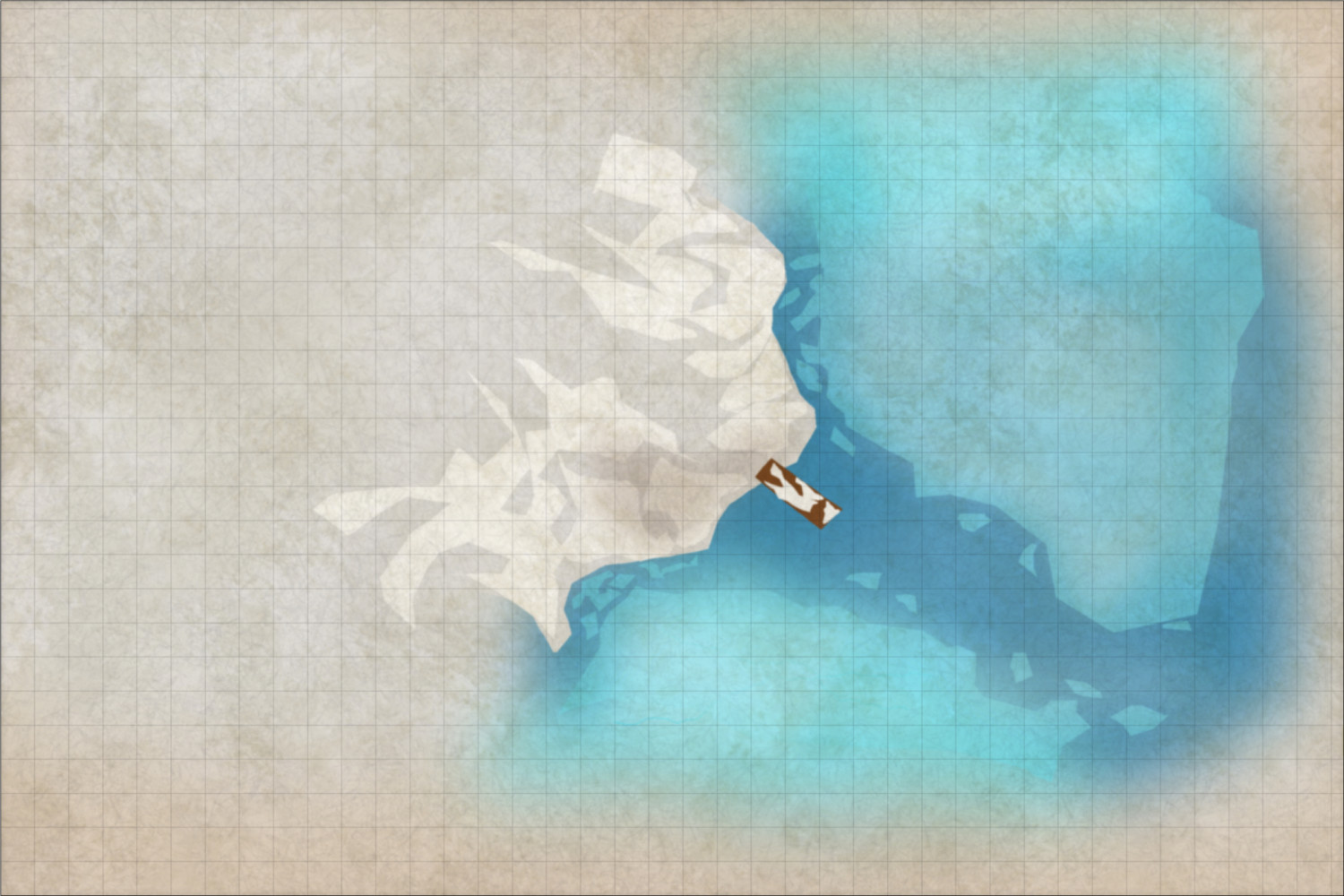
There's a village in Sweden called Ensamheten - (the) Solitude. There's also a children's book called "Viktor builds a bridge" - in which the protagonist (a man on an island) decides to connect with the mainland by building a bridge. He lives to regret the decision.
Not sure it's accessible by boat only, but I rather like the idea of whoever lives in the cottage on the left side of the map - where there will also be woods - gets the occasional visitor (enough to keep the route clear)) but do not themself own a vessel.
We catch them, I think, at a time when there are no guests. Perhaps they are inbound, expected - in keeping with the season.
Or it's just the calm before the Norsca raiding party.


-
Harper Street Gardens (Ink & Brown Wash-like)

Trees and giant spiders, it is!


-
Searching for symbols for WW2 and modern military vehicles, artillery etc.

The game is afoot! Breaking it into Contours and also a Surface (which helps for selecting an area to draw in).
I think I'll be adding some air width to the back: will absolutely want to be able to center symbol on the turret itself since it makes it easer to fit on the chassi, in-map. Also gonna have to add even more air because of course they had the entire alphabet's worth and F has a shorter barrel than L and this was probably a terrible idea. But it's handy to have all turrets in the same workspace.
More height also, for discrete shading around the turret.
And then...painting and decals I guess. Or maybe not decals, after all...I have seen kit hobbyists' blogs on the subject of markings, and I am not yet ready to get that bachelor's degree in tank markings methinks. Good call on layer structures, @Wyvern.
No more hijacking this thread! 😂 Will share in a seperate thread when results.


-
Barnacton Keep (WIP journal)
Give it a few days and it's flower petals - rest assured.
![[Deleted User]](https://secure.gravatar.com/avatar/c75d9a245b74d9c59be0999ea81ca541/?default=https%3A%2F%2Fvanillicon.com%2F92add7f8c954488718110edc4896ad39_200.png&rating=g&size=200)

-
Castellfollit de la Roca - remixed
Thank you, @Raiko! Yes, this was all CC3: the paperlike texture is the background bitmap from the Watecolour and the rest is just polygons, applying the principles from the same annual.
-
[WIP] Community Atlas Competition entry: Thing beneath the Iron Mounds
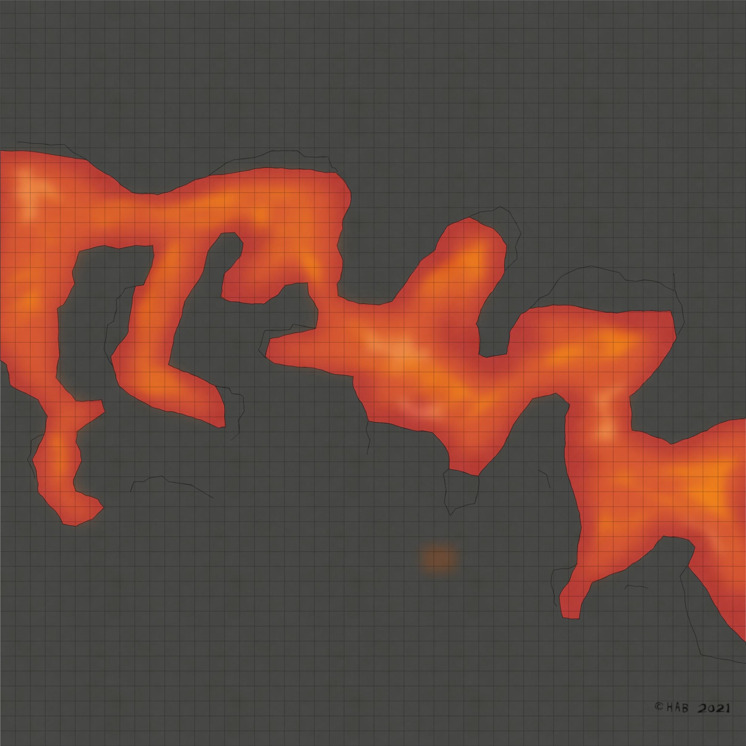
It practically draws itself! Now working on the perspectives, the idea being that areas exposed to the direct light of the lava below get a brighter colour. These parts also get the radiance treatment. With the darker topside, this should - in theory - create the desired contrast and establish a sense of elevation/overhang.
The sollution to the font issue can be seen at the bottom right: a very accurate representation of my actual handwriting abilities.
-
[WIP] Community Atlas Competition entry: Thing beneath the Iron Mounds
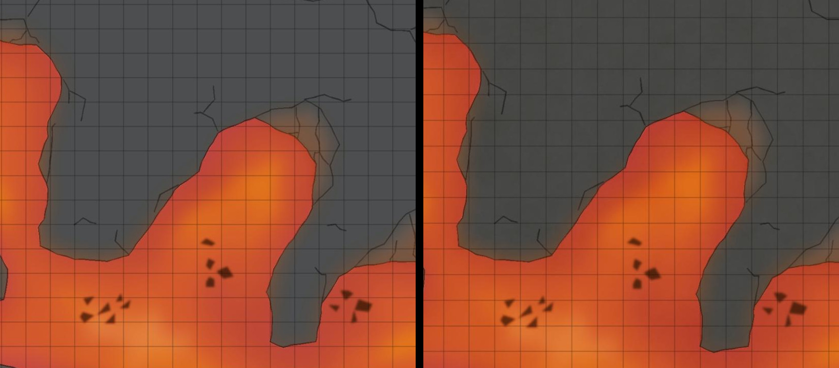
The tone and grainy quality provided by the background texture get to stay. The "naked" variant is, however, a strong contestant: if I were to guess the lava texture somehow informs how I look at the rest.
But, no, not killing this darling. Just yet.
-
Shadowrun Annual?
Consider monochrome and ultrasimplistic.
I don't get to play that much Shadowrun myself since my VTT of choice doesn't come with a 3e ruleset (my SR edition of choice/investment). But I always figured that fancy blueprint/HUD-like maps could work to great effect.
-
Shadowrun Annual?
Well, @JNefzen, it really is quite simple:
Your background is going to be a polygon of the square variety, of the colour of your liking. Here it's the darker end of the turqoise spectrum.
Then add grid of the required dimension, with sheet effects BLUR and GLOW.
For structures, then, it's simply a matter of using GLOW and possibly BLUR sheet effects. It's all drawn using simple line tools of varying width and a colour - preferably brighter, I guess, than the background.
BLUR will give lines softer edges and GLOW, of course, will provide that sense of leaking light/terminal screen extravaganza
So that would be
- Polygon
- Lines
- BLUR/GLOW-combo
- Qapla'
-
Hot Water Recirculation shenanigans
Rounded corners are all Trim & Fillet. The outline actually came first, drawn entirely separate from the fill. Either way you go, TRACE is the ticket. I do prefer outlines first however since the contour typically is a matter of Line-to-path:ing anyway
Here, using up to three sheets for contours and fills, each, means I don't have to worry too much about cutouts in the back for to accommodating in-front bits.

