Monsen
Monsen
About
- Username
- Monsen
- Joined
- Visits
- 723
- Last Active
- Roles
- Administrator
- Points
- 9,029
- Birthday
- May 14, 1976
- Location
- Bergen, Norway
- Website
- https://atlas.monsen.cc
- Real Name
- Remy Monsen
- Rank
- Cartographer
- Badges
- 27
Latest Images
-
New Humble Bundle
The WBC is a collection of previous published articles. They have been cleaned up, organized, and formatted for publishing in a pdf format, but they don't contain any new information from the original articles. It's a mix of articles that talk about word building in general, and articles that focuses more on the CC3+ side of things.
There's also some additional tutorials bundled with it which I haven't been able to look over, but I believe those are sourced from the annuals.


-
Remapping the Forgotten Realms
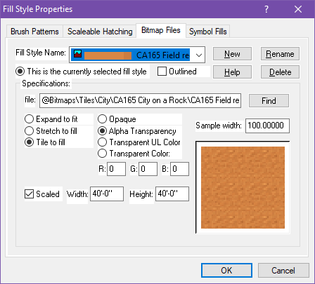
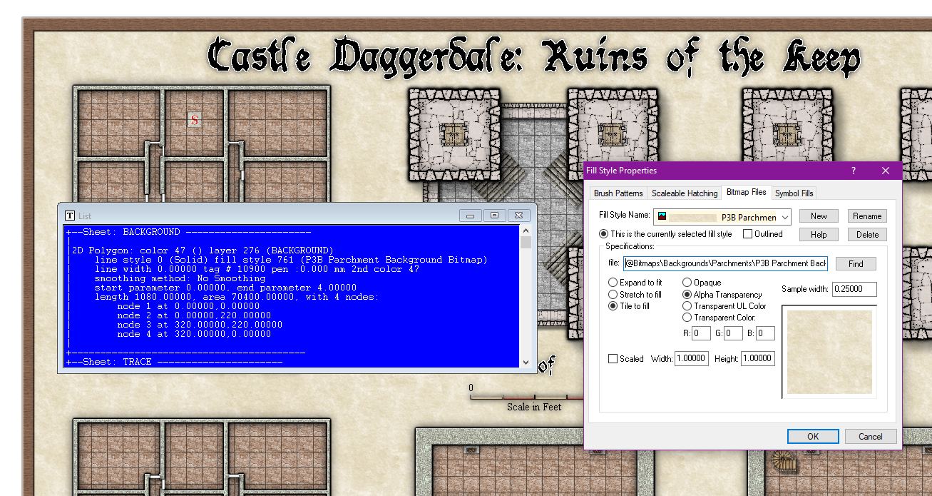
Keep in mind that the names of the fills doesn't mean anything, it is just a name. Just because that particular fill happens to be named "background" doesn't mean it is the fill that is used for the map background.
If you look at my screenshot below, I have used the List command on the background polygon. In the list output, you can see the fill is "P3B Parchment Background Bitmap", which you can then look up in the fill style dialog as I did in my screenshot.
As Steven chimed in above, this comes from Perspectives 3. (It can be a bit difficult to read from the fill style file name since it doesn't mention Perspectives int he path, but P3B means Perspectives 3, bitmap style B.)

-
What is Steampunk...
I think it is important to realize Steampunk is fantasy though. And with that I mean, they do fantastic things with the steam that isn't possible at all under real world physics. In many cases, you see them approaching semi-modern concepts (while still being in the Victorian age) but using steam instead of electricity and more practical fuels. So when drawing steampunk, it isn't "will this be possible using steam", but more "does this seem cool and somewhat plausible if we ignore actual physics?" all the way to "this doesn't seem plausible at all, but it is damn cool".
Many steampunk settings uses things like automatons, which are large steam-powered robots, both "human-like" and "this-is-a-big-machine" like. Sometimes intelligent, self-operating, in other settings controlled by an operator.
I like the city-building computer game Frostpunk for it's visuals. It' is basically Steampunk in the cold (concept art) (automatons)
Another interesting omputer game that takes the concept pretty far and some more, is Sunless Skies. Here you pilot a flying locomotive through the void between the remains of a broken world floating as islands in the void. Even the sun itself is an artificial steam-powered contraption.
For overland maps, I think the difference lies much in the symbology used. Steampunk likes to say, "Hey, here I am!". A typical steampunk map would be something in between a modern map and a fantasy map, and would use symbols and map decorations with a steampunk flair. Symbols would look more like the fantasy symbols, i.e. drawn from an isometric view, not the minimalist top-down symbols on modern maps. Instead of a caravan representing a trade route, you would see a train symbol, you may have dirigibles instead of ships, the city symbols would probably have some smoke stacks and visible pipework in the artwork, and so on.


-
Wishlist for CC4
One of the main advantages with 64-bit is getting rid of the memory constraint. As a 32-bit program, CC3+ can only address up to 4GB of memory, but with 64-bit it would be able to use all the memory in you machine, no matter how beefy, for a long time to come.
There are other advantages as well, but for CC3+ that is the biggest advantage.


-
Gimp or Photoshop as a follow-up? or not needed? Annual OSR style
It is true that PS have more filters, but most of what you need is doable straight from CC3+, and can often be done with less work since you can manipulate how the entities are rendered, instead of just working with the composite image.
Keep in mind that CC3+ isn't a bitmap editor like GIMP is, so some things have to be done in a completely different way, for example you can see he has filled in the interior of your rubble symbols with a light grey and added some grey splotches to serve as shading for the staircase.
I can't really go into details about everything, that would make a very long forum post, but here is how you can do several of the things in CC3+ that have been done with this map.
First of all, the walls have been given a shadow. This serves to enhance and let them stand out, and can be done with the wall shadow effect. I am not sure if your map actually have wall entities, bit difficult to see, but an easy way to produce the walls is to take a copy of the background sheet as well as your floors, place those copies on the WALLS sheet and multipoly them together. This will result in a large polygon with holes in it matching your floors. Now, you can add wall shadows to that.
The grid seems to have been made a bit thinner and made grey (or transparent, gives the same end result) instead of black to give a less intrusive feel. Grids are usually zero-width lines, so to make it nice and thin, it is best to export a somewhat high resolution image in the first place. Images, as opposed to CC3+ drawings, have a finite number of pixels.
The numbering have all been erased and replaced with smaller text. No reason why you can't do that right in CC3+. The original map also seems to have white circles around the numbers. Not sure if that is from an effect or an actual circle, but this was removed in the cleanup, but if you don't need them, no need to have them in CC3+ in the first place.
The symbols seems to be slightly blurred in the final version. This can easily be done with the blur effect in CC3+.
The symbols have also been filled with a grey color in the fixed version. This is slightly more difficult in CC3+ since you can't fill areas the same way as with a bitmap editor, but what you can do is to overlay a partially transparent gray polygon in CC3+. You'll need to draw all these small polys and make sure they fit the symbol though.
Looking at the modified map, it is also clear that multiple things have been done with with it, this isn't a one click job from some filter, so even if the processes do take some manual work in CC3+, it isn't like they wouldn't do the same in GIMP/PS/etc either.
As for the export, 300ppi @ 8.5x11 is just 2550 x 3300 pixels. Shouldn't be an issue exporting that from CC3+. And the export settings dialog allows you to either input the pixel values directly, OR you can input 300 ppi into the dialog and the print size in inches, both options work just fine. You find the export options dialog by clicking Options AFTER selecting an image file type in the save as dialog, but before clicking save.
![[Deleted User]](https://secure.gravatar.com/avatar/c75d9a245b74d9c59be0999ea81ca541/?default=https%3A%2F%2Fvanillicon.com%2F92add7f8c954488718110edc4896ad39_200.png&rating=g&size=200)
-
(Help) How do you center on Cosmographer
After making the map, you can use View -> Move Origin to put the 0,0 wherever you want. I recommend turning on snap and cursor snap to make placing it in the exact center more easily

-
Community Atlas: Queen Mica's Scintillant Palace
Wyvern's new holiday location is now alive in the atlas. Thanks for contributing these interesting maps.


-
WIP: First BattleMap: Ice Caves
Note that lights ends at the FAR SIDE of objects blocking them, this means that the wall around the lighted area will always be lighted. Generally, this makes for much better visuals otherwise you wouldn't be able to see the walls at all which looks weird, but it results in an undesirable effects when your wall si the entire area outside the path, like typically in caves. The way to fix this is to use a set of thin walls on a dedicated light blocker sheet. I usually draw these slightly inside the cave walls, allowing for the light to illuminate the edge of the cave wall. Note that the lighting is also computed on a raster rendering of the map, which means it needs to deal with pixles. This makes very thin lines unsuitable, as light can shine through gaps, so make sure such blocker lines have a certain amount of thickness.
For the map border, just erase and redraw it. The technical map border is just four lines outlining the map on the MAP BORDER layer.


-
Live Mapping - Lava Caves & Virtual Tabletops
So, the map was put to good use this weekend. Not just for one bossfight, but two, heralding the end of our 11 year long campaign on Virana.
Most of you don't know my campaign, but the the main idea was that the players would play through one of the most important formative periods of the world. And we did that by basically playing two interwoven campaigns. In the standard campaign, we played a rather "standard" AD&D campaign where the players discovered something was wrong with the biggest church in the world, and that an evil entity was behind it, while also playing a campaign set about 5000 years in the past where the player characters played as dragons (Council of Wyrms rules). Basically, actions by the dragon characters would end up having consequences in the current world.
So, the players learned that the evil entity behind the problems where the evil dragon queen Tiamat. She had tried to enter the world several times throughout history, so basically the campaign ended this weekend with first the Dragon characters driving back Tiamat in the past and temporary driving her from this world, then switching to the current world where the standard AD&D characters had to drive her back again, with her power level being affected by what the dragons managed to accomplish, but this time finish the job, thanks to certain artifacts made in the Dragon timeline.
So, two fights, same battlemap, same enemy, but with different character sets with hugely different skills and abilities.
It was two hard fights, and a close call, but the players did manage to win the day and save the world, and they seemed to enjoy the fights. So, mission accomplished I guess.
-
After importing bitmap fill styles, how do I use them?
When you add new fill styles, drawing tools won't be created automatically for them. This is partly because drawing tools are specialized tools for different purposes, not a one tool per fill type of deal, as you can see some tools are smooth polys, others are fractal polys, they have different kind of outlines based on their purpose, they are set to go on the appropriate sheet and so on.
When you import fill styles you can manually create your own drawing tools that include these, but more commonly they are accessed by clicking on the Fill Style indicator in the top right of the main CC3+ window, and go to the bitmap files tab. Here you can see all the fills in the map (with preview), and whatever you pick will be the current fill which will be used when you draw things with the basic tools found in the right hand toolbar. Of course, when you use the basic tools, you also have to remember to set the sheet and other properties manually too.