

Ricko
Ricko
About
- Username
- Ricko
- Joined
- Visits
- 6,929
- Last Active
- Roles
- Member
- Points
- 10,582
- Birthday
- February 7, 1977
- Location
- merlo san luis argentina
- Rank
- Mapmaker
- Badges
- 22
Latest Images
Reactions
-
Fast Marshes Tutorial
By chance i was listenning https://www.youtube.com/watch?v=d72j6GEgaJc during this tutorial :D <3

![[Deleted User]](https://secure.gravatar.com/avatar/c75d9a245b74d9c59be0999ea81ca541/?default=https%3A%2F%2Fvanillicon.com%2F92add7f8c954488718110edc4896ad39_200.png&rating=g&size=200)
-
Community Atlas - Elen Daelarion - Foranwe
tryed to use stone bridges from schley dungeon style?
-
Community Atlas - Serkbergen / Peredur
The regional maps I kept the scale. But you may notice that in every section of Peredur that I have had the honor to map, there are some descriptive maps - similar to a landscape photograph/painting, these do not have scales.
I also believe it is interesting to stimulate the DM's imagination and leave him free to design/imagine a castle larger or smaller than the one shown on the map.
Anyway, thanks for the wise advice.
-
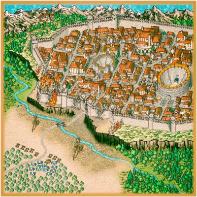
Spring in Hobbitland
hobbit houses are png icons, 3 or 4 dont remeber now, on myke schley city.


-
Budapest
i make for a friend, tryed to explain this, but he want with this font :/


-
Crypt
just have only more 4 questions >.<, but i will wait a little bit, lol.
Thank you so much <3
Forgot to glow the grid, but is there :)

-
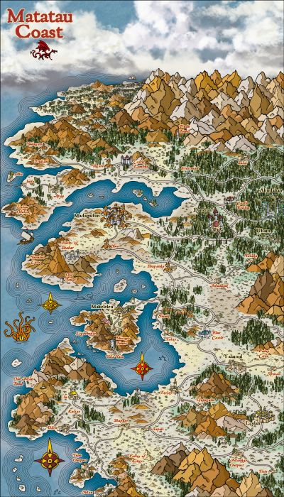
Community Atlas - Berenur - Urtrah Desert
I understand your point of view and thank you very much for the suggestions.
I also consider that distances on maps, especially "medieval" ones, are anything but accurate, since at that time there was no geolocation. :D
Having a scale that indicates approximately how many kilometers are from one point to another is valid, but disregards the distance variables such as the number of curves, ups and downs that demand the relief and that directly influence the final distance. that is, one way or another the distance will never be exact. an example of this are mountain scales, it shows the physical distance from point A to B, but the complexity of the relief will directly influence the final distance, since more zigzag will be needed to cross the mountain.
since I was little I use these rpg story maps as references that don't influence my story much if city A or B is 53.7 kilometers or 64.9. This difference of approximately 10km represents approximately 1.5 hours of walking and does not change the total context of the story. normally I would take a ruler and measure the scale, then measure point A to B and convert to distance. added 15% more distance (through the curves) and divided by 30km/day = so many travel days.
not using the grid above all, and only below the cartoons and text is a matter of personal aesthetic choice.
for example where I live, it is 800 meters above sea level and the top of the mountains is 2200 meters. by the scale of a medieval map it would be only 1.4 kilometers of ascent, but the path to the top is 18 kilometers only to climb on one side, on the other side of the mountains there are approximately 60 kilometers of lowland and on the google earth scale they represent only 12 km.
As Sutat now have sheeps with shadows 🤣
-
Community Atlas - Arthenn / Berenur
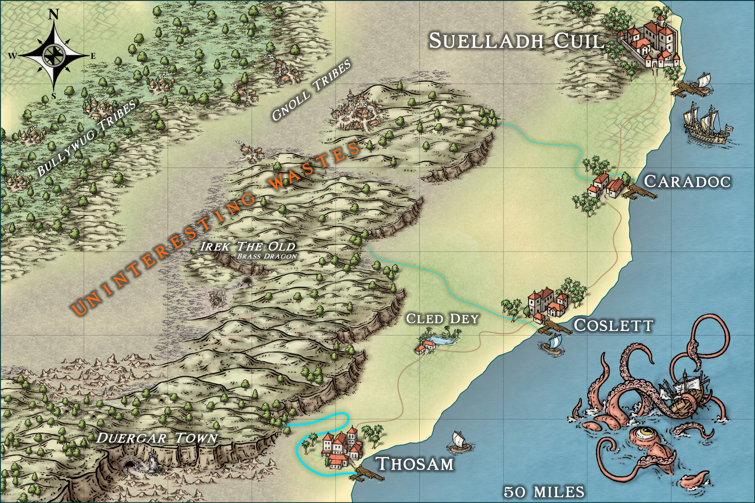
@Quenten when I came up with the name, I conceived it from a "coastcentric"(from east) or "dalecentric" point of view. Duergars, dragon, gnolls, bullywugs, dry earth... no good for farmers 🤣
-
Shrimp Tony
@EukalyptusNow brother its Annual BW Fantasy with some symbols from Annual 13th age.
Frames are very rude to use but ok.
For background i used grey 10 as base. this blue is a massive outer glow effect on land sheet.
Image post procesed in lightroom to give some contrast, shadows and vignetting.
Cheers
-
Karkaroff region
The Karkaroffs are a family of bankrupt nobles living in the midst of the oppression of a new faith that has taken hold over the past 80 years.
they performed an activity not so well regarded by the new religion, hunting creatures of the night. 10th century Russian universe with some Eastern European influence.
"classic ravenloft" without powder.

