


Wyvern
Wyvern
About
- Username
- Wyvern
- Joined
- Visits
- 3,237
- Last Active
- Roles
- Member
- Points
- 5,515
- Rank
- Cartographer
- Badges
- 24
Latest Images


-
[WIP] Atlas Competition Entry - Coils of the Cold Coroner
Does it actually matter? It gives me the impression that the blocky ice of the more northerly area continues in places through the hills and mountains, but only by straining quite hard at the image. Gives a feeling that something's not quite what it seems as well, perhaps.
However, I suspect Monsen's right, that the opacity of the fills simply needs adjusting upwards to resolve!
-
Community Atlas 500th map and 4 year anniversary competition with prizes.
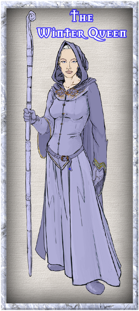
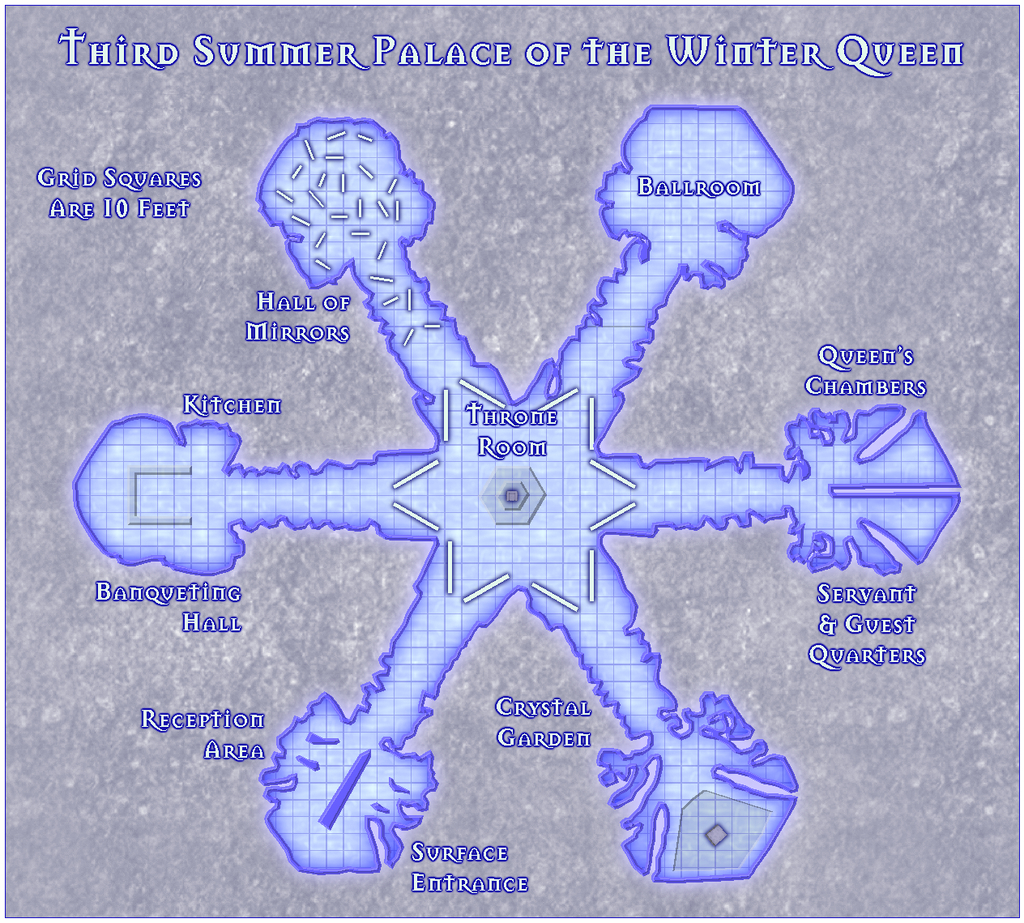
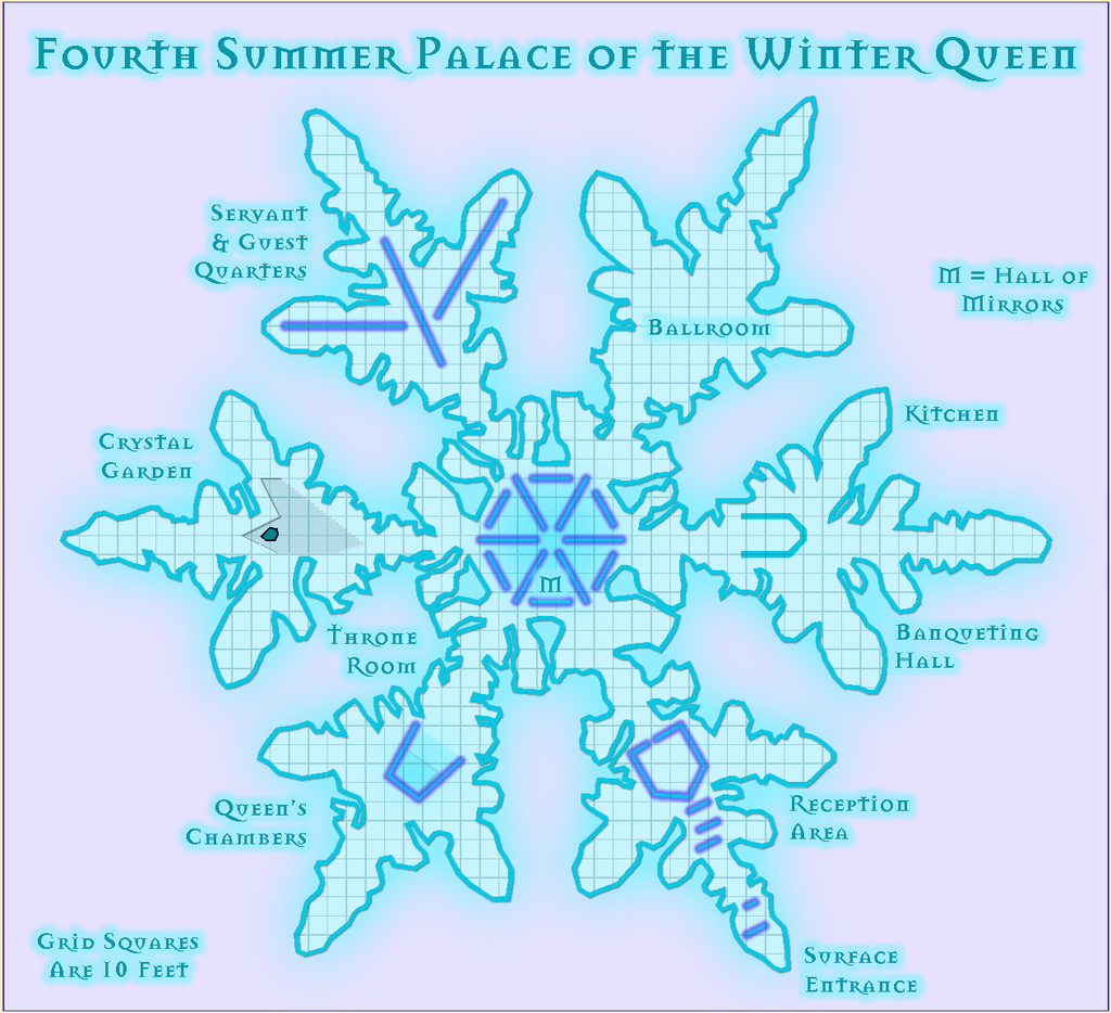
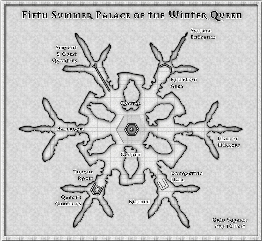
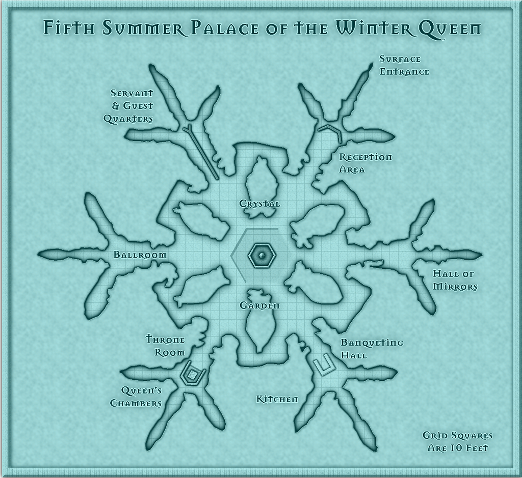
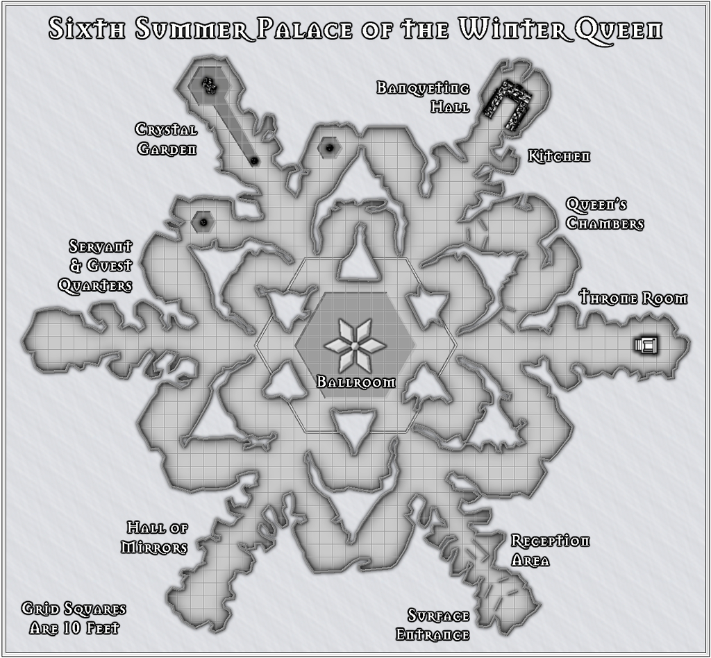
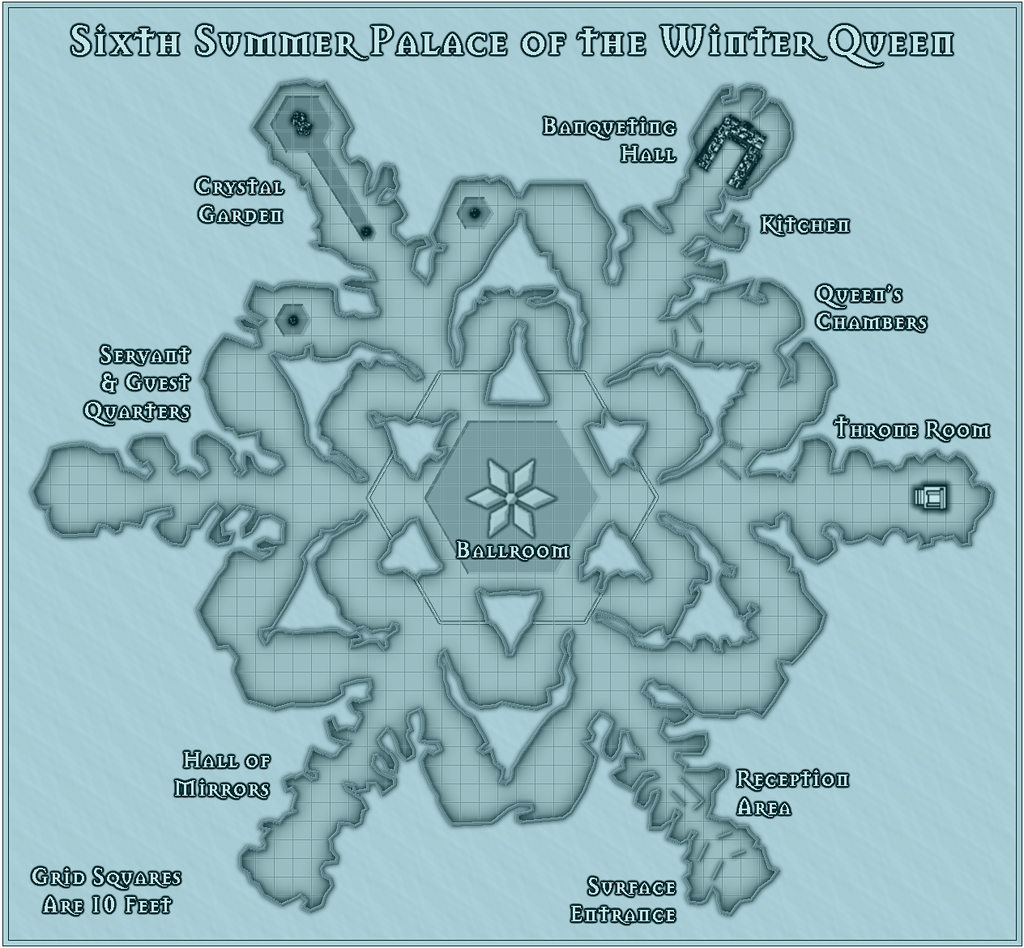
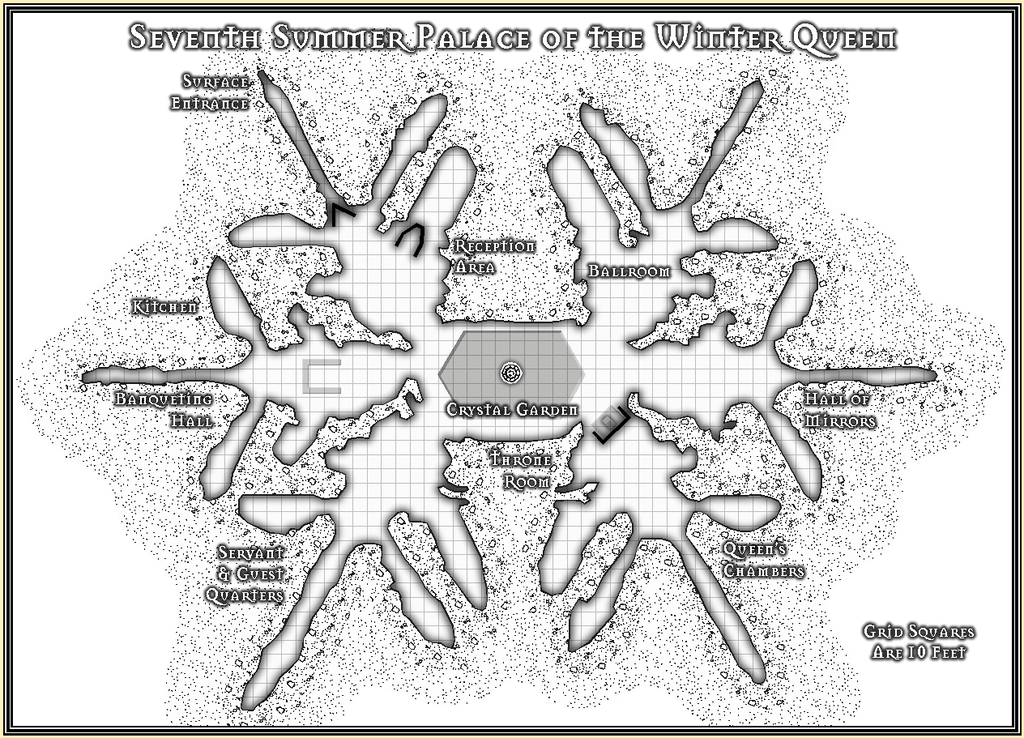
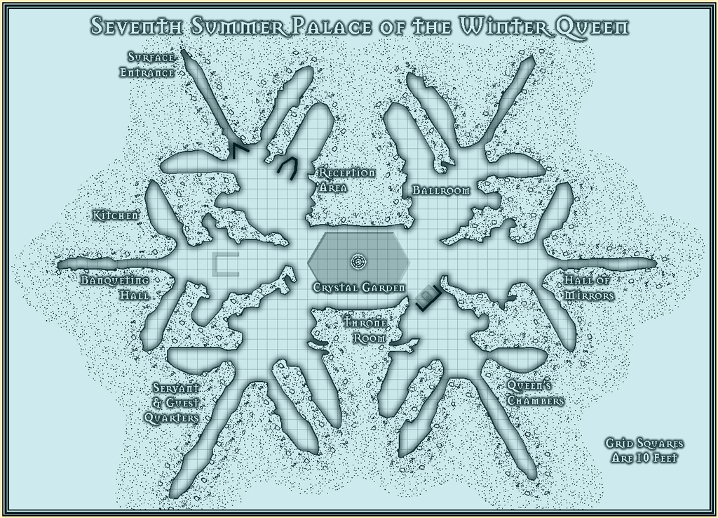
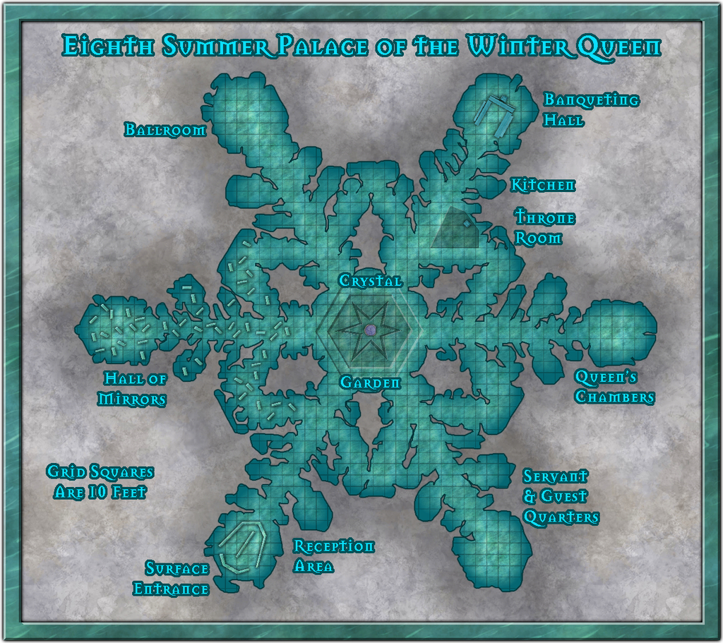
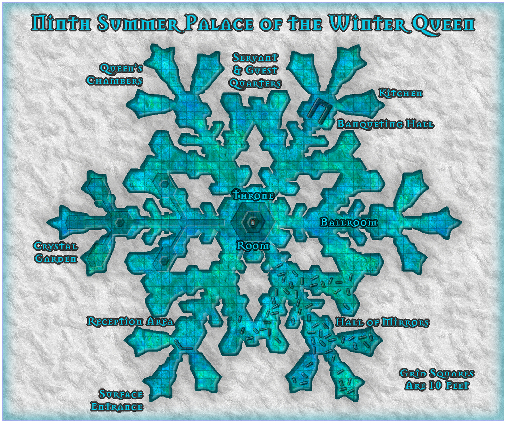
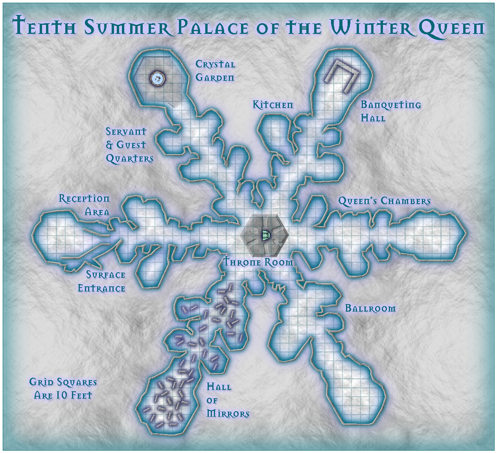
So, here are my submissions for this 500th map and anniversary contest, The Summer Palace of the Winter Queen. For the contest, these should be considered as a single entry, incidentally; I'm not trying to "stuff the ballot box" with a multiple series of maps here ?!
There's a WIP thread elsewhere on the Forum which gives more details on this set, and the construction process in places, and if all goes to plan, I should be adding higher-res versions of all twelve maps to the Gallery once I've finished this post here. Never done that before, however, so we shall see!
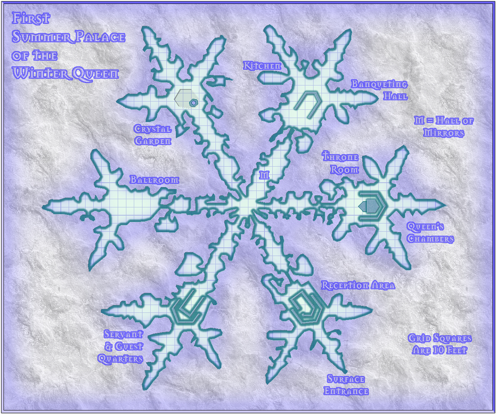
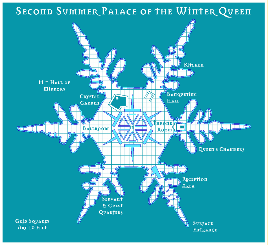
As there is an additional pair of detailing note files to accompany these maps for their final Atlas versions, as well as the usual Atlas submission notes to provide for Remy, I'll send the full set of FCWs, PDF and text files to @Monsen as a separate private e-mail. The FCW files are though included below, following the rules of this contest.
Note that Palaces 5, 6 & 7 come in two versions, the vanilla B&W ones and those with a blue screen superimposed.


Whew!?

![[Deleted User]](https://secure.gravatar.com/avatar/c75d9a245b74d9c59be0999ea81ca541/?default=https%3A%2F%2Fvanillicon.com%2F92add7f8c954488718110edc4896ad39_200.png&rating=g&size=200)


 and 2 others.
 -
Community Atlas competition entry: The Summer Palace of the Winter Queen
Thanks Jim!
And thanks for the explanation, Remy. I appreciate fonts can be problematic in CC3+ at times, although in this case, the two ocean labels seemed to have changed far less than the placement of the four numerals and their associated snowflake markers, which had moved closer to the labels - on the version above here, much closer - than where they were set on the CC3+ drawing. Interestingly, on the higher res printout I did, the texts hadn't altered at all, so far as I could tell, but the earlier placement of the four markers and labels was wrong; not by so much as the lower res version above, but very noticeably all the same. Which does make me think still that it's been primarily a proximity issue along the same horizontal lines (maybe because both the snowflake and ocean text labels were placed using the same horizontal snap-grid placement). Odd the snowflakes should have dragged the numerals with them all the same, as they're not grouped, just individually placed, and the numerals aren't all on the same horizontal lines. Just one of life's little mysteries, perhaps ?
I had another look at the Locations map again today anyway, and decided to try moving just the numerals and markers further out from the labels, and that seems to have worked OK:
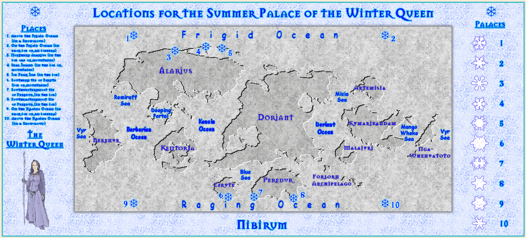
The separation is now only about twice what it was previously, yet as you can see, the difference in where they appear is very much greater, and almost exactly where the markers currently are in the FCW file, as well as on the higher res jpg and printout I tried.
Final checking of the accompanying texts is still to complete, but I'm hopeful of having the set ready to submit by maybe tomorrow or Saturday.

-
Desert map for a commission
The extra water depth complicates matters for the ocean currents aside from surface weather patterns, mostly because we don't really understand how deep ocean currents work on Earth, so for a situation like this, it becomes - whatever you like, more or less!
-
Community Atlas competition entry: The Summer Palace of the Winter Queen
Thanks very much again folks! The response here has been equally amazing for me, Lorelei! And "cool" somehow seems very apt ❄️!
Time for the final Palace 10 map now, this time using the SS2 package as for Palace 9, but now in its Bitmap B format. Even more so than with Bitmap A, the opportunities to use symbols (no varicolor options) were a little limiting, but I did manage to find an upholstered chair in a convenient shade of paler blue, and a fountain with pond that didn't look too out of place either. The background's not actually snow, but the Dirt Grey Light fill, greatly enlarged (wonderful it held off pixellating to such a degree too), while the floor texture isn't ice, but the Marble White fill, both of which worked out quite nicely in their re-imagined versions, I think.
Having completed all ten sample Palace maps meant I could also now update the Locations map too:
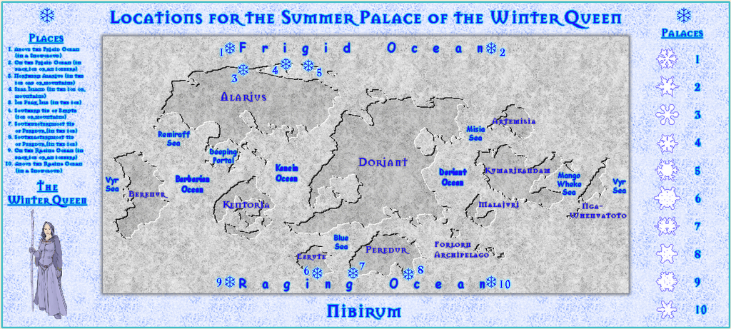
For reasons I don't pretend to understand, the markers and labels for Places 1, 2, 9 & 10 have all ended up much closer to the two Ocean labels at the top and bottom of this rendering of the map than in the CC3+ file. I tried a higher res version as a test too, and as the markers and labels there were further from the labels, I assume it's just a resolution artefact. It's especially odd that none of the other markers and labels had shifted position at all, so I suspect it may have something to do with these four being nearly aligned with other text blocks. Certainly, even the higher res version didn't have the 1, 2, 9 & 10 markers quite as far from the Ocean labels as the CC3+ original still. Weird the things you find out!
Comparing this with the earlier version I showed at the start of this topic, I decided to stick with the text size for the Places list, even though that makes it very hard to read in this low-res version, mostly because I wanted to add a miniature of the Winter Queen CA3 marker under it. I also simplified the look of the snowflake symbols for the Palaces list, as originally, I'd simply been copying-in the floor designs from the Palace maps, with whatever fill style they contained. That started to look a little messy, so I thought a more uniform approach might be better. The idea is that, hopefully, our esteemed Atlas Coordinator Remy will be able to use these map-side markers to link-in to the eleven other files in the final Atlas version.

