Royal Scribe
Royal Scribe
About
- Username
- Royal Scribe
- Joined
- Visits
- 9,539
- Last Active
- Roles
- Member
- Points
- 3,353
- Birthday
- February 5, 1968
- Location
- San Francisco, California
- Website
- https://legacy.drivethrurpg.com/browse/pub/31814/Royal-Scribe-Imaginarium
- Real Name
- Kevin
- Rank
- Mapmaker
- Badges
- 16
Latest Images
Reactions
-
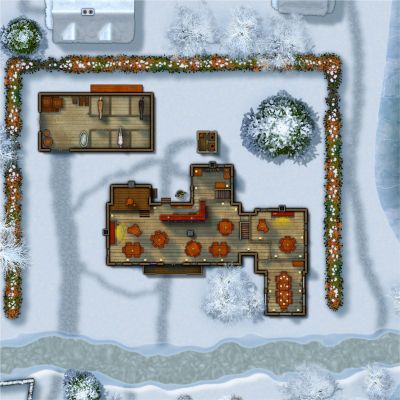
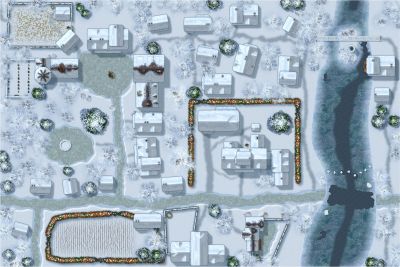
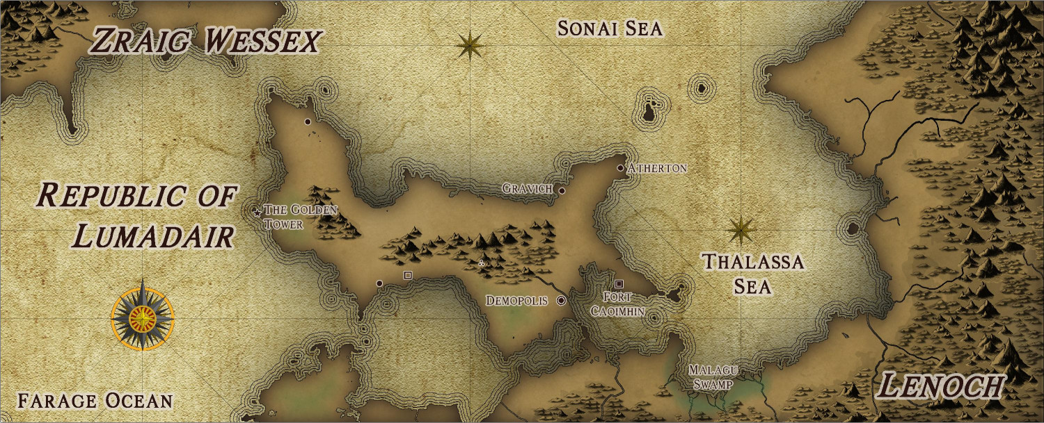
[WIP] Republic of Lumadair - CA218 Fractal Parchment Worlds
Before attempting to do my entire campaign world in the new Fractal Parchment Worlds style, I wanted to try it out with a familiar spot: the Republic of Lumadair.
For this one, I exported Lumadair from Fractal Terrains in the Fractal Parchment Worlds style that Ralf demonstrated in today's Live session. But I also exported a contour map of the same view, and then copied a few of the elevation contours over, then used the Draw Like tool to convert them to the proper contour appearance.


-
What art programs do you use?
My personal experiences are more with desktop publishing, not design. Used to be reasonably proficient with things like PageMaker and Quark and MS Publisher — none of which is useful here. I used the Corel suite in the 90s but haven’t owned it in decades. To create the circular symbols for my Modern Journeys map, I did download GIMP and learned just enough of it to be able to crop an image to a circle. But for quite a lot of stuff, I have used (of all things)…PowerPoint!
-
Dragon sheet
It looks fantastic!

-
[WIP] Community Atlas: Kumarikandam - SE Tiantang Region
Ricko invited me to design some monasteries in this area. The concept and write-up are entirely from him. The mapping is from me, with extensive feedback and advice from Ricko. Would it be possible to publish it as joint authors? Here is the description, followed by the FCW and a JPG.
Chuan Bei Si – The Monastery of the Drunken Cup
In the shadow of the walls of Tiang Long Du, the capital of the Kingdom, stands the peculiar Chuan Bei Si – Monastery of the Drunken Cup, a place whose fame derives less from its spirituality and more from its supply of spirits. Founded by a renegade monk called the Eternal Drunken Master, the place attracted a coterie of individuals seeking less divine enlightenment and more the bottom of a good cup.
Legend has it that Shui Zui Chang had a divine vision while staring at the bottom of a baijiu barrel: he believed that true wisdom came from fluidity of movement and the ability to remain upright while the world turned – a concept he dubbed the “Drunken Way”. Thus, the monastery became a training ground where drunken monks practice their staggering martial arts, transforming awkward falls into lethal blows and hiccups into battle cries.
The proximity to the capital is convenient: the liquor arrives fresh, and the monks can replenish their supplies quickly. They often make “spiritual pilgrimages” to local taverns, always returning with full barrels and wild stories about how they had “purified the spirit” of some unsuspecting merchant in a game of dice.
Rumors about Chuan Bei Si are as numerous as the legends of Tiang Long Du. Some claim that in battle, the monks can defeat armies simply by staggering through rows of soldiers. Others say that the monastery houses the mythical Infinite Barrel, a relic that never runs dry.
Hedonistic and unpredictable, Chuan Bei Si is an anomaly within the kingdom – a reminder that even in the dark, there is room for a sip (or two) of levity.


-
Ideas and Wishes for Monthly Dungeon Symbols
I am so glad you asked, because you know I've been keeping lists! You can check out some of my ideas in this thread, but here's a recap of some highlights:
Interior
- Thrones - Ornate metal and stone; "elven" (wooden with art nouveau flourishes); "evil" (skulls, spikes, etc.)
- Regalia - Crowns; scepters; orbs
- Couches - Both "regular" and Roman-style (I think SS4 only has chairs that I make extra wide for couches)
- Mage/Sage Furnishings - Globes, astrolabes
- Ornate Staircases - Maybe modular so you can construct your own (left, right, and center for bottom, middle, and top, in stone and wood, with and without varicolor carpeting)
- Musical Instruments - Upright and on their side (lutes, harps, harpsichords, drums)
- Ancient Tombs - Think Indiana Jones-style stuff, like idols
Exterior
- Gardens - Varicolor flowers, rose bushes, berry bushes, exotic/carnivorous plants
- Tiltyard - Quintain, pell, horse armor
- Topiary - Bushes trimmed to form the shape of animals and mythical creatures
- Statues - Riding and standing free. Royalty plus archetypical character types (sword fighters, archers, mages)
Building Construction
- Flagpoles - Upright and on their side, separate from flags for flexibility
- Flags - Varicolor top-down and on their side
- Gargoyles and Grotesques
- Clocktower - Clock hands on side of building; bells for belltower
- Spires
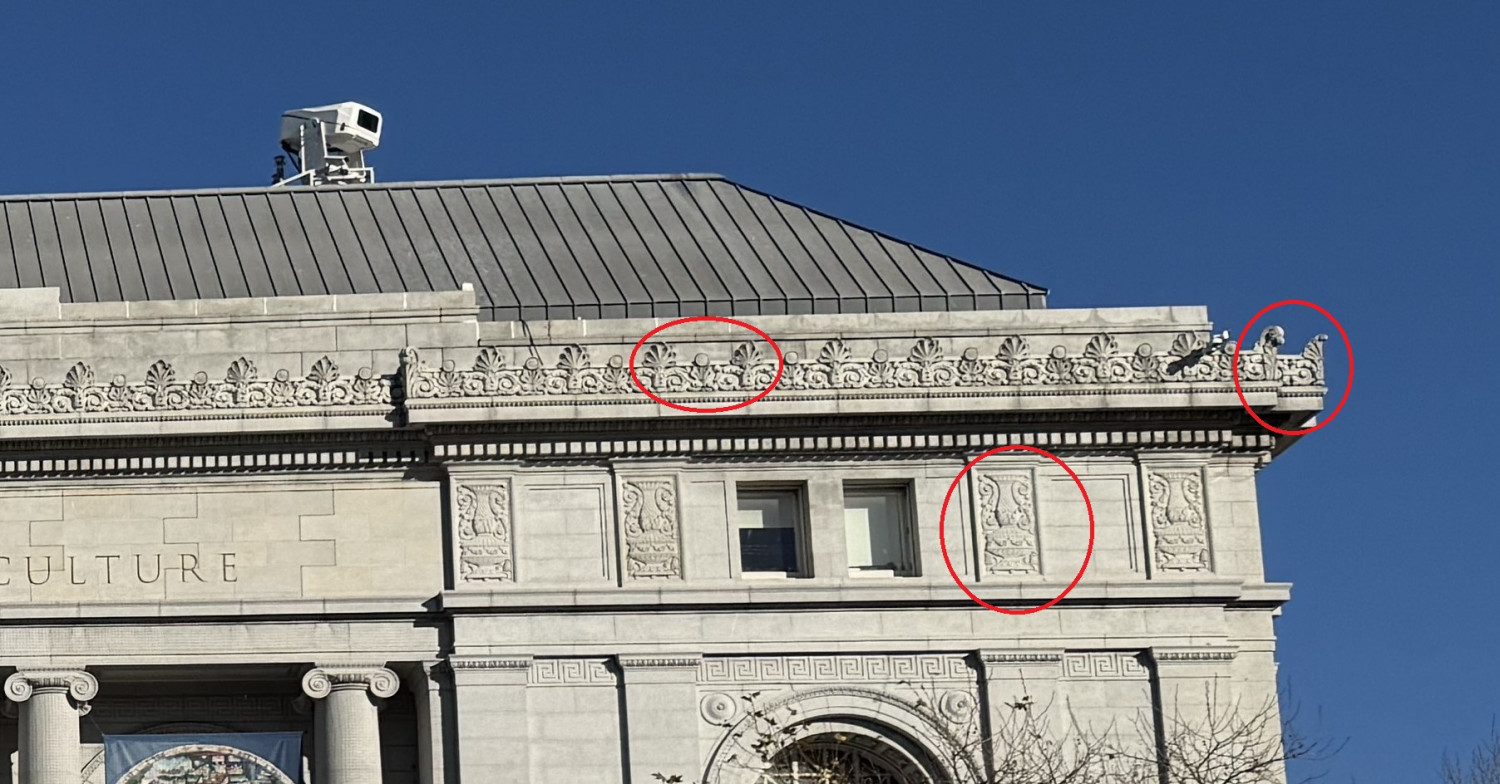
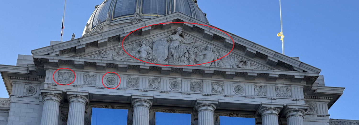
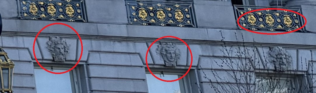
- Façade Ornamentation - I don't know the proper term, but here are some pics I took to illustrate