Loopysue
Loopysue
About
- Username
- Loopysue
- Joined
- Visits
- 9,978
- Last Active
- Roles
- Member, ProFantasy
- Points
- 9,861
- Birthday
- June 29, 1966
- Location
- Dorset, England, UK
- Real Name
- Sue Daniel (aka 'Mouse')
- Rank
- Cartographer
- Badges
- 27
Latest Images


-
Modern and Space assests
Focussing on the Cartographer's Annuals in this response - most recently this month's edition of the 2022 CA (Electronic Systems) might interest you. https://www.profantasy.com/annual/2022/2022-cartographers-annual.asp#May I mentioned this one issue specifically because I haven't updated the annual links wall to include it just yet, but the majority of all the rest of the annual issues can be browsed from here:
There are other add ons and packs, including Cosmographer, which might also be of interest.


-
CA143 Asian Town - Eliminating TA & purple box issues
I suspect that the structure shading has slipped somehow for the symbols that are showing purple. Try hiding the layers called STRUCTURES (SHADING), and STRUCTURES (OUTLINE).
You are mostly there with the transparency acne separation sheet, but instead of using a new polygon on that sheet, copy the actual grass polygon onto that sheet and use change properties to turn it solid and whichever blue colour you are using. Copy the EFI effect from the paler grass to the separation sheet, and edit it slightly to make it wider than it is on the grass sheet.
If there is transparency acne happening between the blue and the grass, try using colour 227 instead of that blue. The exact colour of that polygon only needs to be a colour that definitely isn't included in the overlying grass texture, not even as a single pixel.

-
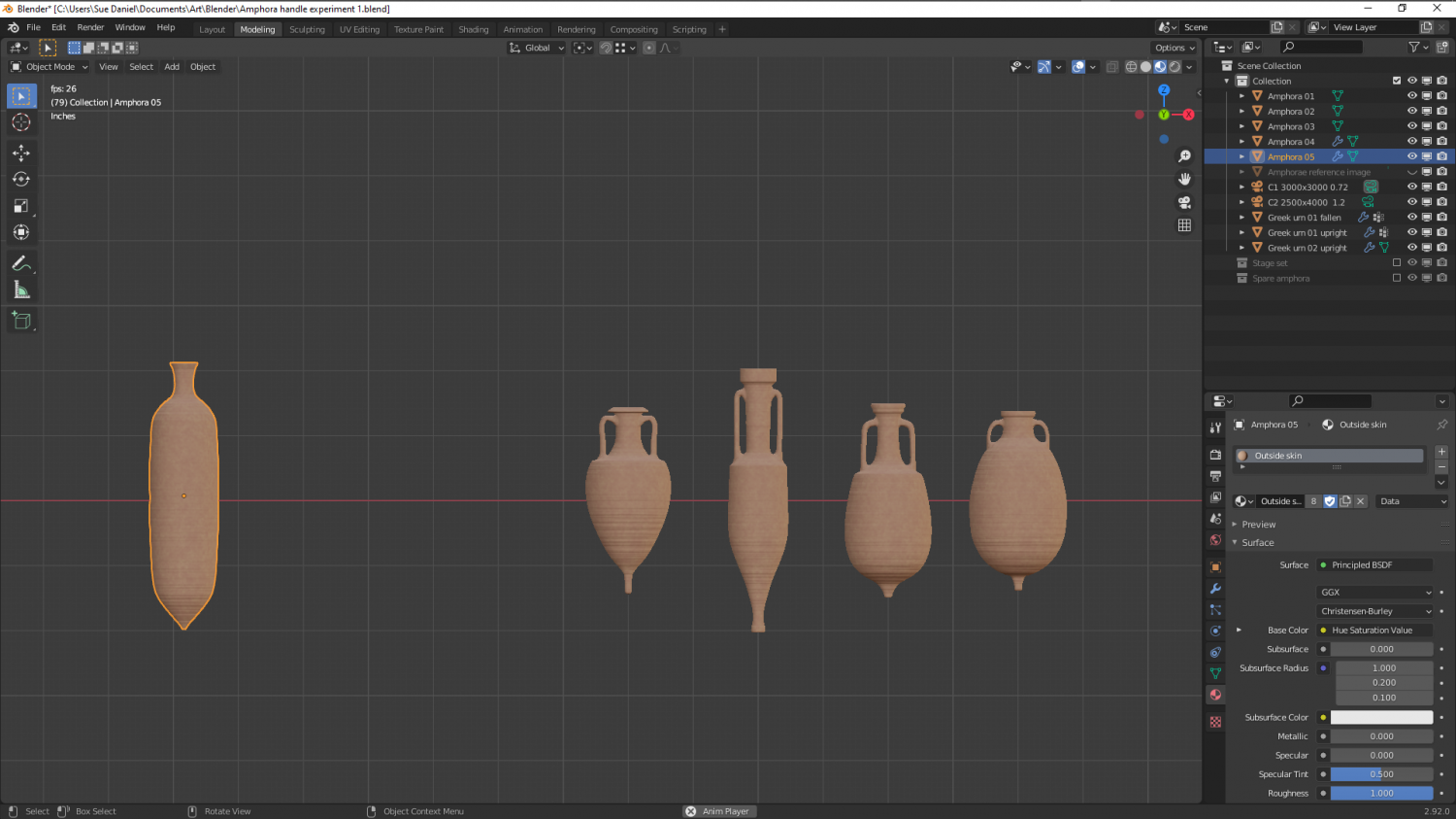
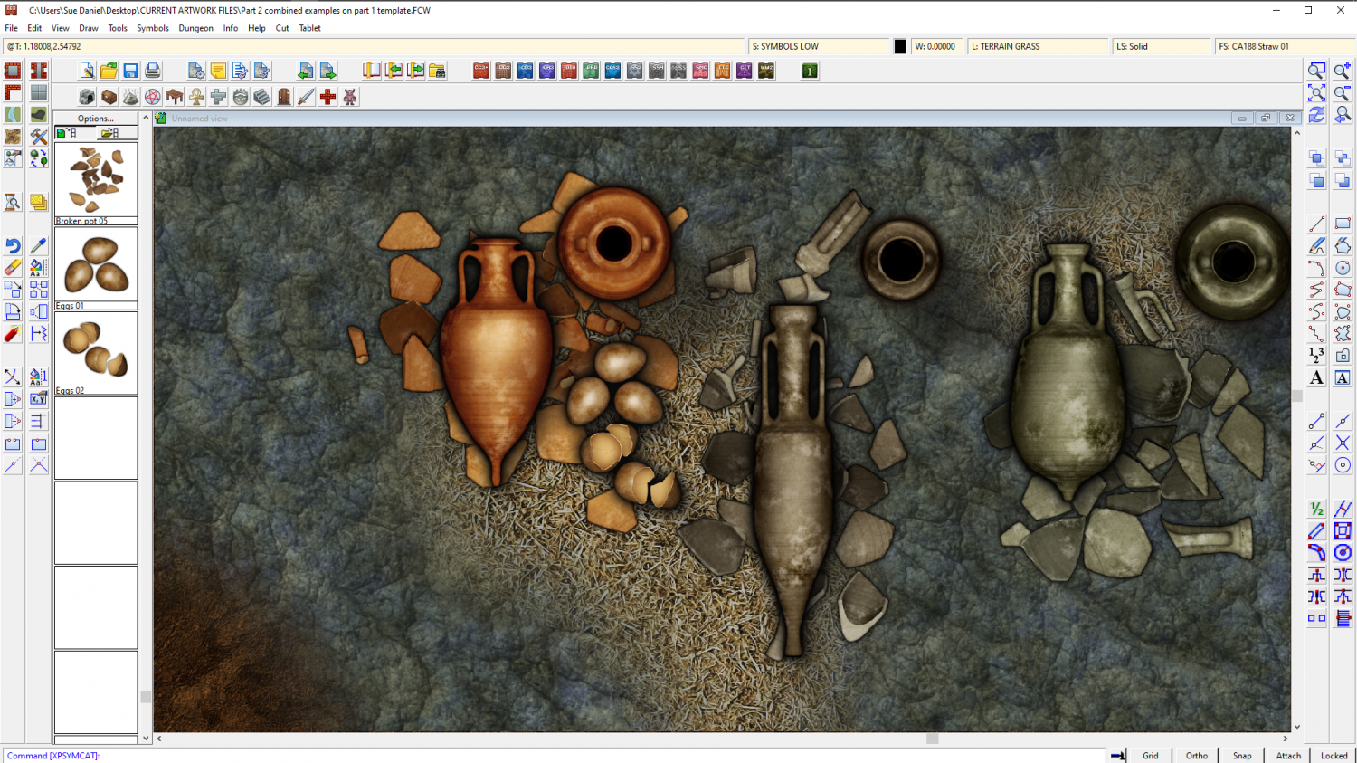
The Creepy Crypt project
This is a broken urn, not a broken amphora, and it still looks too clean.
I think I will have to do a bit of post processing to make them not so sharp, the right kind of colour, and dirtier to fit with the set. But otherwise there's no reason why I can't do several amphora - whole and broken.
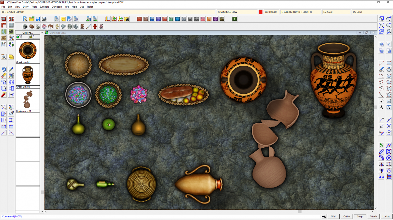
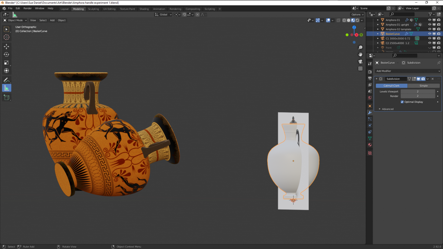
I also haven't figured out how to incorporate handles, since they are separate objects to the rest of the urn.

-
The Creepy Crypt project
Thanks Wyvern :)
I really meant the right look being similar enough to DD3 that the styles wouldn't clash and could be used together. It's a fine line between getting it too close, and not close enough. I want to be able to show a certain amount of detail, but too much makes them look too different. For example, the existing amphora is pretty homogenously coloured and textured, so if I start adding too many stains and too much dirt (though I will try to add some at least) or go too authentically grey-pink or white instead of orange, they just won't look right with DD3 assets.
I looked into how they used to seal them because I was concerned about that as well. It seems that back in the beginning they tried straw and wool and such, but later they were cork bungs. They couldn't really use much else because most of what was transported in them was wine and olive oil, and wine in particular goes bad really fast if too much fresh air gets into it in transit.
The inside walls were often waxed, or glazed in later times, and if they weren't then the inside walls would be even darker than you might expect with all that wine and olive oil soaking into them.
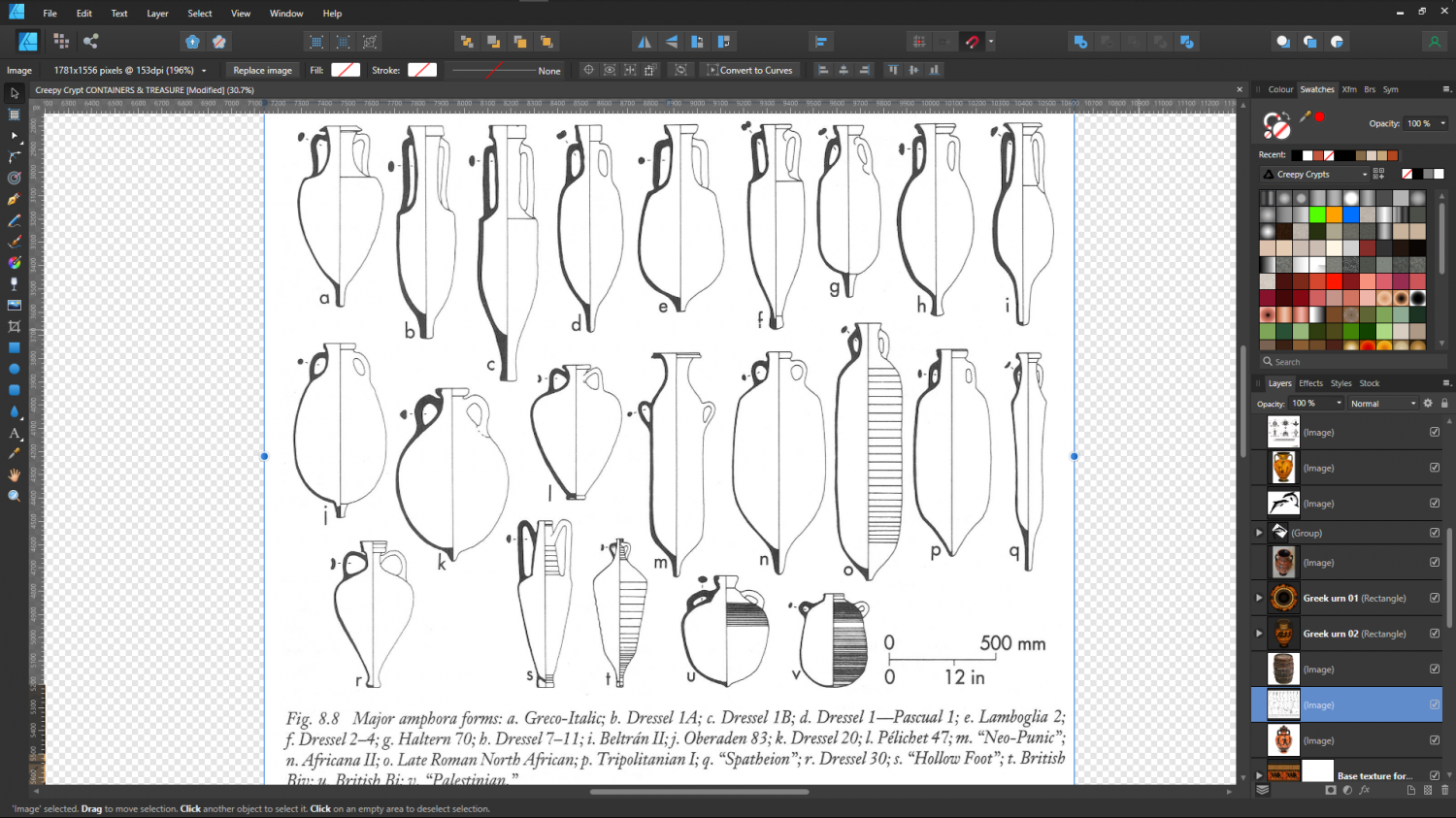
These are all too pink by far, but retexturing is nothing compared to adding handles, and I only have one more to do. I picked the 5 most variable amphorae. Doing more than that would seem to be a bit excessive - especially since there will be 3 versions of each one. Whole and lying on its side, whole and standing slightly on a tilt as if stacked in a ship's hold, and of course broken. That's 15 symbols that are all amphora!
Regarding the use of the pointy end bit. It is said that they were pointed like that to make it easier to stand them in sand, and one source suggested that ships stood them upright in a bed of sand! That I find seriously doubtful, since adding a large enough volume of sand would be such a huge amount of ballast as to be likely to sink the ship without adding the cargo itself. However, if you look at the shape of them you can see that it wouldn't be too difficult to store them in wooden racking, possibly built around them during loading, and if you look even closer you can see that a double row end to end would interlock if they were lying flat or against the inside of the hull and all the same type.

-
The Creepy Crypt project
There's a second one on the way now I've worked out all the bugs involved in creating them, but that one will be smaller. Big urn and little urn :P
Posh memorials.
When mummifying things you need all kinds of stuff, like loads of salt to start with. We have lots of barrels already in DD3, but only one amphora. Since these were still used to transport and store stuff in the middle ages, I'll make a couple of them too, so you can have a bit more variety than just the one currently in DD3.
As for the amphorae, they will be easier and faster to make (I hope) since they aren't so highly detailed and completely unpainted. I just have to decide how many of these to do. I guess it depends how many I can finish before the end of tomorrow. Time limits are important, or I just go a bit crazy creating lots of one kind of thing.

-
Some new maps from the Shattered Sun world
A couple of nice looking maps :)
There's nothing wrong or lazy about using CC3 assets in an alternative app. I used to make a lot of hybrid CC3-GIMP maps myself before my time was swallowed up by asset creation. However, I draw the line at Inkscape, which I loathe with a passion! Personal preference, though ;)

-
Budapest
Another work of art, Ricko :)
If I might suggest something, though, it would be to use a related but more simplified font for the legend. Very ornate text can sometimes be a bit difficult to read when it is all packed together like that.
-
The Creepy Crypt project
I imported them at 200 px per map unit, so you can make them larger if you want, but I think they might be a bit obvious at full size if you are trying to hide them among the fragments. Full size would be if you want them to be noticed straight away.

-
Duskwood Manor - A Village Scale Mood Piece
I think it looks pretty good :)
You can change the colour of the cliffs using either an Adjust Hue/Saturation or Colorize sheet effect on that sheet. While these effects don't normally work with symbols they will with the cliffs because the cliffs have map files.
-
I Lost My Screen Border that Hides Symbols and Land/Terrain Fills
You're welcome :)
All I did was draw the white polygon. That's the only difference. I figured that I could sort the sheets into a more logical order for you, but I decided not to mess with them, because my logical order probably won't be the same as your logical order.
If you want to make the screen broader I recommend temporarily changing the view window colour to something other than white so that you can see what you're doing. Go to View->View Window Color and pick it.
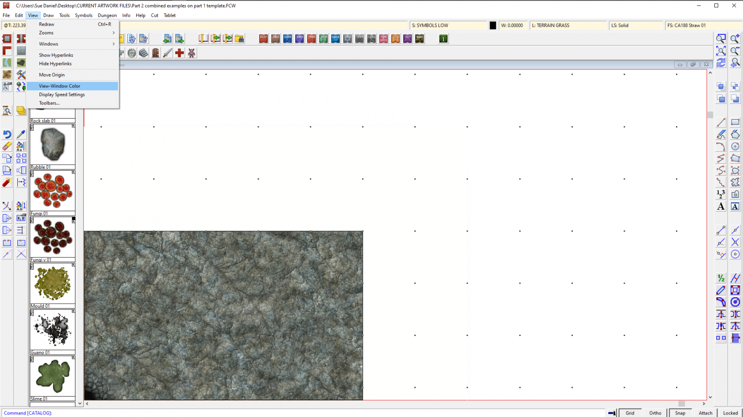
Look at the command line and it will say:
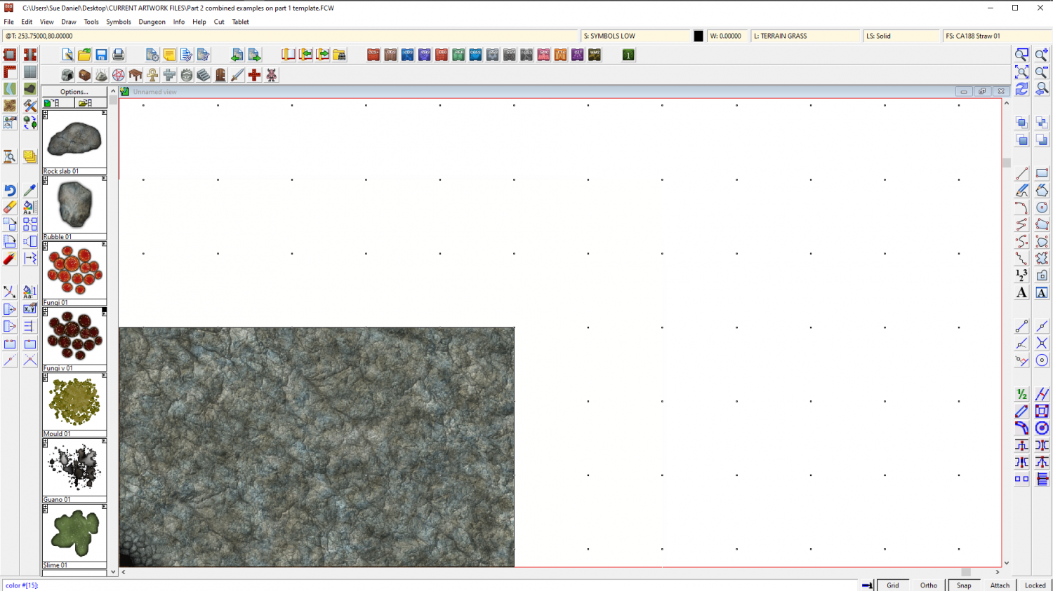
"color #[15]:"
That's white. Remember that so you can go back to it.
Type 0 (zero) and hit enter. That will turn your view window black, so that you can see the white polygon on the SCREEN sheet.
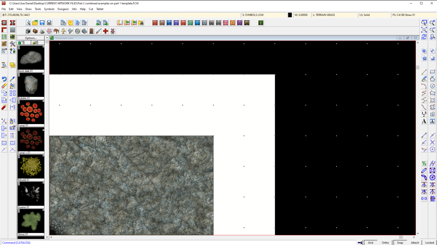
Now that you can see it you can use the node move tool to pick the corners and move them outward to wherever you want them to be. Turn snap on and you can have everything neat and tidy.
I don't recommend using huge fat wide screens because if you zoom to extents you will get an awfully wide swathe of white space and your map will be tiny. It may be worth the time and effort of editing that one piece that sticks out to tuck it under the existing screen.
When you have finished adjusting the screen you can change the view window colour back to white the same way that you turned it black.