Jeff B
Jeff B
About
- Username
- Jeff B
- Joined
- Visits
- 5,898
- Last Active
- Roles
- Member, Betatester
- Points
- 1,238
- Location
- Fairbanks, Alaska
- Website
- https://www.akbattletech.us/endoria/
- Rank
- Surveyor
- Badges
- 9
Latest Images
Reactions
-
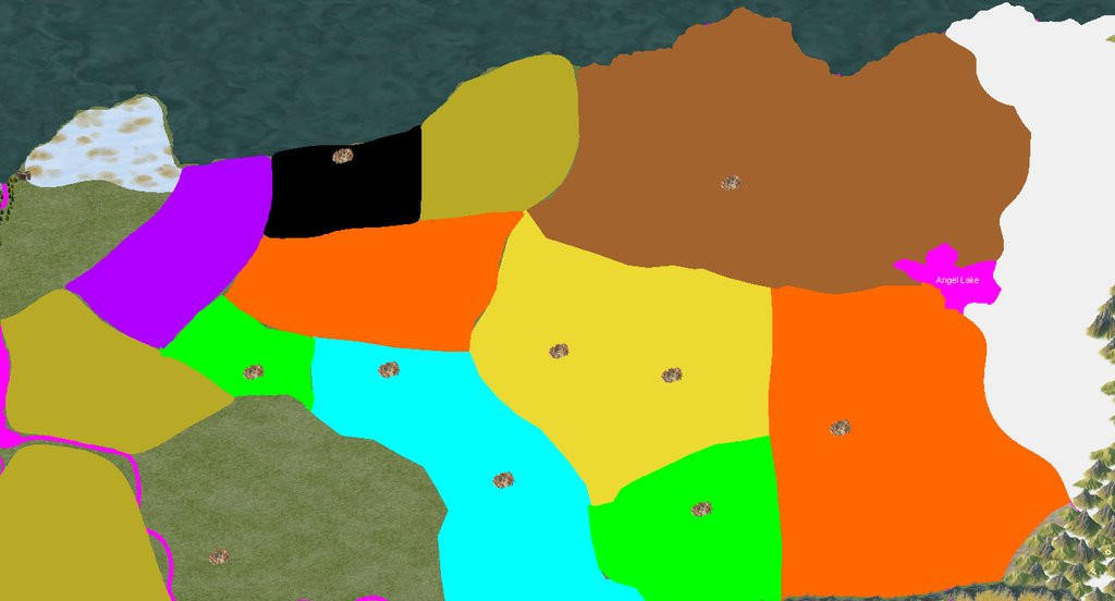
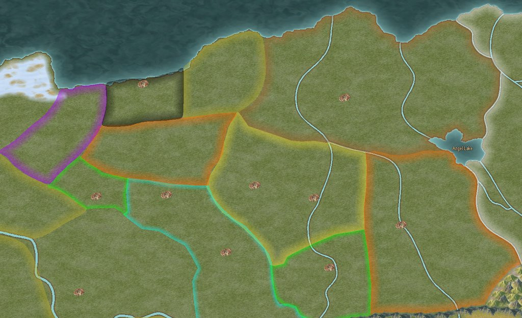
WIP - My New World - Myrrhina
It also depends on what look you want. I’m working on a large map (3500 x 2400 miles) and I’m using smaller fonts as I want them visible in a high res version when zoomed in but in standard res version don’t really care if the text is readable. As the text is a distraction from the map it self if the text size is readable.
personnel choice as to what your looking for and what you want to bring attention to. The text or map it self.
With that said it is possible to find a happy medium for text size depending on the size of the map.
choice of font and color makes a big difference also. Don’t be afraid to use a more readable font for small text like on your borders. It doesn’t have to match the more fancy text your using for the other areas.
-
WIP - My New World - Myrrhina
I would try changing your political boundaries to different colors for each area. You can have two or more areas with the same color boundary but just not next to each other. That would separate the boundaries better and make it easier to see where the boundaries are. I would also use polygons for the area with a filled color and a sheet effect to just show the boundary edges. after you use the smooth poly tool to make the boundary. then use the smooth to straight command to turn the area into a straight poly then you can use the trace command to trace the border of the neighboring region. Once your all done you can leave them as straight or change them back to smooth polys by using the straight to smooth command.
Just an idea for you to think about.
sample below - not all done but this is what I'm currently working on
-
WIP - My New World - Myrrhina
The black looks better because you have the political colors covering the entire area instead of just outlined.
-
[WIP] Kalimdor
I would reduce the font size and to me the white glow makes the text blurry. Mane change the text to a lighter color with a dark glow.

-
Invasion of Warlock
What is the best way to figure out what is the proper scaling for the symbols I'm making so they work with various map scales?
Here is the issue:
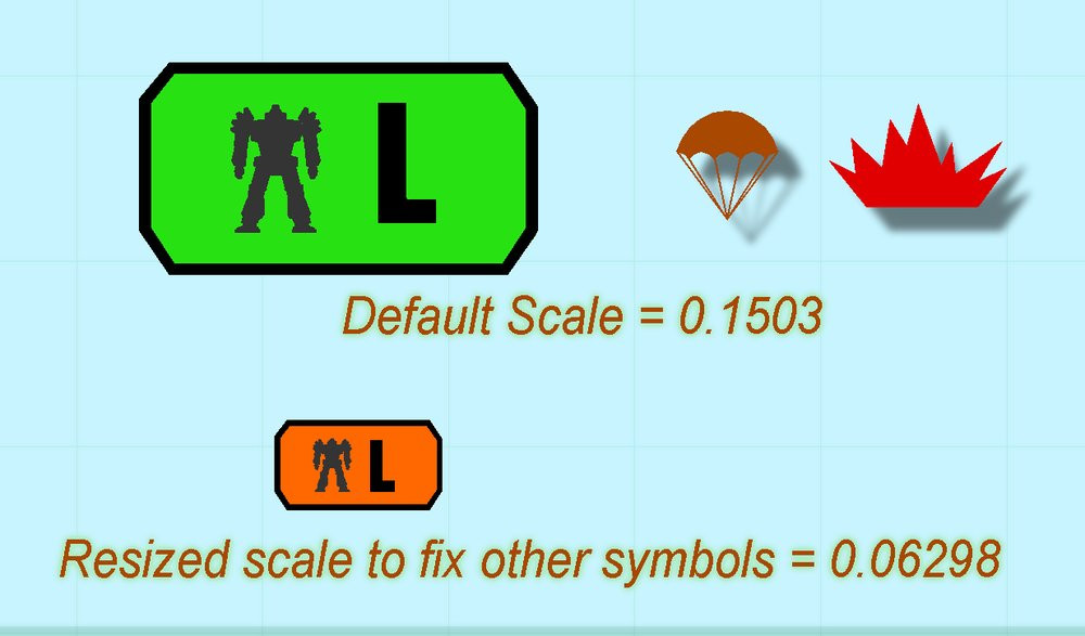

-
Invasion of Warlock
@Monsen That is what I did expect I did it the hard way. I adjusted the size and keep putting into the map until it was close. Never thought about putting the explosion symbol in the symbol file I was working on. My be the cold weather has froze my brain already.
I will say that I was able to use some of the tips I learned from you blogs and videos when working on the symbols. Thank You for those.
I have a set of symbols done now but not sure about how I have them sorted in the symbol file. I need to do the varicolor ones next.
If any experience symbol catalog makers would like to look over my symbol catalog and tell me how i can better organize it that would be greatly appreciated.

-
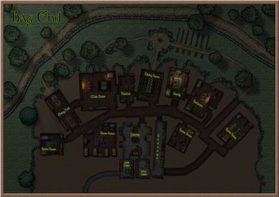
Community Atlas - Berenur - Temple of Aeniar
@Quenten It's the one I made using @EukalyptusNow tutorial. I just resized it from the one I posted in that thread.
https://forum.profantasy.com/discussion/12954/how-to-create-decorative-symbols-by-tracing#latest
![[Deleted User]](https://secure.gravatar.com/avatar/c75d9a245b74d9c59be0999ea81ca541/?default=https%3A%2F%2Fvanillicon.com%2F92add7f8c954488718110edc4896ad39_200.png&rating=g&size=200)
-
Community Atlas - Berenur - Temple of Aeniar
Yes this was designed to go into the atlas. Later I will do a more detailed map of the island and the dungeon located on the island. Remy is waiting until the SS6 goes Gold before adding it to the atlas just in case somethings change between the current beta version and the release version. I will never catch you Wyren or Jim in atlas submissions but I do want a couple more atlas badges.

-
Community Atlas - Berenur - Temple of Aeniar
@Monsen Remy I found an issue with the text so I fixed it and here is the new .FCW file. Also added a glow to the puffin.
After seeing map in Blog found another text error missing stables - corrected and re-uploaded.
-
marble tile floor textures available?
DD3 Color A and Ice Caverns (2022) share the same black and gray tiles that you could adjusted in sheets to be black and white.
There is one other annual that also shares the same gray and black tile but can’t remember which one. I would have to look it up.