


Wyvern
Wyvern
About
- Username
- Wyvern
- Joined
- Visits
- 3,238
- Last Active
- Roles
- Member
- Points
- 5,516
- Rank
- Cartographer
- Badges
- 24
Latest Images


-
Dhakos, The City of Spires - Watabou Cities Annual
Well this is weird, as I've just dropped-by the Forum here following a lengthy discussion on one of my Discords with someone about the old Chaosium versions of the "Stormbringer" RPG, a few minutes ago!
Not sure if it'll help with your spires query, but I had to draw my own shadows of not dissimilar form for one of my Atlas maps a while back, the Thalassan Castle Ruins. The FCW might give you a further pointer or two, perhaps. Or perhaps not! Good luck, regardless 😁


-
WIP Goldenlilly Dungeons
As Sue suggested, something to help the bars look more vertical probably would be helpful.
Maybe think of reducing the intensity of the shadows overall, given they don't really work with the light sources in the dungeon.
Some of the shadows - for the buckets and smaller round table - are also perhaps too large for what they are. The buckets probably shouldn't be casting the same length of shadow as the rack and dissecting table, for instance.

-
[WIP] Community Atlas, 1,000 Maps Contest: Villages in The Whispering Wastes of Haddmark, Peredur
The eighth small settlement in this set is from Hex 1604, Brightlawn Hamlet:
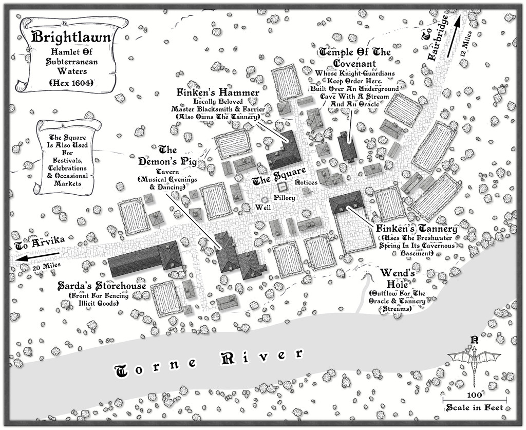
No especially fancy elements were required here, although as a major river shown on the Atlas map for this continent, the Torne needed to look somewhat more imposing than the others to feature so far, and I did feel it would be useful to include an outlet into it from the subterranean streams that had been randomly decided-upon as part of this hamlet's layout. The settlement is also relatively close to the edge of the Siljan Hills, so a few more of the style's contour lines were added than normal. I did trial one of the cliff-line symbols for what became the Wend's Hole stream outlet as well, but that just didn't look right, mostly because the better-shaped of the cliff options is intended as a promontory, with the cliffs on its outer side. Instead I simply hand-traced the line of that cliff piece, and drew the little cliff-line markers to make it look more as if this was a hollow than a clifftop, which in combination with the contours and a mild shadow effect (suitably masked in part) seemed to work well enough.
Everything else was much as has become normal for these village maps, with properties of varying sizes and types, scattered vegetation and a few fields. Interestingly, the random options here from the Shadowdark tables came up with an area with a pillory and a "Wanted" noticeboard that wasn't a market place, although it makes such an obvious feature in the settlement, I decided occasional markets could happen there too. I added a well, and a hut by the noticeboard, since it made sense to develop that other local notices might be pinned-up there, thinking of medieval European settlements and how things such as broadsheets were presented publicly. The oracle in the cave below the small temple here adds a further note of mystery to the place, which hopefully helps make it seem a bit more "real"!


-
[WIP] Community Atlas, 1,000 Maps Contest: Villages in The Whispering Wastes of Haddmark, Peredur
Halfway point, or map five of the ten, if you prefer, is reached via Hex 1105, Osalin Village:
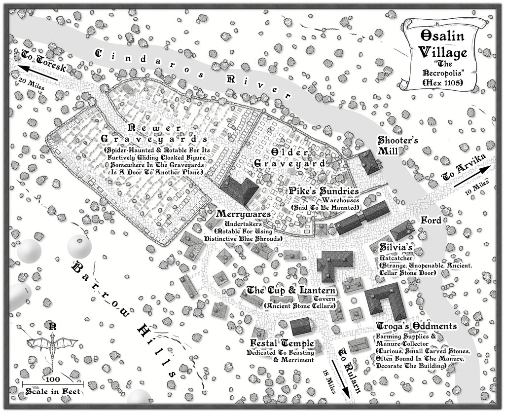
One interesting aspect for me as mapper with this sub-project was how readily the places each developed their own character, partly a result of their broader map setting, partly thanks to whatever features the Shadowdark random tables had come up with. In this case, there was the chance to map an unusually extensive area of burials, an aspect which truly defines the settlement, given that the area occupied by the dead is greater than that of the living village. Everything there was placed individually, to make sure things were never too neatly-ordered, although it's perhaps best not to peer too closely at what some of the repurposed symbols involved as the grave markers actually are! What's important at this map-view is the shape, texture and the shadows (or equivalent effects - there are some "Solid 10" shapes with variant Lighted Bevels in places, for instance). While time-consuming, it was rather satisfying to see the whole area growing in a more or less organic manner.
I'd already decided there might be hints of connections with a couple of the barrow-fields in hexes some way from the settlement on the Whispering Wastes area map, so adding a few more Solid 10 bevelled shapes for a few barrows closer-by seemed simply a natural adjunct. What was perhaps more surprising was the random tables provided by-chance an undertaker, properties hinting further at the ancientness, not to say weirdness, of the setting here, haunted warehouses and a little old temple suitable for hosting celebrations for the deceased (and anyone else at other times, of course). I've mentioned before, there are times when you start to wonder just how "random" these things really are! All I needed to add was a mill, a few contours and those barrow-shapes.
Onward now to the second half of the ten!

-
[WIP] Atlas Contest: Village of Djayet (Gold Coast, west coast of Doriant)
Scalebars are fine in the Atlas.
You can change the font in any symbols like this in your map by making a new symbol with your preferred font in.
Select the symbol in Symbol Manager (in the Symbols drop-down menu), and Clone it, giving it a new name (this is very important, so you don't overwrite the original symbol).
Then, still in Symbol Manager, select your cloned symbol and click to Edit it. Draw your editing pane and then make whatever changes you wish - all the usual CC3+ tools are available to work on the symbol.
Once you're happy with the new version, click the cross box in the top right corner of the editing pane to dismiss it, and you'll get a terrifying message like this:
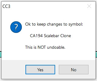
Despite the terror, click "Yes" - it's fine to do so with the cloned image.
Then your revised scalebar will be available to use in that map only.
-
Which style for... Post apocaliptic meshup
Yeah, I've been involved peripherally in a number of discussions elsewhere online lately regarding the use of AI art, including specifically that generated by Midjourney, because a lot of people - primarily artists - have become increasingly concerned about the direction this stuff is taking, most especially how the so-called AI systems are using artworks available online to generate their final images.
The matter is incredibly complex, and much of it remains uncertain, notably how copyright laws in various places pertain to AI-generated artworks, largely because they have never been legally tested this way (a couple of practicing US lawyers posted some very helpful discussions regarding the US situation a little while ago on one of the Discords I'm on, which were very enlightening in this regard).
I can do no better to help inform anyone here as to the current situation, than suggest those interested should read this blog posting from Dec 8th this year, by Jon Hodgson, a British "real" artist, RPG and game designer, who runs a company called Handiwork Games (which is where the blog is). Jon used Midjourney to generate much of the artwork in a new RPG he published this year, so he knows exactly what he's talking about from the genuine artist's perspective. He's also decided that any reprint of said RPG will have all the Midjourney artwork removed, to be replaced with his own, or other artists', real art, and he will not be using Midjourney, or other AI-generated artworks, again.
Personally, I've become very cautious about using any AI-generated artwork now, and would not do so in anything that wasn't purely for my own use.
-
The Expanse rpg; several starships, Annual scifi tiles and Cosmographer
My big problem with large ships is visualizing the layout/deck plans.
I forget whether you mentioned having a copy of any of the Metamorphosis Alpha RPG books or not now Jim, though I suspect from this comment probably not, as even the limited floorplans for the two complete decks, and the brief notes on all the others, in the first edition rules from 1976, would have given you a few pointers in this regard.
In one sense, Remy's right in suggesting it may help to think of the whole ship as like a huge city, actually more like a small country, given its gigantic size. Depending on how you envisage the entire craft as functioning, it's perfectly possible some of the decks might have a single function, or several major functions, each. Something like a farming deck for food production and air recycling, including breeding populations of domesticated animals, for instance, while there could be huge areas given over to parked-up machines on another deck for use on whatever planet the ship eventually reaches to colonise (since that's the primary reason such vast craft were envisaged originally). Elsewhere, there could be factories and machinery for use in them stored on another deck, again to get things functioning once the planet was reached, with maybe one entirely water-filled, for living aquatic foodstuffs, and as a water supply for the ship (could easily be segregated into fresh and sea water parts). Plus power supplies of varying kinds, of course.
It might help to work out what the total floor area is for the whole craft, and then compare that to a populated area on Earth somewhere, and see exactly what sort of features lie within a similar-sized zone, and what of those would be useful/essential on a ship destined to be in space for hundreds of years or more.
Hopefully in all this, we can help get you back on course!
-
[WIP] Community Atlas, 1,000 Maps Contest: Villages in The Whispering Wastes of Haddmark, Peredur
Place four is from Hex 805, Toresk Village:
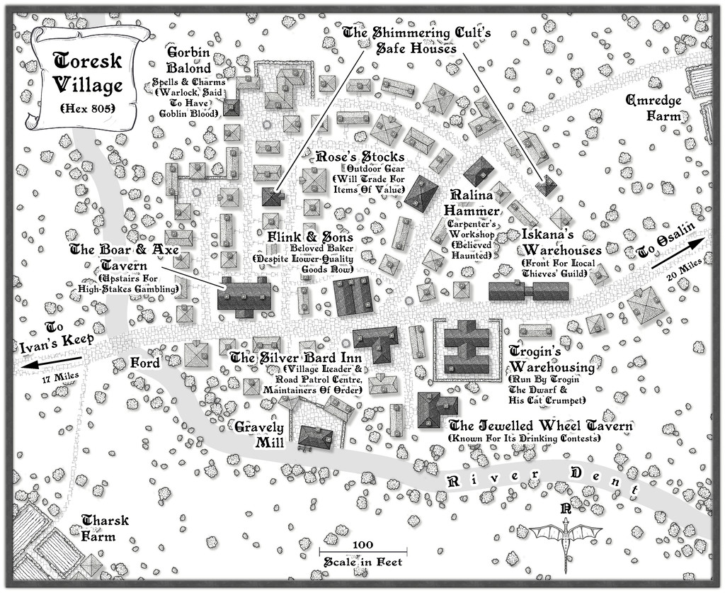
A somewhat more conventional, "open", layout for the next village in this group compared with last time's Ivan's Keep, if with more potentially untoward locations this time, including an overt reference to The Shimmering Cult, to add a little more linkage between features across the maps in this Haddmark mapping extravaganza. Those who read through last time's PDF notes here will have learnt the Druids from Hex 611 had a hand in creating the defences at Ivan's Keep (and may be responsible for the Goblin attacks on the place too, while The Shimmering Cult may be behind the Kobold attacks there...). Here, no similar problems, just a variety of dubious or curious goings-on. The map notes, as usual, have a little more detail.
Even so, I wanted the layout to be a bit odd, since the random rolls in the Shadowdark tables had come up with a Chaotic nature for the settlement (for those unfamiliar, most things in this RPG can be assigned an alignment - Law, Neutral or Chaos - as a keyword for GMs to apply as they choose to provide variant atmospheres for different places). So the village began nearer the river as a planned layout, but as more people came here, it spread more haphazardly eastwards, such that the older properties are now rather run-down and ill-favoured, despite also having a neater street pattern and fancy road-end walls.


-
City locations
Might want to tweak the angle of the seating a little for the rows nearest the outer walls; otherwise, patron complaints about stiff necks can be expected!
Will there be upper levels too?
-
Commercial use of maps
Yep, I think many of us have learnt far more than we wanted to about the murkiness of copyright and IP laws in different parts of the world in recent months, thanks to events elsewhere in the RPG world.
Bottom line is it's probably safer to create your own new maps from scratch, than try copying anything someone else has done, however varied, especially when you're intending to make money from doing so.

