Trying a (few) 2-minute-tabletop style(s)
Before trying my Planescape style (and after trying an old-school style of my own) I tried creating a style using assets by 2-Minute Tabletop (note that I'm only using the free assets... so far). And since I wanted to create a template for each type of map, I ended up making quite a few "sampler" maps (to include as a thumbnail).
These are a few of these maps I ended up creating.
If you've read some of my previous posts, you might have noticed that there's almost always something I don't like about my own creations. But I don't beat myself up, I take it as a lesson, or just something to revisit for later (do throw in comments and suggestions of your own if you wish). And in this case, since they're meant to be thumbnails, they try to showcase what can be accomplished with that template.
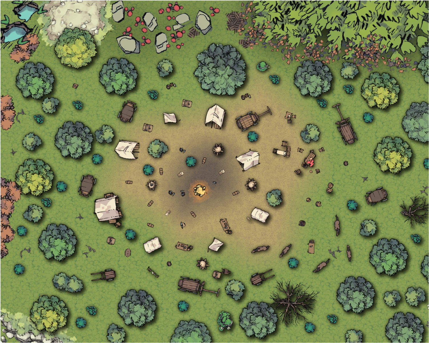
Roadside camp
Love the blending of the floor textures (very easy to do with CC3+, it would take me a bit more to accomplish the same with a raster image editing program).
Not convinced about the shadows (too strong, I think).
Ross has a ton of assets suited for this type of maps (I couldn't possibly include half of them in this sample).
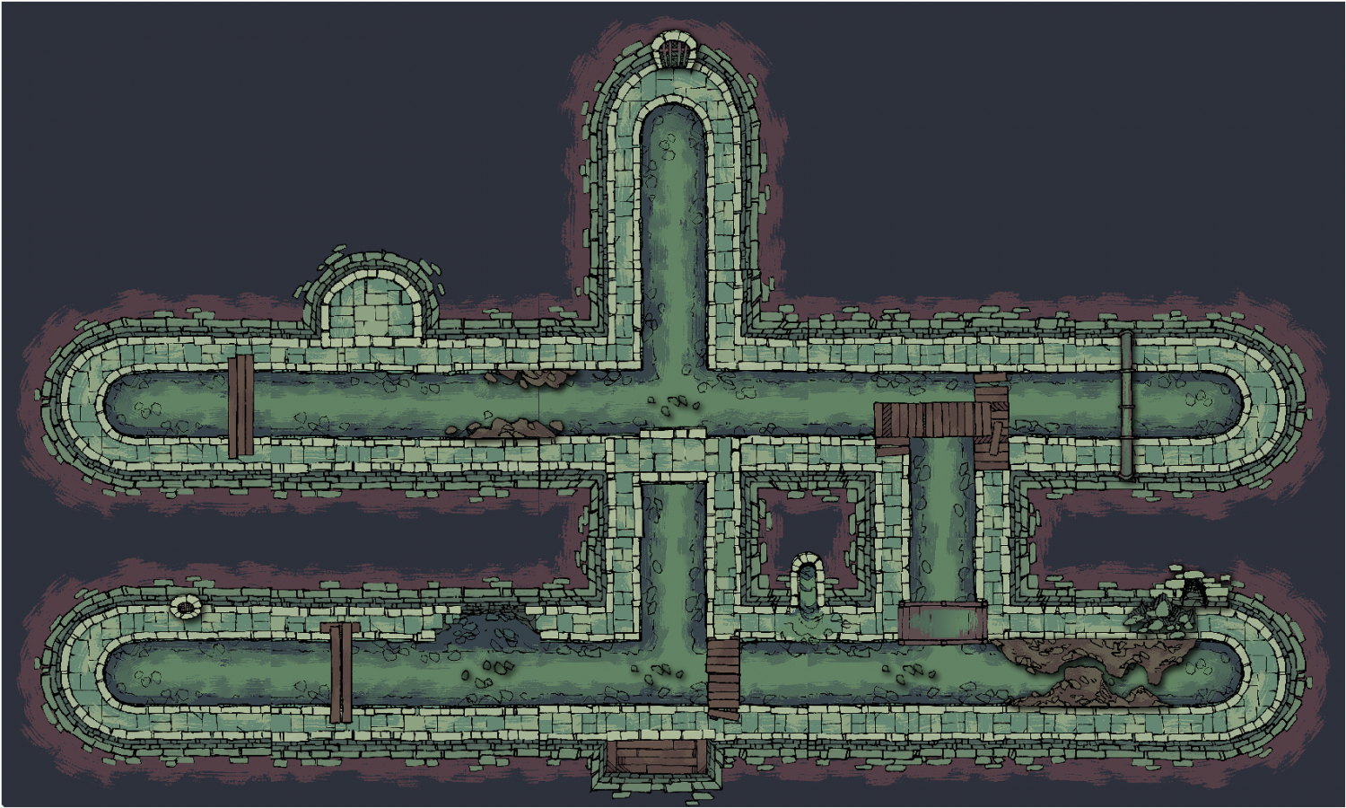
Sewer
There's only a handful of geomorphs for the actual tunnels, and then some symbols for decorating everything.
Yes, I know I messed up the seams in a couple of the geomorphs, something to revisit later.
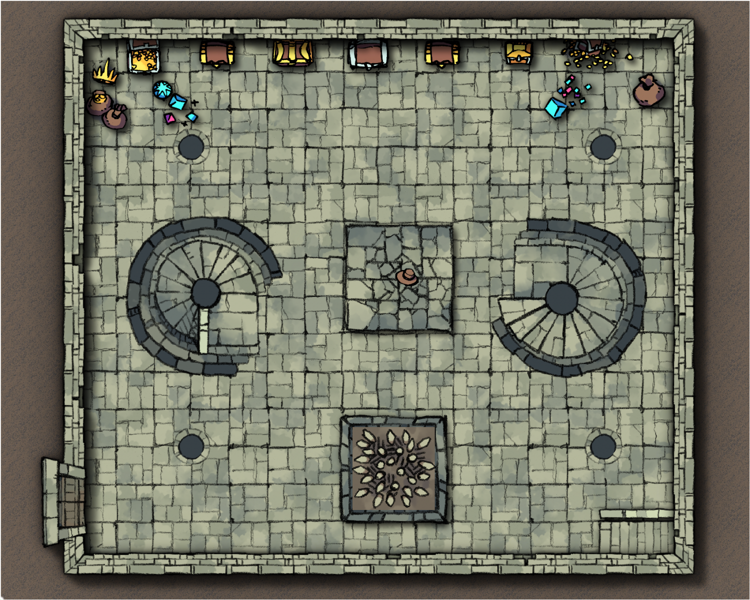
Dungeon
My least favourite accomplishment (the sample I created, not the art by Ross). Basically, I gave up early, created a very bland layout, and called it a day. Also, this was one of the first samples I tried, and I still had some stuff to learn.
Why did I give up?
Well, Ross usually publishes his assets with a generous transparent margin on all sides, so I had a hard time creating properly alingning (snap to grid) symbols for floors and walls.
I do want to revisit the symbols for the walls, and ideally, I'd love to make it a connecting symbol. I might also try to creating a proper texture for the floor instead of tiling symbols at some point in the future.
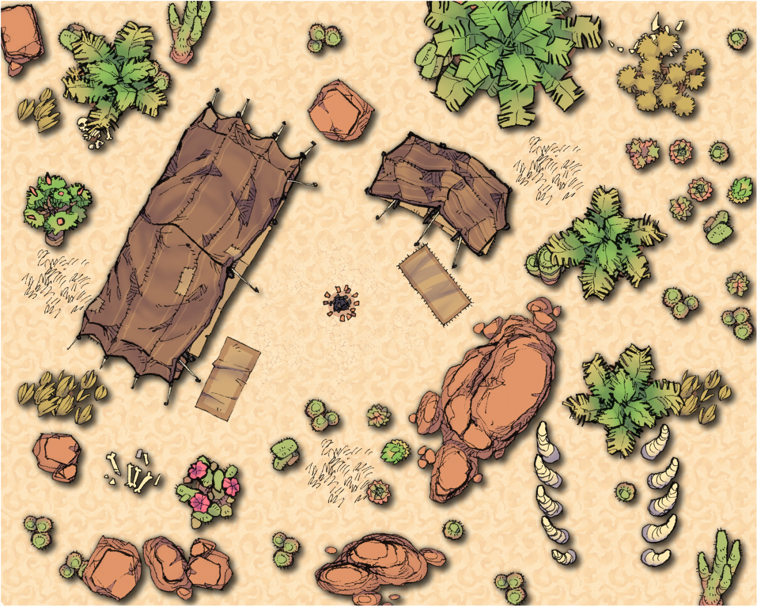
Desert
There's not too many symbols for this type of map... but I feel like you don't need too many.
Shadows could be improved (again). Not everything make sense, but in my defense, this is meant to be a sampler.
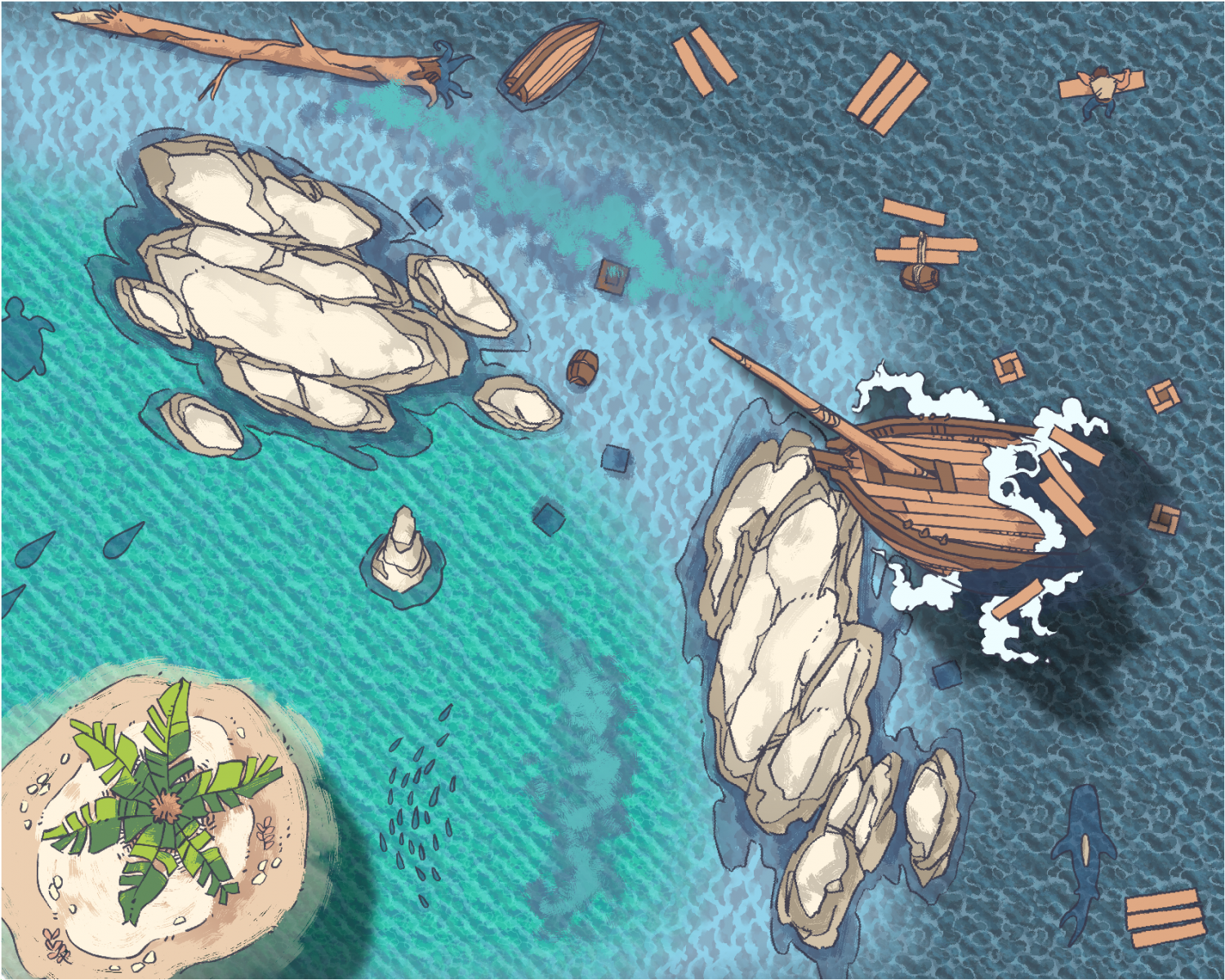
Ocean
There's not too many assets for this "type" of map, but they seem to be enough for me. Ross did a great job with these packs.
I like the blending of the different depths, I like the shadows.
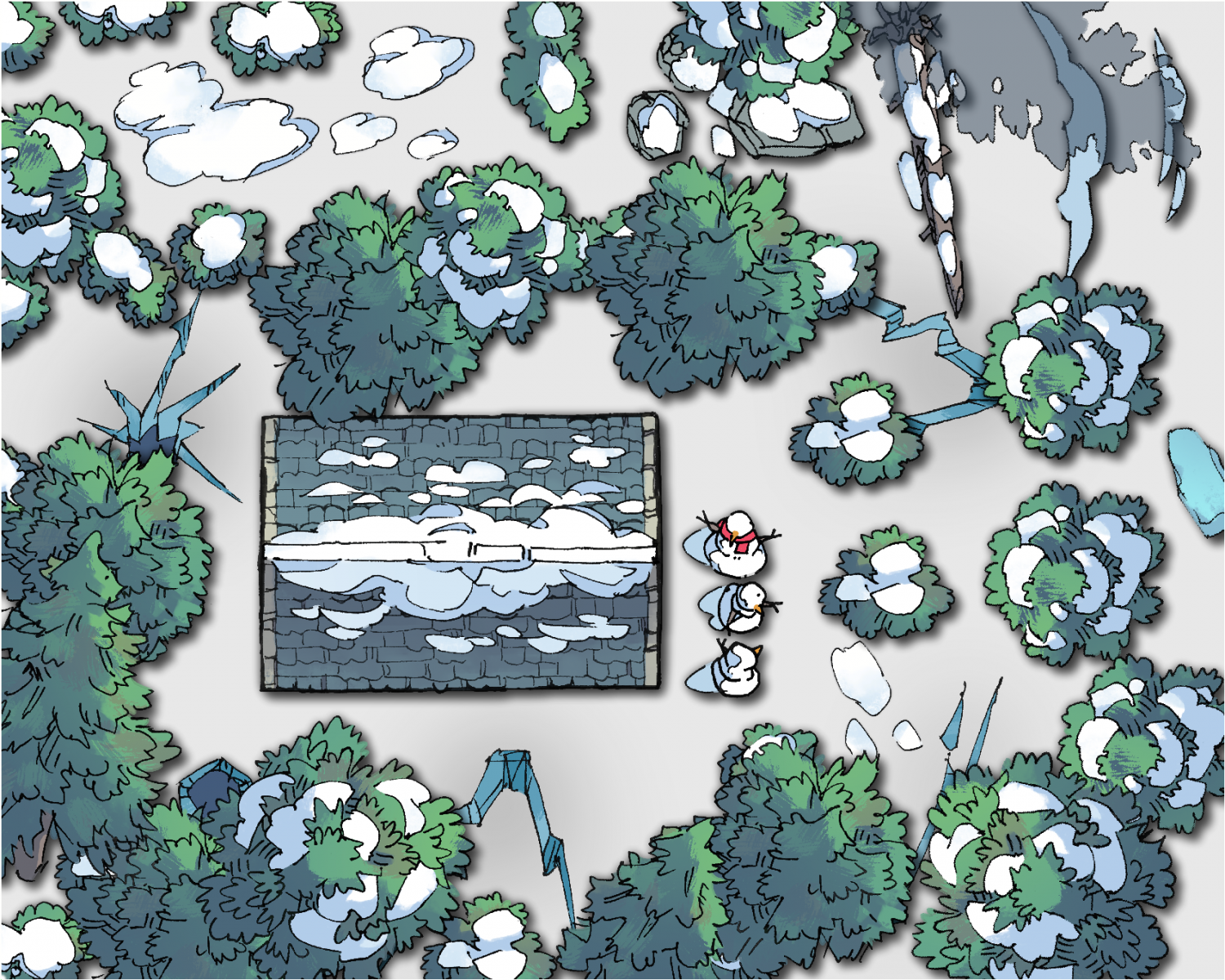
Snowy winter
IIRC, there's one asset pack for this "type". But I liked the result very much. There wasn't a floor texture available, but solid fills did the trick IMO.
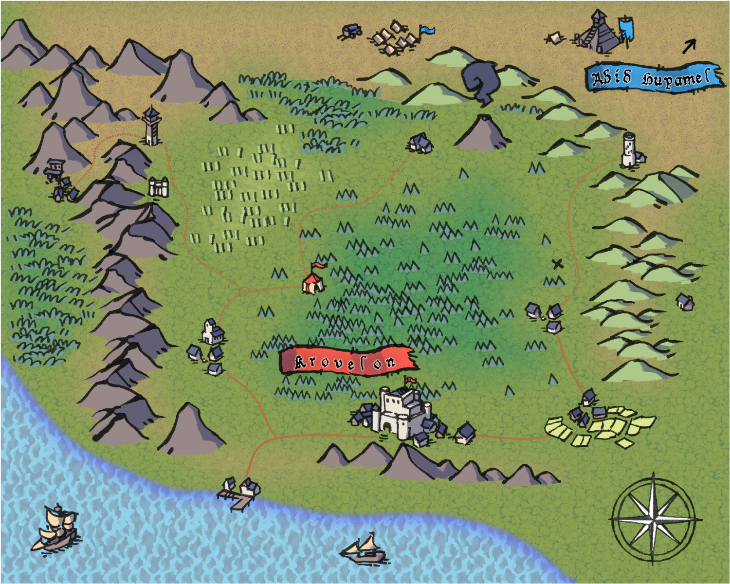
World
Ross created this pack with Wonderdraft in mind, but they can be used in CC3+ with no problems.
I need to work on those shorelines.
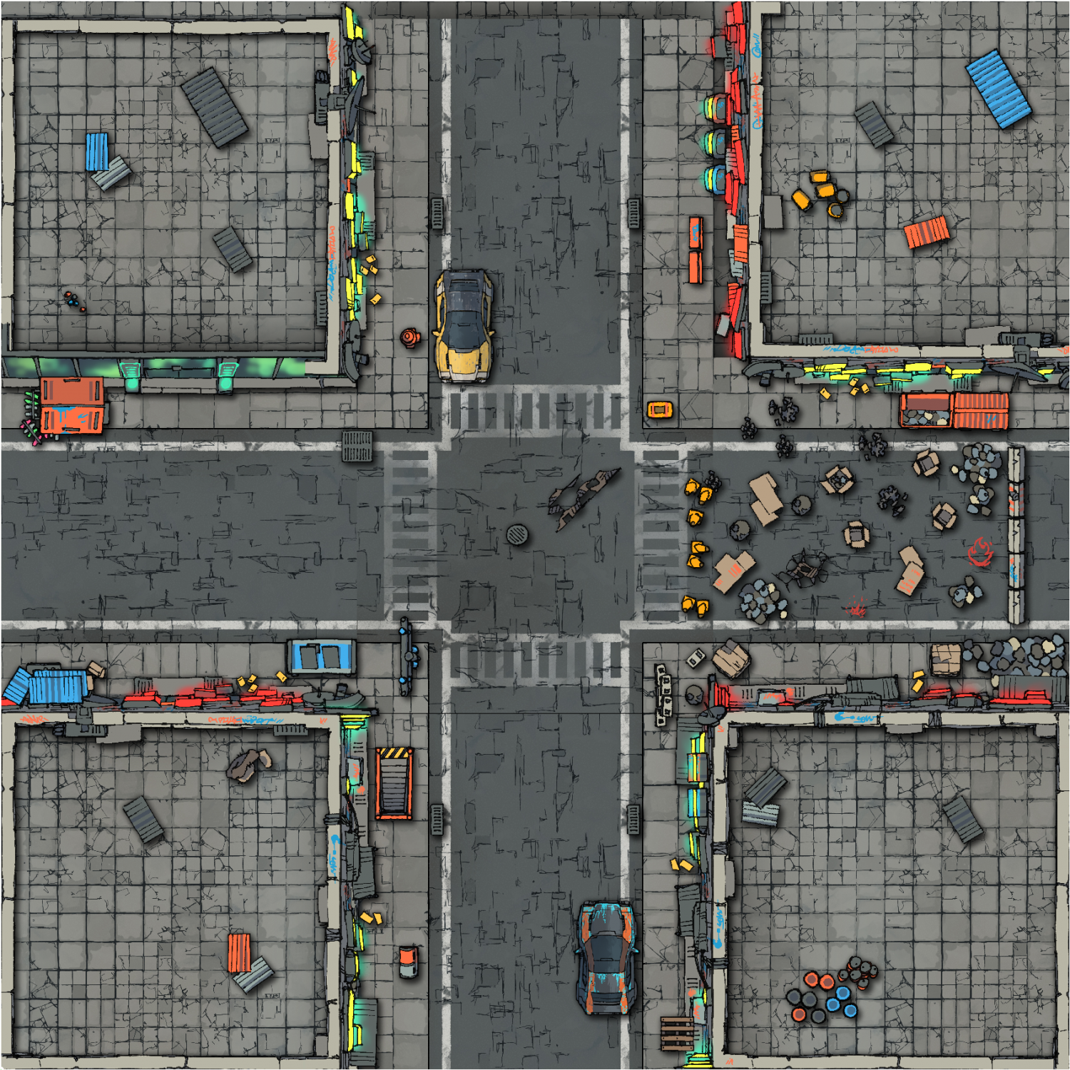
Cyberpunk
I used 3 packs for this sample. Pretty good results (the paid pack should add a lot of possibilities).
As I type this, I realize I could improve the shadows (yet again). Did I mention these were intended for a thumbnail only? ;)
And finally...
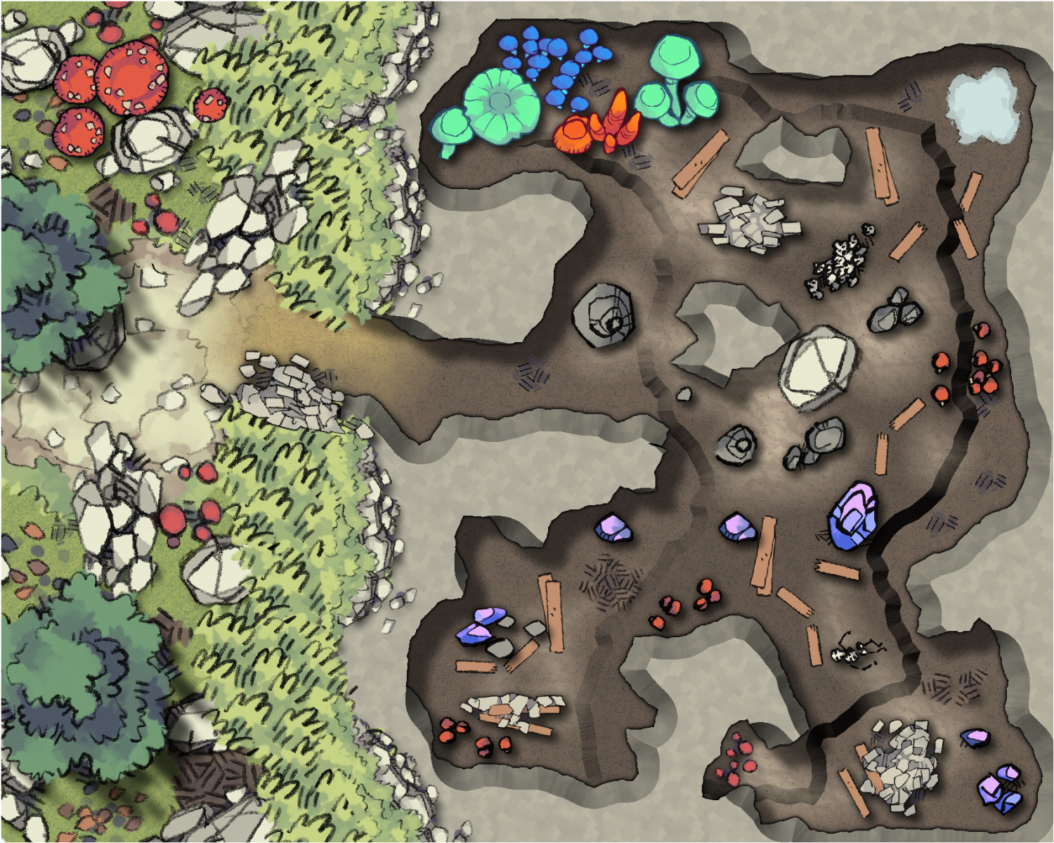
Cave
Now, I should start by saying... I consider this a Beta (or even alpha) sample. More on this after I present to you the image in its current state:
The walls.
You see, Ross has these beautiful hand-drawn textured walls that I like very much. He does offer a cave room builder set, but unless I manage to create a connecting symbol for the cave walls... I'm not sure I'd do it justice.
Or maybe there's something to be accomplished with the Symbols Along Path functionality?
I have to mull it over.
Anyway. This is part of my journey. And it's been fascinating so far.



Comments
I am a fan of these styles and I love these 😍
Any idea why these styles are not used more around here? All I see is the realistic style which honestly is not that appealing to me.
Most people use the styles packaged with the program, or one of the add-ons/annuals. These are already fully integrated with the tools of the software, so it is easier to use than spinning your own style using external resources. And there are a LOT of styles available from these sources, more than enough for most people's mapping needs.
For my own preferences, I could throw the same ball back at you, I find the styled illustrated above in this thread ok, but they are not that appealing that I would generally prefer them for my mapmaking. Maybe for a map just for the sake of variation, but not as part of my primary toolset. But people have different tastes. If you look through the available styles from the add-ons, symbol sets and annuals, you'll find that CC3+ is much more than just realistic styles. Yea, I don't think we have styles that directly try to clone those above, but there is a huge variety.
@Monsen , ah yes... each one of us will have a different idea (or preference) on what exactly is a map or maybe just the specific use we have for it.
I do like 2mtt's styles for battlemaps (either using a VTT or printed and placed on a physical table).
Want to give the players a handout? I'd probably go with Mike Schley Inks or something that looks very hand-drawn (pretty much the reason I'm creating my Planescape style).
Make your own atlas? Then I'd choose something with colors.
And that's the beauty of CC3+... you can have them all.
I am fine with people liking a certain style. I also like some of the styles that I have seen like roflo1's planescape and an isometric hand drawn one from the annuals for indoors and I plan to use them in the future. I want to know rather if to clone the styles above for my urgent needs is it a heavy process in CC3. As I keep talking to people here I feel more confident that its not and its just a matter of changing the pngs. but that the tools are there, perhaps to a much finer degree of customization that raster programs. The reason I was skeptical initially was that I rarely found any cartoony style maps that came even close to the above style and even when it was only the furniture or something like that. I found very few indoor maps in the first place.