

Trying out a Planescape style
 roflo1
🖼️ 3 images Surveyor
roflo1
🖼️ 3 images Surveyor
In this journey to learn CC3+, I remembered the peculiar map style used by many of the the modules for the Planescape setting. This is my (initial?) approach.
I decided to start by redoing the ones included in the manuals first (instead of making something of my own) just to get the hang of it. And I started with Automata since it's the easiest of them (see the original in this link)..
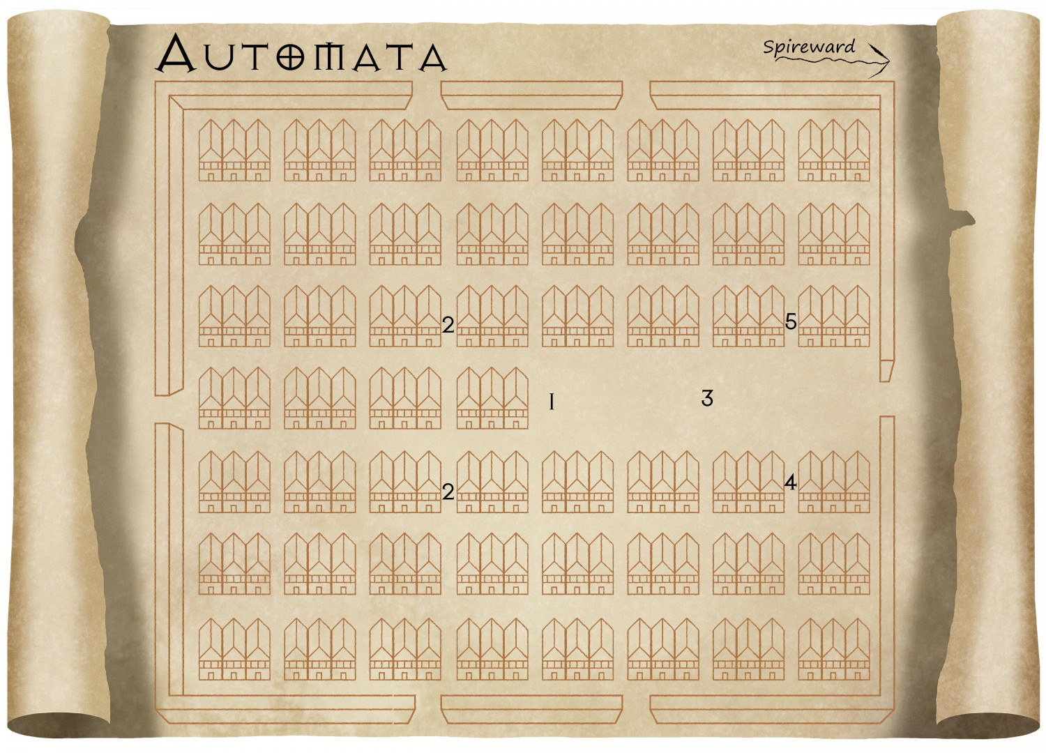
I'll start with an observation of my own: Everything is too "straight", which I might waive off since Automata is a place of clockwork precision. Still, the map wasn't done by a Modron, so I might revisit this one later.
All insights and suggestions are welcome.
Oh, and thanks for the great job on the parchments Sue! They make up for more than half of the looks on this map.


Comments
It is a little straight, but I kind of like it :)
You're welcome, roflo1
Hmm.. I just noticed that the Displace effect I added was "lost" when the forum resized my image... here's a smaller render. The effect should be much more noticeable:
It's a lot less "straight", as you can see.
The house blocks are a lot like Par Lindstrom's Renaissance Style.
Oh, if only... ;)
But yes, there are certainly some things that are similar. Didn't Ralf do a livestream using that style?
As a new user, I've been going through a lot of videos... to many in a short amount of time, so I can't quite place which video I saw. But I've seen a ton. And they've been extremely helpful, I must say. CC3+ has soooo much potential.
Yes, he did
I wanted to follow up with an "Eureka" moment I had while creating my style. Perhaps it's nothing new to all the experienced mappers here, but might be useful to novices such as myself.
My problem was that while creating my vector symbols, they behave as wireframes... allowing visibility of other symbols behind:
I thought this would be the time to add a fill and test the "Line style names to Sheets" options, but no. That doesn't work because all the wireframes from all symbols would still be in the same sheet (and still overlap each other).
I still tried to add a fill that somewhat fits nicely with the parchment background, and ended up with this:
Better, but I wasn't convinced. Then it hit me: I can use the Color Key effect! And that did the trick:
Since all symbols are on the same sheet, the color-keye'd fills will be ordered correctly. And I can no longer see through buildings.
Looks like you're really getting on well.
Another way to do it is to keep the plain white fill and put the parchment over the top of everything else and use a Blend Mode sheet effect set to Multipy 100% on that sheet. It's how I add parchment texture to other black and white styles.
Of course! I keep forgetting the blend modes.
So much to try out. ;)
Thanks!
Nice use of the color key effect there. Very elegant solution to the problem.
Next up was Bedlam (the original image can be seen in this link):
Learned quite some things for this one (the most notable being the one where I used the color key effect, as detailed above).
The one thing I'd like to improve later is the way I did the "roads" (the texture thing, lightly visible on the more transited streets). I tried creating a connecting symbol but it was taking too much time and I wasn't convinced with the progress. I want to use vector-based entities as much as I can, so I discarded the possibility of creating a raster texture.
A fill style based on a Symbol Fill sounds promising.. I did experiment a bit with the Palladiana Symbol Fill, but I'd have to create my own symbol collection and make something similar but filled. Perhaps later.
I'd initially discarded the Brush patterns since they all end up with white backgrounds... but then I remembered the Multiply Blend Mode (thanks again Sue!) and I liked it enough to call it a day.
Very nice visuals!
Colour Key is a great pal and teacher of how the locked door in reality simply opens the other way.
The next town is Ecstasy (original map here):
This one took a lot of work. I had to create one too many symbols, and in that process, I discovered I need to find a better way of naming/grouping the building and house symbols. The thing is: you can't rotate isometric symbols. A house drawn at 45º can't be rotated to match a 30º road.
On one hand, you want to be able to switch between different angles/orientations (ie: pressing tab on a collection to "rotate") and on the other hand, you want to choose a single orientation and have the symbol catalog randomly choose a symbol so they all look different. But I was already getting tired of drawing symbols, so I took some creative liberties.
Roads were the easiest part. I just created a drawing tool and traced the road edges instead of the full roads. Unlike previous maps, I added a noticeable glow to the text in this one (I like it. I might add it later to the previous maps). Finally, I'm not convinced about the farms. I drew them with the pencil tool, but when I added the displace effect it was a bit too much. I could have also rotated each one of them manually, but I was getting tired so I just adjusted the worst offenders.
I still want to redo something about all the previous maps, so we can also call this: version 1.0.
I made a mess. Please learn from my mistakes. ;)
Next up in line came the gate-town Hopeless (see original map).
It took me over a month to get to this point mainly because I kept avoiding it. And I kept avoiding it because of the following...
First, I assumed I could simply reuse all the bunch of symbols I'd made for the previous maps, but the issue about the orientations (briefly explained on my previous post) came back to bite me in the... nose. If you've used the John Speed city style, you might have noticed that the symbols are neatly organized and grouped by angle at which they were drawn (0º, 15º, 22º, 30º, 45º, 60º...). And then the symbols grouped inside the collection are the directions where that building is facing. I should have done the same.
Then, I managed to mess up everything about the scales. I've since read Remy's article "Scale Matters" and I wish I'd read it a couple of months ago. Everything in my Symbol Manager (still haven't dared creating a catalog) has a different scale. That means I ended up changing the scale 'by eyeballing' too often. I'm a bit ashamed to admit that it took me too long to realize I had huge houses right in front of tiny buildings. ::sigh::
Believe it or not, I've actually fixed the worst offenders. Too many times I wondered if I should scrap it all and start over. At times it all seemed so Hopeless (yes, I did that on purpose). Actually, John Speed's symbols might be enough -and better- for these maps. But really... I decided to recreate this style to learn. So I kept going.
By the time I determined I didn't really want to keep fixing scaling and orientations ad infinitum, I also realized something more important: I hadn't really learned any new tools or techniques. So I decided to see if I could customize the background. Now, I know there's an Annual issue with much fancier parchments, but I don't own it (yet?). Plus, this venture is all about learning.
The first thing I tried was seeing if I could once again use the Color Key effect and just cut out stuff from the background image, but you can't use Color Key on an inserted raster image. So I removed the picture, created a fill style based on it, and created a new drawing tool. Easy. As I type this, I opened the map and checked if I could use Color Key for this newly created drawing tool, and yes! It does work if do it that way (something with which to tinker later).
Perhaps I should try to add burn marks. If Lillhans can make gorgeous watercolours, surely I can add some stains. Right?
Lessons learned? I could use some planning (I mean, I knew I wanted to make several maps from the beginning). Make sure everything (scale!) is consistent (especially when creating symbols). I shouldn't feel rushed.
Here's a tip I've only just recently become aware of, thanks to Remy's comment on another thread. You can use Color Key on imported images as long as you switch DELAYDRAWSYM from 1 to zero.
It's a marvellous map you've made. I wouldn't call it a mistake!
Very good work! Need to bookmark these to find your tips later so I don't make the same mistakes ^^
@Loopysue , thanks for the tips, and for the praise.
It's a marvellous map you've made. I wouldn't call it a mistake!
I really appreciate the kind words and encouragement. I know I'm hard on myself. It's a hard habit to break, but the one habit I no longer have is the one where I used to feel bad about it. So that's gotta be something positive.
Anyway, I'm not afraid of mistakes. You learn a lot from them.
I fixed most of this map's mistakes before posting; and the style is very forgiving. It's supposed to be crooked and crude. So you can get away with a lot.
Very good work! Need to bookmark these to find your tips later so I don't make the same mistakes ^^
Thanks @Fersus .
I wanted to write down a bit of the process I went with these trials. As a newcomer, I though it could provide a different perspective. And hopefully it's useful for someone else. :)
The whole idea of a John Speed-like CD symbol catalogue is nothing short of awe-inspiring, I think. And plain, regular inspiring, too.
Good stuff!
It felt like I drew a thousand symbols during these tests. But no. Turns out I didn't even reach a hundred.
Anyway, before moving on to the next map, I thought it was about time to fix my catalog. I reordered and renamed everything to have my buildings grouped by the angle in which they're drawn. That way I can choose the orientation I need first, and then cycle if I want another building with a different look.
Some symbols had a fixed color and some were varicolor, so I changed them all to be varicolor.
Then I did a very important thing: I homogenised all the scales (different scales had given me a tough time while making my Hopeless map).
I think I'm ready to try one final city map before thinking about trying the overland maps I want to replicate.
So... this is my Catalog Thumbnail file (so far), which I slapped into a parchment, turned on effects, and added some burn marks. All my rescaling effort is not noticeable here, but I can't emphasize how important it is (and how much time I could have saved if I'd planned it beforehand).