Regional and Battle Jungle Maps
 Will Mason
🖼️ 97 images Traveler
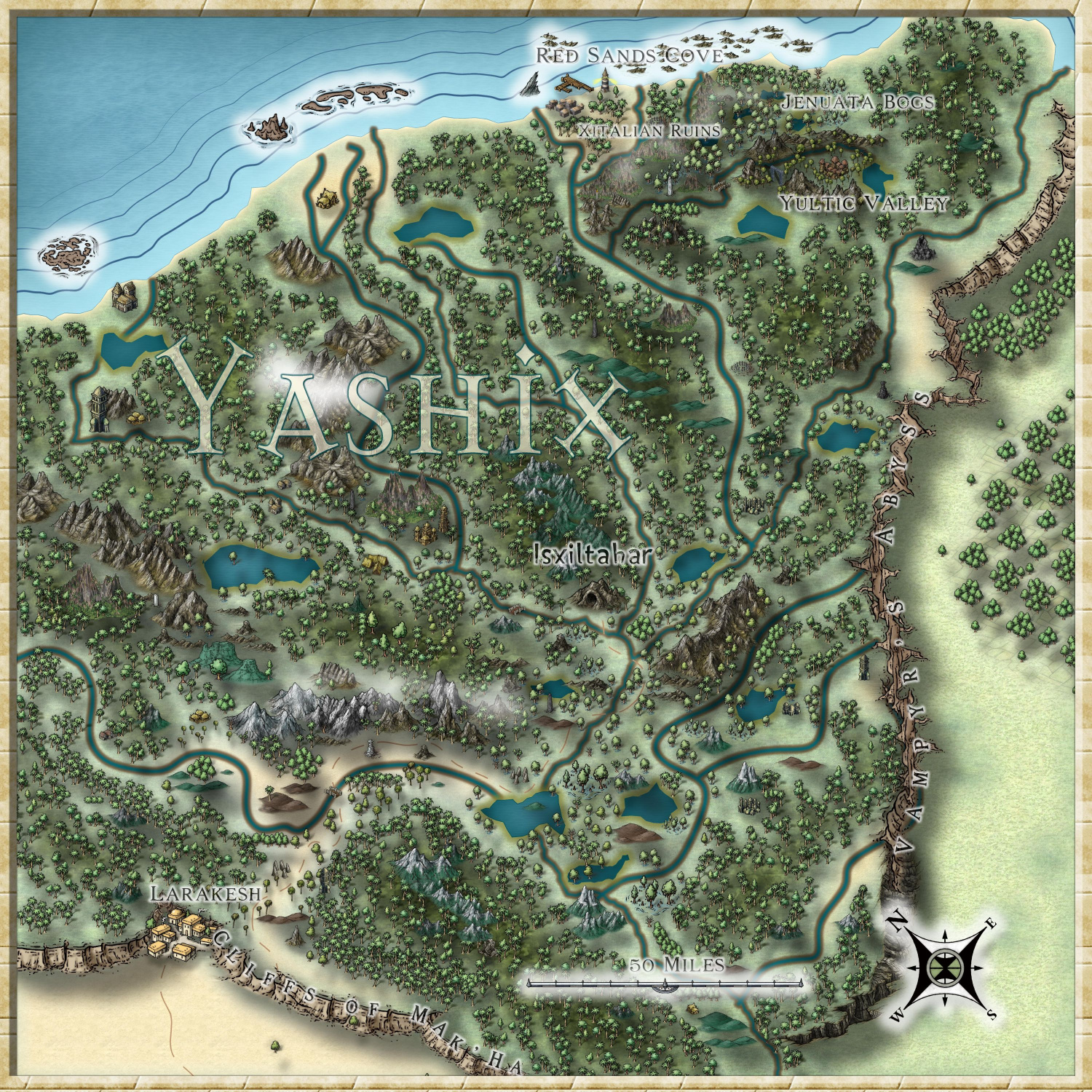
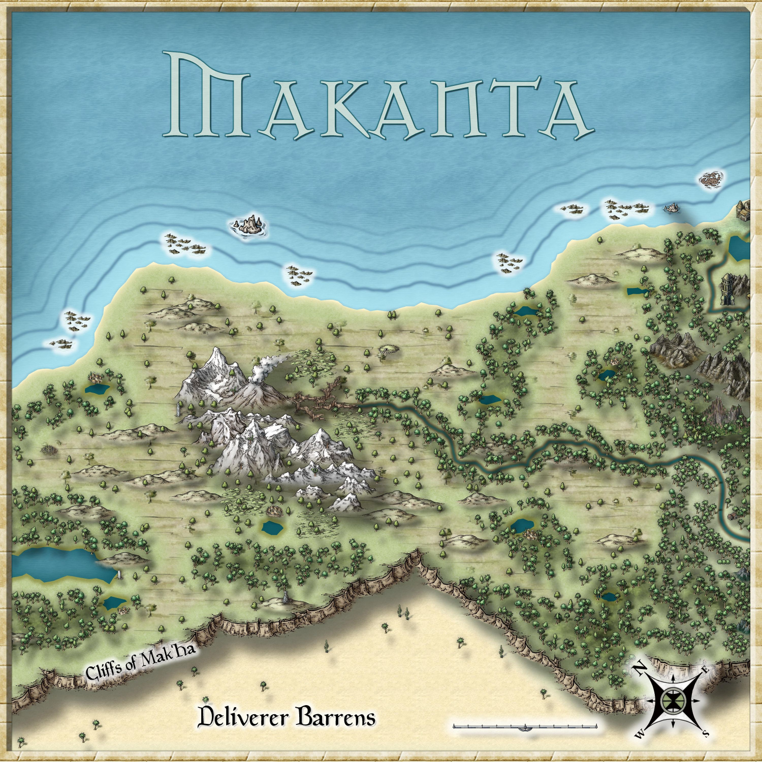
These two geographical maps were created as an "Indiana Jones-esque" low-level adventure. They combine symbols from both Schley and Jonathan Roberts and Weilink.
Makanta Region
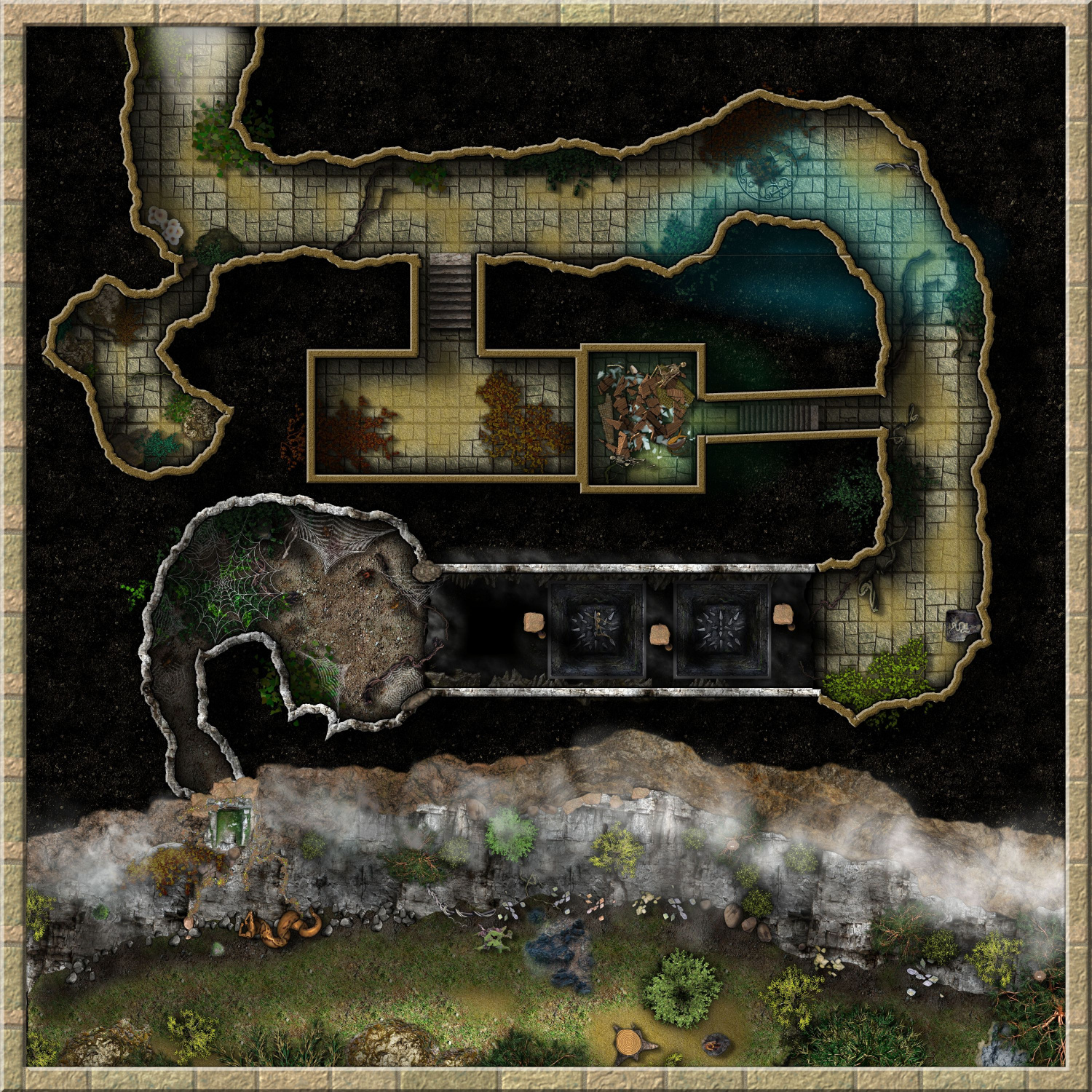
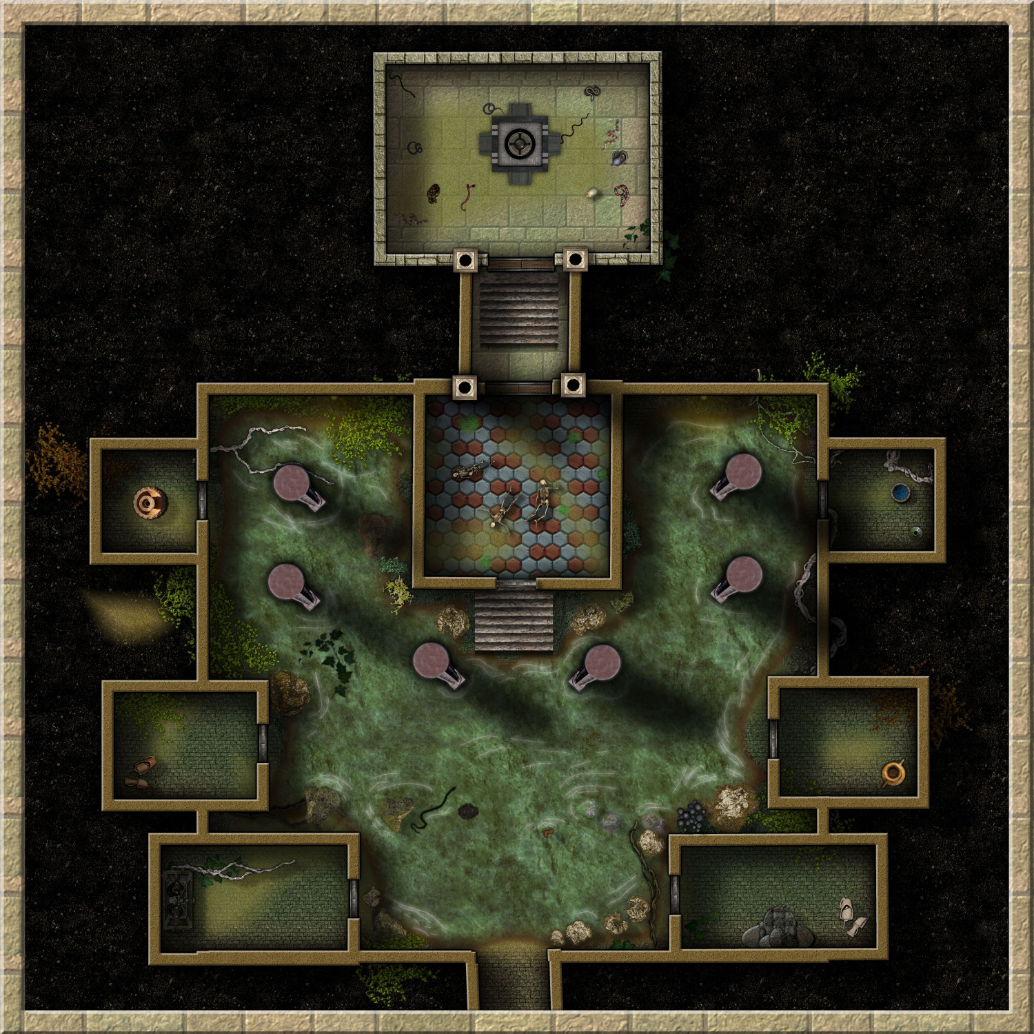
These two battle maps are 125x125 feet. I had some problems with lining up the rooms and with the water, which I'm still trying to get right.
Temple of Isxiltahar, Level 1
Level 2
I welcome any and all comments and advice.
Glad to be a part of this community.








Comments
These looks great. You've got some very nice aesthetics and colors going on there.
These are fantastic, especially the dungeons. If you have kept to CC3+/CSUAC/Bogie/Dundjinni archive stuff, they would be GREAT entrants into the competition. And I could help place them in the Atlas.
Again, I am in absolute awe at the dungeons - so evocative.
These are pretty cool. The second one looks like Mike Schley. Is the first one also the same?
Great job! Is it just me or are the shadows on the overland maps a bit off? It looks as though things are floating.
Nice! They would be perfect for somewhere in my jungle region on the Malajuri continent in the Community Atlas - you should consider placing them there, as well as the contest! Great work.
Thanks all! I'd be happy to do that with the contest/atlas, if you have an idea where any of it could go. I've been tweaking them a little since then, but nothing big. Sorry, all, for the late response, but I'm a school teacher and things have been, well, insane.
@Elfling , I do LOVE Schley, so I automatically go to him and then to others if I need something special.
@Quenten , there is nothing in these maps that aren't from CC3+ or CSUAC. I stopped doing that. :)
@Monsen , I started using color schemes or a thing I call "ground color" that just gives an area a certain feeling. It's just a transparent color polygon over the floor or over everything.
@Lorelei , thank you so much. I'm happy to offer them. Wherever you think they could go.
@jmabbott , You're right! Especially in Makanta. Those shadows are too long. Hm...let me take a look at that. :)
Just wanted to say that these maps are absolutely wonderful. Well done!
@Monsen maybe they could fit along the northeast shores of Malajuri?
Ok, I will find Malajuri. I have the downloaded atlas on my computer, but I'm going to find it here and find a spot.
The overland maps may fit fine along the coast of Malajuri. Direction doesn't really match, so that compass rose may need a bit of rotation.
Keep scale in mind. The overland maps seems to be 200 by 200 miles according to their scale bar, so that means the exact same length as the scale bar itself on the Malajuri map.
I'll get to know the specs of that Malajuri area and adapt the regional to make it work.
OK, after much discussion with myself, I have decided not to add this one to the Community Atlas (although I'd love to). My brother created an entire world from scratch called Sycharia, and I have been creating the maps for it. Out of respect for his creation, I don't want to pull from his to make it something different somewhere else. HOWEVER, I will be doing a new volcanic/water dungeon for the contest and community atlas. It's always nice to do something new. Thanks to everyone for the time and critiques!
I have a question. Are your landmasses floating? It kind of seems like they are with the shadowing you have on them. I would cut way back on the shadow. Just adjust the number on whatever sheet you have that effect on.
Otherwise these look fantastic.
They look great, good use of merging both styles. Thumbs up!
I seem to keep having that problem with shadows that are too long. Those are cliffs on the south side of the land masses, but I should cut that shadow in half. Thank you!
I think I'm going to need to produce some jungle temple type maps myself soon for a game in The Isle of Dread, so I'll be borrowing some ideas from you.
Any time, Raiko, let me know if I can help.